SlideMagic Blog

Frequent updates about all things presentations since 2008. Subscribe to never miss a post.

RSS
·Layout

Counting the boxes

The first thing I do for almost any slide is “counting the boxes”: how many points does each argument have, how many people are there on the team, how many layers to the technology, how many steps in the process.

This drives the layout of the slide: 2 columns with options and 3 arguments each, a 5-step value chain, a 6 x 4 grid of logos, 5 management bios next to each other, 10 columns of sales data, etc. This layout will make sure that your slide looks evenly spaced out. You are also see that in most cases, the (bullet point) list grid structure is actually not the one you need.

PowerPoint and Keynote do not have very strong grid capabilities. Spacing out equally sized boxes across a slide is a pain, and table editing is not much better. And that is why I made the grid structure the central feature of my own presentation app SlideMagic, try it out!

Art: Perspective box, Pieter Janssens Elinga, 1623

Stale PowerPoint templates

User interface, web design, and presentation are moving quickly. Graphics that looked fresh and new a couple of years ago, now look really stale and old. Look at old version of Windows and Mac OSX operating systems, a mobile phone home screen in 2008, and the PowerPoint template you are still using today.

A large part of this is driven by screen technology. Ten years ago, monitors had lower resolutions and fonts had to be fatter, and rough gradients could still look smooth. Also documents that long reasonable on a 4:3 aspect ratio become harder to read on wider 16:9 monitors as sentences streeeeeetch over the entire screen. Harder to read, and it looks out of balance.

What can you do to your PowerPoint template to make it look less like the 1990s? Here are some steps:

  • Switch to a lighter font. Calibri light looks OK and won’t give you any compatibility problems on Macs and Windows.
  • Stop using drop shadows and gradients
  • Remove the old low resolution JPG graphics from your slide template. If you or your corporate communications department insists on having some branding on the slides, but a tiny high res logo at the bottom right
  • Don’t use bullet points
  • If you have to use bullet points don’t use a hierarchy of bullet points
  • If you have to use a hierarchy of bullet points, keep them all the same font size, and use a dot, dash, smaller dot for the levels (no squares, or other funny characters)
  • On 16:9 screens don’t run long sentences in small fonts across the full width of the screen. If you have a lot of text put boxes next to each other (a horizontal list, versus a vertical list)
  • Restrict the use of colour, use the accent colour in your company’s logo, well, to make an accent. Stop using bright red, pink, green, or yellow
  • Stop using underline and italic
  • Legal disclaimers, footnotes, and page numbers can be really, really small somewhere at the bottom, only readable for people who press their nose against the screen
  • Get someone in IT to program all these changes into a idiot-proof new PowerPoint template with all the right default shapes, fonts and colours
Continue reading →
·Concepts

How to present pros and cons

A question came in on Twitter the other day:

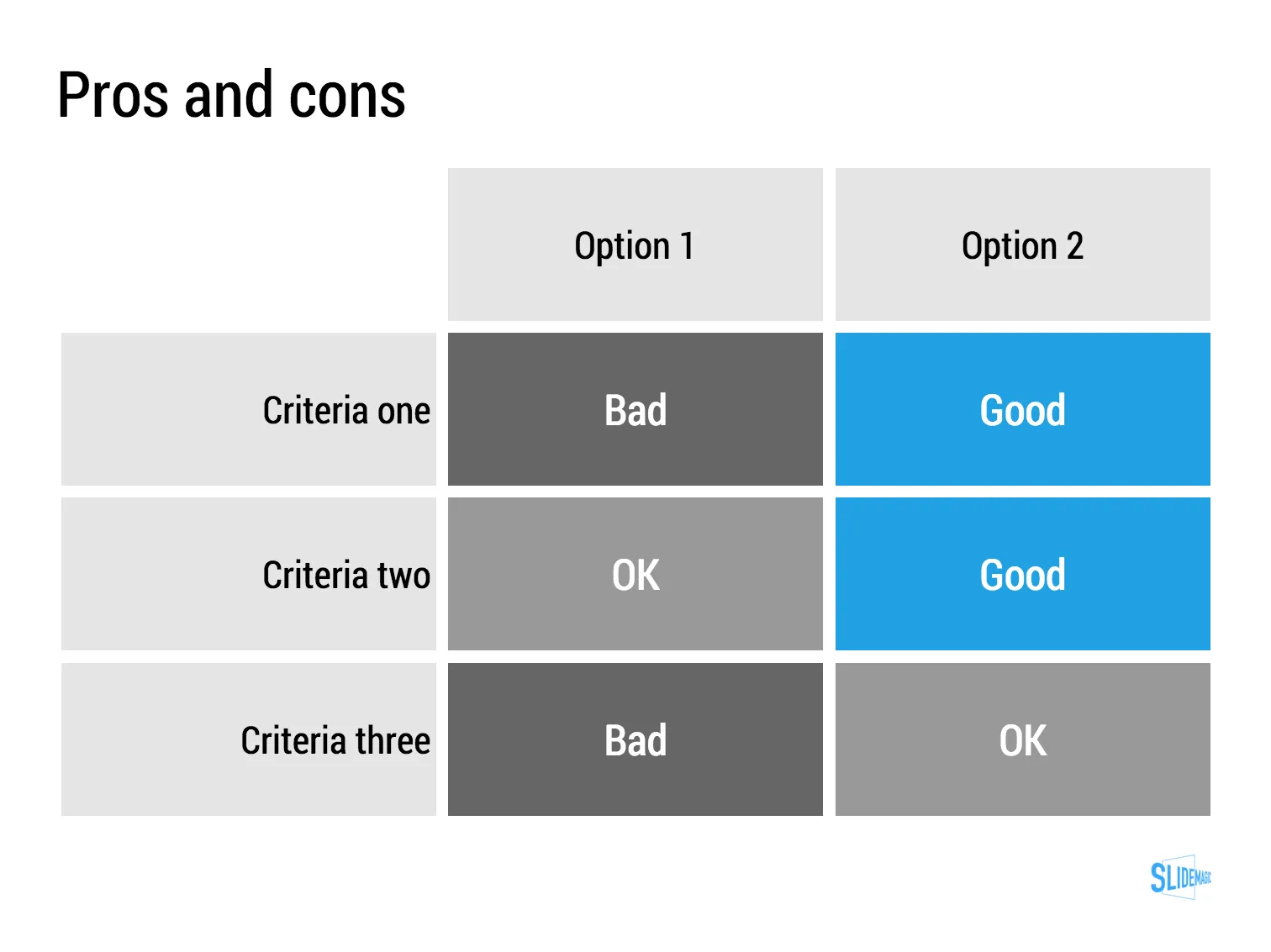
My answer is: a simple table, like this one I prepared quickly in my presentation app SlideMagic (you can clone it to your own SlideMagic account in the presentation template file that contains on the slides I have used on this blog).

The difference between a good pro/con slide and a bad one is not the design in itself, it is how your present the argument. A presentation slide is a tool to get a decision, it is not a laundry list of pros and cons that you evaluated in your analysis. Put your analysis aside, and design from a blank sheet of paper:

  • Group similar arguments together, if an argument is sort of the same, combine them
  • Sort the rows in the table in such a way that things visually line up. For example you start with rows where both options are “good” (all blues), then do the "OK/good"s, then the "OK/OK"s. etc.
  • Isolated and focus those arguments that are going to drive the decision and/or are controversial. "Option 1 is cheaper, option 2 is faster but the what will make the difference is whether we think [criterion 3] is important.
  • Cut words rigorously until you have a page that is still meaningful but does not look cluttered.

Art: weighing of the heart versus the feather of truth

·Investor presentation

The impatient audience

When I am reading I switch in different modes:

  • Losing yourself in a novel and forgetting the time
  • Digging through an article to find the acquisition price that was paid for a company
  • After having failed to resist the click bait title, looking for the answer to the question it raised
  • Absorbing every background aspect of the making of a certain music album

“Newspaper” journalists often get this wrong. They think they are writing for a person sipping a glass of wine and sitting in front of a burning wood fire, while most often they are not.

Hardly any business presentation is digested in the lounge chair. The audience:

  • Has no time
  • Is constantly distracted by calls, emails, messages
  • Thinks that they know it all already and tries to put your idea in a box that is familiar
  • Is clicking down and clicking down and wondering when they get to the point already

The captive TED Talk audience is in the lounge chair sipping wine. The venture capitalist is scrolling down your slides on her mobile while wondering whether the elevator button “1” or “0” will get you to the lobby.

BTW: Happy 2016 to everyone!

Art: Edouard Manet, Young Woman Reclining in Spanish Costume, 1862-1863

·Creativity

Back to pencils

I have tried many tablet note taking apps, but have gone back to the pencil. And of the many pencils I have tried, the Lamy 2000 propelling pencil is my absolute favourite. It is made out of plastic, but has a great feel to it, it has the right thickness, the right balance in the hand and looks great! The origins of the pencil go back to the mid 1960s when the Lamy pencil called in the help of a Gerd Mueller who has previously been designing for the Braun electronics company.

·Investor presentation

Know the risks

In yesterday’s post VC Fred Wilson gave another interesting peek inside the brain of an investor:

  • Investors are in the business of taking calculated risks
  • Any investment has risks attached to it, you just need to manage/mitigate them
  • And here is the key point: an entrepreneur who does not see (or does not want to talk about) the risks is an absolute no-go.

Investors are potential future Board Members looking for CEOs they can work with. Act like one.

Image: Painting by Tigran Tsitoghdzyan

·Software

The broken Apple Keynote interface, is it me?

I have now created many, many client presentations in Apple Keynote. And most of the clients who request a presentation in Keynote rather than PowerPoint are proud that they are willing to use more design-oriented products. For many years, Apple Keynote was ahead of PowerPoint: a cleaner user interface, cleaner templates, those alignment guides that pop up when you want to position an object. And in addition, you were using the same product that Steve Jobs, the master presenter, was using for his slides.

With the latest release of PowerPoint, I think both applications are at par. With each one of them, you can create both beautiful presentations, and horrible decks full of bullet point slides.

The workflow of Keynote though makes me scratch my head. While more complicated tasks are taken care of very well, it is the basic functions such as changing fill colours, font colours, aligning, that drives me crazy. Too many clicks, and I am always looking where to click. Initially I though it was me, but after month and months of trying things are still not getting better.

PowerPoint has a more cluttered interface but after some time working with it your eyes look on locations/icons and you instantly click without having to think. The solution for both programs is clear: create space for one user customisable tool bar. PowerPoint for Mac had one, but it disappeared with the 2016 update, Keynote needs one.

The above partly informed the design of my own presentation design app SlideMagic. You actually need very few functions to create beautiful charts. Most reviews of software tools are still 1990 style: a comparison of features. What you really should be measuring is how fast/easy it is to get a decent end product. Hopefully Microsoft and Apple are not reading this post, so SlideMagic can keep its competitive advantage!


Continue reading →
·Investor presentation

Your audience has heard it before

You are only aware of your own sales or investor pitch. Your audience (investors, clients) sit through dozens of them. After 10 sales or investor pitches in a certain industry, they probably understood the key industry trends, and in their heads they are wondering how you are different from the others.

Have the “101” slides ready, but the body language of your audience should tell you whether you are the first presentation they are watching, or number 12.

Image by Malcolm Carlow

·Software

Microsoft Excel versus Google Sheets

In spreadsheets, I have now moved from Microsoft Excel to Google Sheets as my favourite app.

  • It is faster to fire up quickly for a small calculation doodle
  • It also snappier in use to do the basic things, entering data and moving around
  • It has some neat functions (like automatically cutting up a string and putting all words, numbers in subsequent columns)
  • While I don’t believe in online collaboration of presentations, for models it is actually useful that all the people in the team have access to the laters numbers 24/7
  • Filing and naming of presentation documents is usually pretty organised. With spreadsheets however, I always lose that calculation I did, and the Google search function is really helpful here.

Part of this might be rooted in the way I use spreadsheets: basic functions only, even for the biggest models. I “grew up” with Lotus 123 and early on in my McKinsey career realised that errors in a valuation model can make a difference of billions of dollars. A simple model is far easier to debug because it allows you to see every step in the calculation.

·Layout

"We need to add this bullet"

Group editing of a slide deck is difficult, especially if it involves a lot of people, and especially if some of the people editing dial in from a remote location. If you do not have the full view of the presentation (either because you are far away, or you have not been involved in the process that much), you should resist the urge to ask the junior analyst to add “an extra bullet to the slide that say [fill in message]”. There is a good chance that that point is already made on another slide.

Art: Dogs Playing Poker by C. M. Coolidge