

This animation (GIF alert) shows the distribution of music sales over time. Wait a few seconds and you see the pie chart changing for multiple years. This data can be represented much better by a series of stacked column charts. The animation takes too long, and the audience does not have the overview of all the years.
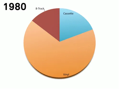
I copied this image from a Tweet that did not include the reference to the source.
There are other problems as well with this chart, gradients, standard Microsoft Office colours, drop shadows, small data labels, and ambiguous labelling (“Internet”, “mobile”, “video”, etc.).