SlideMagic Blog

Frequent updates about all things presentations since 2008. Subscribe to never miss a post.

RSS
all posts

Category Typography

·Software

Why does it look like PowerPoint?

It is often quick and easy to use PowerPoint to draw a diagram. No need to install and learn new specialized software. A few boxes, lines, a screenshot, and you are done. But why the result totally obvious a PowerPoint slide, even if you are not using the program to present your visual?
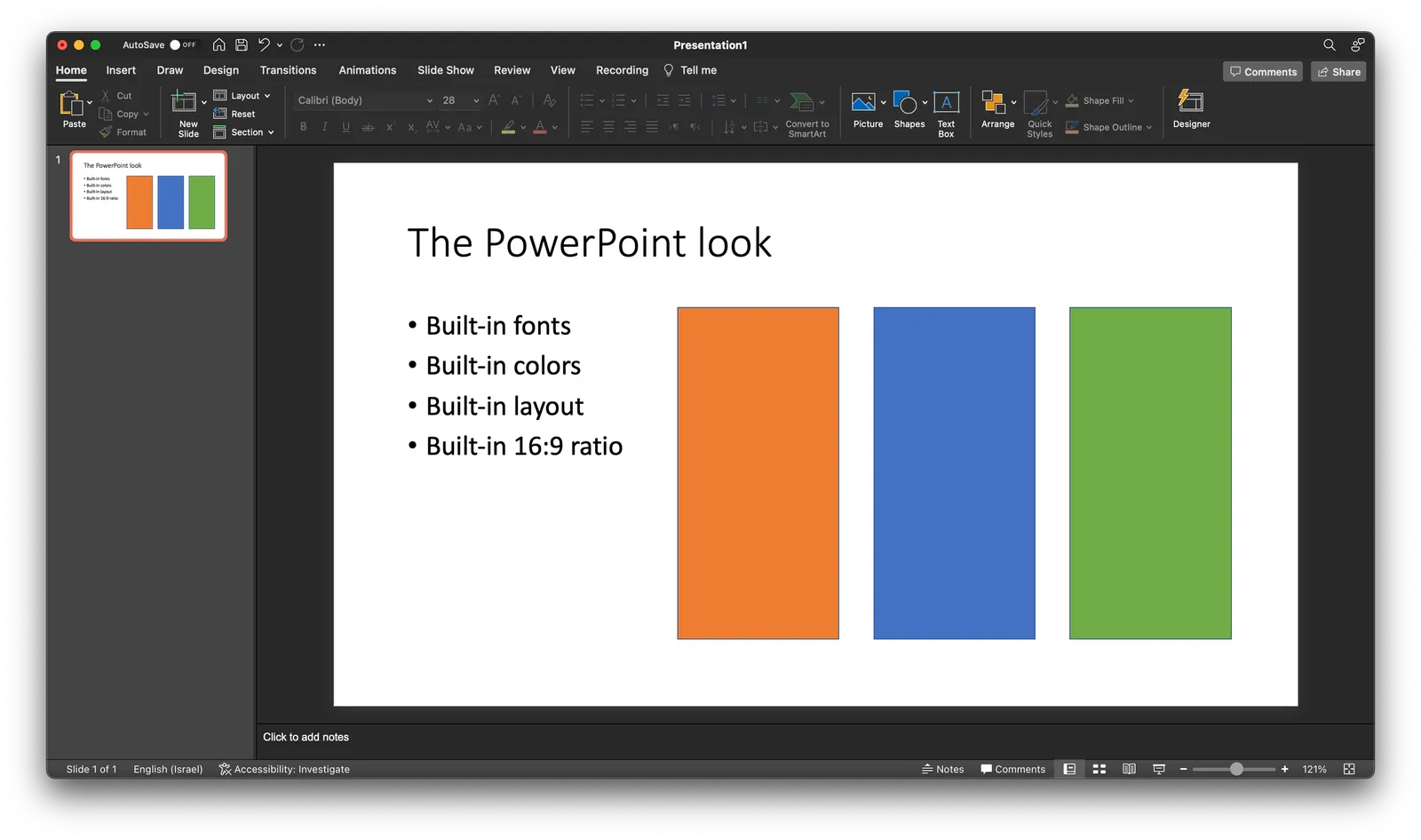
Over the past years (decades for some) we have become so used to seeing PowerPoint slides with the built-in fonts, standard color palettes, that most people will recognize it instantly. But when your end product is a screenshot, you don’t have to worry about things like font compatibility and presentation templates.

  • Change colors and fonts to match the document you are working in
  • Let go of the restrictions of the aspect ratios for a slide (4:3, 16:9) and pick something that is appropriate for your diagram.
·Typography

ALL CAPS

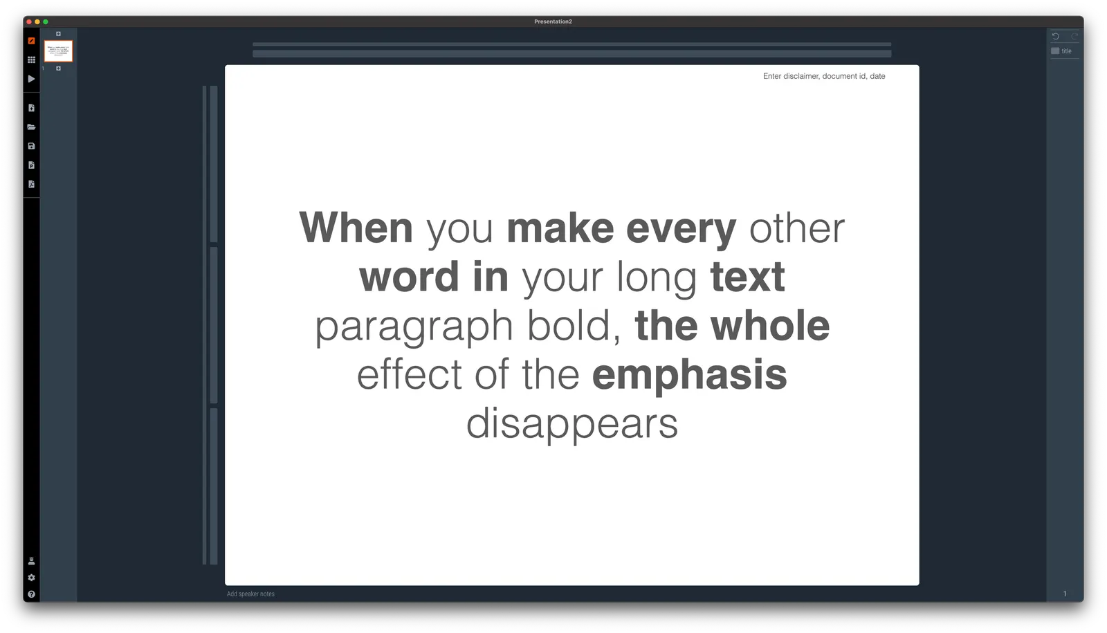
Some people use ALL CAPS TO MAKE A TEXT STAND OUT. That’s not a good use of all caps. It looks busy/messy, especially when used frequently on the same page. A subtle use of bold is better, and if you find yourself bolding every other word, maybe it is a signal to reconsider the design of the slide.

I like using all caps for labels or tags, especially if the text in these tags has similar length. The consistent height of the characters creates nice and stable elements on the page.

Consider reducing the font size of your all caps tags though, from the font your are using for the rest of the page. All caps look bigger (by design).

·Typography

Being too bold

Smart use of bold text can help make a slide clearer. Overdoing it takes out the whole effect.

Why do people fall for this? If you start at your own chart for hours, rereading it, changing the line breaks, bolding and un-bolding text, you become convinced that the text is super clear. It is, for someone who has studied it for a long time. Not for someone who looks up from her phone and sees it for the first time.

P.S. Use ctrl-B (Windows) or cmd-B on selected text in SlideMagic to make things bold.

·Design

Should the fonts of your logo and presentation match?

No.

Now that mobile devices are becoming the dominant screen on which we look at brands, more and more logos become text-based. The font is the key design aspect of the logo. To set your whole presentation in a funky font would not make sense.

Having said that, the fonts of your presentation and the logo are very close, but just a bit different, a design nerd might find it bothersome. (Arial - Helvetica for example). This would only be an issue for big, bold headlines. Though.

Some brands do force the match between logo font and text font. Think of the ads produced by the Absolut Vodka brand. Slogans and headlines are in Extra Bold Futura Condensed all caps and it matches the brand exactly.

·Typography

Typography tutorial

Why does certain typography look great and others not? When a designer ‘get its right’, she is intuitively adjusting a great number of parameters. And the most important ones are not the obvious ‘in your face’ ones (such as the font type). Paragraph width, line height, lots of subtle adjustments that can make a big difference to your layout.

This online typography tool lets you experiment with some of these parameters and get feedback on the result

·Typography

Typography is everywhere

The building manager finally installed a house number on our building, to reduce the amount of desperate calls I get from couriers. Still, I wished he had asked me for a suggested position where to put it. “Bleeding off the page” is not the right concept here…

·Typography

Sorting text by length

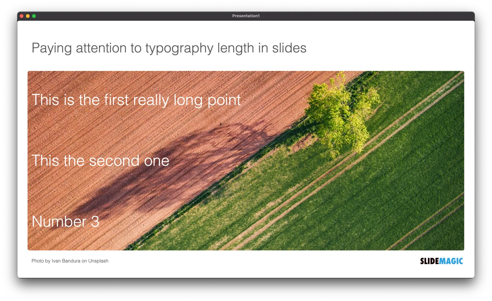
In slide design, every detail counts. Pay attention to the length of text blocks when putting them on a page. Sorting them by length can give an interesting visual effect. Or the other extreme, picks words on purpose so that the length of each text box is more or less the same.

PS. How did I get the picture? Search for “diagonal" in the SlideMagic app and you get lots of suggestions

·Typography

Different types of language errors

Most business presentations in the world are written in English, most people who write them are not native English speakers. Different type of errors pop up:

  1. Typos and grammatical errors that can be caught by a spell checker / other software
  2. Typos and grammatical errors that are hard to spot by software
  3. Mistakes in word choices, a literal translation from another language into English produces a result with a totally different meaning, or double meaning in slang

Number 1 can be avoided, no excuse here.

Number 2 are also made by native English speaker, they look sloppy but are not a deal breaker. To catch all of them, you might need to help of a professional editor.

Number 3 can be a big problem and really damage the credibility of your presentation. Having your presentation read by anyone who is an English speaker will catch these, also no excuses here.

·Typography

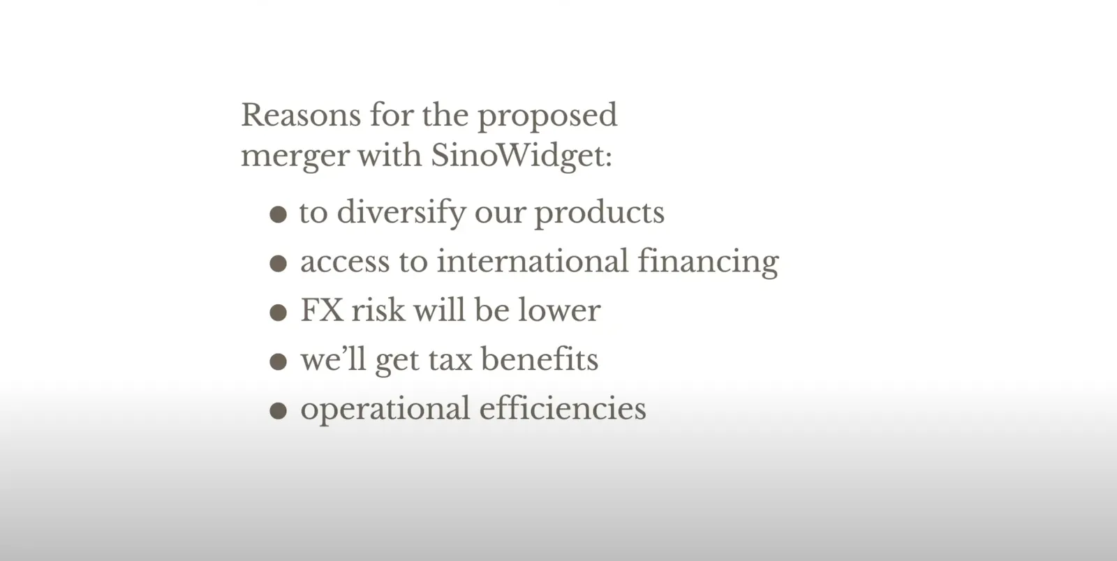
How to punctuate bullet points

Dr Clare Lynch is “chief business writing expert” at Doris and Bertie Ltd and a University of Cambridge writing instructor, she has an excellent YouTube channel that deserves more viewers.

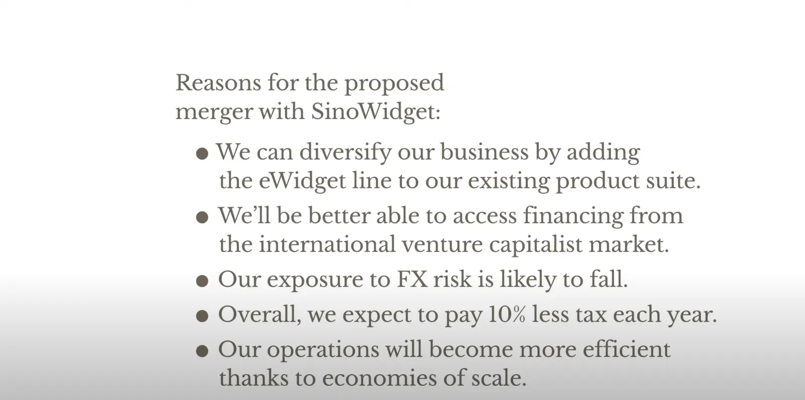
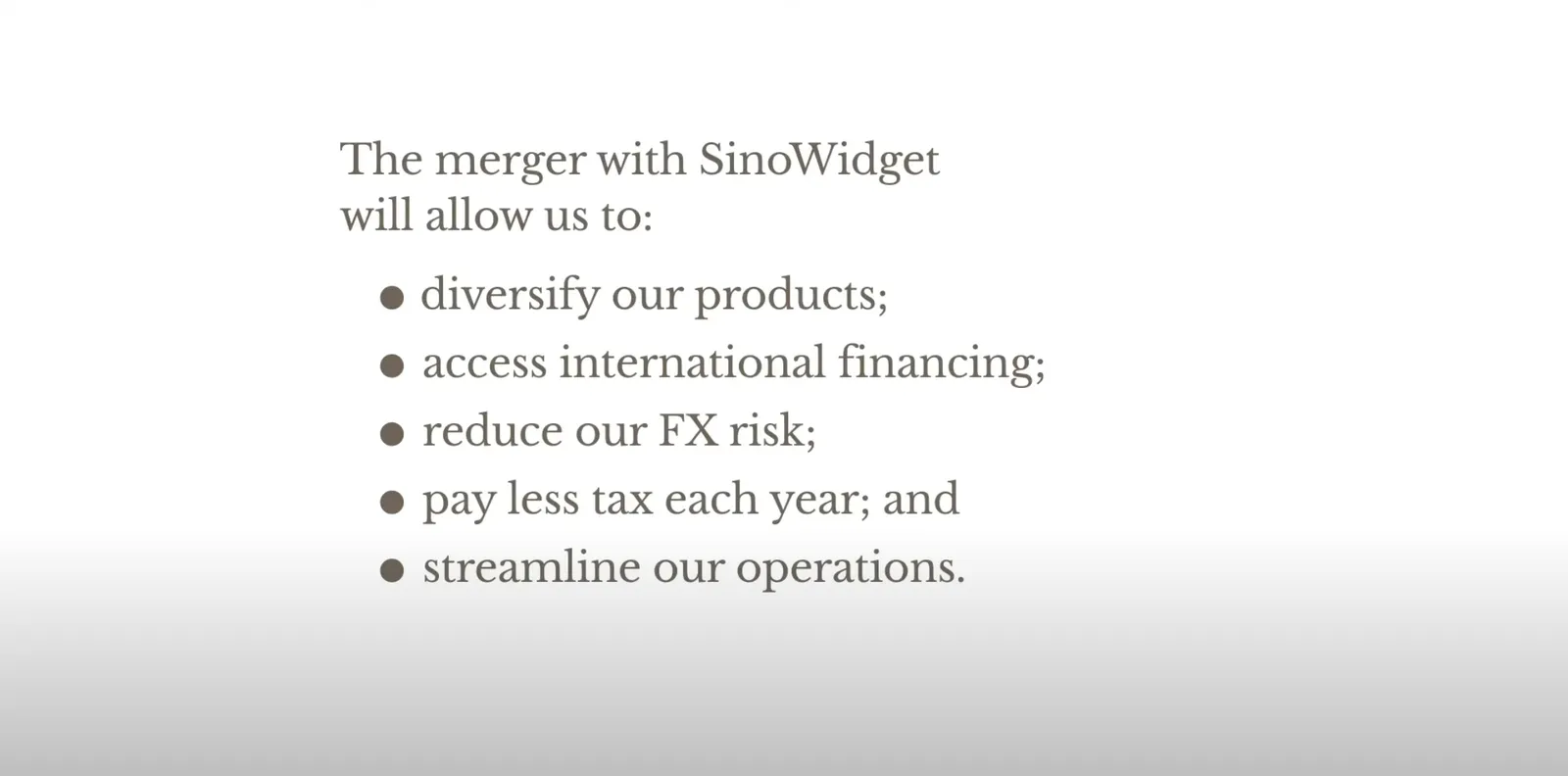
In a recent video, she explains the official rules for punctuating bullet points, full stops or not, capitals, etc.

She gives 3 options and a warning:

 Colon: no capitals, no full stops

Colon: no capitals, no full stops

 The long hand version with capitals, and full stops

The long hand version with capitals, and full stops

 For writing: semi colons

For writing: semi colons

 Don’t mix sentence styles

Don’t mix sentence styles

Back at McKinsey in the 1990s, we were taught to write paragraphs in bullet point form but starting with what we called a “clunk”, with a heavy paragraph sign as the bullet point anchor (a pilcrow), and leave the full stop out after the last sentence (but use them for other sentences in the bullet point paragraph).

In presentations? First rule avoid bullet points if you can. If you to include some sort of list to make your point on a slide:

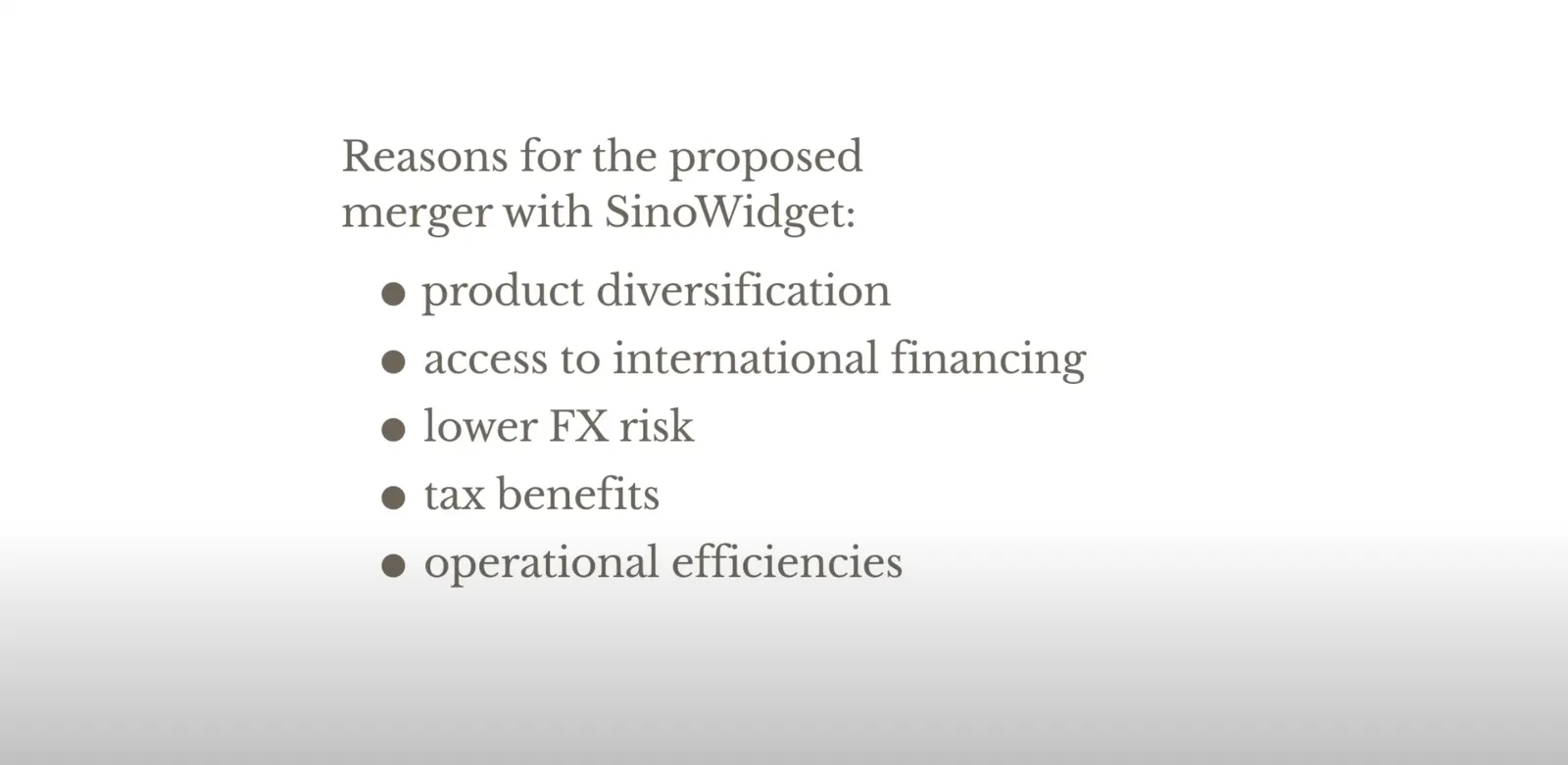
  • I try to keep the text super short (even shorter than Clare in the above examples)
  • Try using some repetition: Higher sales, higher market share, lower costs (“business poetry”)
  • And pay close attention to the length of the text I am writing, I want all text boxes to be roughly the same in terms of length. Yes, I admit that I sometimes “stuff” a super short bullet point with a non-essential word to make it look prettier…
·Typography

Making a sentence a bit longer than needed

I just caught myself adding a few words to a sentence that added no meaning whatsoever to the slide, but the layout of the whole page just looked so much better… Usually, it’s the other way around.

Photo by Sharon McCutcheon on Unsplash