SlideMagic Blog

Frequent updates about all things presentations since 2008. Subscribe to never miss a post.

RSS
all posts

Category Templates

·PowerPoint

Re-discovering Smart Art

Smart art inside PowerPoint is a semi-automated template engine for diagrams. It easy to add and remove boxes/bubbles, edit text. The idea is good, but I have not used them a lot:

  • The standard out-of-the-box formatting is ugly
  • Although there are many frameworks to chose from, none of them usually really work for my particular presentation problem
  • I have seen them too many times in presentations where designers simply dump in a smart art graphic to replace a bullet point chart (the result is still a bullet point chart that looks a bit different)

Recently, I have started to use smart art in my presentations, but in a different way. I use them to position objects on a slide by picking only the very basic configurations and reformat the slide items heavily so you can hardly recognize it is a smart art object anymore. An example below:  
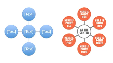
Well, I said before: your PowerPoint is really good PowerPoint if your audience cannot tell it is PowerPoint…

More about smart art on the Microsoft site, or over at the PowerPoint Ninja blog.
·Colors

Ugly colors

When your company has an ugly corporate color scheme it can be hard to make good looking charts. Here is one solution: go mainly for shades and grey and use one or two of the corporate colors as an accent color to highlight things. In 99% of cases this will look very elegant and nobody can accuse you of deviating from the prescribed colors.

·Concepts

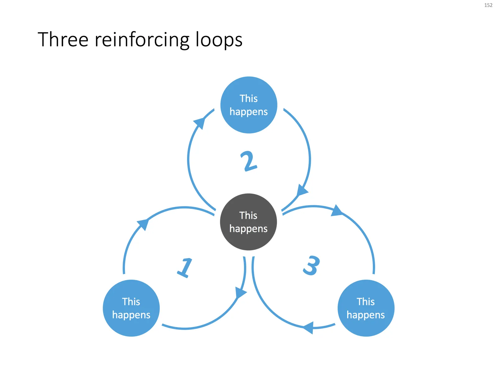
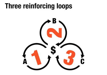
Reinforcing loops

At McKinsey, we used to call this Business Dynamics, mapping reinforcing and opposing forces using arrows. The concept is borrowed from systems theory in mathematics and physics. These circles can make a great chart to show the main growth drivers behind your business.

The notorious US army spaghetti chart is a more complicated execution of the same principle. Contrary to many critical review, I actually liked it as a visualization of the incredibly complex situation over there.

UPDATE: There is now a PowerPoint slide template with 3 reinforcing loops available in the template store.

·Data visualization

How to export a chart from Excel to PowerPoint?

Yesterday’s post triggered this question: how to export a chart from Excel to PowerPoint? The short answer: copy the data not the chart.

Standard Excel charts are ugly, they have the wrong formatting, they have the wrong colors, axis labels are in the wrong place, data is not rounded up and too precise. Copying and pasting an Excel chart into PowerPoint is also copying all that ugliness. Even worse, copying and pasting it as a picture might make it look blurry.

I believe that data charts in a PowerPoint presentation deserve careful attention and need to be designed by hand. You start by inserting a blank, ugly, PowerPoint chart into your slide, next copy the data across from Excel and then start tweaking until it looks perfect.

Once you have done one, you can use that PowerPoint chart as a template for other charts in your presentation.

·PowerPoint

Non-wordy-self-explanatory slides

Everyone has bought into the idea that presentation slides full of text are poor communicators of ideas. The result is that many presentations are now so minimalist, that hardly anyone can understand them without verbal explanation. This creates a problem, as more and more, slides are used as commercials of ideas that are shared without the presenter being present (yesterday’s post).

One solutions is to add an audio stream to your slides, or going a step further, turning your slide deck in a small video. This requires some technical skills though. Also, busy important people often prefer to sticking to the communication medium that they have grown up with: slides. But, they like to do so at their own pace (meaning fast), impatiently looking for a visual that catches their attention. Boring blah blah blah gets skipped.

So what to do in situations where you do not have time / resources / patience to separate slide decks for a live presentation and a cold email attachment? Some ideas.

A very clear headline. Write your message out in a human sentence, you can even change your presentation template to allow 2 lines of text at the top of your page.

Pick useful images. A big squished orange to support that your are crushing the competition does not add much. A photograph of bored people waiting and lining up to buy paper lottery tickets to argue that there is a market for mobile lottery makes the point perfectly.

Swap verbs for visual concepts. A tension can be 2 boxes of text with a rope in the middle that is about to snap. An implication can be arrows with 2 words in each pointing to another box with 2 words. Best of both worlds can be a Venn diagram. Contrasts can be 2 boxes with opposing colors.

Continue reading →
·Investor presentation

What is a good fund raising web site?

I see many startups pitching for VC or angel money early in their life. The investor presentation is often first piece of collateral that the company produces. The second one is a web presence and people ask me how it should look like.

A fund raising web site of a company that is not operating yet is completely different from one that provides a service and/or processes live transactions: it is a relatively static piece of fund raising content. The only visitors it is likely to get are investors you have met or heard about you checking out the company, or maybe potential users that have found out about you in the rumor mill. The web site should be designed with that audience in mind.

The content of an investor web site can be very minimal, look and feel should be highly professional. Let’s start with the look and feel.

  • URL. Make sure that you have the URL to your company name and that your sites uses it (and that you use it for your emails). This is check 0 of an investor to see whether you are actually real or not. Gmail addresses and Google sites do not score you any points here.

  • Template. The site needs to look like that of a serious company, not a MySpace social media profile. Just setting up a Wordpress blog in disguise (i.e., a blog template that is used as a static site) with a nice minimalist template should do (go to sites like Theme Forest to find one).

Continue reading →
·PowerPoint

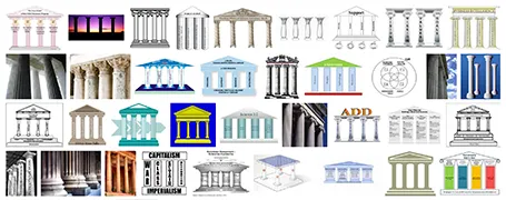
Over-used: the temple framework

The pillar template goes back to the early days of PowerPoint. A building structure is a useful concept to show that things are dependent on each other, and will already collapse if only one pillar is removed. Still, using a Greek temple will give your PowerPoint presentation that instant 1990s feel. I am not sure that is what you want…

·PowerPoint

5% presentation, 95% Q&A

These are often the best meetings. The audience has prepared, read the material, and is ready for a discussion. What presentation slides can help you run a meeting that is mostly free discussion?

Bring your entire deck, but select from it those slides that create a mental framework around the things you want to discuss. Often, they are very simple slides, but relatively dense with content. Examples:

  • A 2x2 matrix with all the competitors listed
  • A matrix of market segments (growth, and size on the axes)
  • A simple ranking of sales and profits by brand
  • A product development timeline
  • Two market share pies: last year and this year
  • A software architecture diagram

All these can be projected onto a whiteboard (use a white slide brackground), on top of which participants in the meeting can scribble. After the meeting is over, snap a picture of the remaining group art.

Changes are that if you look at that picture 3 weeks later, you can pretty much replicate the entire discussion. Not because the scribbles are so clear, but because your mind has allocated a physical space on the white board to store the entire debate in your memory. Similar to stories, a physical location makes it much easier for people to remember things.

·PowerPoint

A reason why competent graphics designers design ugly templates?

Most corporate PowerPoint templates are ugly and take up too much screen real estate. Most corporate PowerPoint templates are designed by professional graphics designers. This does not make sense? I just realized, here is probably why: graphics designers design the template on an empty screen (or Microsoft’s bullet point opening screen). Uh oh, need to fill up that white space with something interesting.

The solution: next time your PowerPoint template is up for renewal, hand the graphics designer a real slide deck and tell her: put this presentation in a new template. My guess is you would get far better results.

·PowerPoint

Do you do backgrounds?

Not really.

Background watermarks such as these are often used in PowerPoint templates to lighten up a slide that is loaded with bullets. They are supposed to look sophisticated and fancy. They might work for a restaurant menu card or a birthday party invitation, but not for a professional presentation.

  • They make text hard to read (including bullet points)
  • They clash with any type of graphical element that is not a bullet point

There are other ways to make a slide look sophisticated with a completely blank background:

  • A nice image
  • Big text in a nice font
  • Minimalist / simple elements (boxes with a few words in them will do) in colors that match your corporate identity

Take off the logos, take off the watermarks, take off the page numbers, remove the date, get rid off the file path, convince your lawyer to write just one page that all pages in your presentation are highly confidential rather than repeating it on every page.