SlideMagic Blog

Frequent updates about all things presentations since 2008. Subscribe to never miss a post.

RSS
all posts

Category Templates

·Colors

What really matters in PowerPoint template design

The design of the template should be simple: minimal graphics and logos, maximum screen space (see a previous post here). My favorite is really simple: a nicely designed title page followed by a completely white page for the rest of the deck.

So what does matter? The technical PowerPoint stuff that helps thousands of employees with only a very basic understanding of PowerPoint do the right thing. Before letting the genie out of the bottle and releasing a new template to the whole organization check the following:

  • Are the RGB codes of the color scheme coded correctly as standard colors? In 99% of all templates I see, PowerPoint offers the default blue, green, red color options when drawing a shape in a template. Easy to fix.
  • Are the drawing guides set up correctly so that people align objects correctly on the page? There should be guides that align with screen graphics, and guides that help users position objects on the screen. (Earlier post here)
  • Does the standard blank page pop up correctly when hitting “insert new slide”? Most templates are a bunch of example charts that people can use for inspiration. Nobody uses them, every one clicks “insert new slide” and - if not corrected - gets served the standard Microsoft chart with a big title and a hierarchy of bullets in Calibri font. To fix this, go into view slide master, delete most of the template charts on the left side of the screen and carefully re-design the key blank slide with the correct graphics, colors, and fonts. If you have courage, delete the standard bullet page.
  • Are the standard shapes set correctly? Draw a text box, set the font, right click it and set as default shape. Repeat for a shape (rectangle, anything) and focus on the color, the font, the outline, the shadow, etc. Right click and set as standard shape.
  • Are custom fonts embedded in the file? (PowerPoint Ninja post)
  • Are the page-filling images in title pages and separator pages compressed? If not, a presentation of 2 pages can already take up 5MB in hard disk space. Go into the slide master, select the image, and compress image sizes.
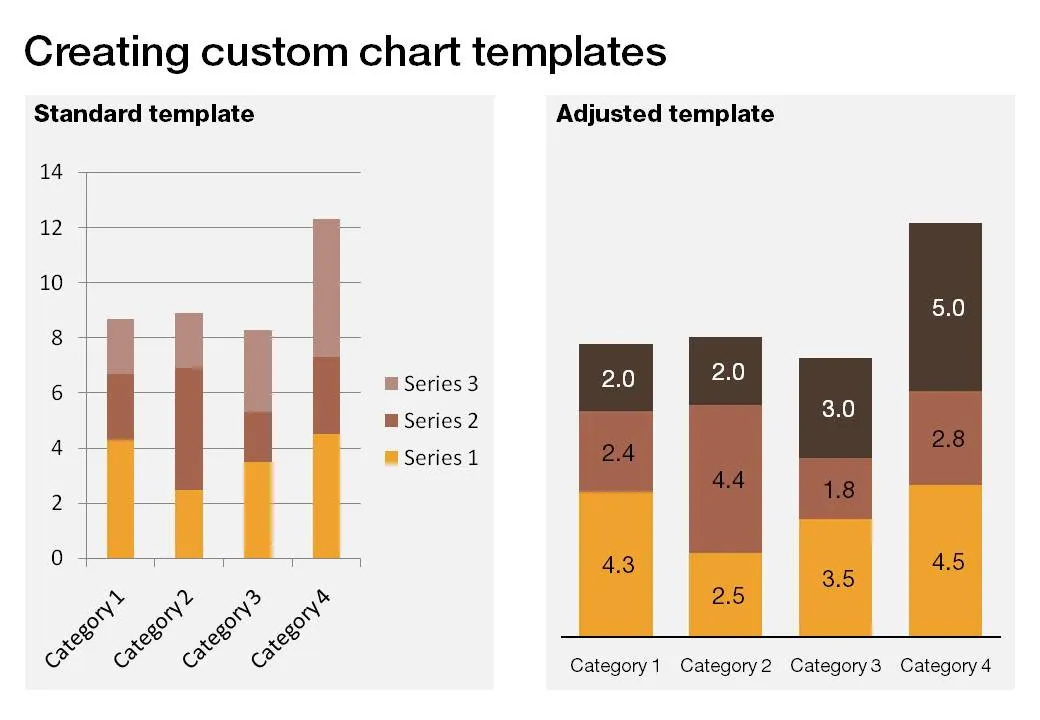
  • Are the data charts formats set up correctly? This is a bit more advanced but should really pay off. See an earlier post on fixing issues.
Continue reading →
·Design

Useful: 2010 calendar PowerPoint template

I do not use standard Microsoft PowerPoint templates very often, but I must admit that I was pleasantly surprised by this 2010 calendar template on the Microsoft web site. That saved me a lot of time in designing a kick off presentation for a new project. Tons more here.

·Design

Should you put page numbers on PowerPoint slides?

I think yes, but really tiny ones, in a color with a very low contrast with the background. Standard PowerPoint templates put huge page numbers, dates, and other graphical distractions on every page. It looks ugly, and having a visible counter running on your pages might make your audience wonder how many more numbers there are before the end.

Why still put them on (in a very small font)? It makes it easer to discuss comments/improvement suggestions on your slides, it is easy to run a meeting with printouts and related to that, it makes it easier to put your print deck together if you drop your pages on the floor.

·Design

Dealing with ugly corporate templates

Corporate PowerPoint templates are often (in fact, most of the time) too busy and too cluttered for presentation design. Lots of graphics that is repeated on each page, big logos with reflections, legal disclaimers, huge page numbers, all of this eats valuable screen real estate. Depending on how strongly the corporate communication department insists, here are some work-arounds:

  1. The most radical option: go into the slide master and take all the unnecessary stuff out. [view, slide master]. But then do something extra: go into [design, create new theme colors] and enter the exact RGB colors of your company’s color scheme, a step that is often overlooked in corporate templates
  2. Keep the front page, but design a presentation full of large images that you stretch across the page (including the cluttered graphical elements). “What, I did stick to the template, the images just did not fit in in any other way”.
  3. If 1 and 2 do not work, create a window inside a window: design your slides inside the frame that is left, using the correct corporate colors and ignoring the bullet point default template. If the window is consistent, the audience will slowly loose the attention for the clutter around your chart, in pretty much the same way as is the case in big conference halls with distracting sponsor logos around the projector screen.

Thank you Gonzalo Álvarez Marañón for suggesting this topic.

·Design

Leave some room for your chart title

The space allocated to the slide title in a PowerPoint template is constantly under threat:

Please give the title some space:

  • It is virtually impossible to win the battle against dense bullet point charts in big corporates. However, giving people some space to write the conclusion in the title of the chart might be one of the easiest ways to overcome this problem: read the title, ignore the chart content. A similar effect to how Twitter is educating people to write more concise email subject lines.
  • I find a title that runs on 2 lines hard to read: if you do not give people space they will simply add a line, and maybe even another one.
·Data visualization

PPT hack - custom chart templates

The standard PowerPoint templates do not look very good. The standard slide layout invites people to write presentations through endless lists of bullet points. But even more time-consuming to change are the standard templates for data charts.

This earlier post with a make-over of a column chart in a presentation by Skype shows some of the pain a presentation designer has to go through over and over again to create decent data charts. It took me around 17 years to discover the option to create your own templates. Let’s save you this time, right now.

If you click a chart in PowerPoint 2007, you can find the “save as template” button in the “design” ribbon of the chart. (Confusingly, two “design” ribbons pop up when you have a chart open, one for the chart, one for the slide). Give your template a name and PowerPoint 2007 will save it in the appropriate directory (with a “.CRTX” extension, but you do not need to worry about that).

The next time you select “insert chart”, a folder appears at the top of the standard PowerPoint options, open it to create a data chart using your own customer templates.

·Design

Logos on PPT slides / logos on corporate gifts

It’s the time of the year for corporate gifts. Many of these could be really nice, where it not for that huge corporate logo that makes you shelve a beautiful pencil instead of using it. A waste. If your gift is nice, you do not need to remind people that it was you who gave it to you, they will remember.

Most corporate PowerPoint templates waste a lot of screen real estate on elaborate graphics to make sure that the audience does not forget who the employer of the presenter is. This is not only a waste of space, but these graphics also disturb the overall balance of the slide. A far better way to reinforce your corporate identity is to use the corporate colors consistently through your presentation. No need for logos.

So far, a consistent message. But what if the presentation is poor, and people walk in and out of the conference room, check email, make a phone call or get a much-needed coffee? In that case, you might need a reminder of who is speaking when you re-enter the room. Maybe template designers just anticipate this situation…

·Design

FedEx shows: no need for an elaborate PowerPoint template

An ad from FedEx found on Ad Goodness:

Proof for one of my 101s of PowerPoint design: ditch the elaborate PowerPoint template (with colorful horizontal bars, big logos, and other graphics repeated on each page). From a mile’s distance, anyone can see that this is an ad by FedEx. Achieved by consistent use of colors on a completely white background. They can almost do without the small logo in the bottom right.

Related reading: the 2nd post on this blog from July 2008

·Design

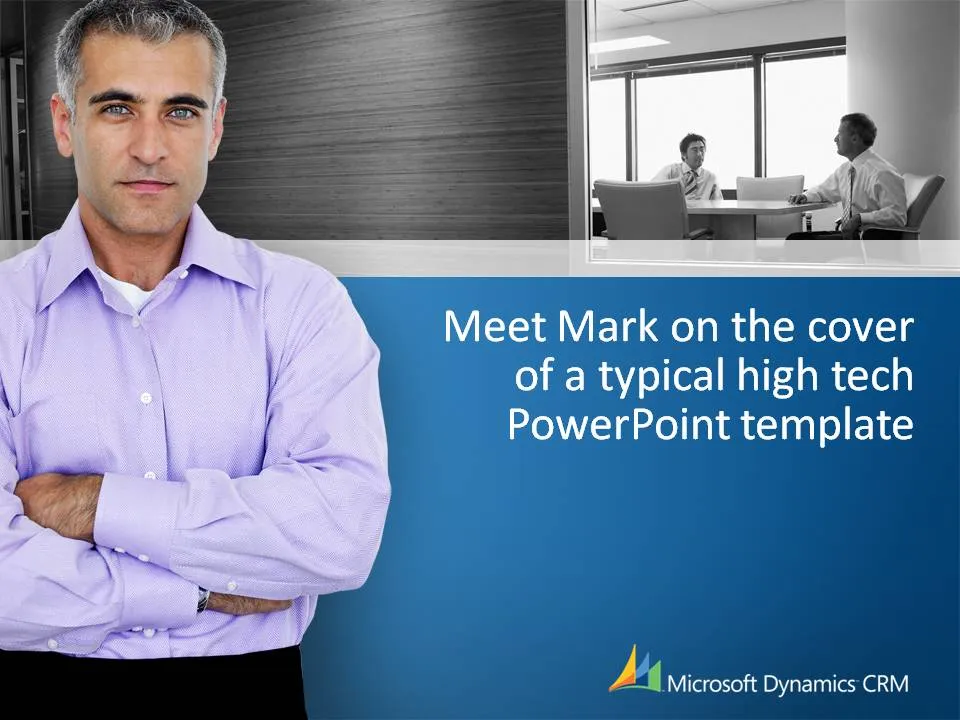
Meet Mark on the cover of a typical corporate PowerPoint template

I came across this template in a meeting yesterday. I am not picking on this specific company that is using this PowerPoint template, it is just a great example of templates that almost all companies in high-tech use. “Business-like” settings, professional models and big logos and graphical elements repeated on every page.

Technically, these templates are well executed (images, composition, colors). Your presentations look professional but they do not really stand out. They could look so much better and more original.

I do realize that creating a standard PowerPoint template for large corporations that have thousands of employees, most of them not skilled in PowerPoint, that have to produce documents that look vaguely consistent in format is a challenge.

Some suggestions:

  • Avoid professional models in slides, but especially in templates. They are not real people.
  • Get rid of “frames” around slides, the blue line at the bottom is not required
  • Avoid heavy graphical elements on the page, especially at the top. It makes the slide too heavy
  • I do like using images as separators for different sections in presentations. Instead of using images of models, hire a photographer and use real images: anonymous people in the street of cities your offices are located, images of a delivery truck unloading your product for different stores, cafes that feature your beer brand on their building facade. If you want to use people, take real ones (employees from all over the world that use your software) and include many, many, many images to avoid boredom of seeing the same face
·Design

Learn from the Skype "how do we look guide"

A while ago I posted a fairly critical review of the abuse of the Skype PowerPoint template. The first sentence of my post however was: “Skype has a beautiful and very strong visual identity”.

Spot on. Browse through this document with guidelines for creating documents in the “Skype look”. You can learn from it even if you are not designing for Skype. Beautiful graphics. Nicely written to give you directions but leaving you enough creative room to make your own designs.

Skype- corporate identity_ how do we look