SlideMagic Blog

Frequent updates about all things presentations since 2008. Subscribe to never miss a post.

RSS
all posts

Category Templates

·Keynote

A good PowerPoint template

I just gave a client some feedback on new PowerPoint template options, I might as well share my thoughts with all of you:

  • Flat: no drop shadows behind fints, no gradients, no reflections. These look dirty in a world of razor sharp retina displays
  • Out with the subtle waves and watermarks, they 1) make slides hard to read and interfere with the slide design and 2) make your presentation look like 2003
  • Lighter fonts: there is no need to scream to get your point across. Keep a lot of white space around the slide title.
  • If you have to put a logo on each slide, put it at the bottom right, not top right (or even left), you want to leave the maximum space for the slide title.
  • The client spent a lot of time on the cover page, but my suggestion is to worry about it last.
  • Design your template around a real presentation rather than empty pages.

·Colors

Too cute for investors

Unfortunately, in 2013 most investors are still male. Coming in with a cute deck (curly flower background, pastel colours, retro-chique font, etc.) is not going to get you points. Even if your product itself has to be cute (a cosmetics line for teenage girls for example) you can still separate things in your investor deck. Use more macho graphics for the serious business stuff, leaving the cute graphics for the product show case pages.

·Keynote

Subtle textures

The majority of my presentations have either a pitch black or bright white background. But now that monitors are getting Retina-like resolutions, it becomes possible to add a tiny, tiny texture to the background. Here is a site that has a few candidates: subtlepatterns.com. (Update 7 April 2017: new link https://www.toptal.com/designers/subtlepatterns/

On the average crappy VGA office overhead projector this effect will not come out though.

·Keynote

Wireframing in Keynote

I have started to wireframe my PowerPoint/Keynote killer in… Keynote. Presentation design software is excellent to make mock up web sites or mobile applications, no need for special software. You have all the shapes at your disposal and can add basic interactivity with hotlinks that point to other slides in your deck. You can design icons yourself or use standard packs such as these, or these to make things look even more real.

·Keynote

Changing a corporate template

I am close to convincing a large client to change its corporate presentation template (at least for one event). Here is my strategy:

  • Convincing people that a high-profile, external event merits a format that can deviate from everyday documents that are mainly used for internal audiences
  • [But this is the most important one] Comparing the 2 template options not based on a blank slide, but on one of the most important slides of the entire event. Seeing a straight comparison of what is, and what could be for one of the most important messages of the company makes deciding easy. You pick the one that looks better.
·Keynote

One framework fits all?

Some presentations are a series of ideas, a number of products, a string of business unit updates. Most people try to force some sort of uniform framework to discuss all options: market potential, challenges, next steps, etc. But often you find that that one framework does not work for all the stories you want to tell. In those cases, feel free to drop the uniformity and pick the visualisation that fits best for that particular story.

·Colors

Hey, where is the colour?

A recent client was wondering why I turned all images in his presentation to B&W.

The answer: because I matched the colours of the presentation to the colours of his brand; shades of grey plus a strong blue as accent color. These type of colour schemes are actually my favourite ones. They look elegant, are recognisable, and it is very easy to create a harmonious, consistent set of slides through the deck with out the distraction of clashing colours. Definitely not a presentation with a 1980s, pre-colour monitor, look and feel.

·Keynote

Page numbers?

Big graphical elements that are repeating on every page obstruct your slide design. Examples are legal disclaimers, company logos, banners, and yes: page numbers. I am not a purist here, and will most of the time put a tiny page number in light grey at the top right of the page. Too small for a keynote audience to see, but big enough to guide a page switch in a phone conversation.

·Data visualization

Excel on the front page

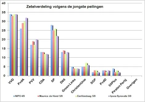
It is shocking to see that pre-election poll results on the cover of a large Dutch newspaper are presented in a plain standard Excel template and colours with one adjustment: add some 3D effects, which makes it even worse.

·Keynote

A double-edged sword

There are 2 benefits to using simple slides with little content and one focussed message:

  1. They are much more effective than busy complex slides (most of us believe this by now)
  2. They are a lot easier to design than busy complex slides (very few realize this)

Once you decide to adopt 1, your slide design skills have quadrupled instantly because of argument 2.