SlideMagic Blog

Frequent updates about all things presentations since 2008. Subscribe to never miss a post.

RSS
all posts

Category Presentation design

·Data visualization

How to export a chart from Excel to PowerPoint?

Yesterday’s post triggered this question: how to export a chart from Excel to PowerPoint? The short answer: copy the data not the chart.

Standard Excel charts are ugly, they have the wrong formatting, they have the wrong colors, axis labels are in the wrong place, data is not rounded up and too precise. Copying and pasting an Excel chart into PowerPoint is also copying all that ugliness. Even worse, copying and pasting it as a picture might make it look blurry.

I believe that data charts in a PowerPoint presentation deserve careful attention and need to be designed by hand. You start by inserting a blank, ugly, PowerPoint chart into your slide, next copy the data across from Excel and then start tweaking until it looks perfect.

Once you have done one, you can use that PowerPoint chart as a template for other charts in your presentation.

·Data visualization

How to pick the right data chart

PowerPoint offers a vaste number of options for designing a data chart. Which one should you choose? Here are some of the guidelines I use:

  • A ranking by size: horizontal bar
  • Development over time with a handful of data points: column, if there are many data points a (fat) line
  • Decomposition of something in its parts: a waterfall (see a post on how to make waterfalls charts), waterfalls also work great to visualize 1 year of a Profit & Loss statement
  • Showing something as a % of the total: a pie chart if it is one year/period, a series of 100% columns if it is a trend over time.

Data has multiple messages. In the analysis phase of your work, you need to study all of them. But when you are ready to present conclusions, you pick the one and only message that is worth emphasizing. If you cannot settle on one, make 2 charts and present them quickly after each other: the market grew [click], our market share increased.

If things get really complex, for example when there are 3 or more factors driving change going into difference directions, you might have to resort to a source-of-change waterfall chart, followed by a data chart that highlights each of the trends individually.

·Keynote

Zapping double Keynote shadows

Usually I blog about grander things than software tricks. Today is an exception with a help-desk-type post. This thing drove me crazy in Keynote: a double drop shadow that just did not want to go away in the data labels of a chart. If I am struggling to find it, there must be a few other people out there getting annoyed by this. Here is a video that explains how to get rid of these ghost shadows. The fonts button at the top right of the screen has some hidden options.


·Concepts

Movement without animation

I am not a big fan of animation. It distracts the audience, can sometimes look funny instead of serious, and is not visible when you send people a PDF file, the new standard with the proliferation of platforms (PowerPoint, Keynote, mobile devices).

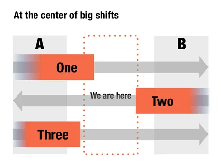
Here is an option to give a sense of movement in your slide without using animations. When filling a box, select the gradient option and let one side fade out to 100% transparent or 0% opaque. The chart below is a sanitized version for a client that is right in the center of some pretty major transformations that are going on now, so if you are an investor, that is where you want to be as well.

It has been a while since I blogged about chart concepts (here are some earlier ones), let me know if these ideas are useful for you.

·Investor presentation

Presenting a mobile demo

Passing a device with your demo app around the audience is not enough, even for a small group of people:

  1. Screens are small and do not make a big impression
  2. People do not know what to do in order to see the best of the app

So the point of passing the device around is mainly to prove that your app exists. It should be supported by very large screen shots on the projector screen that tell the story behind the app, with the right sequence of features. Preferably with different levels of zoom: a user holding the device, the opening screen with the device around it, and then zooming even further to parts of the screen.

·Images

Projecting black

When a screen projector projects the color black, it projects nothing. Think about this when designing slides. If you have an image with an aspect ratio that is different from a regular slide (4:3, 16:9) and it is not possible to crop it without damaging its visual impact, make the bits of the slide that are not covered black instead of the default slide background color you are using. Once on screen, the black border will blend in with the area outside of the projection screen.

·PowerPoint

Two industrial narrow (free) fonts

Beebas Neue and League Gothic are my favorite narrow fonts that can fit a lot of text in a headline, and give that industrial modern look to a slide. And best of all, they are open source.

·Art

Diagonal lines

I do not understand why I have not used diagonal lines in presentation slides more, they work great together with simple shapes and colors. The Swiss graphic designers from the 50s and 60s were masters in this. The poster on the left is for the National Zeitung, designed by Karl Gerstner in 1960. On this page, you will find a few more posters that use diagonal lines combined with simple clean typography.

·PowerPoint

Non-wordy-self-explanatory slides

Everyone has bought into the idea that presentation slides full of text are poor communicators of ideas. The result is that many presentations are now so minimalist, that hardly anyone can understand them without verbal explanation. This creates a problem, as more and more, slides are used as commercials of ideas that are shared without the presenter being present (yesterday’s post).

One solutions is to add an audio stream to your slides, or going a step further, turning your slide deck in a small video. This requires some technical skills though. Also, busy important people often prefer to sticking to the communication medium that they have grown up with: slides. But, they like to do so at their own pace (meaning fast), impatiently looking for a visual that catches their attention. Boring blah blah blah gets skipped.

So what to do in situations where you do not have time / resources / patience to separate slide decks for a live presentation and a cold email attachment? Some ideas.

A very clear headline. Write your message out in a human sentence, you can even change your presentation template to allow 2 lines of text at the top of your page.

Pick useful images. A big squished orange to support that your are crushing the competition does not add much. A photograph of bored people waiting and lining up to buy paper lottery tickets to argue that there is a market for mobile lottery makes the point perfectly.

Swap verbs for visual concepts. A tension can be 2 boxes of text with a rope in the middle that is about to snap. An implication can be arrows with 2 words in each pointing to another box with 2 words. Best of both worlds can be a Venn diagram. Contrasts can be 2 boxes with opposing colors.

Continue reading →
·Investor presentation

A shift in my design work

A few years ago, the main purpose of my presentation design work was to arm people with a powerful set of slides for a live stand up presentation. Usually, the meeting would be set up after an initial telephone or in-person conversation, and the audience would see the slides for the first time.

More and more, I see my visuals being used to get to that meeting in the first place. The “cold” email attachment. Presentation slides become a short 3 minute commercial for an idea. The distribution is not in print, not on TV, but through an emailed document or URL. The actual presentation is more about figuring out the people behind the idea, not the idea itself.

There is general presentation format, or universal PowerPoint document. PowerPoint can even be used to write text documents. The 3 minute commercial is yet another one to add to the long list.