NY Met puts collection online
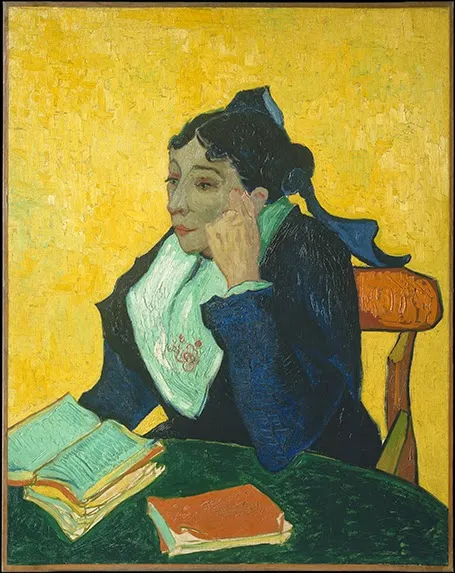
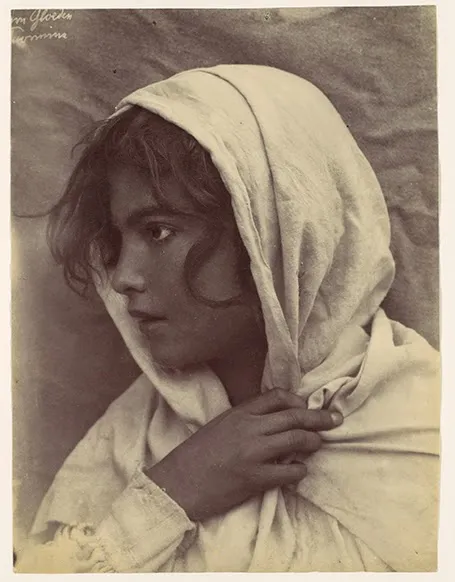
The New York Metropolitan Museum of Art has put 400,000 super high resolution images of their collection online, free to use. Great for use in presentations.


Frequent updates about all things presentations since 2008. Subscribe to never miss a post.
The New York Metropolitan Museum of Art has put 400,000 super high resolution images of their collection online, free to use. Great for use in presentations.
The Obama press conference yesterday in front of Rembrandt’s The Night Watch is an example of how a nice presenter background can make a big visual impact. The dark painting background looks great in close up photos, although less interesting from a distance.
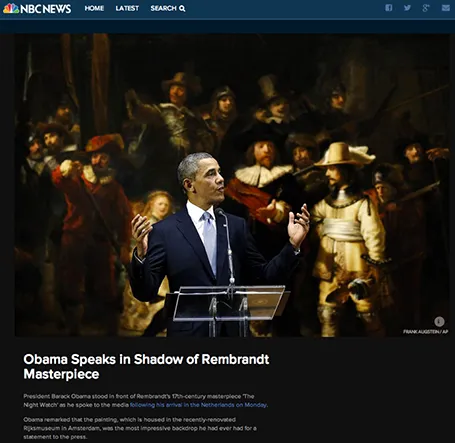
Conference organisers should think beyond the curtain, blank wall, or list of sponsor logos.
I am reading the book How to Think Like a Great Graphic Designer (affiliate link) by Debbie Millman (picked up at Rizzoli in New York, a great place to find design books). The book comprises of a series of interviews with famous graphics designers. Here are some common themes in all the discussions.
We have all been in them: museums full of densely packed displays of artefacts with tiny description signs that provide factual information rather than the story behind the objects. Crowds of people pass by without anyone paying attention.
Good museum design involves empty walls with just a few pieces to focus on. The explanation and background text are prominent, it could even be bigger than the object itself. People take a moment to absorb the piece, get interested in the story, read it, ponder the artwork a bit more, maybe take a picture.
Think about these 2 different approaches in the context of presentation design.
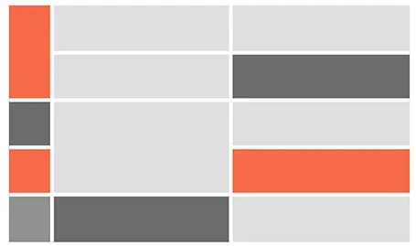
For boxy charts, I find it very convenient to use tables as the basic organising structure. Use big fat lines to separate the cells. In this way, it is easy to add, delete cells, combine, and split them. The Mondriaan look.
I would love to use hand drawn graphics in my presentation, but I never got to drawing and sketching on a computer. Any tools without a direct screen feedback loop (the mouse, drawing pads, and even the Wacom Inkling) simply do not work for me, and I think a screen like this are very expensive and generate additional clutter in my workspace.
The iPad could solve this, because it has a touch-sensitive screen. As a result, hundreds of drawing apps have popped up in the app store. Drawing apps are different from note take apps. The latter require wrist protection, a good way to organize notes. Drawing apps require brushes, color, pens. Like with writing apps, most drawing apps come loaded with features that just confuse me.
Hence, I was happy to discover Paper by 53, a minimalist drawing app (one of the readers pointed it out to me in a my recent review of iPad note taking apps). Paper just cut down the drawing tools to the bare essentials, and the result is actually good I think. The app is free, but this version comes with one drawing tool: the ink pencil, if you want to get a pencil, a marker, a pen and a paint brush (water colors) it will set you back $8 in in-app purchases.
The pencil is the tool I actually use most. There is a big drawing problem with the iPad screen: it is not pressure sensitive, and varying stroke width is the key feature what makes writing with an ink pen so great. Paper solved this with adjusting the stroke with depending on your speed as you move the pen over the screen. More confident, fast strokes, will appear bolder. (The pen tool works the other way around, moving it slowly creates heavy ink, moving it fast produces a thin line). I love the simple cartoon style sketches that this app produces, and I am looking out for a first client situation where I can try out a cartoon-style presentation (like the one below) for real.
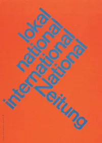
I do not understand why I have not used diagonal lines in presentation slides more, they work great together with simple shapes and colors. The Swiss graphic designers from the 50s and 60s were masters in this. The poster on the left is for the National Zeitung, designed by Karl Gerstner in 1960. On this page, you will find a few more posters that use diagonal lines combined with simple clean typography.
Have a look at the way**Francesco Paciocco** credited this short video about Milan. It is a video, but the shots are very close to still images. We do not see the cliché images of the Duomo and other tourist attractions. Instead, a flow of scenes from daily live.
I like cinematic openings in PowerPoint presentations. A series of images to take the audience to a different place. While it might be a bit too complicated for the average designer to create such a video, you can create a very similar effect in PowerPoint by sequencing a series of Flickr images with a Creative Commons license. If you want, you can go one step further and add a slow-zoom effect to your images.

I just re-designed my Twitter avatar with a dash of fluorescent paint to stand out in the noise of social media. It is interesting how computer screens work. A really bright color is not yellow or orange, but rather the ones that sit on the edges between 2 colors. Mine is in between yellow and green. It is as if our eyes are being teased by interfering light waves that are just a bit off in terms of wave length.
Other examples of interfering colors are on the border of pink and blue, or green and blue. I blogged earlier about how great classical painters manage to create rich colors through a combination of color mixing, patterns, texture.
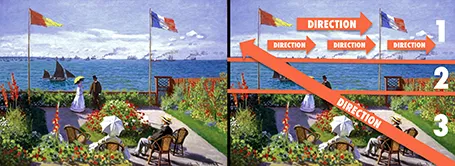
Every presentation slide should have a clear organization, and direct the eye. Paintings are a good example. Have a look at this painting by Monet: The garden at Sainte Adresse. It is clearly divided in 3 horizontal bands, has a strong diagonal cutting across, and the flags and steam clouds from the boats provide energy that leads the eye from left to right.