SlideMagic Blog

Frequent updates about all things presentations since 2008. Subscribe to never miss a post.

RSS
all posts

Category Presentation design

·Creativity

Introversion and creativity

This article in the New York Times argues something that I have discovered for myself over the past years: working on your own boosts creativity. I think that 50% of the reason why I can be more effective at designing presentations than clients who hire me is my work environment that allows me to focus without noise and distractions. I explain this every time when people get frustrated why it is so hard to get me to answer the phone or why I take some time to respond to voice mail messages.

Why? Design is a process that requires you to be able to finish a line of thought without interruption. To sketch things. To go back and forth over things at your own pace.  To put your feet up the table. To listen to some music. All things that are hard to do in a conference room.

During my career as a management consultant, I was always surprised that competing firms can make a living as pure process facilitators without getting into the substance. They would get everyone in a room, put up a flip chart, and argued that is enough to get the problem solved.

All of this seems to go against the current trend of collaboration and team work. It does not. Collaboration is not sitting all day in a meeting that goes nowhere. Collaboration is splitting up responsibilities, do the work, discuss, and iterate. Collaboration is not talking, it is doing.

Some more reading material that might help you understand introverted people in a world dominated by extroverts better:


Continue reading →
·Images

Real images

I am more and more fed up with stock images and turning to alternative sources of photographs for my presentations. Here is a great example of a real image with real people. If you want to make the point that the mobile era has arrived, you can do that with mobile penetration statistics (6b out of 7b people now have a cell phone), or you can just **this great image by Josh Liba**on Flickr, showing people consumed in their mobile world and not really interacting anymore among each other.

·Investor presentation

Different investors, different pitch

You can be very efficient when pitching to a professional VC and leave the 101 stuff out of your deck. She will have read all the relevant blogs, she is likely to be a power technology user, she sees 1,000s of deals each year, no need to teach her about the market environment anymore.

One, it is a waste of your scarce pitch time, two it shows that you do not have an ability to seize up your audience, which might tell her something about your skills as a manager and sales person.

If you are pitching to a less experienced angel investor, it is a different story, These people require more background and more time. But remember, there are highly seasoned angel investors as well.

·PowerPoint

Slide make-over secrets

You do not have to pay a professional presentation designer to do basic chart make-overs. Here are the secrets:

  • Take out ugly reflections, bevels, and huge shadows
  • Center things properly
  • Align and distribute any object on the slide
  • Cut words on bullet points
  • Group bullet point lists in sub categories
  • Take out random colors and replace with those in the logo
  • Remove Times Roman and Comic Sans and replace with Arial
  • Take out italics and underline
  • Round chart numbers and other financial information
  • No ticks on chart axes
  • Chart gap width to 50%
  • Titles all in the same place, on 1 line (chop words if necessary)
  • Replace fuzzy logos with hi-res ones
  • Fix hanging bullet points (i.e., the next line starts under the bullet, rather than at the indent)
  • Reset images to their original aspect ratio

After this, no need for a slide-make-over artist.

·PowerPoint

Ltd. NV. Inc. AG. SA. Gmbh.

OK, officially these company names include these legal classifications, but on slides they just create extra clutter. Take them out.

·Investor presentation

The early-stage VC pitch deck

Ryan Spoon of Polaris Ventures wrote this guest post on TechCrunch about designing a VC pitch presentation for early-stage startups. Most of his guidelines are valid. I have a few comments on some. It is interesting to take a step back and read between the lines how a VC is analyzing a presentation. Ryan does not say everything explicitly.

How to Create an Early Stage Pitch Deck

·PowerPoint

Making a fool of yourself

Reading through the book The a-z of visual ideas, I came across this tip: do not hesitate to make a fool of yourself in a creative briefing. So true. I think the largest part of my contribution as a presentation designer is asking the stupid questions, and having the courage to take a fresh perspective on things.

If you design your own presentation, ask a friend or colleague to take the role of asking the stupid questions. If you are working in a big corporation and need to design a presentation for a senior executive,  maybe try to get a few minutes of 1-on-1 time to ask the stupid questions, it easier to make a fool of yourself there then in a huge meeting.

·PowerPoint

Re-ordering objects

Despite my 10,000 hours of PowerPoint I never bothered to push the re-order objects button in the arrange menu (Mac). Hey, and out came a nice interface to make things to the front or to the back of the slide.

·Delivery

Teaching teenagers (2)

Last week I did my presentation design workshop to this year’s class of MEET (more details in an earlier post) in Jerusalem. I used grown-up stuff for these 15-16 year olds, a slightly modified version of my deck about investor and sales presentations designed for a senior managers. The results surprised me.

Despite being a 09:30am speaker (teenagers do not get a lot of sleep when they stay away from home in a large group), 95% of eyes were hooked on me (5% were deeply a sleep). In my usual audiences I rarely find someone really sleeping, but there are a lot more people distracted, even if your story is interesting.

Afterwards, I coached the students in the design of the pitch presentation of their ideas. It was interesting to see how these kids were sponges of ideas: the presentations were stitched together over the course of 3 hours and often looked better than finalized version 1s of pitch decks that clients sent me at the start of a project. The new generation has not been programmed by overhead transparencies and Microsoft PowerPoint bullet point templates, but is ready to try a fresh approach to design.

Teaching to present your ideas should be introduced in education much earlier than it is today.

·Data visualization

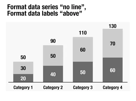
Column chart with totals

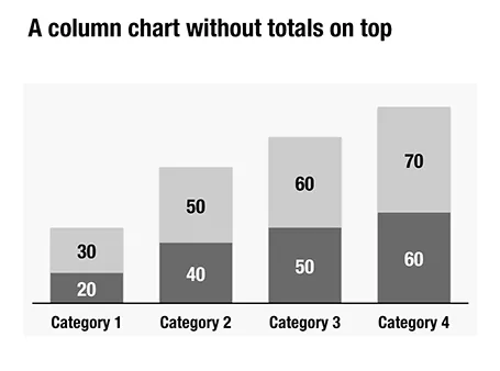
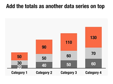
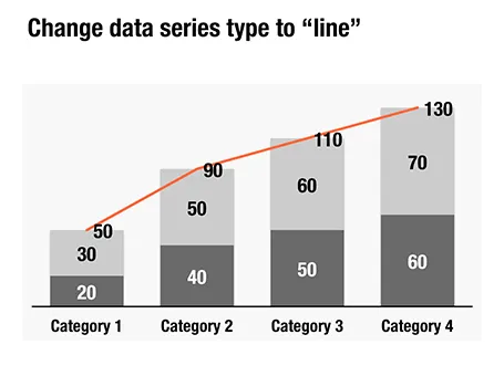
Here is a little trick to create automatic totals on top of column charts. This is an alternative to placing text labels manually, and especially useful when the data in the column charts is changing frequently.