

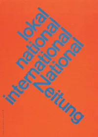
I do not understand why I have not used diagonal lines in presentation slides more, they work great together with simple shapes and colors. The Swiss graphic designers from the 50s and 60s were masters in this. The poster on the left is for the National Zeitung, designed by Karl Gerstner in 1960. On this page, you will find a few more posters that use diagonal lines combined with simple clean typography.