SlideMagic Blog

Frequent updates about all things presentations since 2008. Subscribe to never miss a post.

RSS
all posts

Category Layout

·SlideMagic

Spoon feeding detail

Different types of audiences, different types of questions, and/or different phases in your interaction with the audience require different types of slides.

  1. In the first meeting, you introduce an idea with a big, bold, minimalist data chart
  2. In a follow-up meeting, you are answered a question about assumptions behind the numbers, or, in a Zoom meeting, your audience sits very close to her screen and has time / visual ability to dig deeper into the visuals than she would be able to when sitting in a big room.

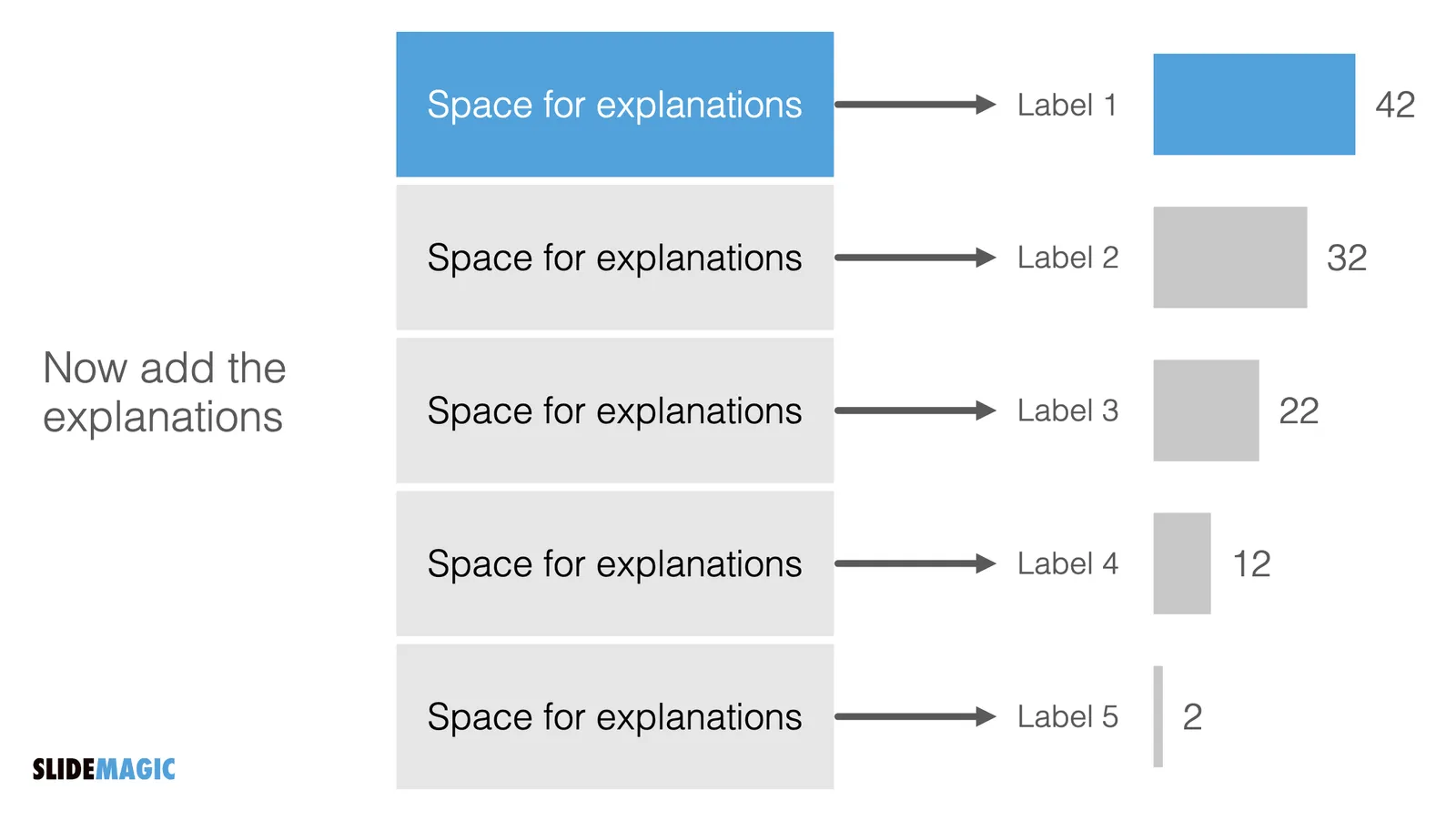
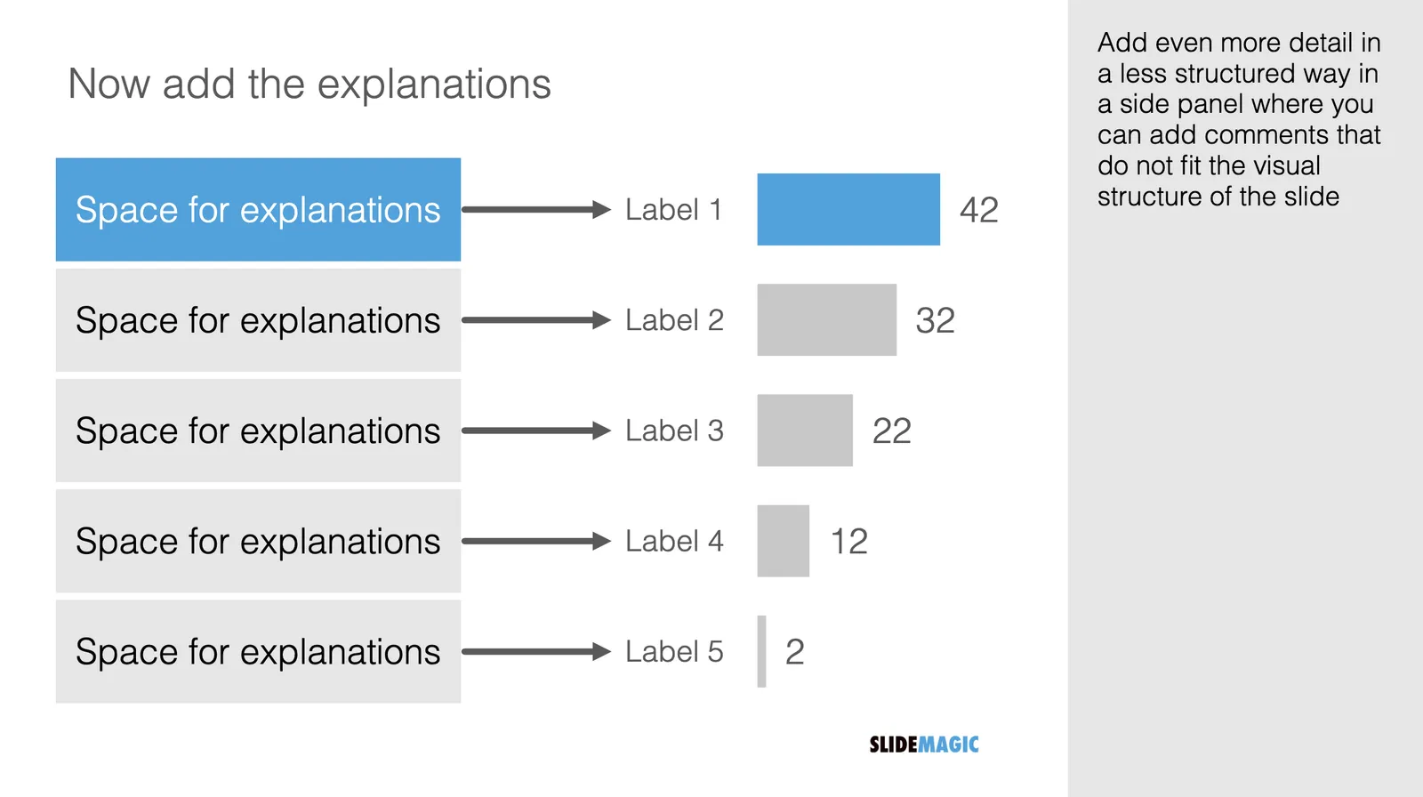
For these occasions, you can make slide variations of the same slide. Seen an example below:
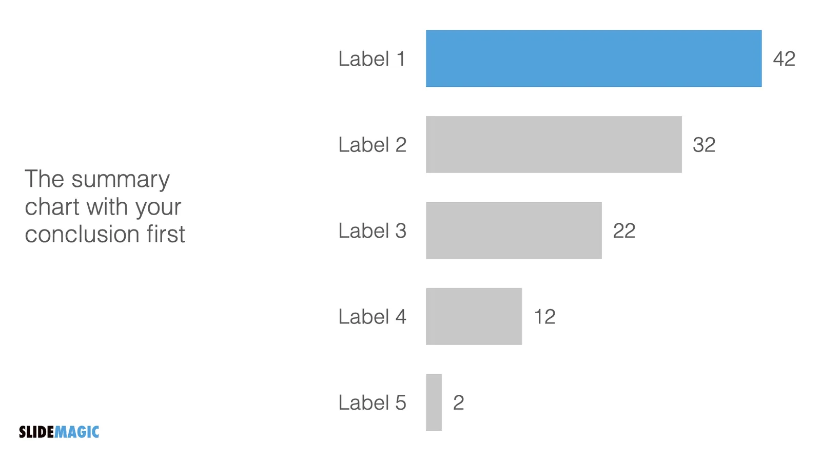
Clicking back and forth between the slides will give the illusion of some sort of animated popup, while in effect the audience is looking at two different visuals. In practice, I would design the busy slide first, then cut things out to create your minimalist slide.
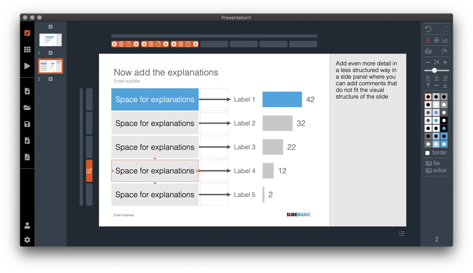
Note how easy it is in SlideMagic to toss things around and add (remove) complications to your slide without breaking its visual grid

·Layout

The point of masks

Social media is full of people arguing about masks. Part of the reason I think is that it is such a statement: “Look, I proudly wear one”, “Look, I proudly do not wear one”. I think masks deserve the benefits of the doubt, without becoming overly obsessed with it.

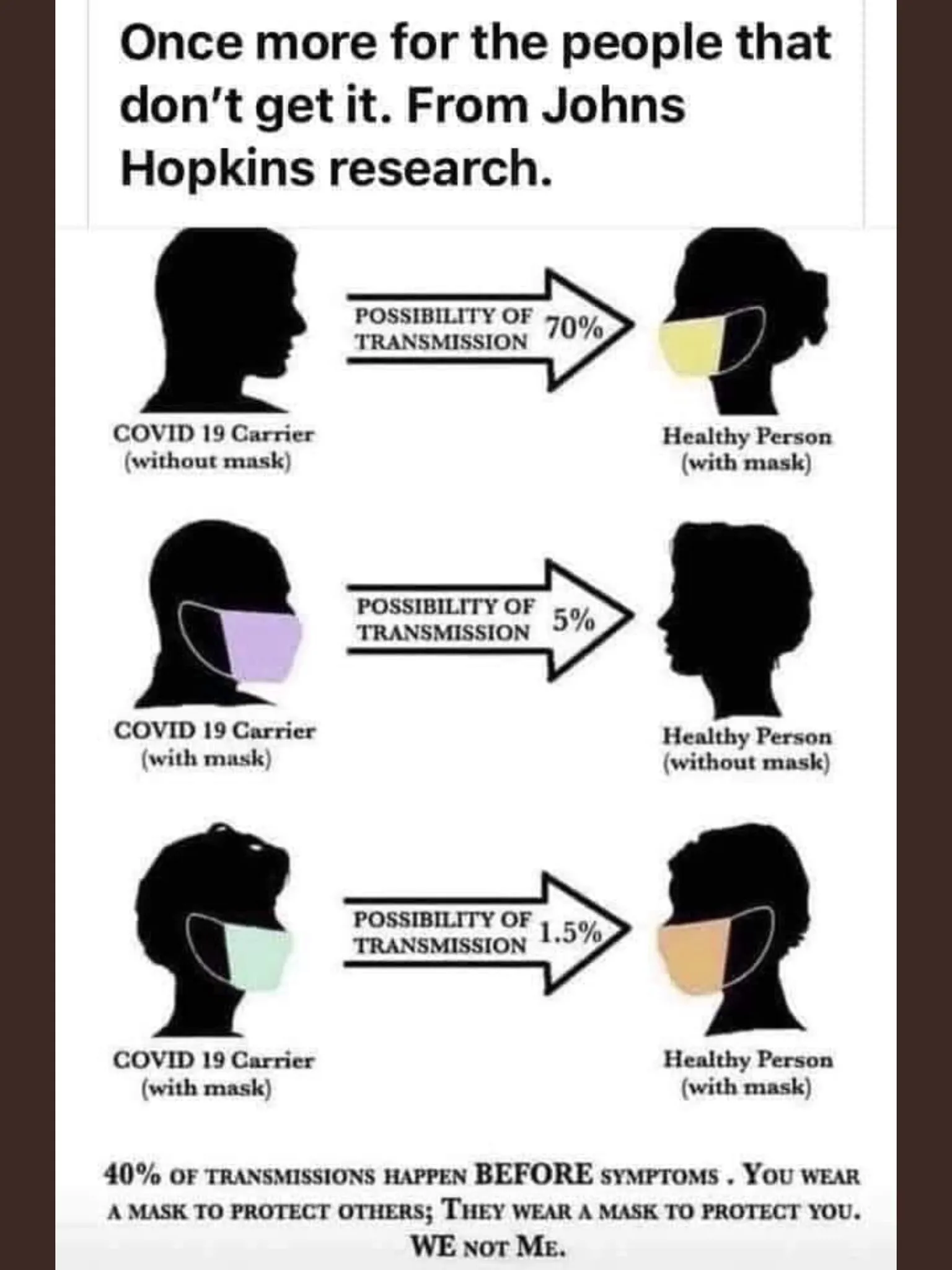
Leaving the debate to the side, and turning to graphics. My Twitter feed is full of diagrams such as this one below (found it here):

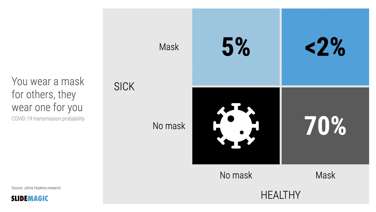
The masks and the faces look cute, but it is actually hard to understand the chart instantly. Using the SlideMagic approach to slide design (quick, to the point, good enough design), I came up with the following 2x2 that tries to make the same point:

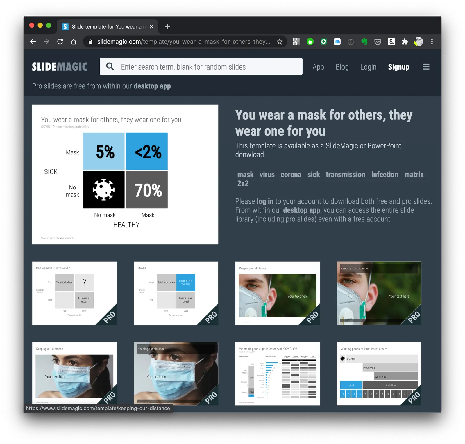
Now the question is, did I put myself in the shoes of the audience? Maybe not every non-mask-wearing person is a former management consultant who prefers 2x2s… This slide is now available on the SlideMagic template bank, and you can access it free if you search for something like “mask” inside the app (v2.4.29 is the latest version).

See below how the desktop app adds dynamically generated slides to the search query. I am not running that on the server at the moment, since 1) it will take a lot of processing capacity that is now being done on individual user machines, 2) I do not consider the web store to be the optimal user experience: downloading slides, and then opening them in the app, but maybe I will change my mind at some stage in the future.

Continue reading →
·Images

Image cropping with a focal point

SlideMagic can switch back and forth between multiple layouts, and needs to handle rapid changes in the grid of a slide. As a result, aspect ratios of images get changed all the time, tripping up your carefully selected image composition. At the moment, the app is storing different crop and zoom levels for different aspect ratios, but that solution is not ideal. (You see how Squarespace gets it wrong with the banner image of this blog post).

I want to get to the point where a SlideMagic user can click a focal point of an image, after which the app will do the hard work of re-adjusting the crop automatically. Doing research, I see a lot of “AI” applications that can figure out what the focal point of an image should be, there seems to be nothing that deals with focal point-based cropping itself. The solutions I see, are ones where you can store multiple crops of the same image, after which the most appropriate one gets selected.

I started scribbling a manual algorithm to come up with reasonable compositions. Here are the first (manual but automateable) results applied to some cows on a beach in Africa, the first image is the original.

It works pretty well, on the the extremely horizontal one gets cropped too low, I would have shown a bit more sky on that one. Let’s see if we can get this to work, both in terms of the algorithm, and the user interface.

Continue reading →
·Layout

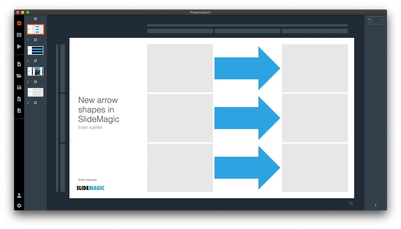
New arrows are now live

Thelatest version of SlideMagic has the new arrow feature available, finally enabling me to discontinue the dreaded connectors. Arrows are big and bold to show cause-effect relationships or other forces. I made an algorithm to let them do the right thing in terms of layout in various box sizes, and in various aspect ratios, both for horizontal and vertical shapes. In PowerPoint and Keynote it is fiddly to get arrows to look exactly the same once you start changing the angles of the pointer by hand.

When converting to PowerPoint (a pro feature), your arrows will show up as editable PowerPoint arrow shapes.

I can now call SlideMagic 99% feature complete (hmm, line charts?) and will focus on hardening the application to make it absolutely stable.

The legacy connector feature will stay in the background. If you load an old slide that uses it, the legacy arrows will be rendered and you can edit them. If you have to add more legacy connectors, simply shift-click on the connector icon, and you will be given the option to use the old feature.

The new arrows also give me more design freedom to start expanding the template library with new slide layouts that features these ‘fat’ arrows.

 Fat arrows are great for showing cause-effect relationships

Fat arrows are great for showing cause-effect relationships

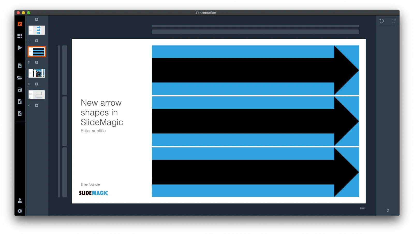
 Arrows follow the color scheme of the cell, black on accent, will give you this result

Arrows follow the color scheme of the cell, black on accent, will give you this result

Continue reading →
·Design

The perfect arrow...

I am replacing the connectors in SlideMagic with 2 features. The relatively thin lines that connect boxes in a diagram went live yesterday. Currently I am working on the 2nd feature: fat arrows to show cause-effect relationships or other forces.

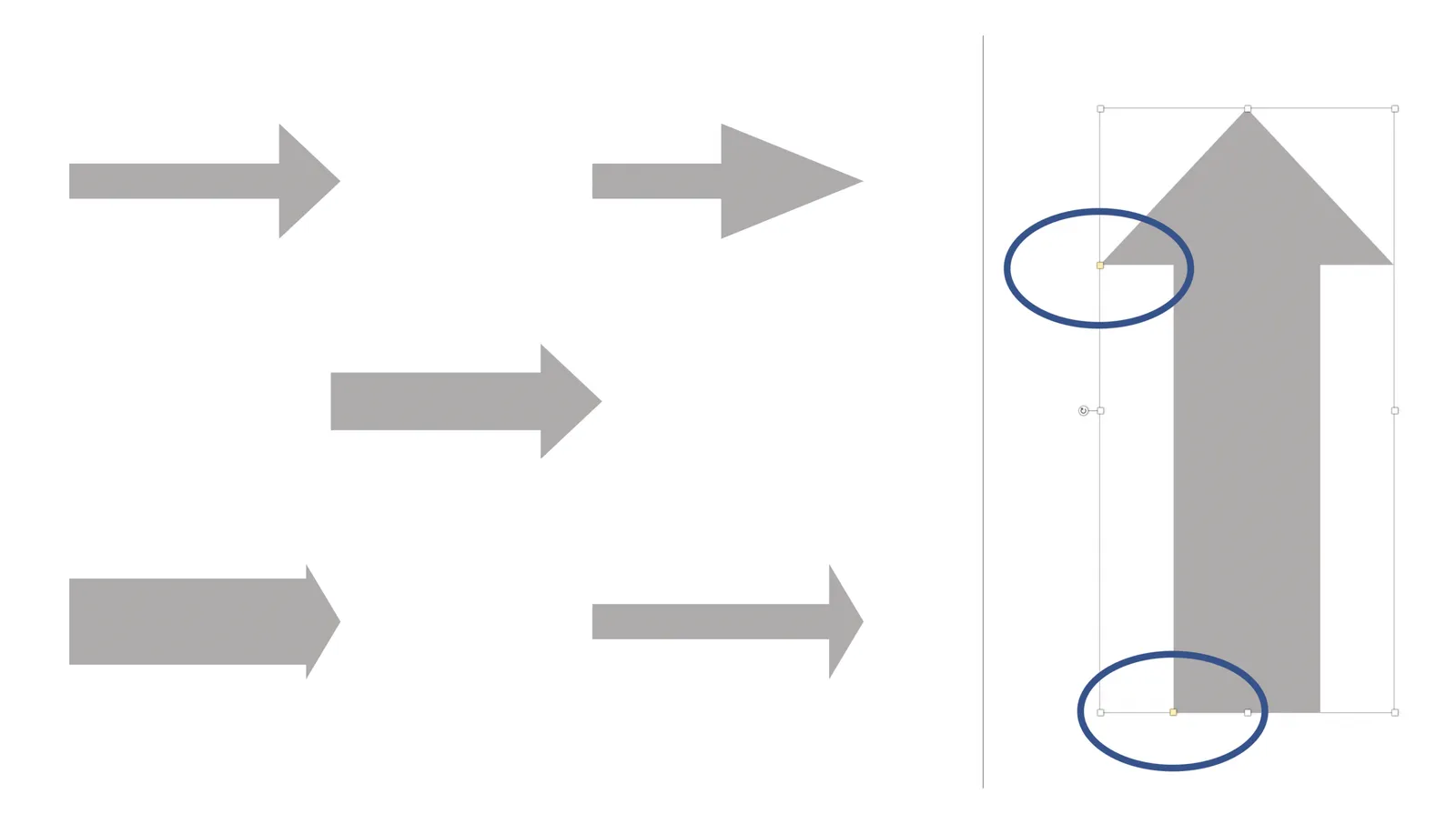
As I already discussed back in 2017, it is tricky to get arrows to look right in presentation software. The aspect ratio of the containing box, the angles of the arrow, some come out great, others won’t.

And even if you got one right on your slide by moving the various sliders in the shape, how do you make sure that the 3 below it look exactly the same? Oh, and then you need to insert a fifth one and squeeze everything a bit…

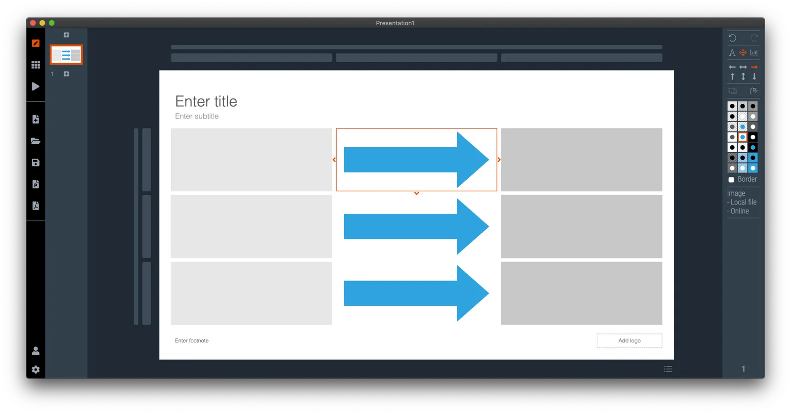
I think I am on to a possible solution. I scribbled an algorithm on a piece of paper, now let’s see how to bring it to life in SlideMagic, and then convert them to PowerPoint. The latter might have to be via an image rather than a dynamic shape. Below is a screenshot of my development machine. Work in progress.

·Concepts

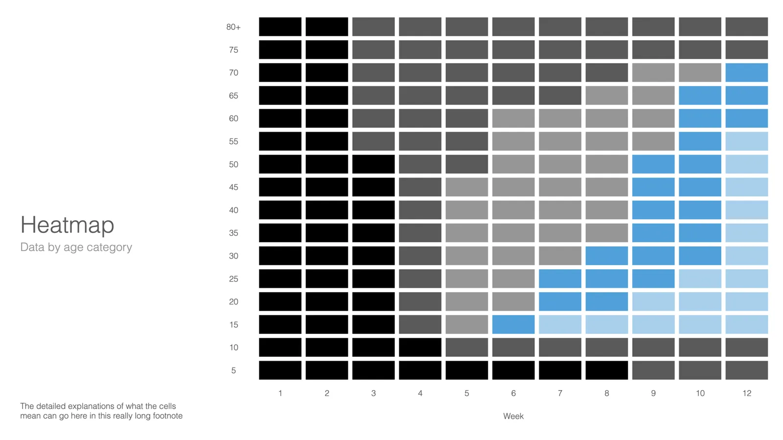
Using heat maps in your presentation

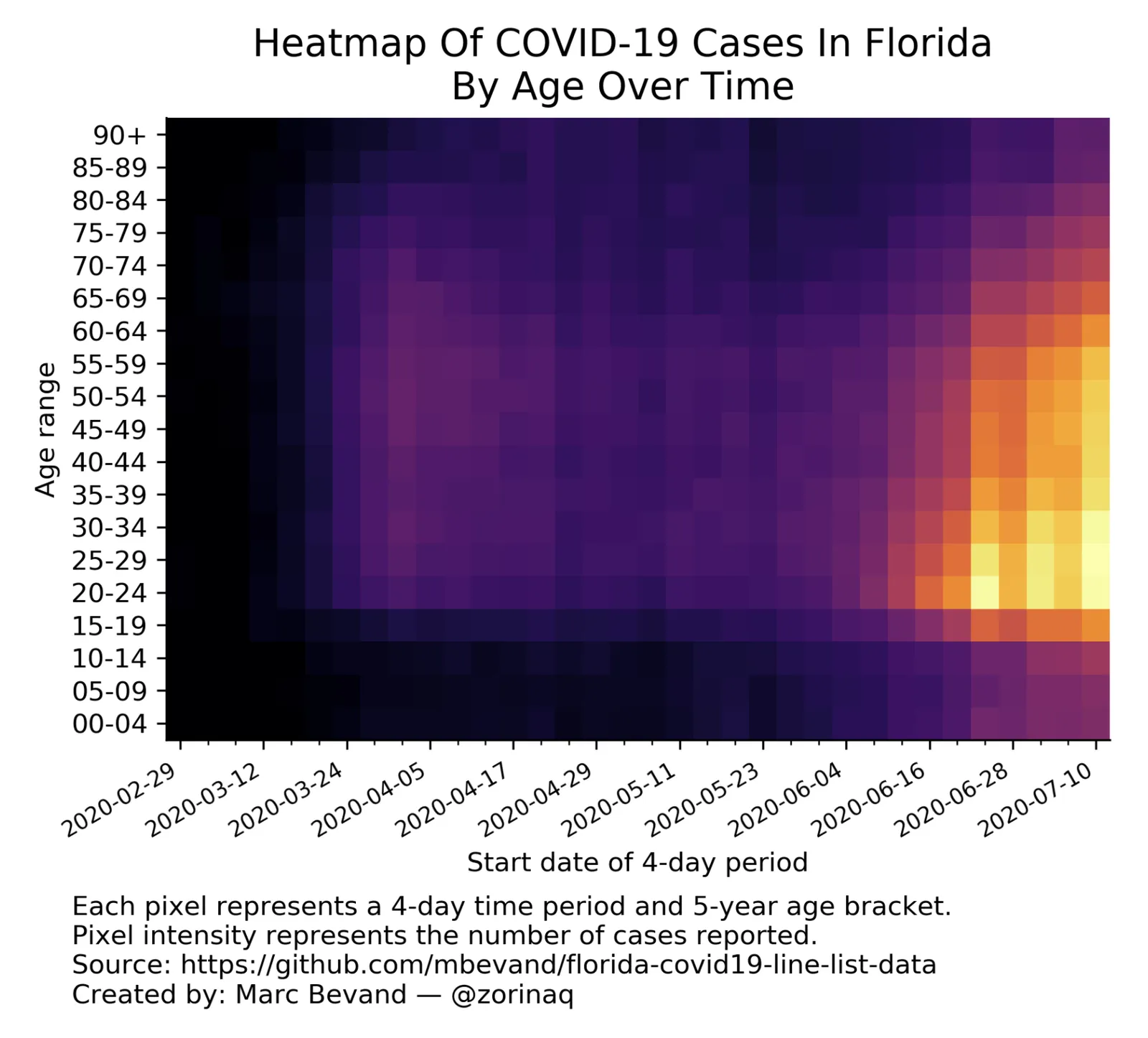
This is a neat visualisation of the COVID outbreak in Florida:

Why does it work?

  1. It uses colour intensity to introduce another dimension of data in a column diagram: time, number of cases, and age range.
  2. The colours are nicely chosen so the chart gives the impression of some sort of fire being lit (which is unfortunately the case).

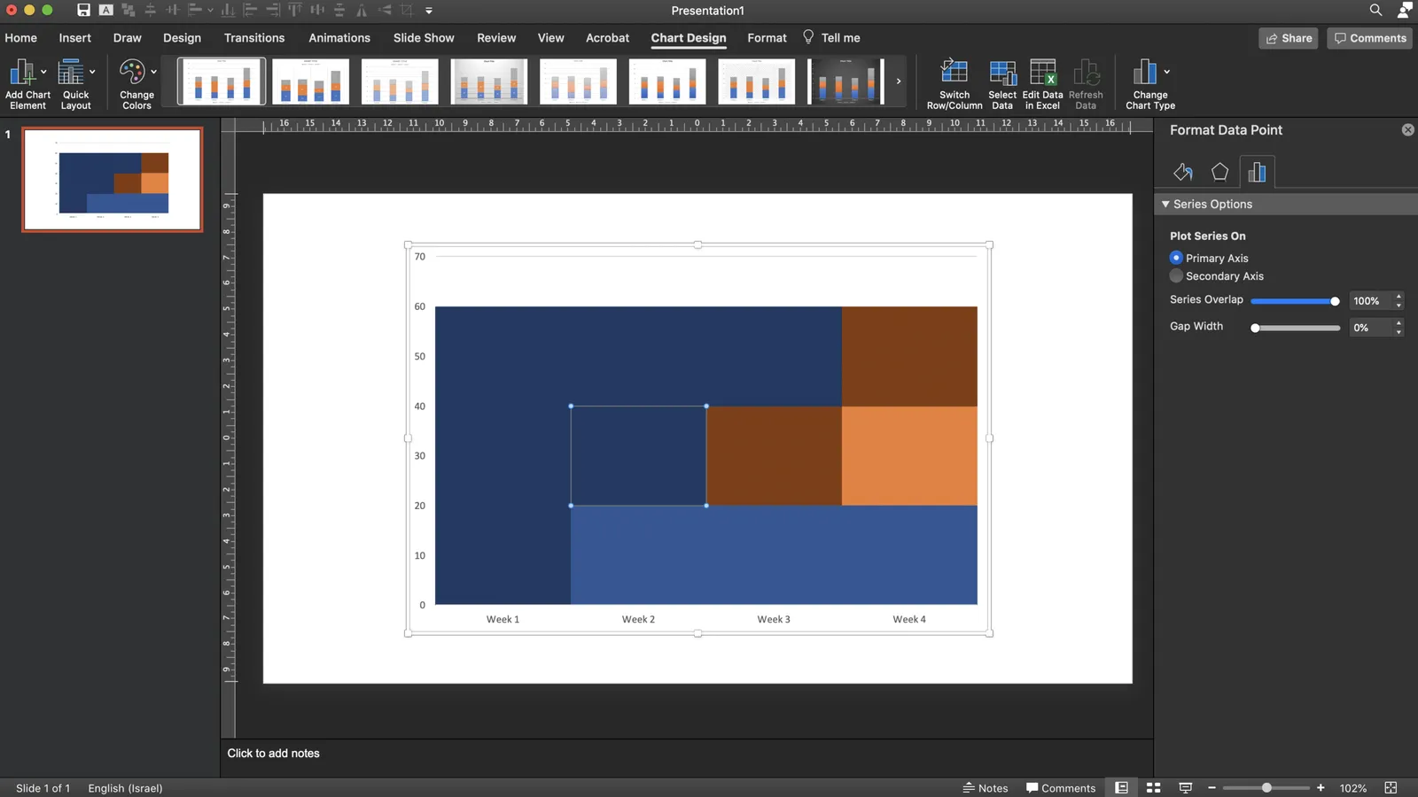
These charts cannot easily be created in PowerPoint, this one is generated by some code. But you could give it a go in PowerPoint.

  • Take a standard column chart in PowerPoint
  • Make all the data series have the same value, the age brackets you want to use
  • Set the gap between the columns to zero
  • And now comes the hard part: manually add different colours to each data point. To select a data point click it twice in quick succession (one click will give you the entire data series wiping out your detailed painting effort in one go)

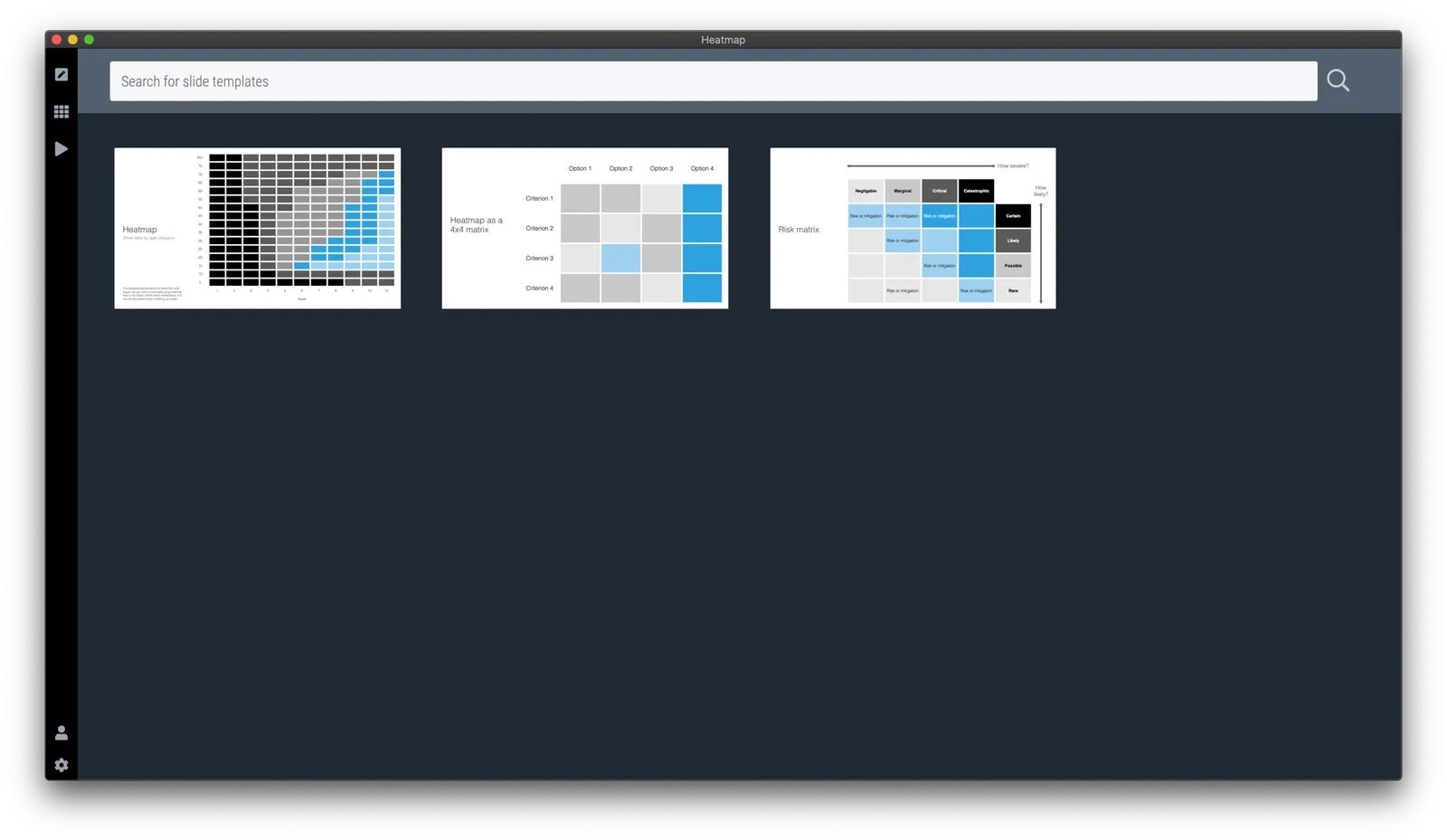
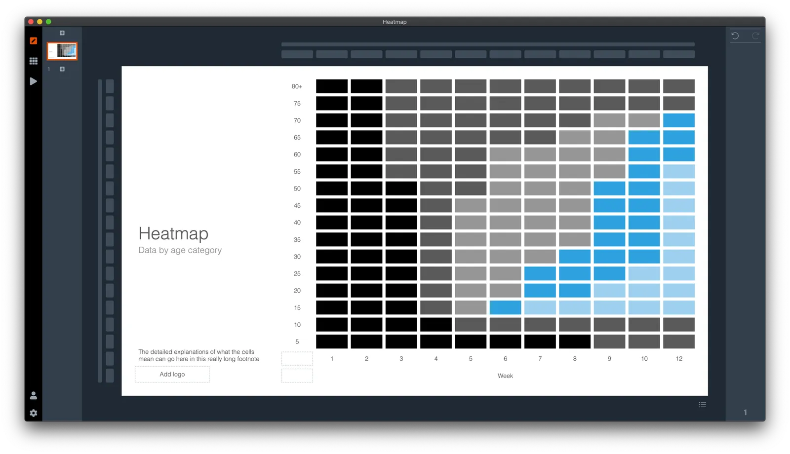
Here is a quick search for heat maps in SlideMagic, I added one design that sort of resembles the COVID chart. You can see how the new slide layout with the side title I introduced a few days ago comes in handy to create more vertical space for data.

·Layout

My preferred 16:9 layout for presentations

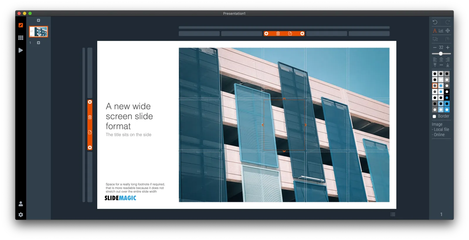
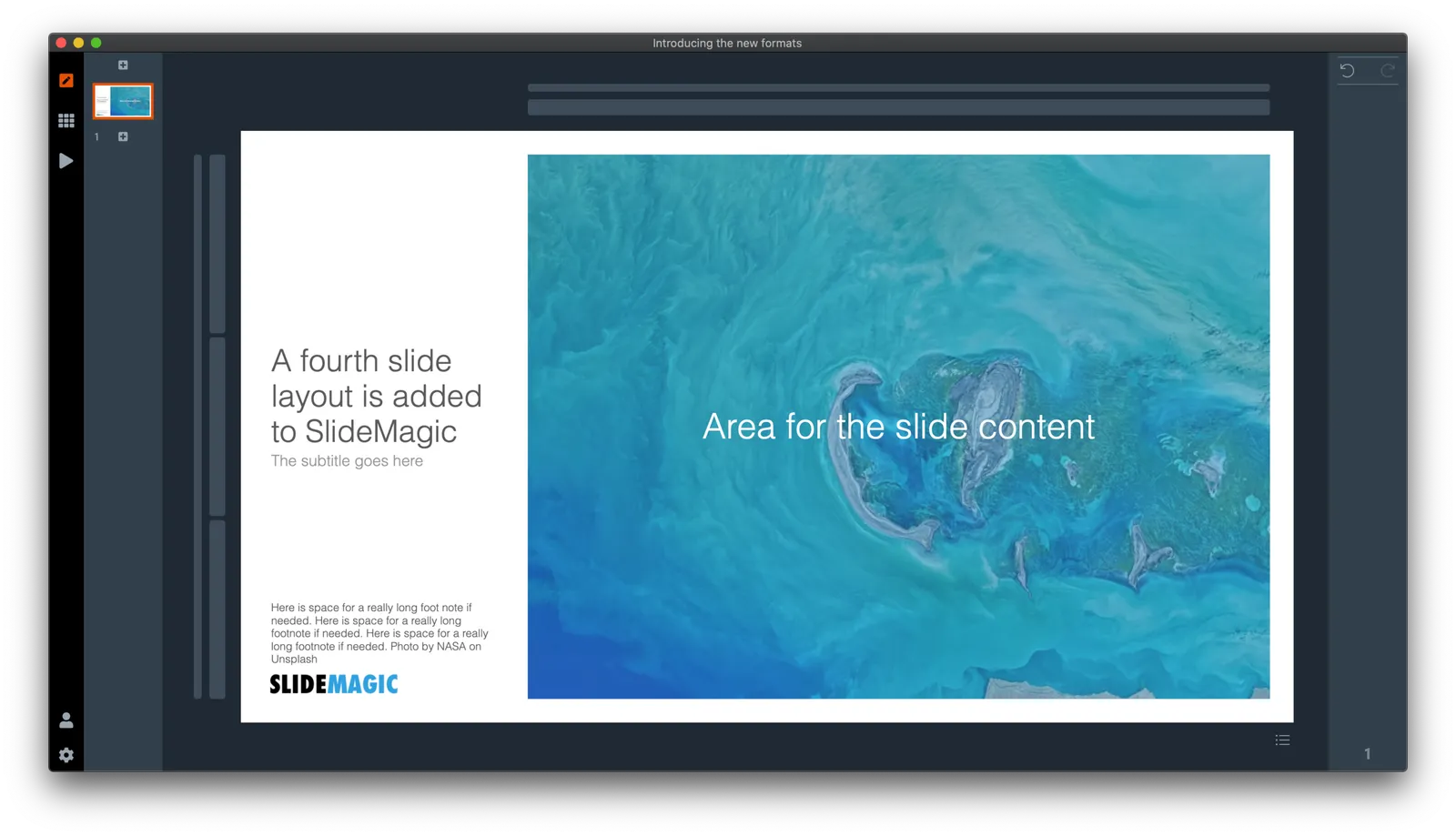
I just pushed a big update to SlideMagic (2.4) to the server and it contains a brand new 16:9 slide layout, the slide title. Most monitors today are widescreen, but unlike movies, I think 4:3 slides look much better. Text lines that run across the entire slide are hard to read, and wide screen slides always force you to make very “stretched” slide layouts.

The side title is the best of both worlds. The title of the slide is moved to the left, and the slide contain area is scaled up now that it has more space at the top. It stays in a 4:3 ratio though. The footer and logo is also moved to the left, creating even more space. The entire design shows up without black bars on a wide screen monitor. Below is an example.

It follows an approach I already blogged about in 2016

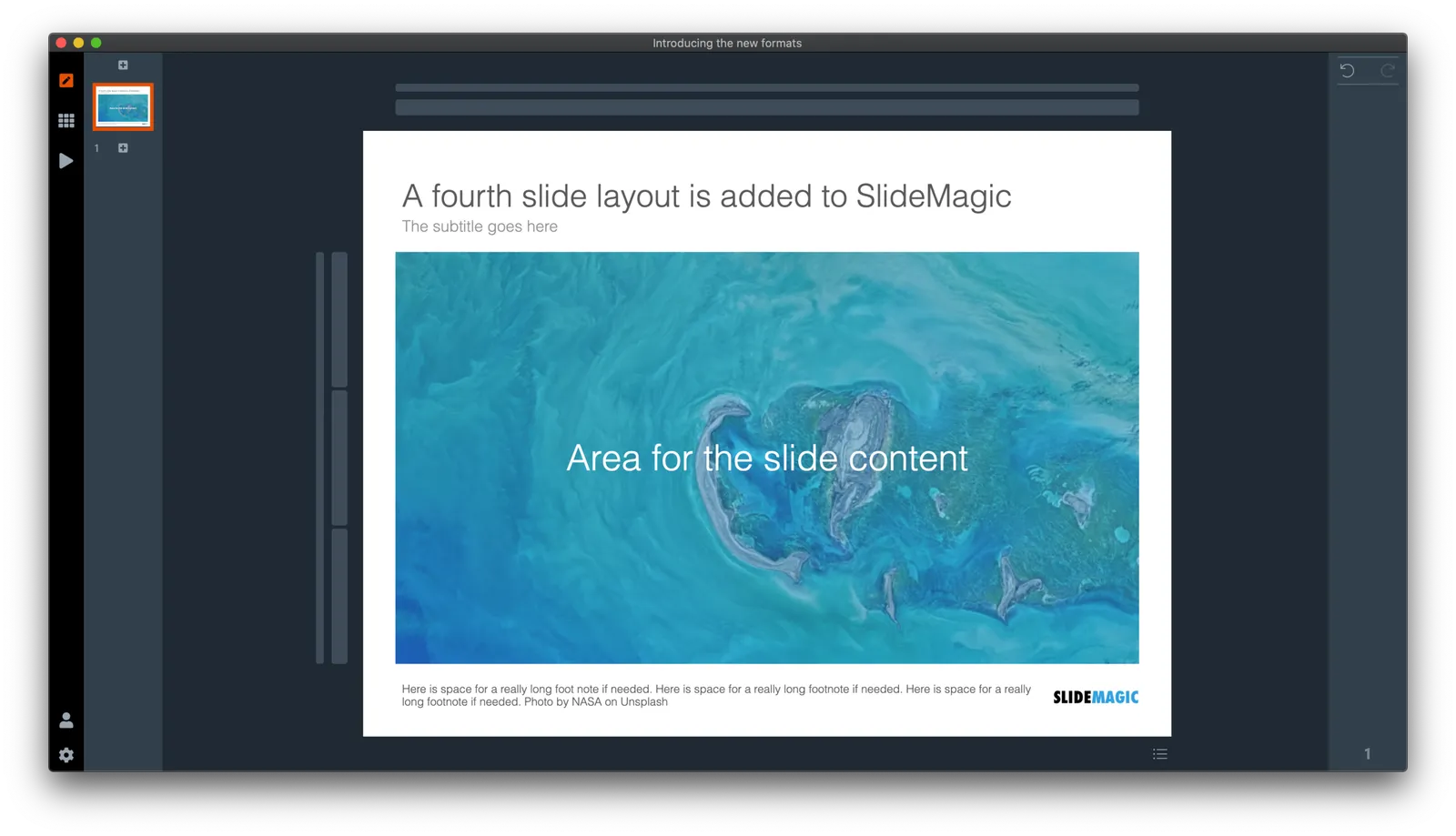
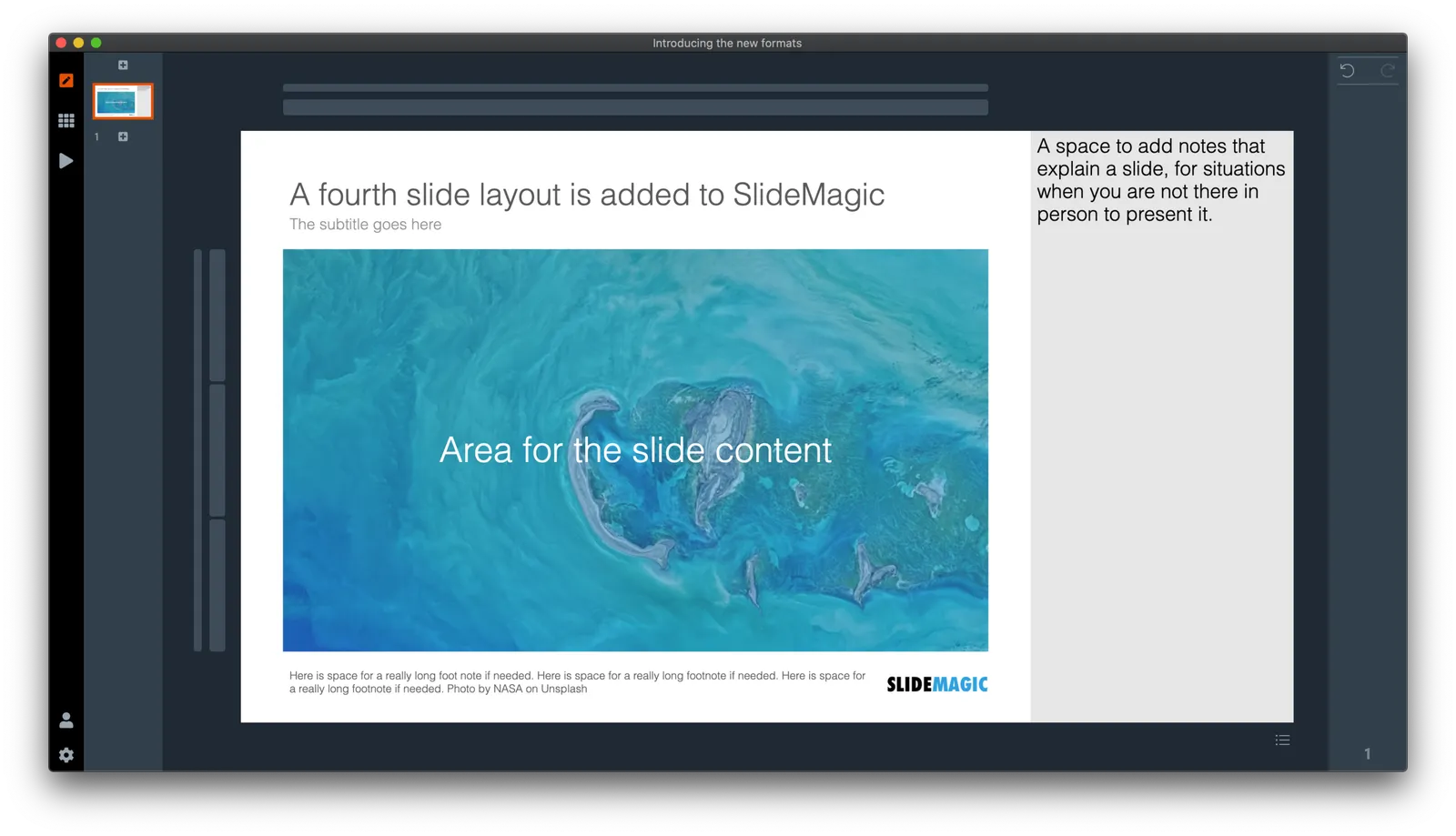
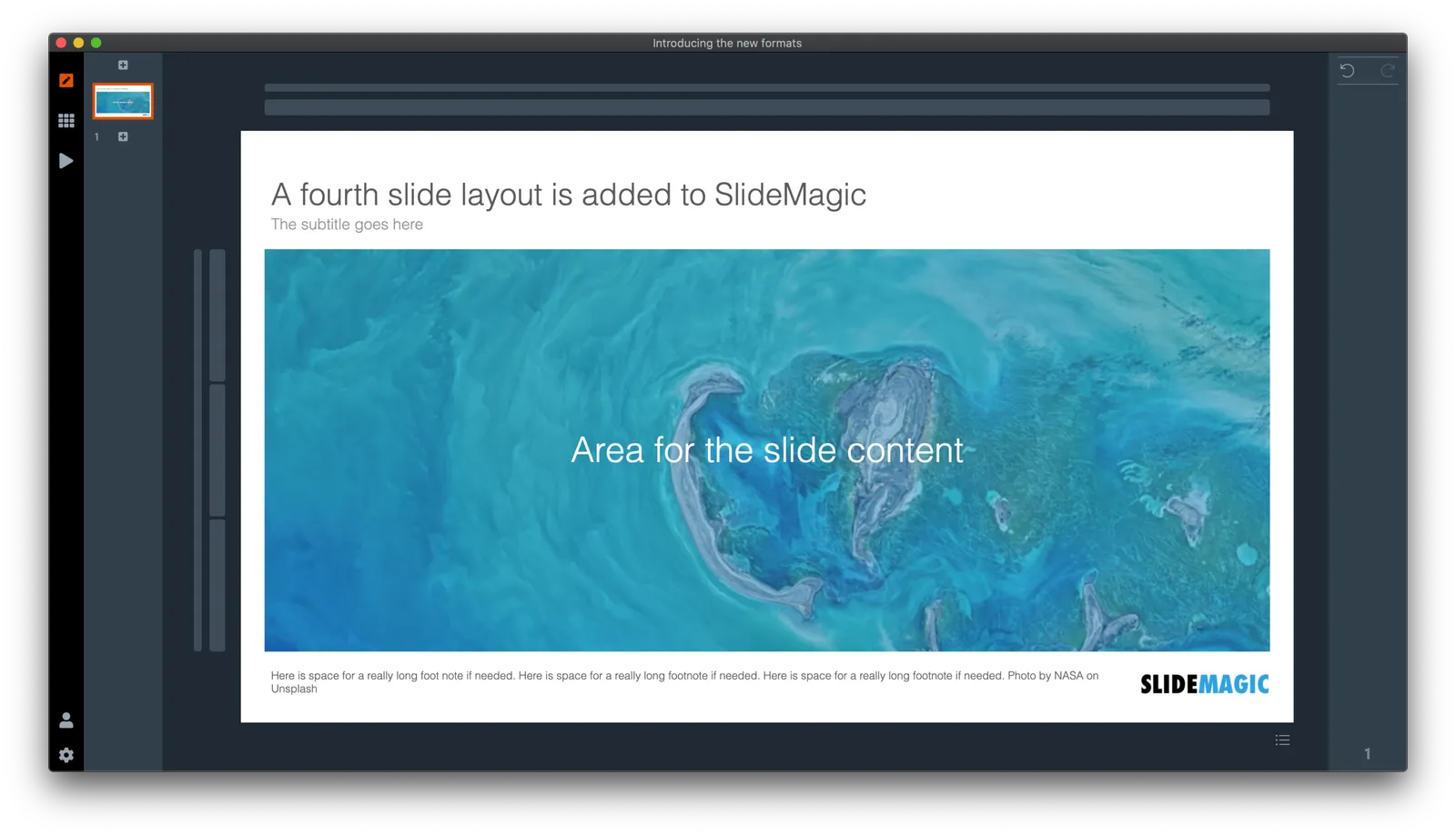
SlideMagic has now 4 screen modes, and you can switch instantly between them:

  1. Traditional 4:3 narrow
  2. 16:9 wide screen
  3. A 4:3 slide with an explanation panel to the side to leave notes for when you are not there in person to present the slide
  4. The new and shiny 16:9 side title

Soon, I will rerun the PowerPoint conversion algorithms on the server to increase the size of the SlideMagic PoiwerPoint template database with 25%, each slide will now be available in the new format as well,.

(Hmm, the side panel needs some more padding, I will fix that [Fixed in 2.4.1]). There are a number of other new features introduced in version 2.4.

Continue reading →
·SlideMagic

"Operating system updates" for presentations

Every year Apple releases operating system upgrades for computers, tablets, and phones. Your apps and documents have the same content, but look slightly different. I am trying to push this concept to the world of presentations.

It has already happened (sort of). The slide-out panel to right changes the look and feel of your presentation without changing the content. Over time, I have made subtle changes to font sizes and layout proportions, which means that every SlideMagic presentation in the world will have a slightly different look. Switching to a dark slide background turn the colours of your presentation upside down (in a good way), far beyond just making the background black.

I will try to push this further, by adding more layout options , your slides will look entirely different, including the ones you made 6 months ago, but you can always switch back to another layout format.

Photo by Michael Held on Unsplash

·Images

Working on improved image cropping

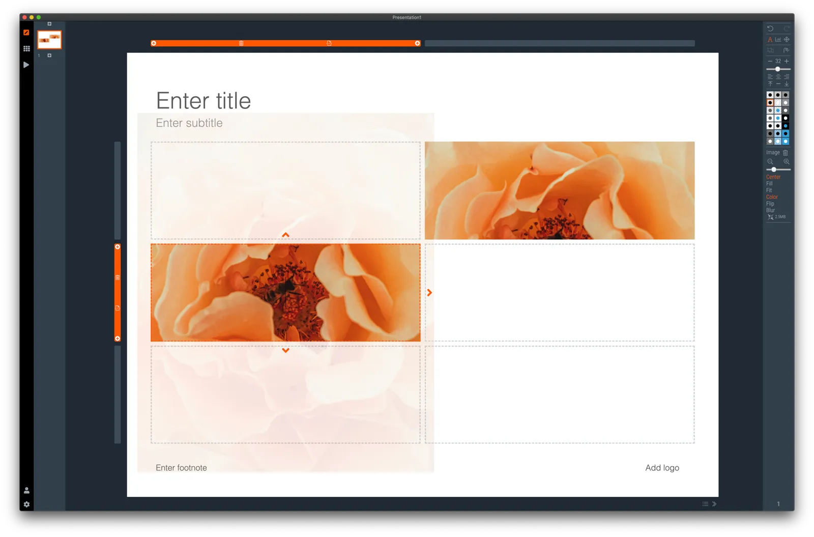
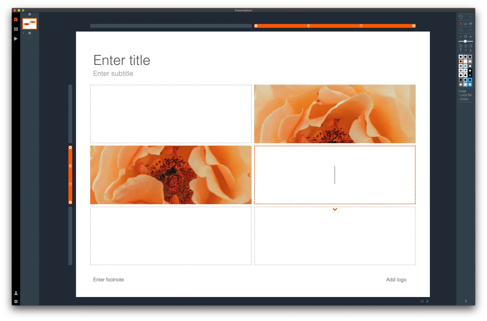
Working with images is turning out to be one of the most powerful uses of SlideMagic. The built-in image search gives access to an endless flow of great images, and the grid makes it really easy to layout these photos in a beautiful and consistent way on a slide.

Aligning images has always been difficult in presentation software (it is only worse in word processors), and that bit is solved by the SlideMagic grid. Next up is image cropping. Most design tools use some sort of overlay that allows you to mask/reveal an image. Even as a professional designer, I still struggle with this.

In SlideMagic, you simply drag an image around in a box to decide what part of the photo you want to reveal. I am working on 2 improvements:

  • Showing the entire image in semi-opaque when you are editing/dragging it around to give you. a better orientation of what you are doing
  • Creating a way to keep the image focused on the most relevant part regardless of changes to aspect ratios or zoom levels of the photo. At the moment, I store to image positioning versions (one for 16x9 and one for 4x3), but in future releases I want to automate this

The challenge here is to offer something that works without turning SlideMagic into a complicated photo editor. Work in progress.

·Templates

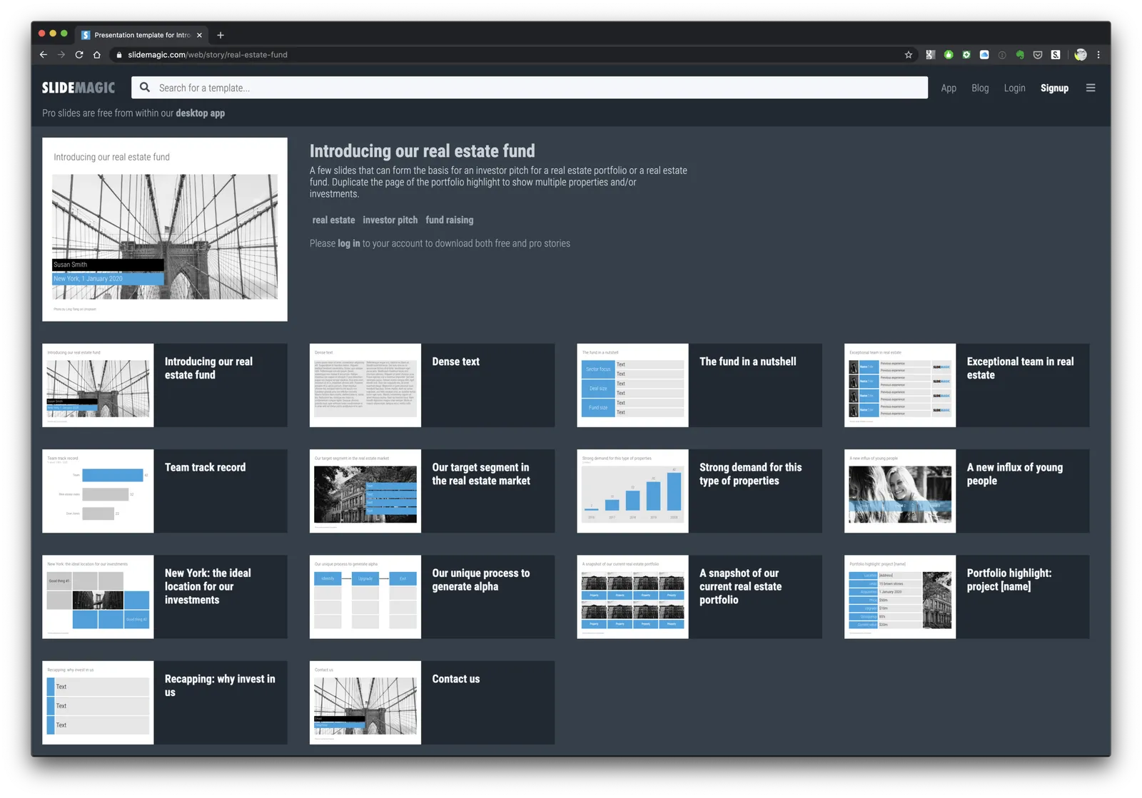
Real estate (fund) pitch presentation template

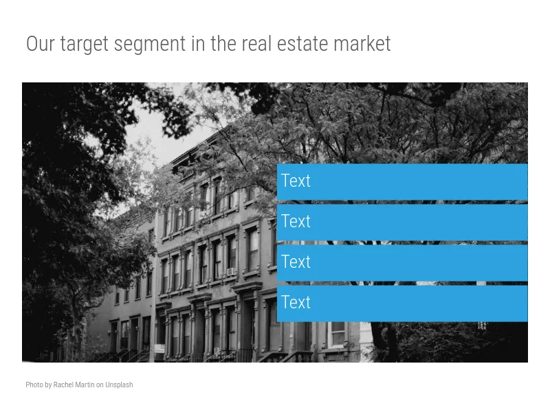
SlideMagic is very suited to make decks that promote real estate projects or funds. It is easy to manage pictures of properties and add boxes with information about square feet and returns. I have added a template for a real estate fund pitch to get you started.

Note that when searching for slide templates, you do not need to resort to keywords such as “real estate” (it will give some results now though), any layout that shows lists, or grids, or portfolios, or screenshots will do. Real estate presentations use very generic layouts.