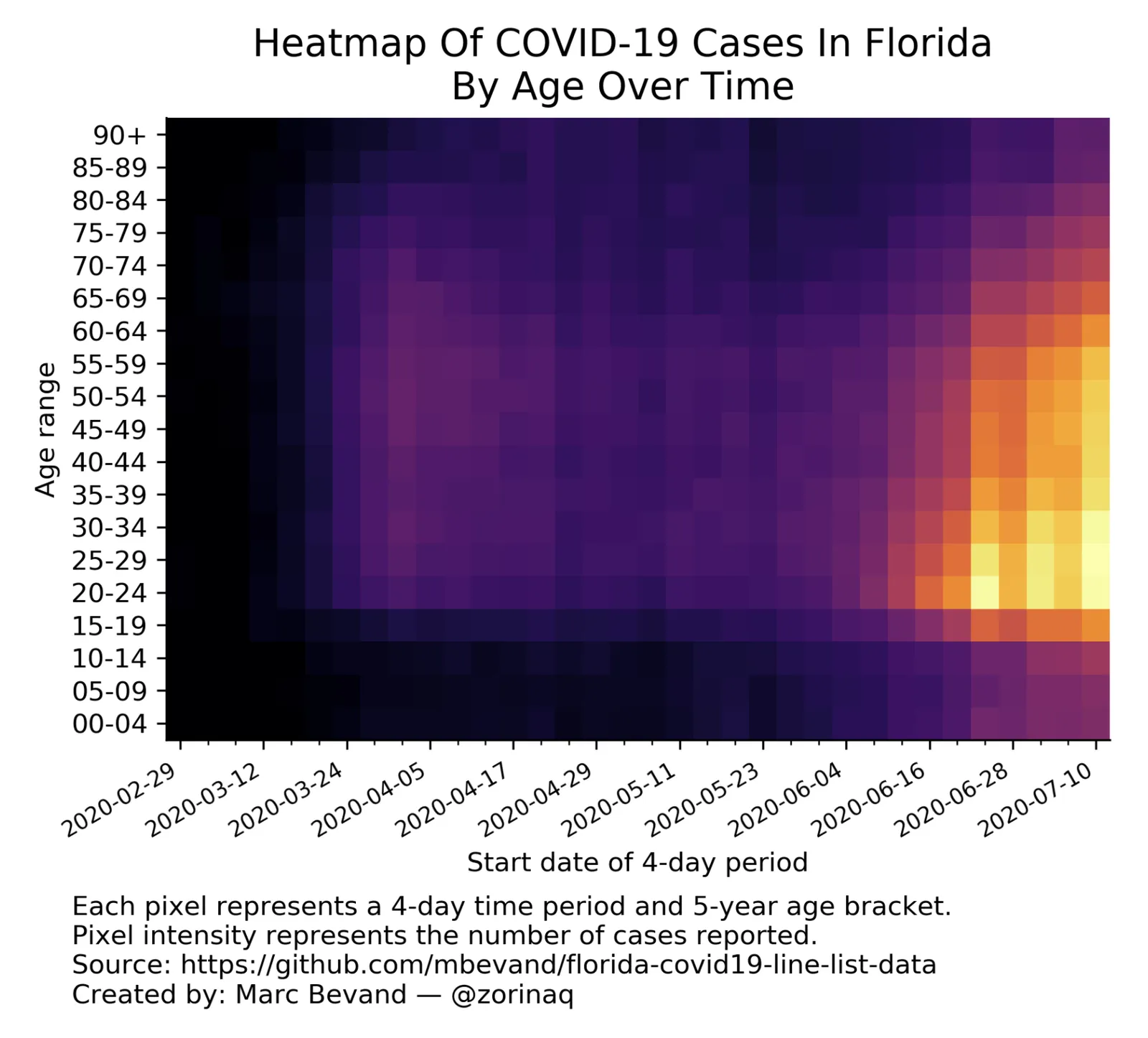
This is a neat visualisation of the COVID outbreak in Florida:
Why does it work?
- It uses colour intensity to introduce another dimension of data in a column diagram: time, number of cases, and age range.
- The colours are nicely chosen so the chart gives the impression of some sort of fire being lit (which is unfortunately the case).
These charts cannot easily be created in PowerPoint, this one is generated by some code. But you could give it a go in PowerPoint.
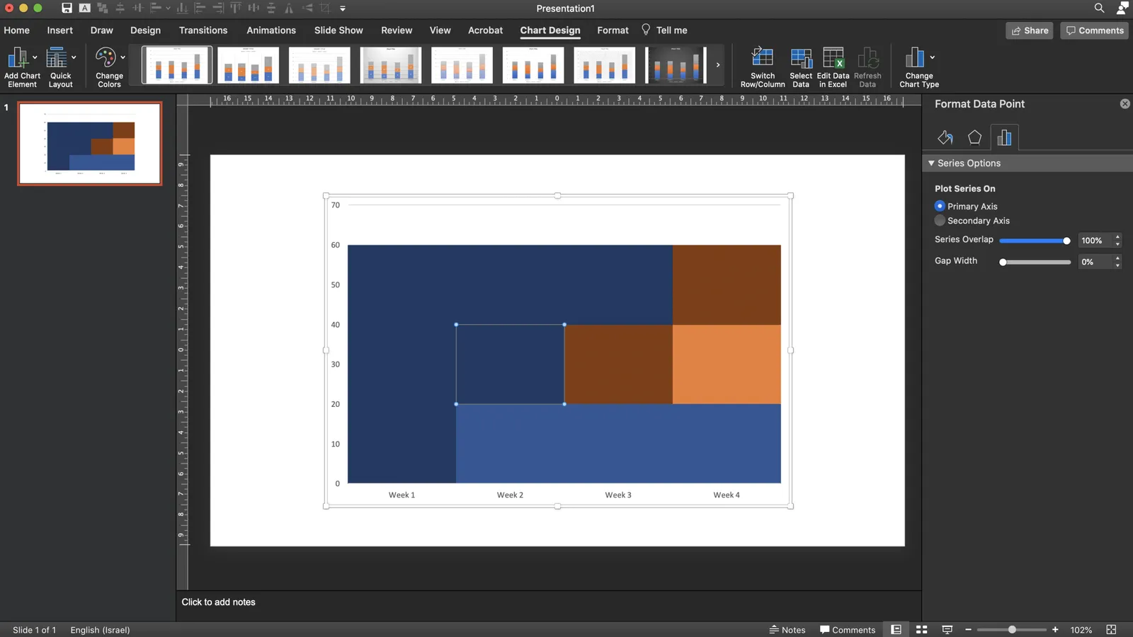
- Take a standard column chart in PowerPoint
- Make all the data series have the same value, the age brackets you want to use
- Set the gap between the columns to zero
- And now comes the hard part: manually add different colours to each data point. To select a data point click it twice in quick succession (one click will give you the entire data series wiping out your detailed painting effort in one go)
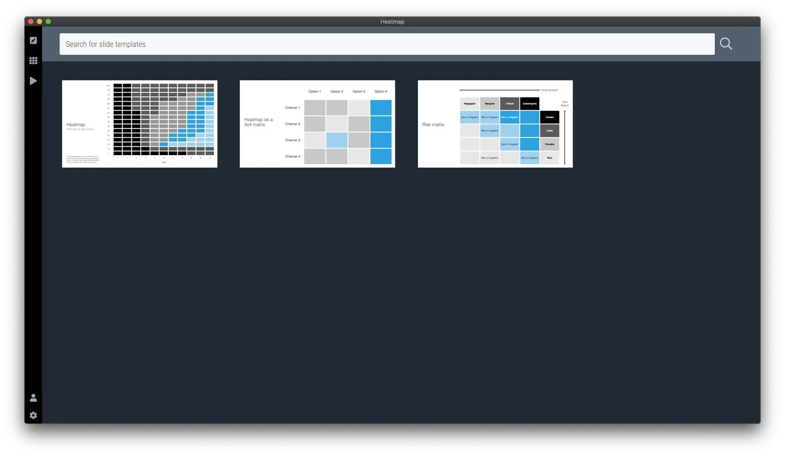
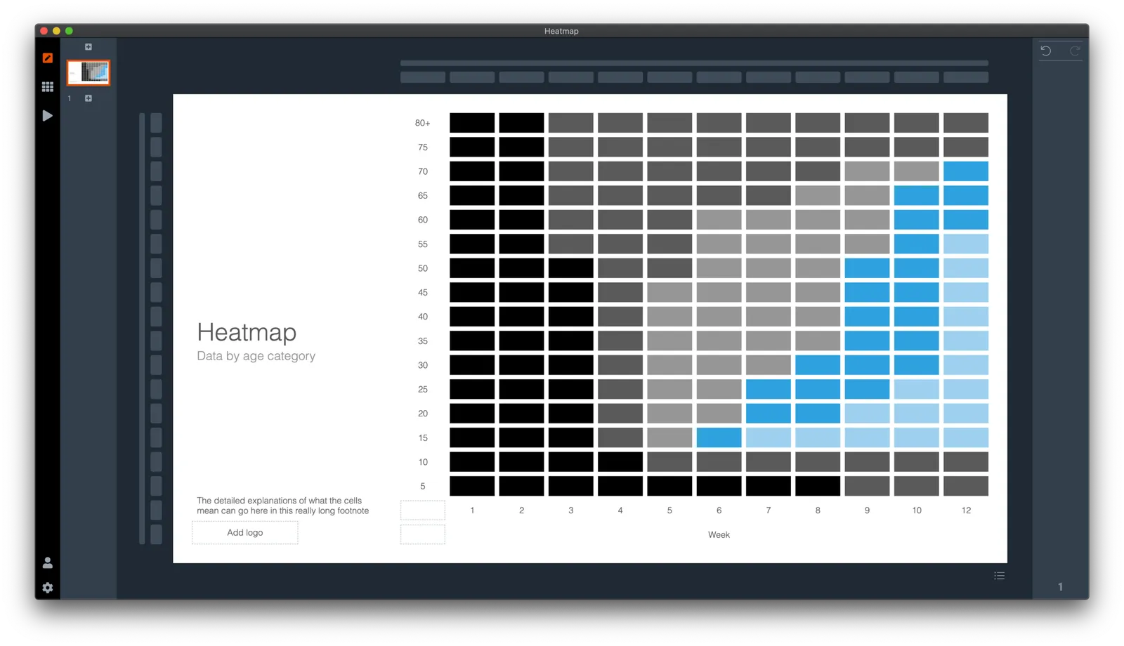
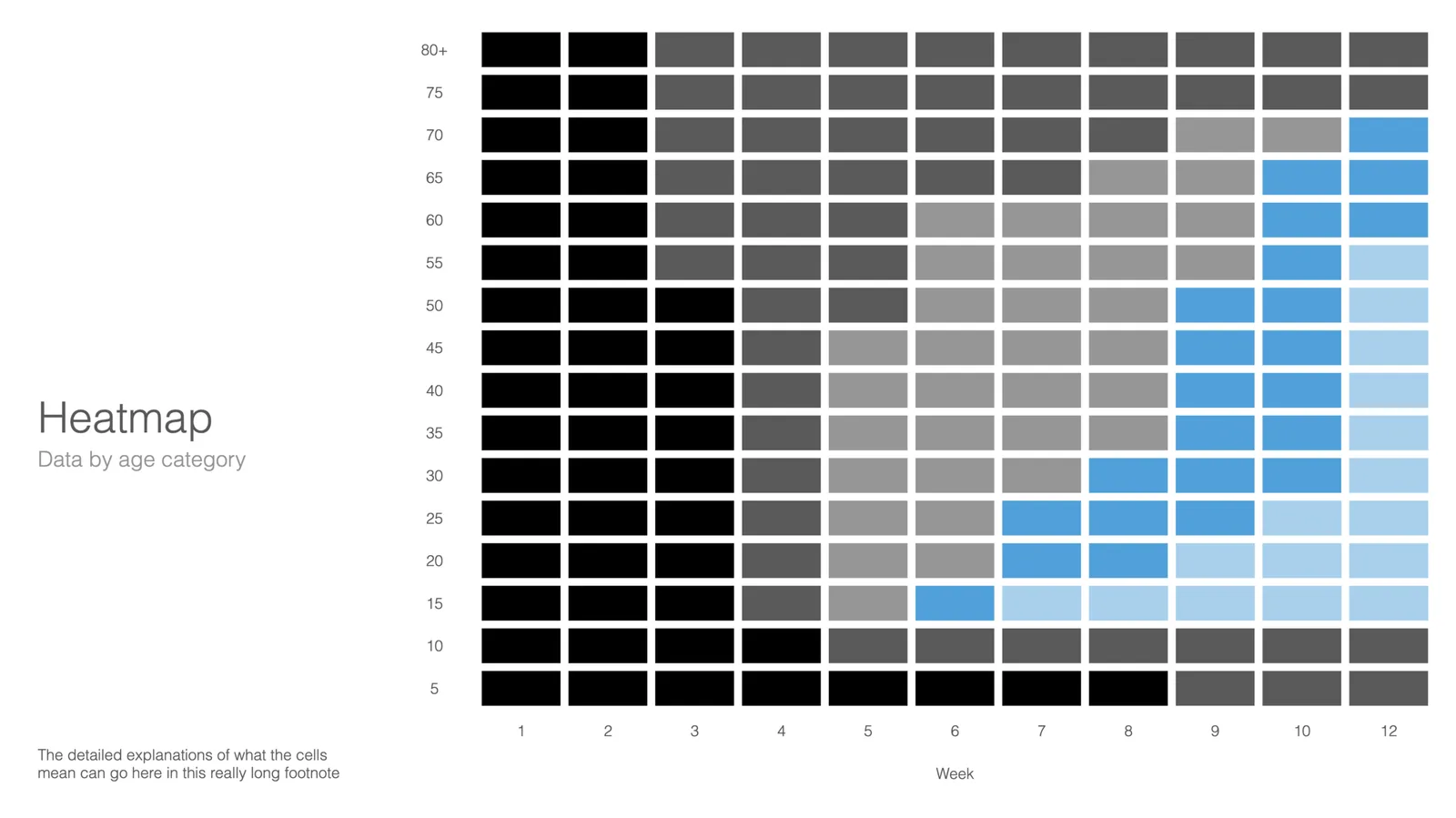
Here is a quick search for heat maps in SlideMagic, I added one design that sort of resembles the COVID chart. You can see how the new slide layout with the side title I introduced a few days ago comes in handy to create more vertical space for data.