SlideMagic Blog

Frequent updates about all things presentations since 2008. Subscribe to never miss a post.

RSS
all posts

Category Layout

·Layout

Make any presentation look better

I took a recent draft presentation that came across my desk (in PowerPoint) and took out all the specific / confidential information and images, replacing them with dummy text and boxes.

This was by no means a final deck, but it highlights something that most people get wrong when creating a slide deck: tidying up your layout.
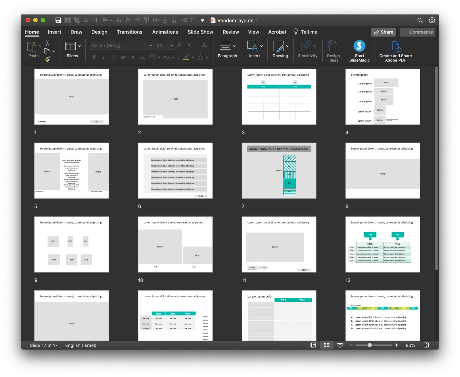
Some slides have a white frame, others having images bleeding off the page. Icons are different sizes. Things are not properly aligned. Get all these things right, and your deck will instantly look good, even without fancy fonts, graphics, colours.

This is easier said than done. In PowerPoint, you have the freedom to place anything, anywhere you want. You realise in the last minute that that particular text needs to go in, well it will always fit.

SlideMagic will not let you get away with this. Grids are strictly reinforced. Many users complain about that lack of freedom. I need that 5th box, and now the whole slide layout cannot handle it. And this, exactly, precisely, the process a professional designer has to go through. Unlike you, she does it instinctively and switches the slide layout. With SlideMagic, you will be reminded (kindly) as well.

Here is a quick layout of what a deck like this in SlideMagic should look like. This is not “super design”, SlideMagic helps you make a decent looking deck in the minimum amount possible. “Super design” requires a lot of investment (time and money), which gets you a great looking deck, but one that is sort of set in stone, it is very hard hard to make changes to it. Great for your IPO road show, less so for an every day presentation.
Continue reading →
·SlideMagic

All the way back to 2008

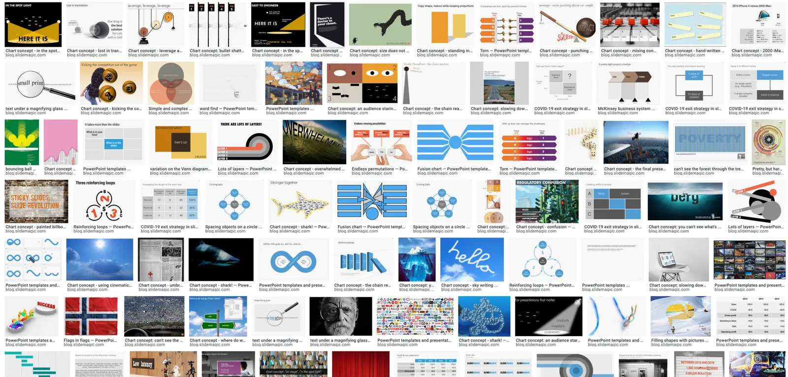
Now and then I dive back into the 12 year archive of my blog and see some or the early slide layouts I made. This Google image search pops up many of them.

While many of these layouts are now still available as templates in SlideMagic, some of them, especially the early ones are a bit different:

  • “Slides that stick” orange and brown
  • Lots of hand written fonts
  • Unusual visual analogies
  • Most of them are definitely not for the layman designer…

Yes, I made have been a bit more “daring” back then (and remember, most of these designs actually were taken from actual client work), but I still think that I am on the right track with my current sober, simple, easy-to-make layouts. Less artistic, but far less time wasted by smart people that can use their energy to do more useful things that creating presentation slides.

·Layout

Quora answer to "How to design a good presentation slide for business?"

Someone requested me to answer: “How do I design a good presentation slide for business?” Here is what I suggested:

This is a very generic question that is hard to answer without the specifics of the point you want to get across. Having said that:

There are many web sites, blogs, and books out there that advocate the principles of good slide design: minimal use of bullet points, use images, no clip art, use graphs, use white space, etc. etc. Everyone can spot a poor slide vs a good slide. The tricky bit is how - as an “amateur designer” - to make a (reasonably) good looking slide that still captures everything I want to say.

Some guidelines:

Find a basic look that seems to work, you can “borrow” from Apple, or other presentation styles that you think look decent and stick to fonts and generic slide layout rules. Personally, I like the style that Swiss graphics designers used in the 1960s a lot: Helvetica font, with a few simple colours. Very easy to copy to today’s presentation software.

Write the headline of what it is that you want to get across. Important: it can only be one message, not 2, not 3, just one key point that the audience should remember. If your whole slide fails, you (and your audience) still have that title to hang on to

Now, think about what you actually need to show to make that point. Here is where people lose it. They addd info, details, data, graphs, that do not contribute or support the headline at all. In that whole spreadsheet, there could be 2 numbers that you need. Be religious about this: you want to make a point, what visual do you need to support it. If you want to make other points, put them in other slides.

Consider more ways to express an idea than words. Use very simple graphics to simplify text. If there is a choice: put 2 boxes with the options with a double sided arrow in the middle. If there is a consequence, but 2 boxes with a single sided arrow. If there is an overlap of interests, use 2 overlapping circles. I would call this “visual verbs”: very simple shapes that instantly communicate what you want to say.

(Product plug: I am developing a software tool that supports some of this, you can check out SlideMagic, which has a free option, to find slide layout to get you started).

Good luck!

Continue reading →
·SlideMagic

How to make a CV slide

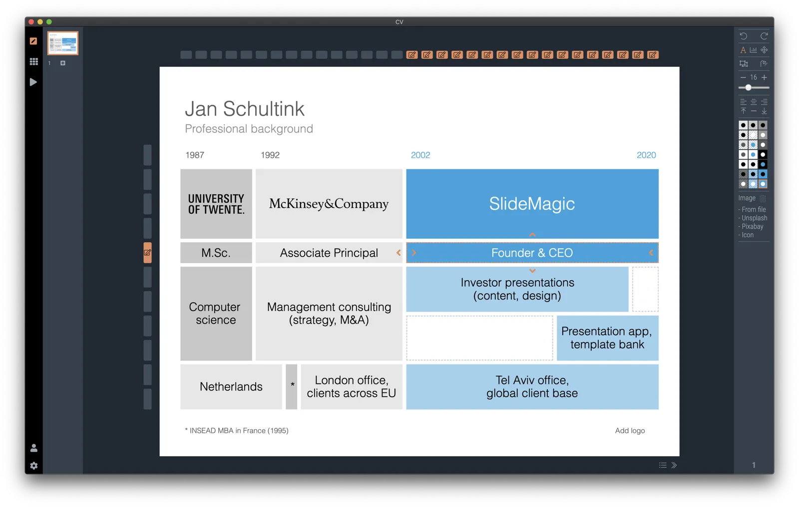
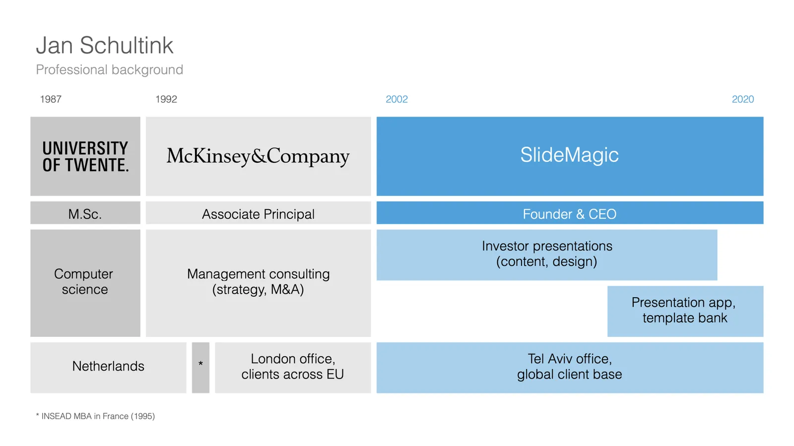
I am starting to work on a standard slide deck to present your CV, with me as the test subject. The first page is done. I like these type of time lines, because they communicate a lot of the basics about a person (years, employment, locations, education, etc.) in one slide, without making it too crowded. The rest of the presentation will cover more background.

They way to set the slide up is to start with a fine grid, create the major divisions based on your professional work history, then start refining. Notice how I left the consulting-style table labels (‘Employer’, ‘Role’, ‘Location’, etc.) out because it is very obvious from the chart what the rows mean, and these labels would take valuable space/destroy the balance of the layout.

In general, I think 4x3 slides look better than 16x9 ones. 16x9 is made for movies, 4x3 has a more pleasing balance for graphic design. These type of timelines are an exception though, the amount of left-to-right information makes the 16x9 format very useful. SlideMagic switches back and forth at the press of a button.

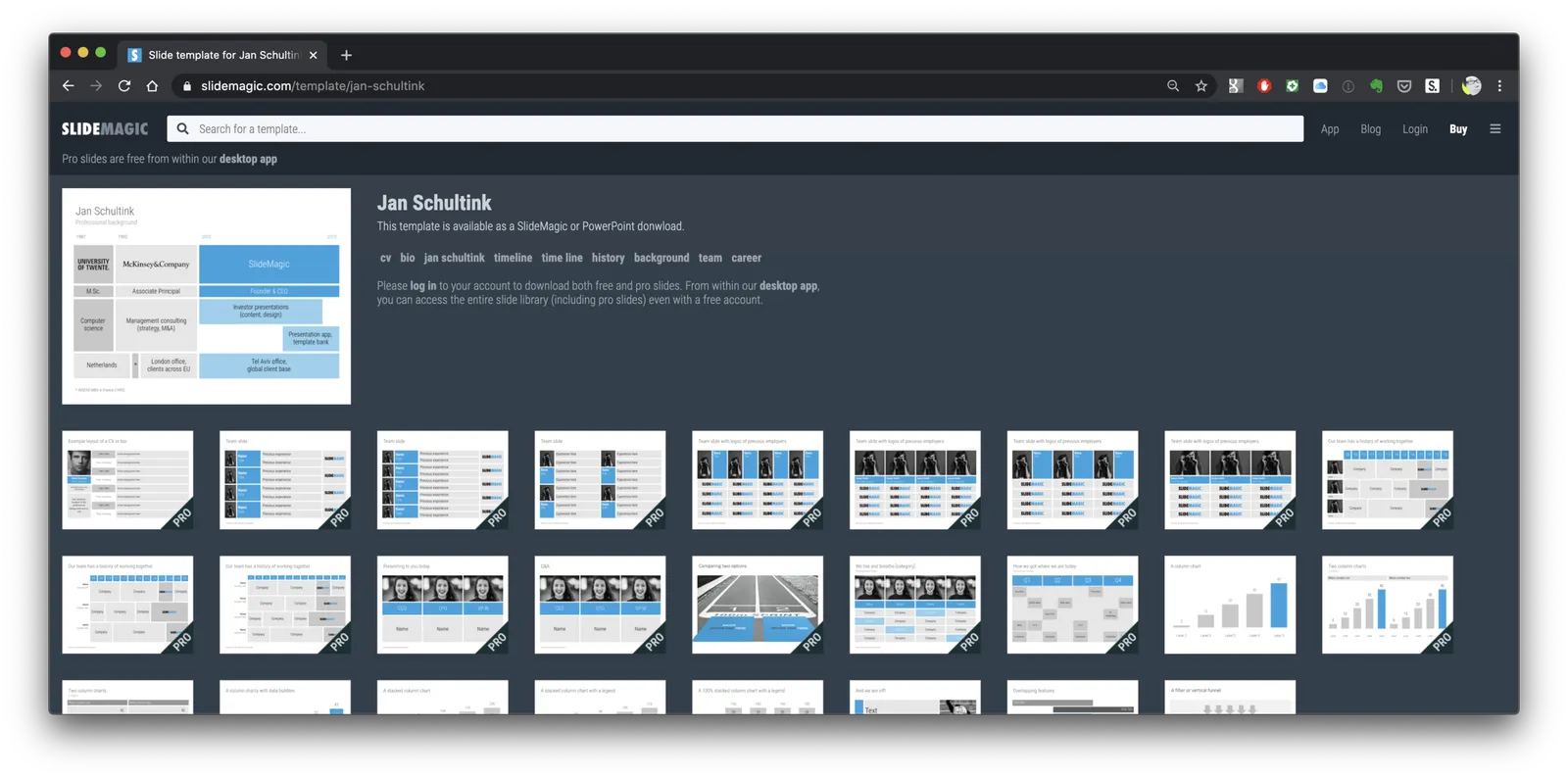
You can find the slide here in the template store, or simply search for “CV” in the desktop app.

You see how the search algorithm recommends other slides for highlighting career backgrounds and teams.

There is more work coming up on the CV slide deck, stay tuned.

·Layout

New slide templates

A busy day today: i completed a 2nd submission for the PowerPoint plug in, hopefully ticking all the boxes (well, except one that is actually an issue with the Microsoft Javascript API). Let’s hope for the best.

So no long-read, deep blog post today, still I found a few minutes to upload some new slides into the database. Soon, I want to get 1,000 layouts in the database, and we are making good progress towards to that goal.

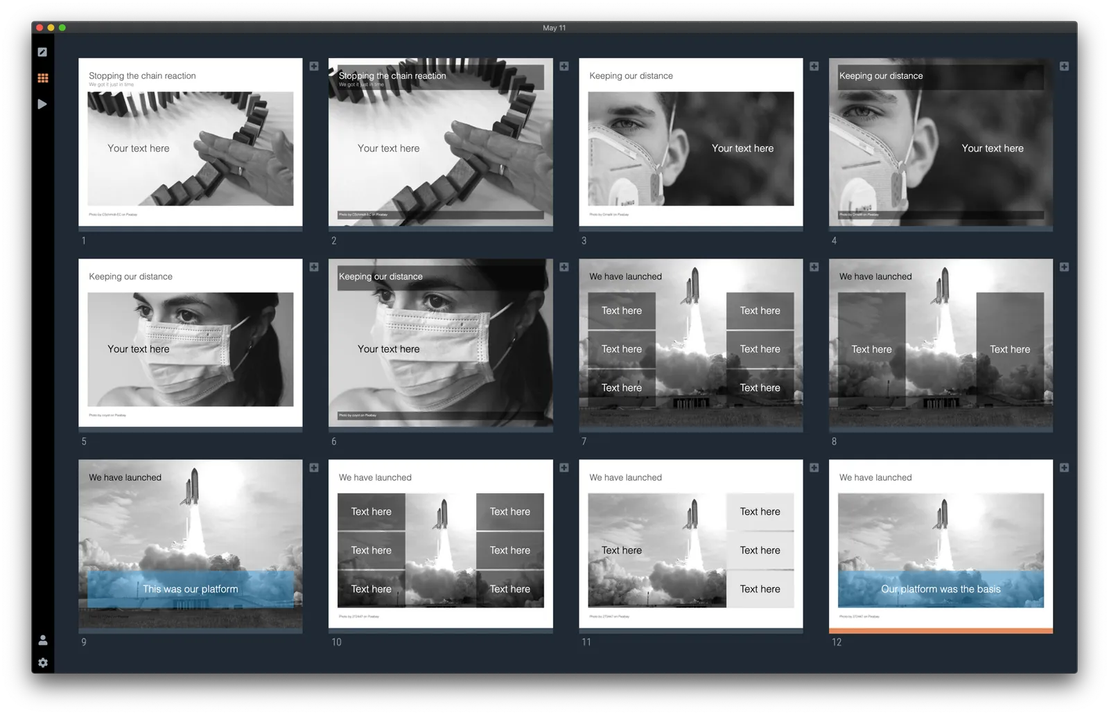
Here are today’s additions. Remember that you can bring the colour of the images back once you download them into the desktop app.

Image by 272447 from Pixabay

Warren Buffett's investor presentation slides

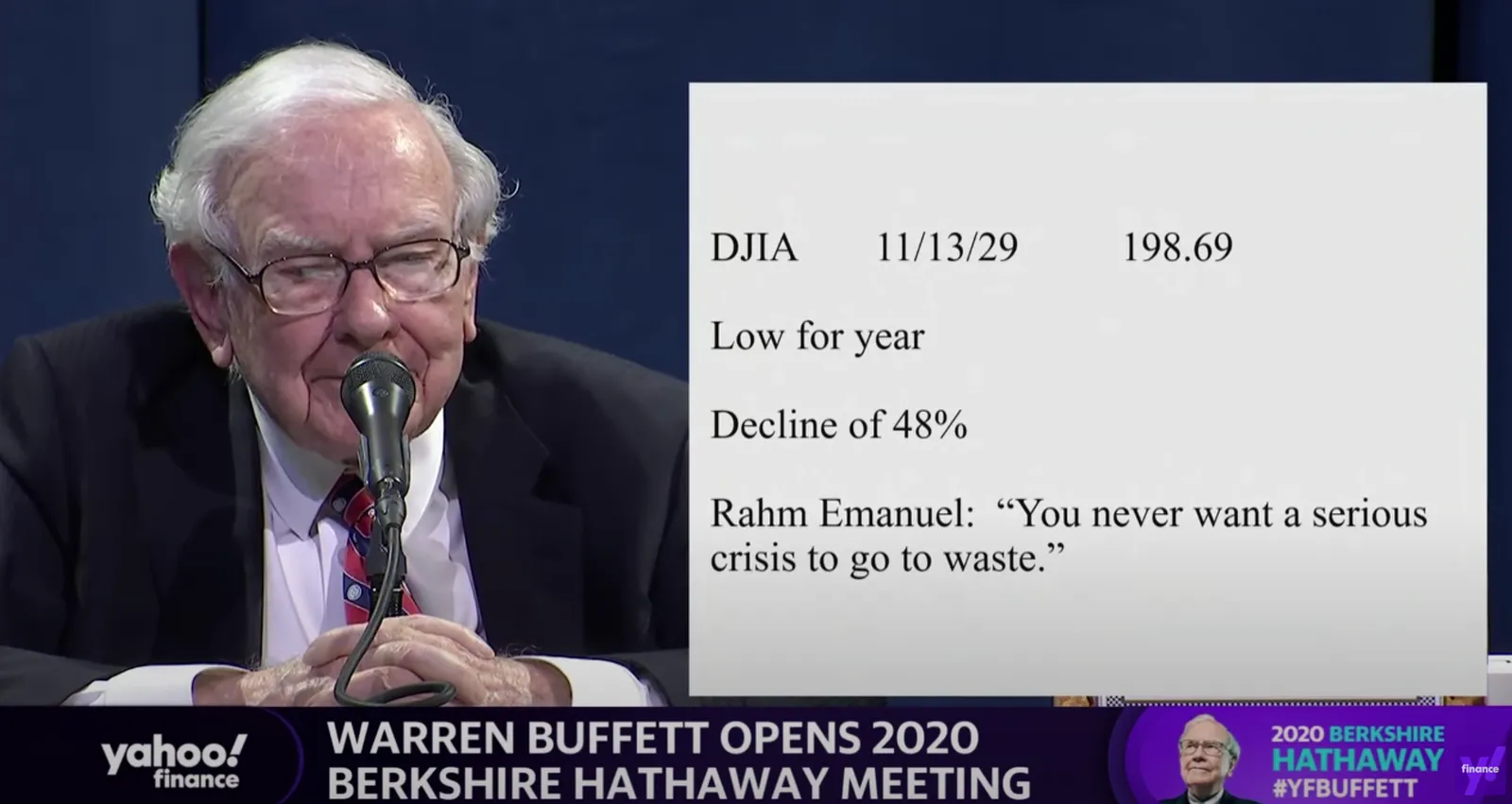
This tweet flew by about Warren Buffett’s slides during his annual investor meeting.

A sans serif font and centering the text would have made it look better, but overall, this slide is actually not that bad. One big message without distractions. (If Warren had used SlideMagic with this template, his slide would have looked like this)

Other slides are less crisp though, as seen in the example below:

But, Warren does not read out the bullet points, he tells a story starting with background about his father. People will read the slide for 2 seconds, wonder about the quote, and then focus all attention back on him.

OK, I could not resist, SlideMagic would have produced the following slide (a quick search for “1930” in the built-in Pixabay image search delivers good results)

I would put the quote on a completely separate slide, if at all.

Coming back to the first tweet. If you are Warren Buffett, then you get away with pretty much any slide design. On the contrary, making it all too fancy is a direct contradiction to his modest life style. If you are not Warren Buffett, putting in 2 seconds worth of effort with SlideMagic will definitely make a difference.

I tagged these 2 slide examples with “buffet” in SlideMagic, you can use them in your own designs and find them in the presentation app, or download them here.

·Layout

"SlideMagic style"

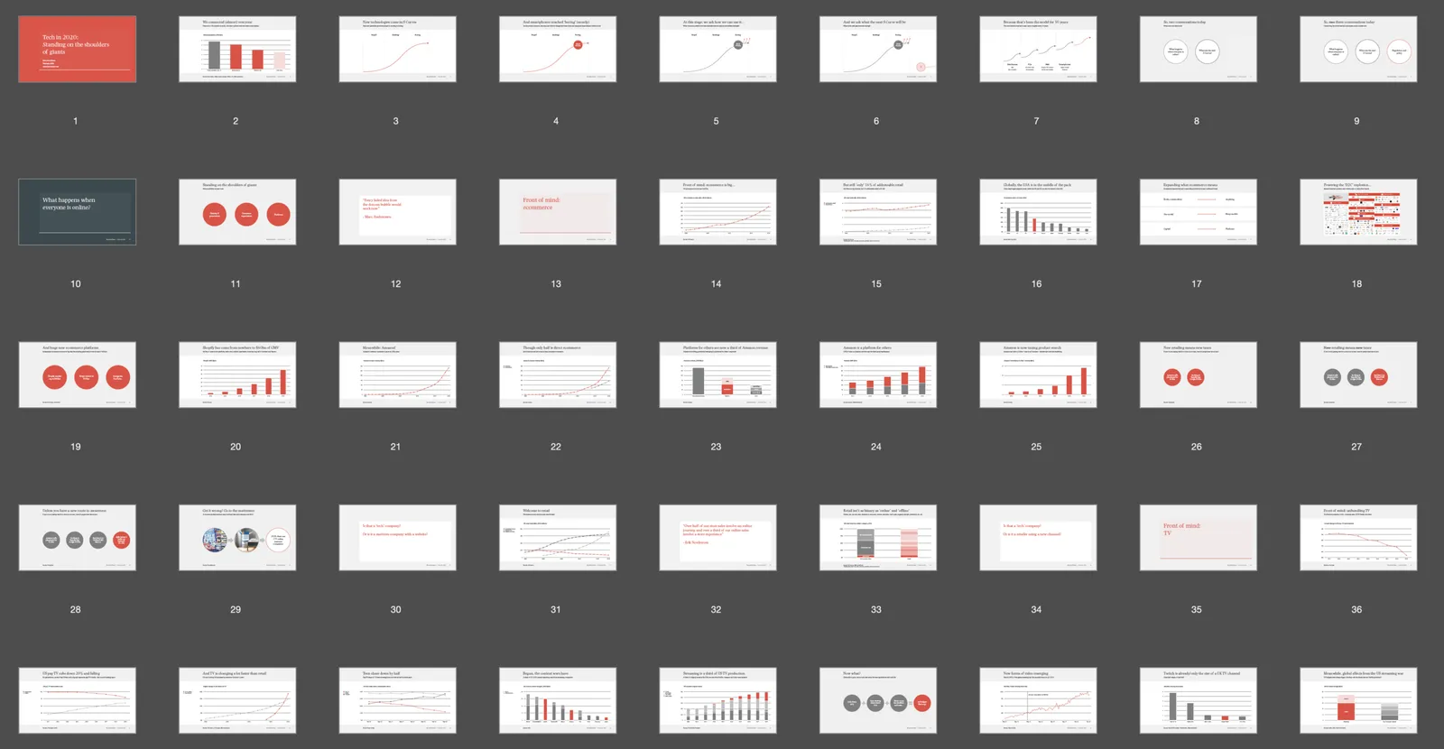
Even presentations not made in SlideMagic can look like one. Have a look at “Standing on the shoulders of giants” by analyst Ben Evans:

The design approach:

  • One strong accent colour
  • Lots of variations of grey
  • Calm slide layouts
  • Clear grid structure

SlideMagic does not like these circles (yet) though and makes you fit into that boxy look :-).

For your next presentation, put the slides in slide sorter view, and take a step back. Do things look consistent in terms of layout, colour, and the balance between white space vs used space? If you struggle to stick to the discipline, SlideMagic is here to help.

·Layout

One image, different compositions

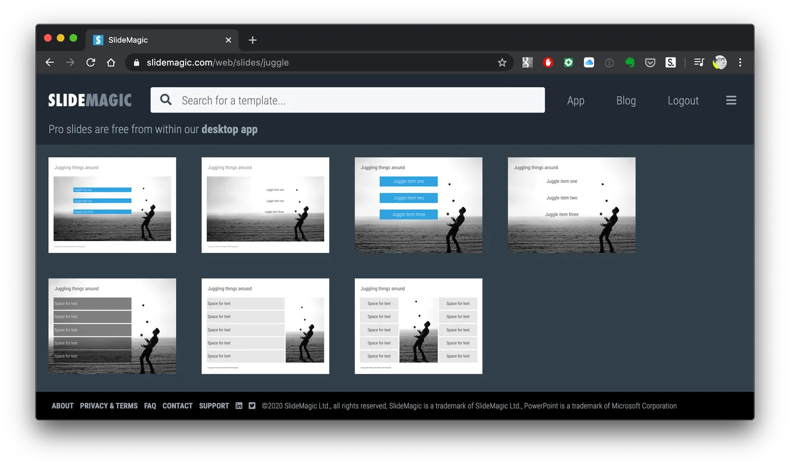
I am uploading lots of slides now to SlideMagic everyday. Where possible, I create multiple layouts of slides, often depending on the underlying image I use. For example, see the juggler below.

There are lots of degrees of freedom:

  • Image in a frame, or bleeding of the the page
  • Line up text with the balls, or not
  • Different colour options

As a SlideMagic user, you can pick one of these basic layouts and add or subtract boxes easily without messing up the overall of the slide.

Try it out for yourself, the search for juggler slidesis here. For the moment, I have made access to the entire slide database from within the desktop app free, so you can experiment with presentations in .magic format. PowerPoint conversion and/or downloads require a pro subscription.

·Templates

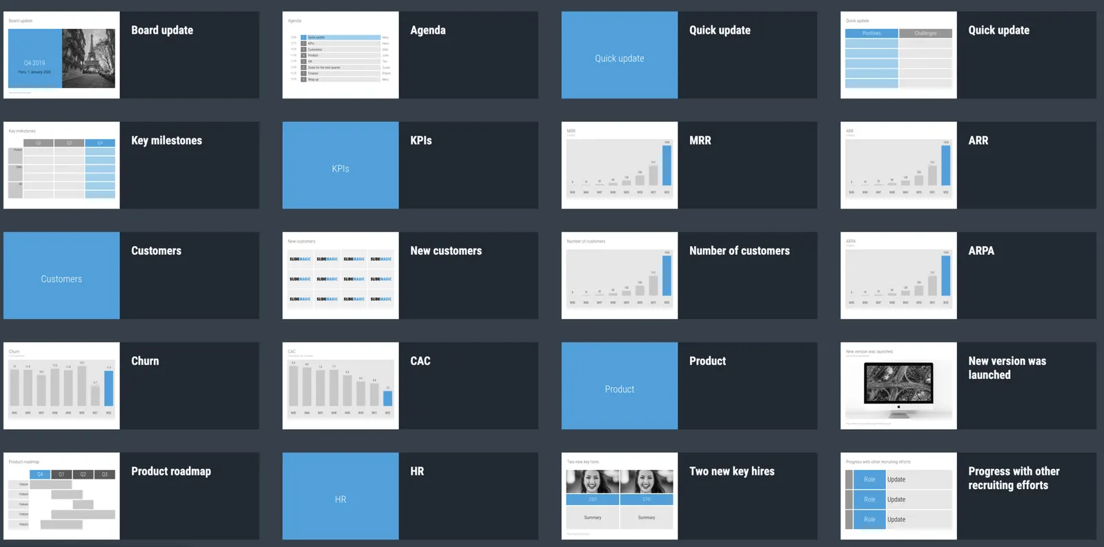
Startup Board update deck

You can now access entire slide decks (“stories”) from the home page of SlideMagic. A few days ago I added a slide deck template for a startup Board update. As I upload the new slide decks, individual slides will get added with the right tags to the slide database as well so they will pop up when you search for relevant layouts.

More slide decks to follow. Let me know if you have any special requests.

·Layout

How to create a logo page in a presentation

Yes, I have been in this situation as well:

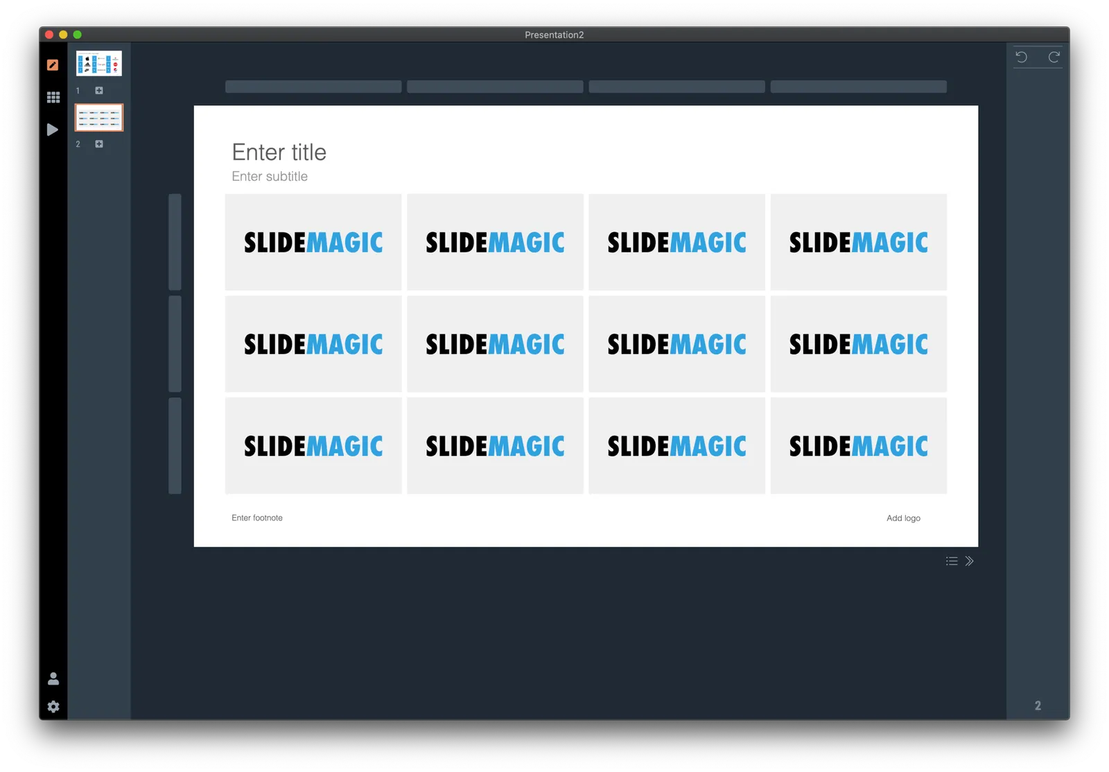
Below is a short video that shows how SlideMagic makes creating logo pages in a presentation really easy. In the first example, I start from scratch with a completely blank page. Notice how logos get plopped in, and how everything lines up instantly in the grid, and how easy it is to add columns, text boxes without having to re-arrange and re-align the entire page. (I have added this slide as a free slide on the template store, you can find it here, stripped of the logos I used because I could not verify copyrights)

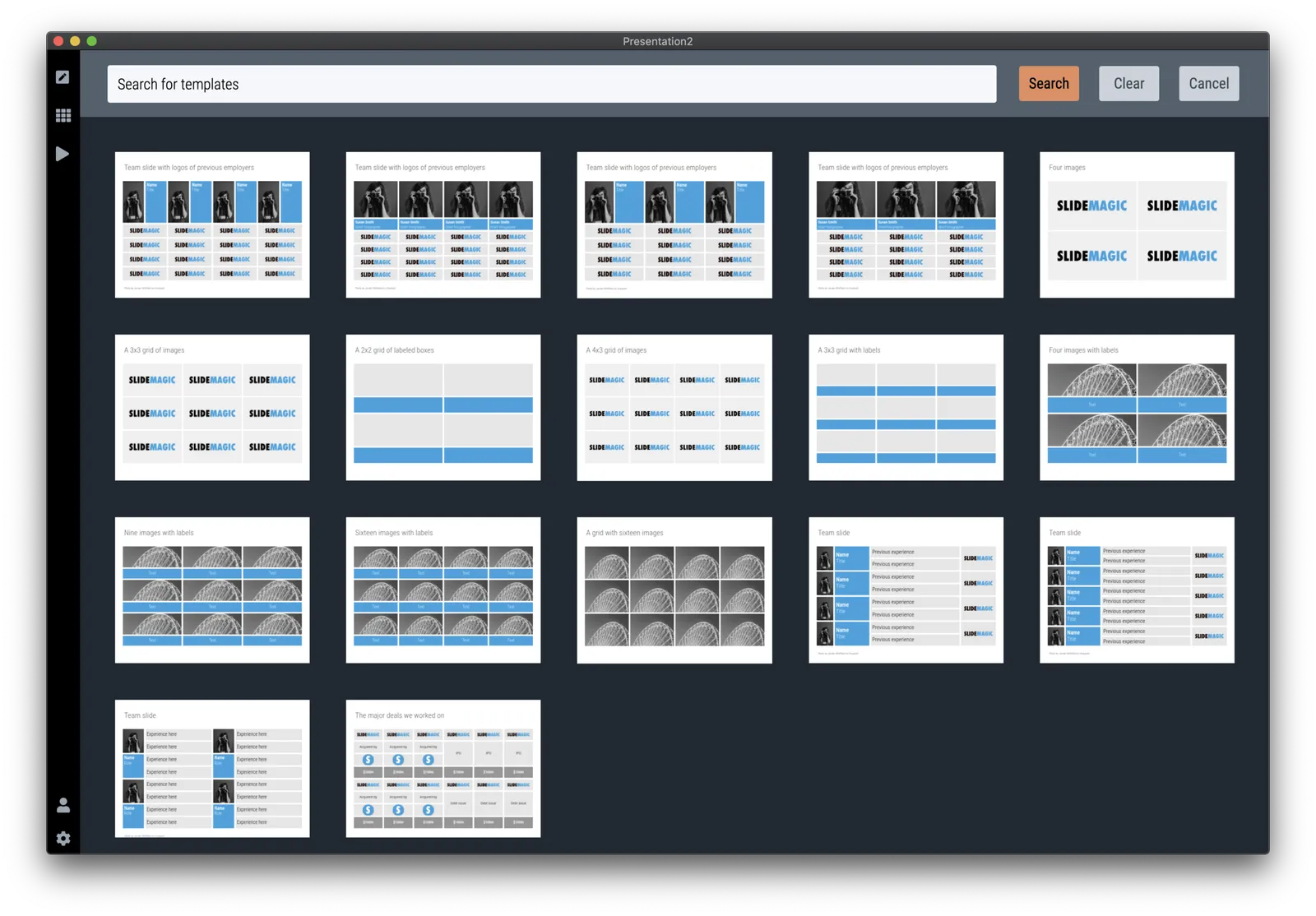
The alternative is to start with one of the built-in templates of SlideMagic, search for “logo” in the app and see what slides come up:

Now you can customise the page and swap the logos for the ones you need.

The exact same search available in the online template bank as well (try searching for logo), but users who are downloading the PowerPoint version directly from the web site miss out on the magic of SlideMagic when it comes to manipulating image grids.

My suggested strategy: tweak things in SlideMagic, and export at the very last moment to PowerPoint if you have to share things with your colleagues. You will save a lot of time making those nasty logo grids.