SlideMagic Blog

Frequent updates about all things presentations since 2008. Subscribe to never miss a post.

RSS
all posts

Category Layout

·Layout

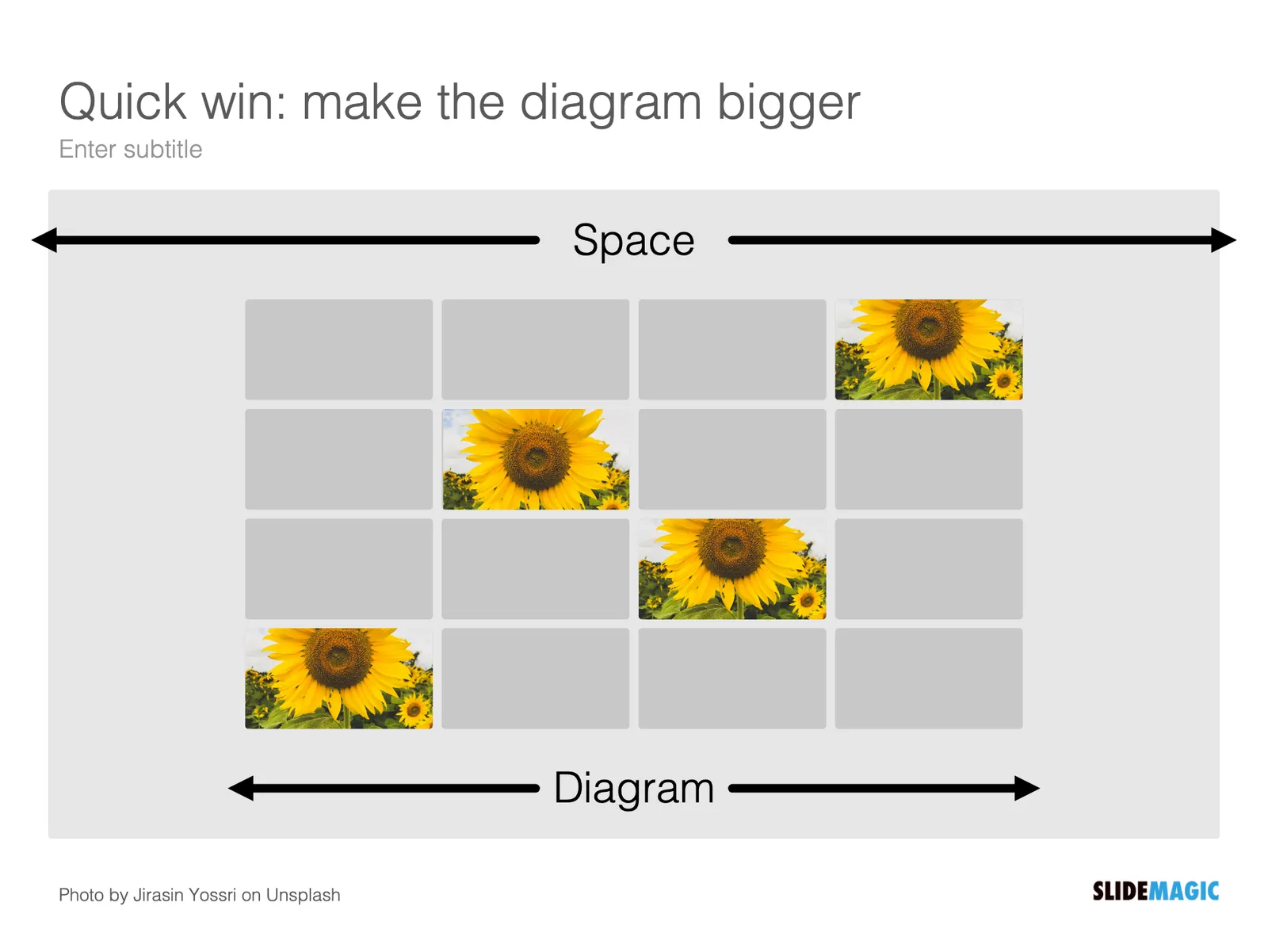
It is all about box counting

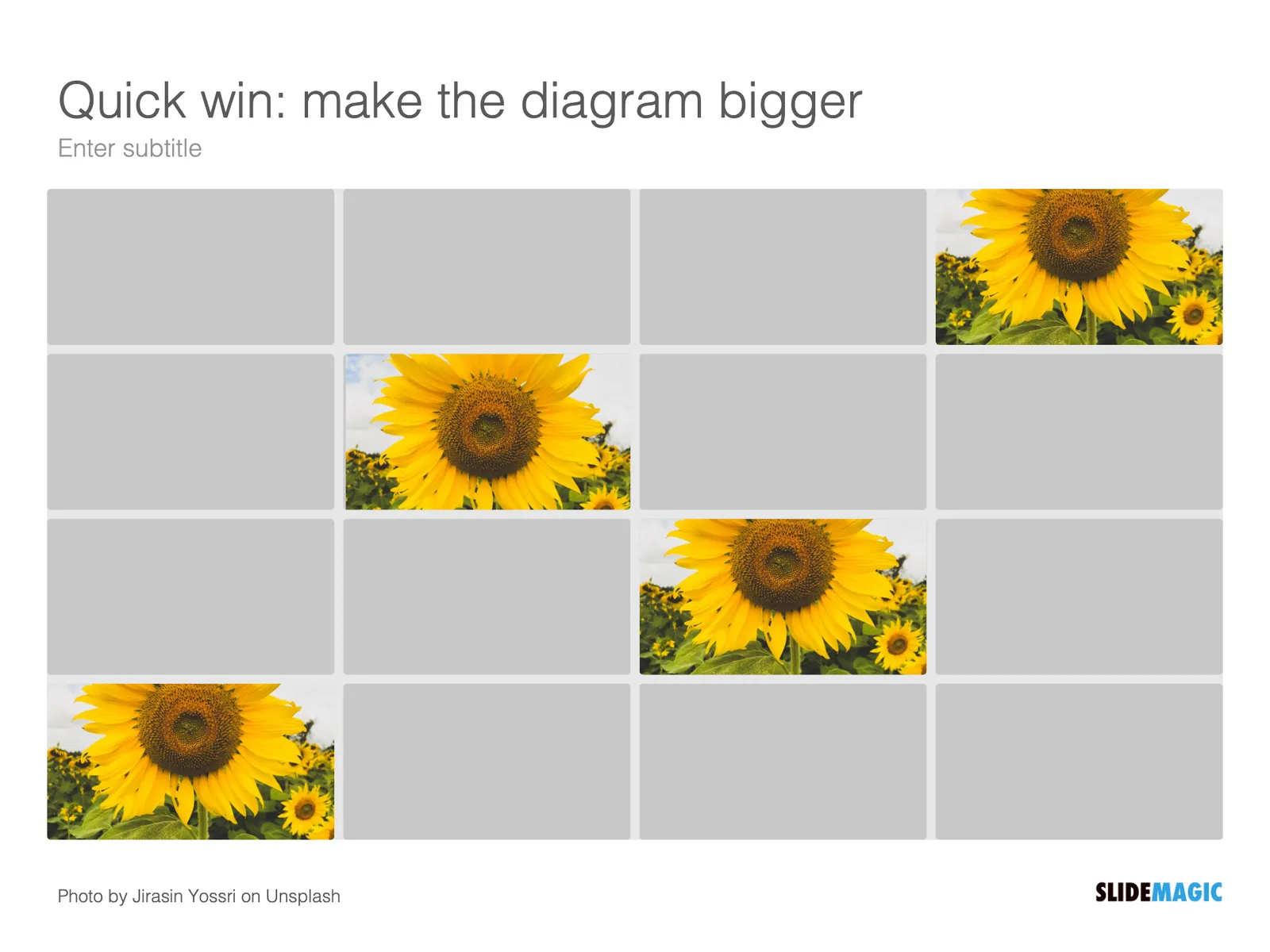
One of the biggest issues in business presentation design is adjusting frameworks to the amount of boxes you need. You had this great slide that fats 8 things, but thing number 5 and number 6 is no longer relevant, so now you need to rehash the whole slide layout…
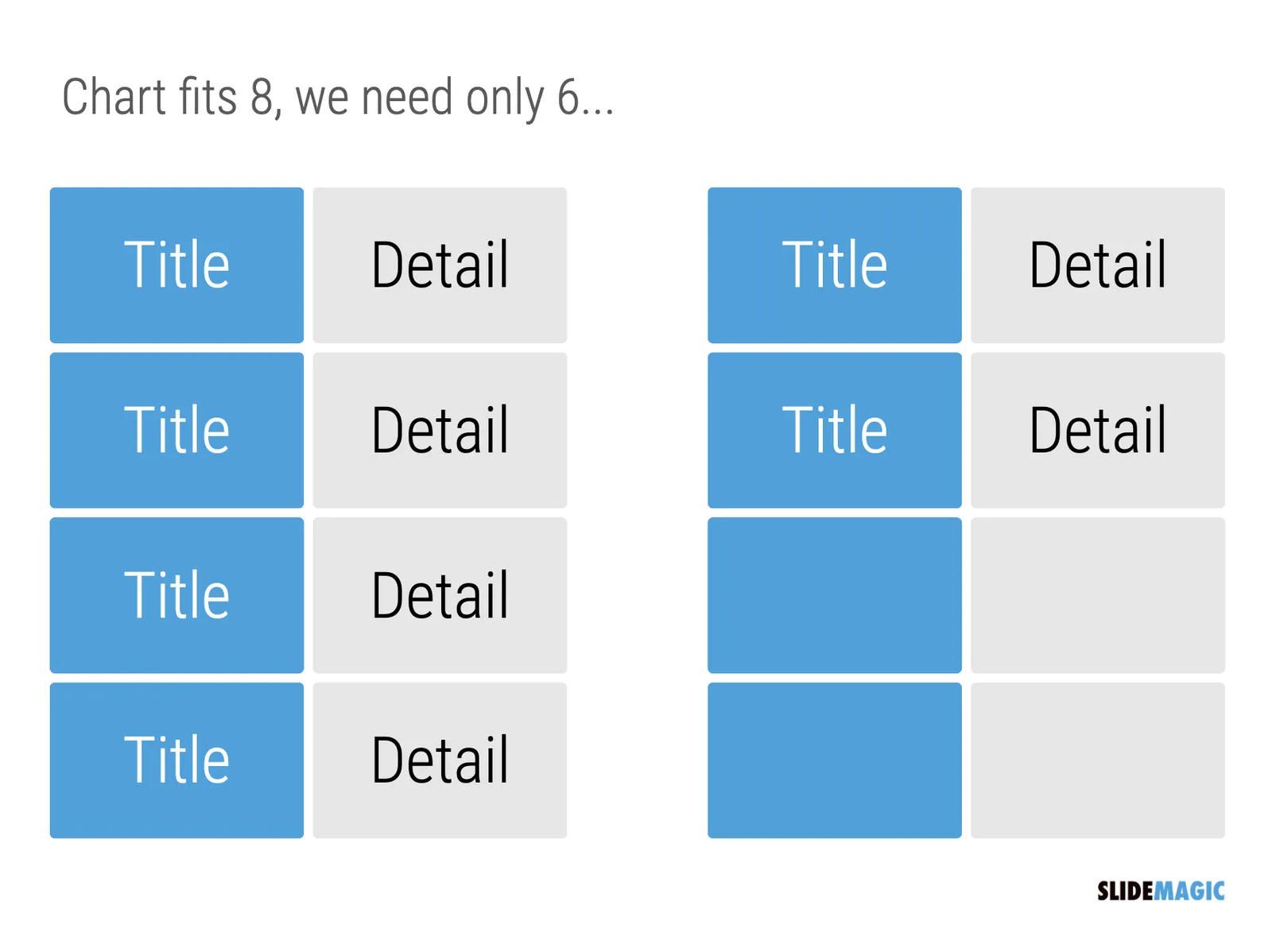
I think this “bug” in the design process might be one of the biggest reasons for the popularity of bullet point lists: it is super easy to add and subtract things on your slide. And this is also the reason why pre-fab PowerPoint templates are so hard to use. The designer made that super pretty 8-box slide with sophisticated shapes, and 5 minutes before your meeting, you need to get rid of one without destroying the design of the slide…

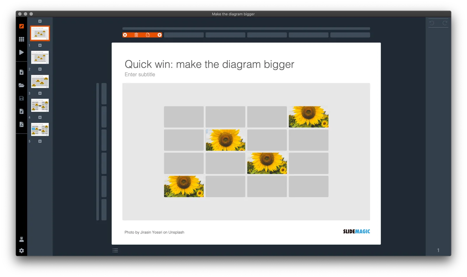
In SlideMagic things are super easy. Option one: it is easy to adjust the grid layout to match your new box count. Or even better: a new box count might merit an entirely new slide layout. In the latter case, you will have to copy-paste your boxes, but at least SlideMagic takes care of the fiddly task fo lining things up.
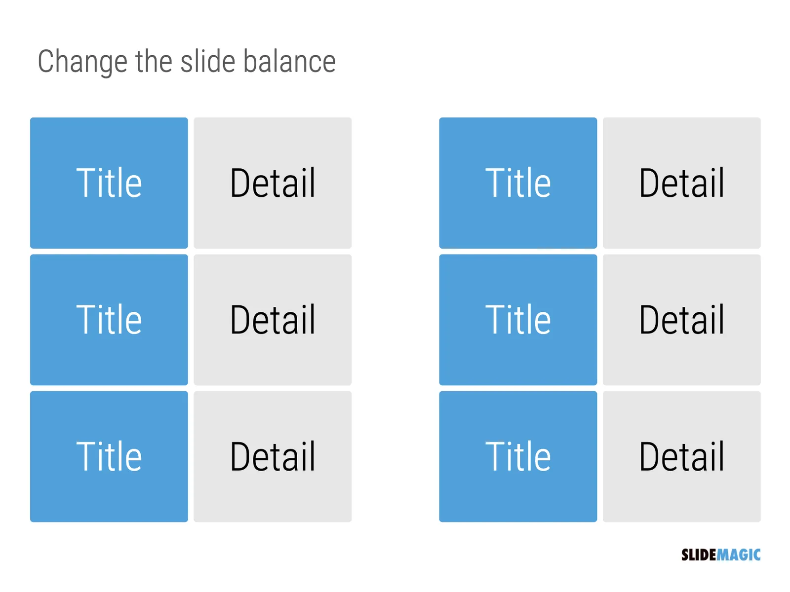
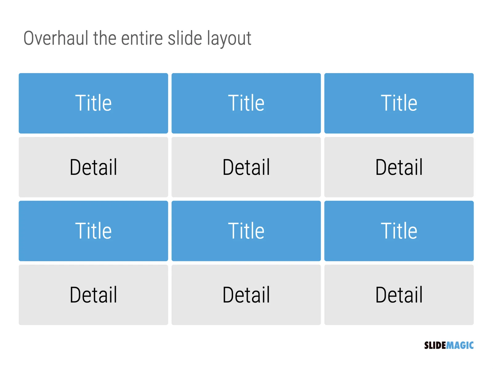
Here is a pro tip: box counting is the first thing I do when staring a new slide. How many items, how do they spread across horizontal and vertical dimensions? Can we consolidate points? Should we break them up across multiple slides? Once you have your count, it is easy to find a matching design.

·Layout

How to crop headshots in your presentation

The ideal design for a slide that shows your team is a group picture, all taken together. Unfortunately, these are almost impossible to produce. Teams change, and people are hardly ever in the same room (especially now with the virus).

The next best thing is a collage of headshots. Professional graphics designers have a specific approach to line these up properly:

  • Make sure that the eye line of all the head shots is more or less the same (at 25-33% of the image height
  • Make sure that the sizes of the heads are more or less the same

In PowerPoint and Keynote, this is an absolute pain to do. Getting different images to have the exact same size is tricky. Cropping images to position eye ines is tricky to do, and might undo part of the work that you did to get them to be all the same size.

In SlideMagic, things are easier, because it works with fixed shapes and smart cropping.

Below I plopped in 3 portrait images from the built-in image search engine of SlideMagic. In 2 of the 3 cases, the “AI” smart cropping algorithm did already a reasonable job, in the last case, totally not. But first things first, all images have the exact same size, and are spaced out absolutely perfect.

Next, we are going to drag the central dot at eye level for each of our team members and drag the images inside their boxes so the eye lines line up.

Continue reading →
·Layout

Seth Godin chart make-over: Venn vs. 2x2

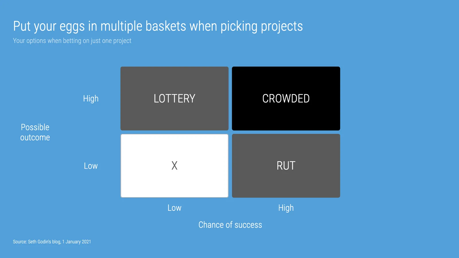
Seth Godin opened the 2021 blog with a post that argues not to put all your eggs in one basket when it comes to picking projects. (You could argue that my own bespoke presentation design projects fit in the “rut” category, and the SlideMagic software is a “lottery”, but on balance the risk of the overall portfolio is small with an option to win the lottery, even if it is modest).

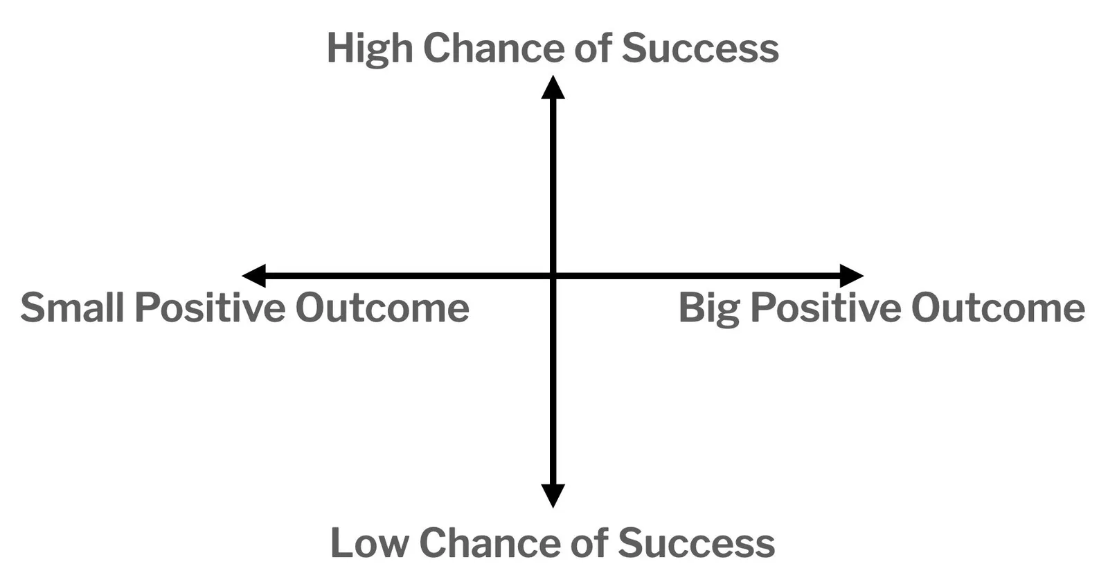
To illustrate his point, he used a 2x2 matrix.

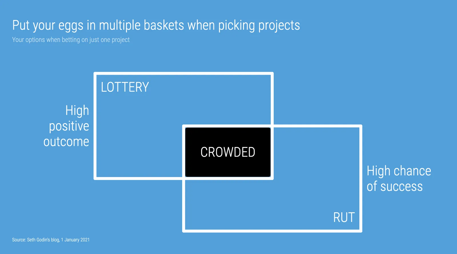
The 2x2 works, but when looking for these type of charts consider a Venn diagram as well. In many cases, the low-low option is not really realistic (in this case picking projects with a low probability of succeeding, and with a low potential upside).

I added 2 charts to the SlideMagic database to show the 2 options, in a different colour scheme this time. Download them from the web or search for “seth” inside the desktop app to access them.

·Layout

Weave effect in slides

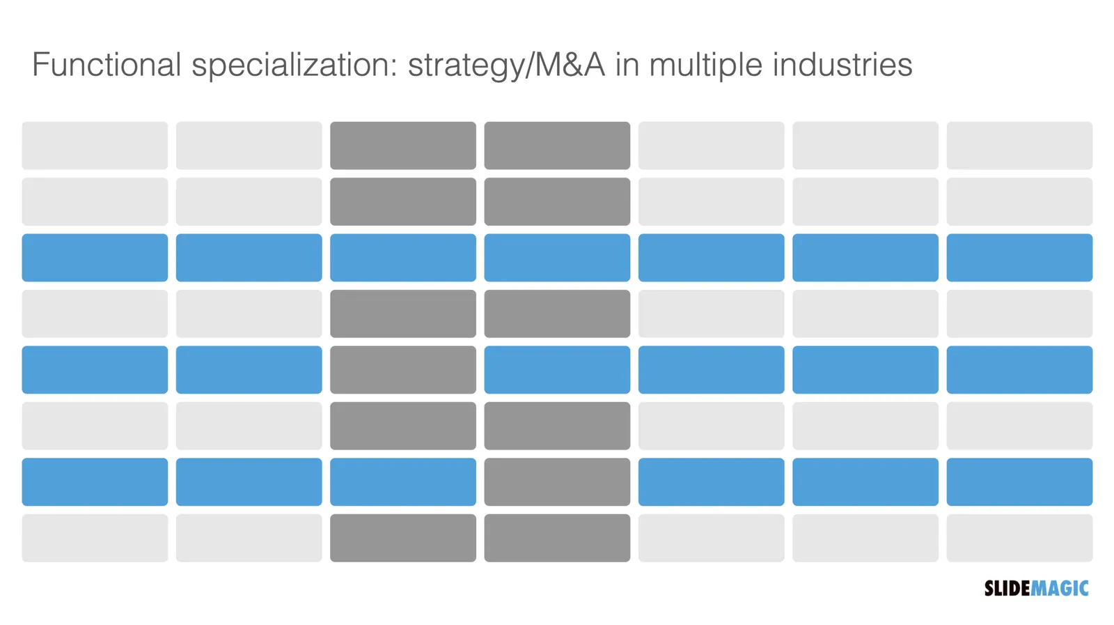
See the slide below. A weave effect shows how vertical and horizontal things are interconnected (in this case stuff I did back at McKinsey). It is impossible to weave shapes in programs such as PowerPoint or Keynote, they cannot be on top in one spot, and at the bottom in another,.

One way to get around this is the visual trick I applied here. Stick to a flat grid of boxes and colour/connect them to fake the visual effect. Super easy to make, super easy to change (adding, removing rows and columns). Below is the basic grid structure I used for this chart:

In PowerPoint and Keynote it can still be fiddly to line up all the boxes, especially when you want to make changes to a grid. You might have to resort to tables with very fat white margins between cells,. In SlideMagic it is super easy and even fun to create these charts. (Pro tip: SlideMagic converts to PowerPoint and can do the hard work for you).

I have added a variant of the slide to the SlideMagic template database (find it here, or simply search for “weave” in the desktop app)

·Layout

Focal point cropping!

********* UPDATE: The new focal cropping is now out of beta and part of the regular SlideMagic release **********

Happy new year to you all, 2021 has already an important feature update.

I am testing an exciting new feature for SlideMagic: focal point cropping. (I first spoke about this back in August.) For each image in SlideMagic, you can set a focal point, a dot on the most important part of the photo. This can be a face, a feature of your product, a quote on a screen shot for example. If you subsequently change the size or shape or zoom level of the image, SlideMagic will re-crop the image so that your focal point appears in the right spot.

I have seen many examples of focal crops in other applications, but no one did get it completely right. That small house on the mountain you focused still disappears on certain screen sizes, or pictures get completely stretched and distorted when resizing screens or changing the composition of your slide. In SlideMagic, everything stays in place.

A particular design decision in web technology standards made it particularly hard to do (without having to divide by zero). Over the winter break, I rewrote the entire image rendering engine of SlideMagic, which was a bit like replacing the foundations of a house while people continue to live in it.

A lot is going on here, in terms of underlying math and how the user interface works. I won’t spell it out in detail here, the app should respond naturally without you having to think about it. The basics are in place now, but I still see a lot of improvement opportunities to the image cropping algorithm including automatic object detection.

Continue reading →
·Layout

A box for each point

It is really easy and quick to add bullet points to a text slide: hit return and start typing away, boom, you found a place for that other thing you want to say. Check.

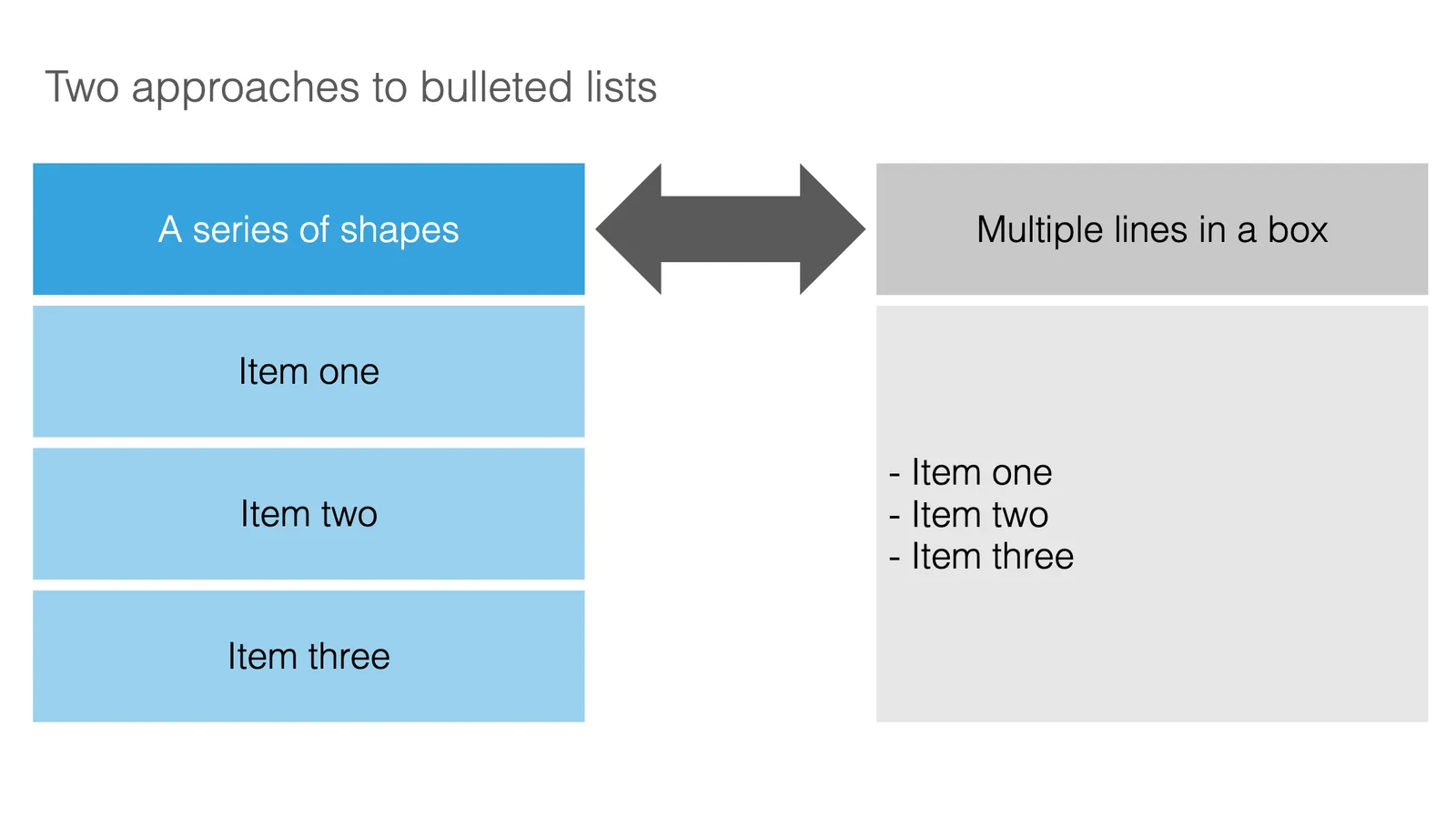
SlideMagic does not support automatic text bullets, and you need to put each item in a separate box. Bummer.

This is by design. (Let me explain in a number of bullet points).

  • Boxes look a lot better on a slide than a list of sentences. The equal size and background colour compensate for different length of text content. Everything is always lined up and spaced out
  • More importantly: the box hurdle is a little ‘brake’ in your writing process. Do I need 3 or 4 boxes? Should the points be one, or multiple slides? Are the points equal in weight, or is one a sub point of the other?
  • The list is hardly ever the post visual layout for a slide, maybe boxes should be lined up next to each other, centred around some central box, go up, go down? When writing text lines, you are not even considering these layouts.

When designing slides, I spend most of my time thinking about the layout, the amount of rows and columns in the page and how everything fits. Once that is settled, the rest follows. I want you to do the same.

Photo by 🇨🇭 Claudio Schwarz | @purzlbaum on Unsplash

·Layout

Use the whole page

White space is a good thing in design. It makes text breathe, the whole page looks calmer somehow.

This applies to business presentations as well. Cut text that is not required, make images as big as possible, and your slide starts to look like a well-designed ad on a billboard.

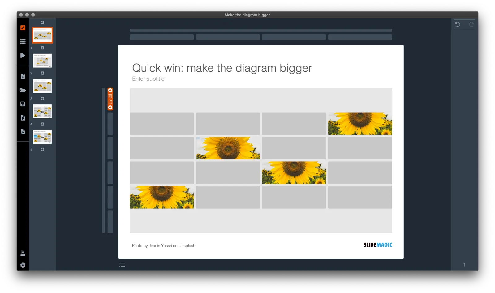
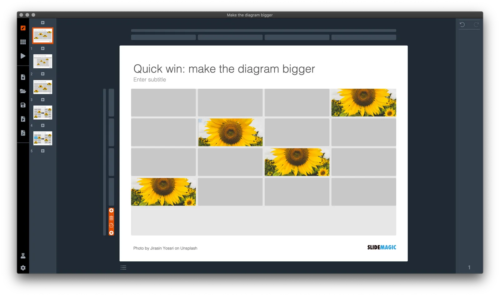
However, in some cases, a business presentation slide is not meant to be a fashion ad. Think of the sales target data for the next quarter, or the new IT system architecture that you need to get approved. What I often see in SlideMagic is a “left over battlefield” with the final product of a complex table or system diagram. After many iterations it finally looks like it should look and everyone agrees to it.

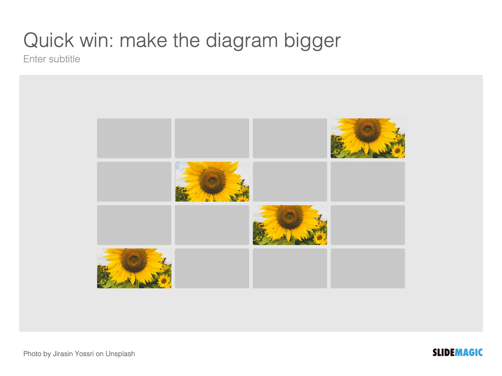
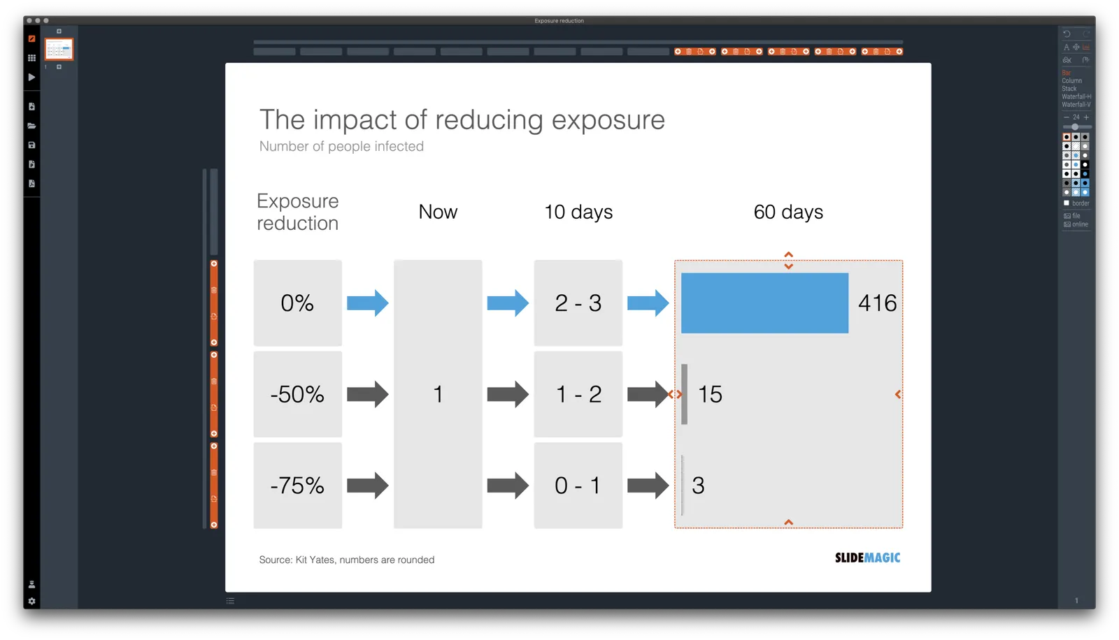
In the process, the designer forgot to clean up, and remove rows and columns that are no longer needed. In SlideMagic, you can get rid of them with a few clicks and your entire diagram or table will scale up instantly, in the right proportions.

Yes, you gave up some white space around the edges, but overall the chart is more practical. To make things calmer, consider cleaning up data and text in the cells of your diagram instead.

·Concepts

Example: COVID chain of infection

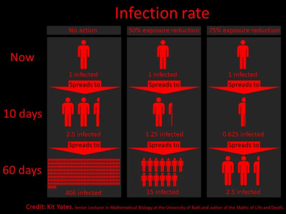
A slide came flying by on Twitter:

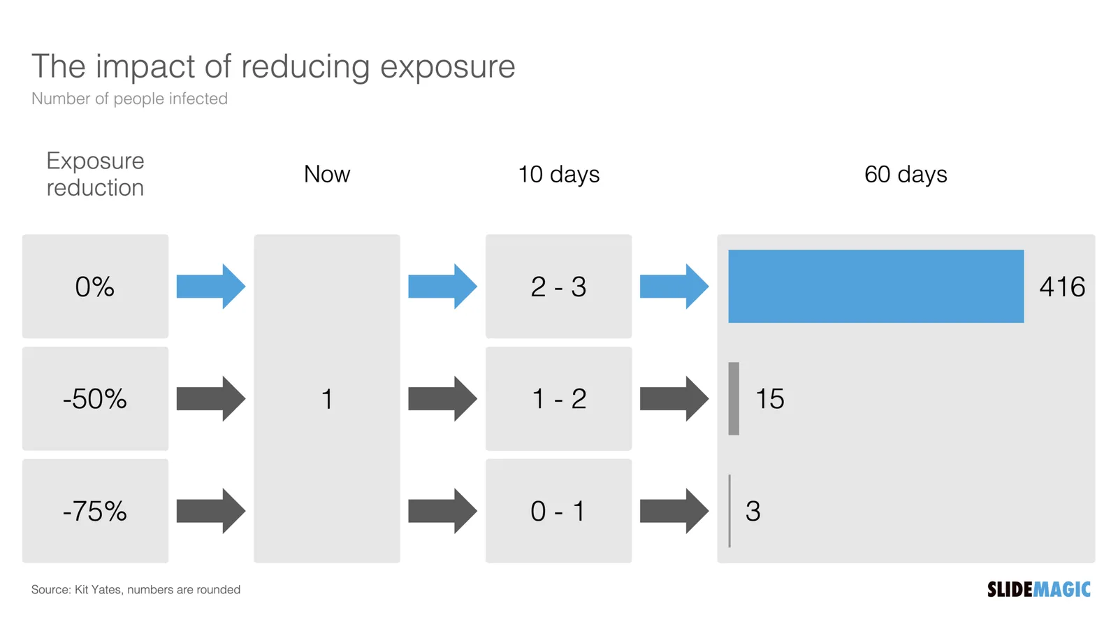
I might a quick remake of this slide in SlideMagic, in line with the SlideMagic philosophy: quick, clear, nothing too fancy (= time consuming) and added it to the SlideMagic template database since it could be a useful basis for any slide that needs to show some sort of chain of events.

What did I change?

  • Removed the low-contrast red on black colours
  • Took out the simplistic icons and replaced it with no-nonsense clear numbers
  • Rounded up numbers so to avoid cut up people (audience is not hard core scientists)
  • Put in a proper bar chart to show the magnitude of 416 vs 3, instead of an icon count
  • Flipped the design left to right to make the flow in time more clear

This slide demonstrates how easy it is to line up bars of a data chart, arrows, and text cells of a table in the overall slide layout (an absolute pain on other presentation design software).

·Layout

Bullet point alert

Bullet point slides are a no-go, they are boring, hard to understand, and look ugly and SlideMagic tries to discourage you from making them.

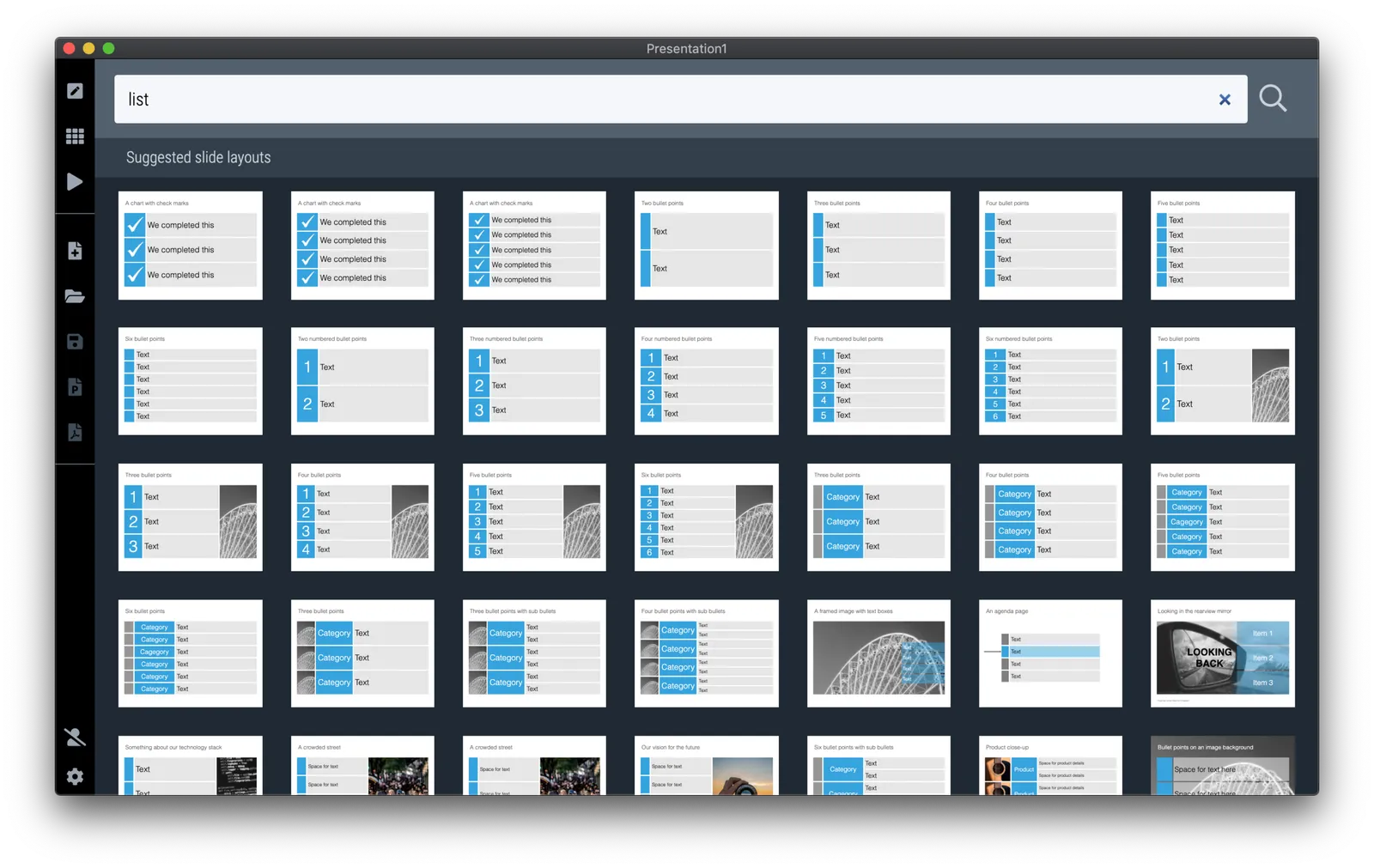
Still, SlideMagic is not dogmatic and recognises that there will now and then be an occasion where you need to put 3 things on a slide (agenda items, next year’s strategic priorities, the fact that your product is faster, cheaper, and lighter). In the SlideMagic desktop app search for “list” and you are presented with lots and lots of list-style templates (yes, bullet point slide templates).

But in these templates, each list entry is a new shape, a new row, to make the slide visually more appealing. And SlideMagic’s grid engine makes it super easy to add and delete rows. If the message of your slide is “we need to do 3 things”, one of these templates will do the job perfectly to communicate that.

Often though, bullet points creep in when you are not really designing a list-type slide. “Ah, where do I put these points as well?” The points are not important enough (are they?) to merit a new slide, or drastic surgery to the layout of the slide. You end up adding a few quick dashes to a text box.

The moment you have to resort to this emergency bullet point solution, it should trigger an alarm bell. If it looks like I should change the fundamental slide layout, or even create a new slide, maybe you should…

·Data visualization

Architecture diagrams

I am starting to experiment with different chart types in SlideMagic. One experiment: IT architectures that consist of users, servers, databases, clouds and lots of lines.

The built-in icon search, combined with the new line drawing feature does a pretty good job actually. And while SlideMagic is not a dedicated tool to design network architectures, it might actually force you to make better architecture diagrams in presentations. Let me explain.

Detailed network diagrams have the same problem as detailed spreadsheets when it comes to presentations. They are project work tools to run analysis and plan work, they are not tools for communication. When I need to make a data chart, I always disconnect from the spreadsheet and resist the temptation to copy-paste. Instead, I pick the 10 numbers that matter, round them up to the relevant precision, and plop them in a very simple bar/column chart that tells the story.

The same is true for IT architectures. If you want to present an architecture overview on a slide, that slide needs to be understood almost immediately when putting it up (like all slides in your deck). If tangled connections, boxes, servers make that hard, then the only thing your slide communicates is that your architecture is complex, not much more.

Again, disconnect from the working papers. Think about your message: ‘my architecture has 3 layers’, ‘my system connects the systems of 15 suppliers’, ‘my system is entirely on premise’, whatever that message is, make a simple chart that supports it.

Continue reading →