Version 3.1.8.
I deployed a new version of the SlideMagic app today with security updates. The server was patched too. Please let me know if you experience any issues.


Frequent updates about all things presentations since 2008. Subscribe to never miss a post.
I deployed a new version of the SlideMagic app today with security updates. The server was patched too. Please let me know if you experience any issues.
When quickly putting a draft presentation together, it is tempting to not spend any effort at all on design and layout. “We can always fix that later”.
I would argue the opposite. Make the draft look as good as the final product will be. It sets the entire mood for the project. Looking at messy / ugly charts is not a big motivation to do great work. Messy / ugly charts encourage people to add bullet point and too much text, because you can always remove it later.
The good news is that a simple chart with simple content does not take a lot of effort to design properly. Fix proportions, alignment and colors and everything looks great in a few clicks.
(Pro-tip: use SlideMagic for your draft documents)
This post on the F1 Instagram account has an interesting solution to the labels of a data chart:
The advantage is that this enables you to make the column graph taller as a whole (no need to budget extra space for the labels), and it is easer to put a background image as most labels (in tall columns) have enough contrast against them.
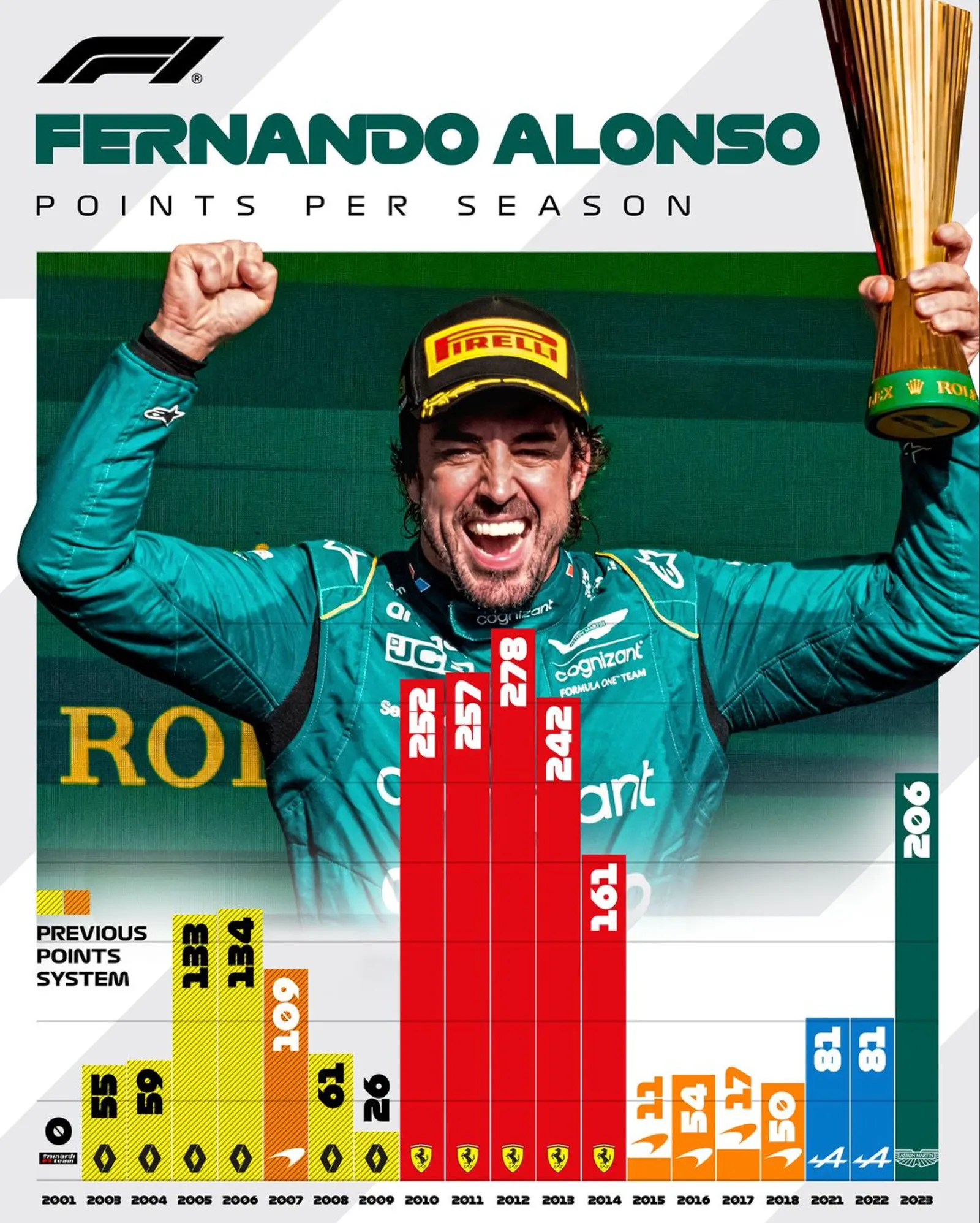
The vertical orientation of the labels though…
See below a screenshot of a news article discussing a pipeline review of a pharmaceutical company. Some drugs will be cut and the editor added an image of a worker chopping a tree.
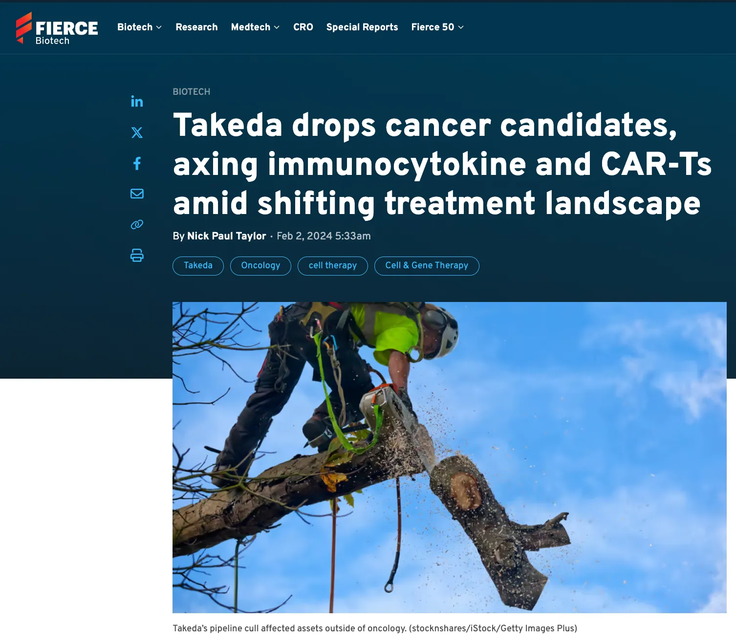
Not sure about this. For this type of publication and news, another cliche image of the main entrance of the corporate building with a big logo might have been more appropriate.
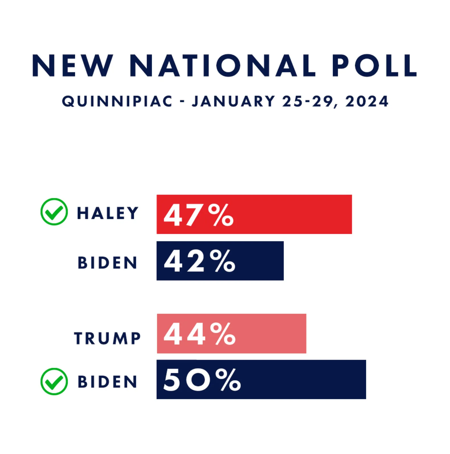
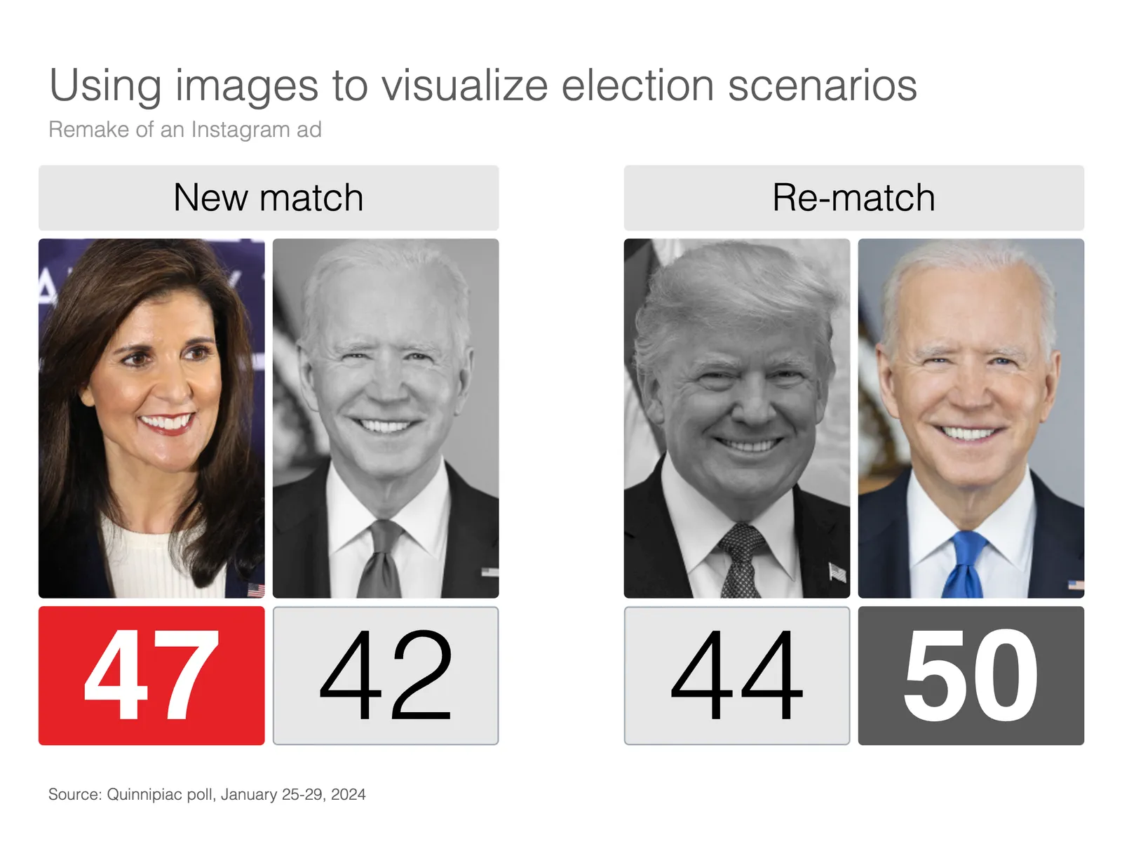
Here is an attempt to redesign a Nikki Haley Instagram ad. I removed the bar charts (with the skewed axes) and added images to make the viewer really visualize the 2 scenarios.
I added the following slide to the SlideMagic library, search for “Biden” in the app and it will show up. Alternatively, find it here for download. Pro subscribers can convert slides to PowerPoint.
I am doing a number of service updates to the plumbing of SlideMagic to keep things secure. You might be logged out in the process. If things are not behaving normally, please log out and back into your account. Sorry about this.
I have not been posting for a while here. As you know, I am based in Tel Aviv, and the attacks of October 7 made it impossible for me to continue and write a frequent “happy blog post” as if nothing happened.
This blog is about presentation not politics, so I won’t start a discussion here that repeats what has already been said everywhere. When reading and listening to all these opinions, keep this in mind: everything changed on October 7. Whatever you thought on October 6, needs to be reevaluated and reconsidered. Old narratives don’t work anymore. Whatever side your on.
I am continuing to work incredibly hard on my other startup in the medical field, where I try to tame “chatty” generative AI bots to provide disciplined and structured information which is not obvious at the moment. The results are actually very promising.
My blog was always about spontaneous ideas that came up during my work in presentations that go online without much though or planning. I spend a little less time in the world of presentations at the moment, but will try to start posting again slowly. I also owe users a few bug fixes in SlideMagic.
ChatGPT is good at writing fluent text because there is lots of quality text around on the Internet to train it on. Most text online is at least grammatically correct, and a subset of online content is of some decent quality at a story level (books, reports, professional news websites, etc.) . Midjourney can make up great images because there are lots of images around to train it on, they do not even have to be that good in terms of composition, the pixels in an image add up to an accurate representation of something.
Now with presentations though…. There are fewer of them around online, and most of these are actually not that good. Even if you were to feed let’s say McKinsey’s entire archive of decks into an AI model, would it be able to produce a McKinsey-style deck based on a prompt? Maybe. But the result would be a consulting-style, dense document, not an engaging pitch deck.
In 2023 the power of ChatGPT is not in automating extremely complicated tasks, but taking out the daily hassle of smaller things. For presentations, one of my favorites are translating long-hand text into tables of short points. “Please summarize the pros and cons of both options discussed in the following text”. What you get back ia a bird’s eye view of all the elements of the story. Often, the first thing an old-fashioned presentation designer does on a piece of paper.
Below is an interesting chart from McKinsey. It combines a column chart with a line chart. The chart only works when a column has a reasonable size though.
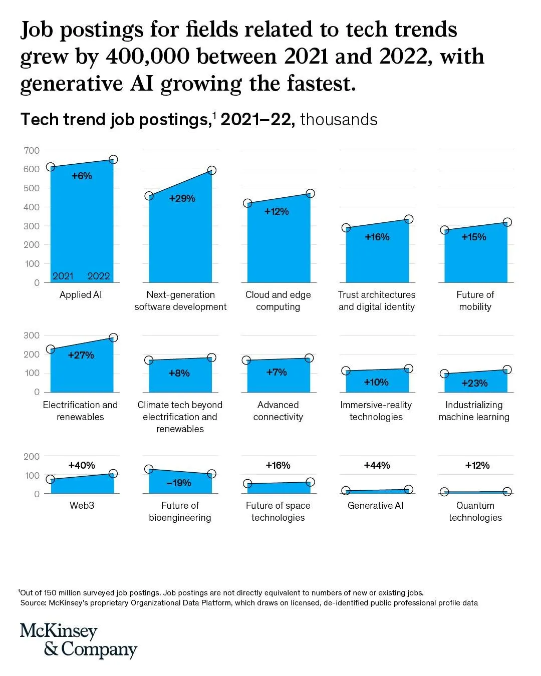
I am not aware of any presentation software that can produce these (including SlideMagic), so this might have been bespoke illustration work.
Link of the original post.