

Blog post

Combining column and line charts

September 11, 2023 ยท by Jan Schultink
โ† all posts

Below is an interesting chart from McKinsey. It combines a column chart with a line chart. The chart only works when a column has a reasonable size though.
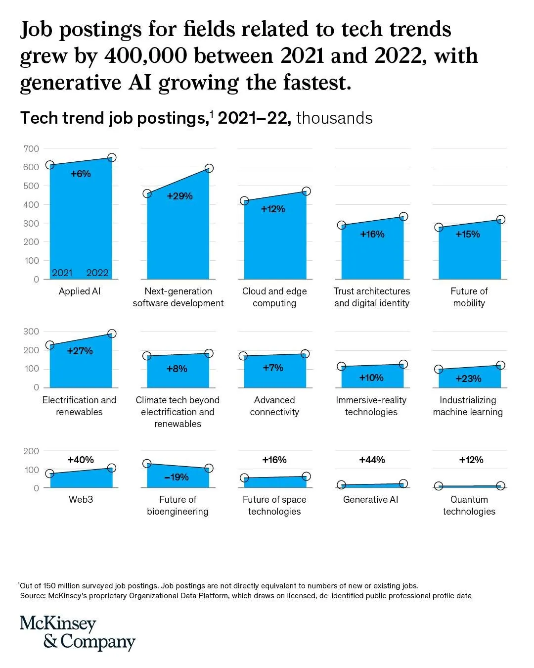
I am not aware of any presentation software that can produce these (including SlideMagic), so this might have been bespoke illustration work.

Link of the original post.

Data visualization

About this blog

Notes on all things presentations โ€” design, storytelling, and AI workflows.

Subscribe now to never miss a post.

RSS

About SlideMagic

A platform for business presentations.

A free student plan is available.