SlideMagic Blog

Frequent updates about all things presentations since 2008. Subscribe to never miss a post.

RSS
·Images

Adobe Firefly review (AI in Photoshop)

Firefly is Adobe’s stab at generative AI. I had a quick look at it an and am pretty impressed.

Most current AI image generators make either very cute artificial / fantasy / cartoon style photos, or allow you to create crazy / unreal compositions. For example: creating compositions you would not normally see (an elephant riding a bike), or mixing styles (the US president soloing on a guitar in the style of Van Gogh).

Adobe Firefly is more useful. You can extend backgrounds on existing images, or position objects in pictures. Below are some of my efforts to add a purple cow to an Alpine background.

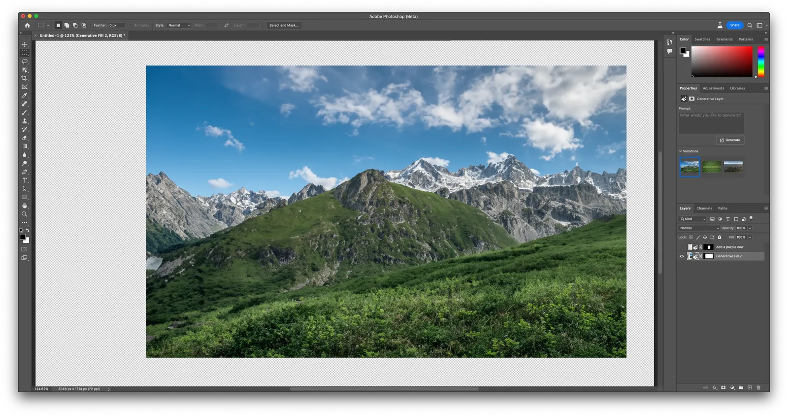
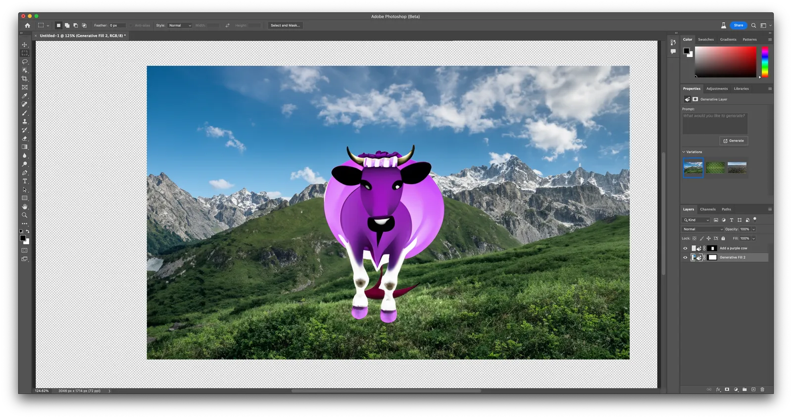
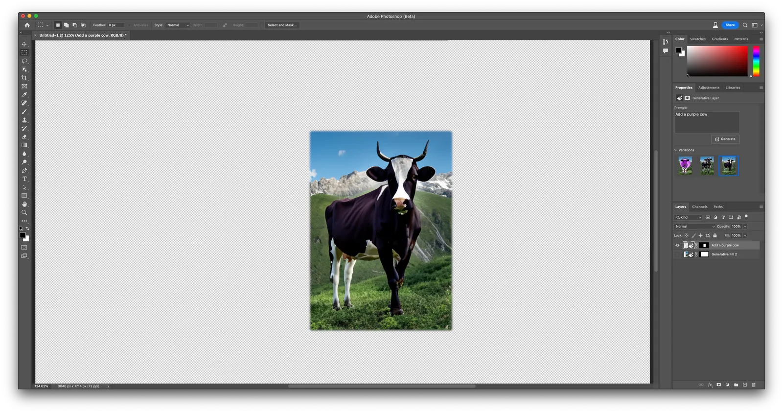
Here is a basic background. You can now add an object in it. This is the first result after prompting “purple cow”

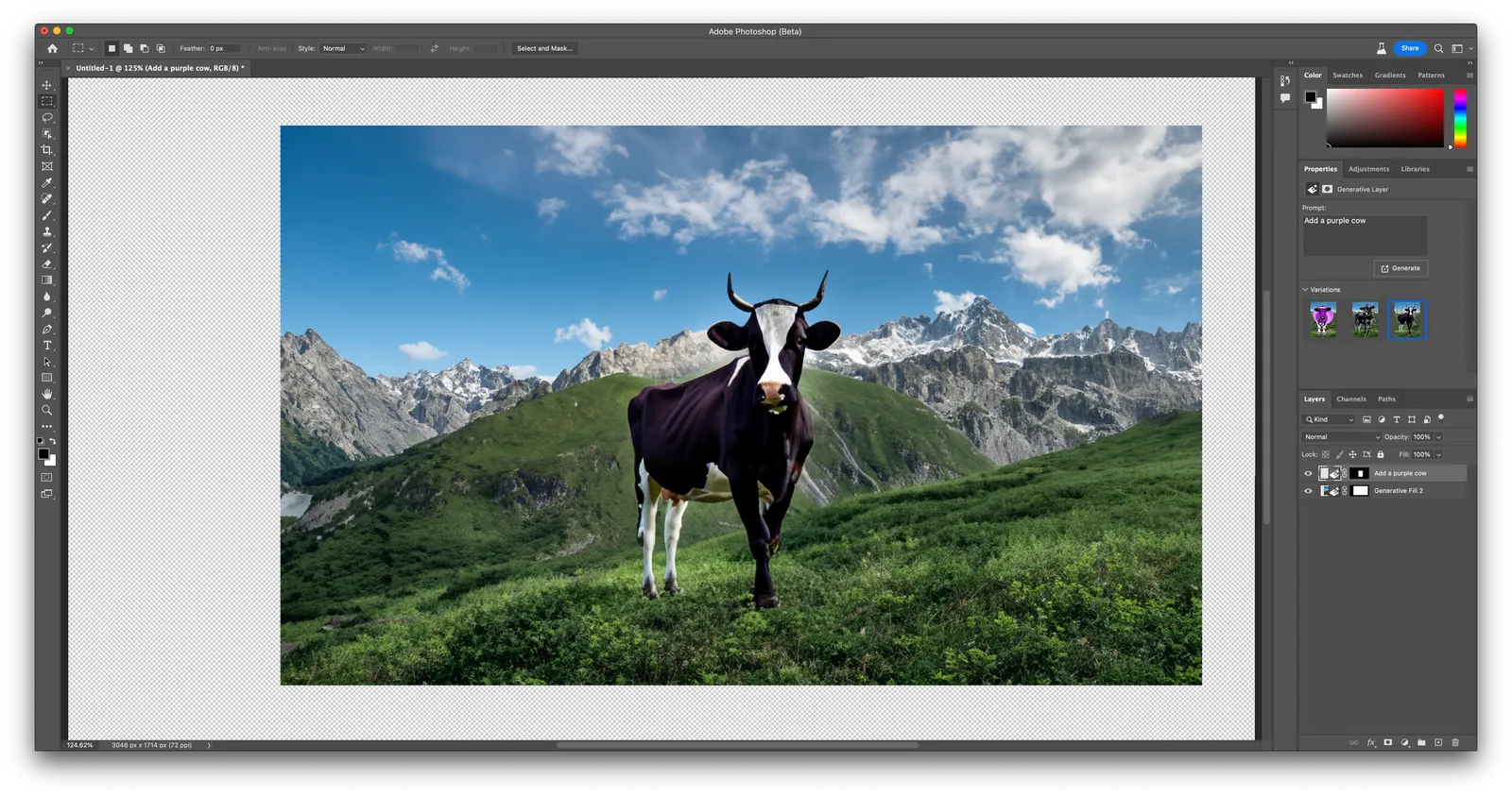
The placing of the cow is very good, the purple cow itself is totally unrealistic, probably because “purple cow” in itself is not a concept that is very common. You can select alternative versions of the cow that are more realistic (and less purple):

It’s pretty good (although not perfect). Here is the layer that the app generated on top of the background image (I disabled the background layer)

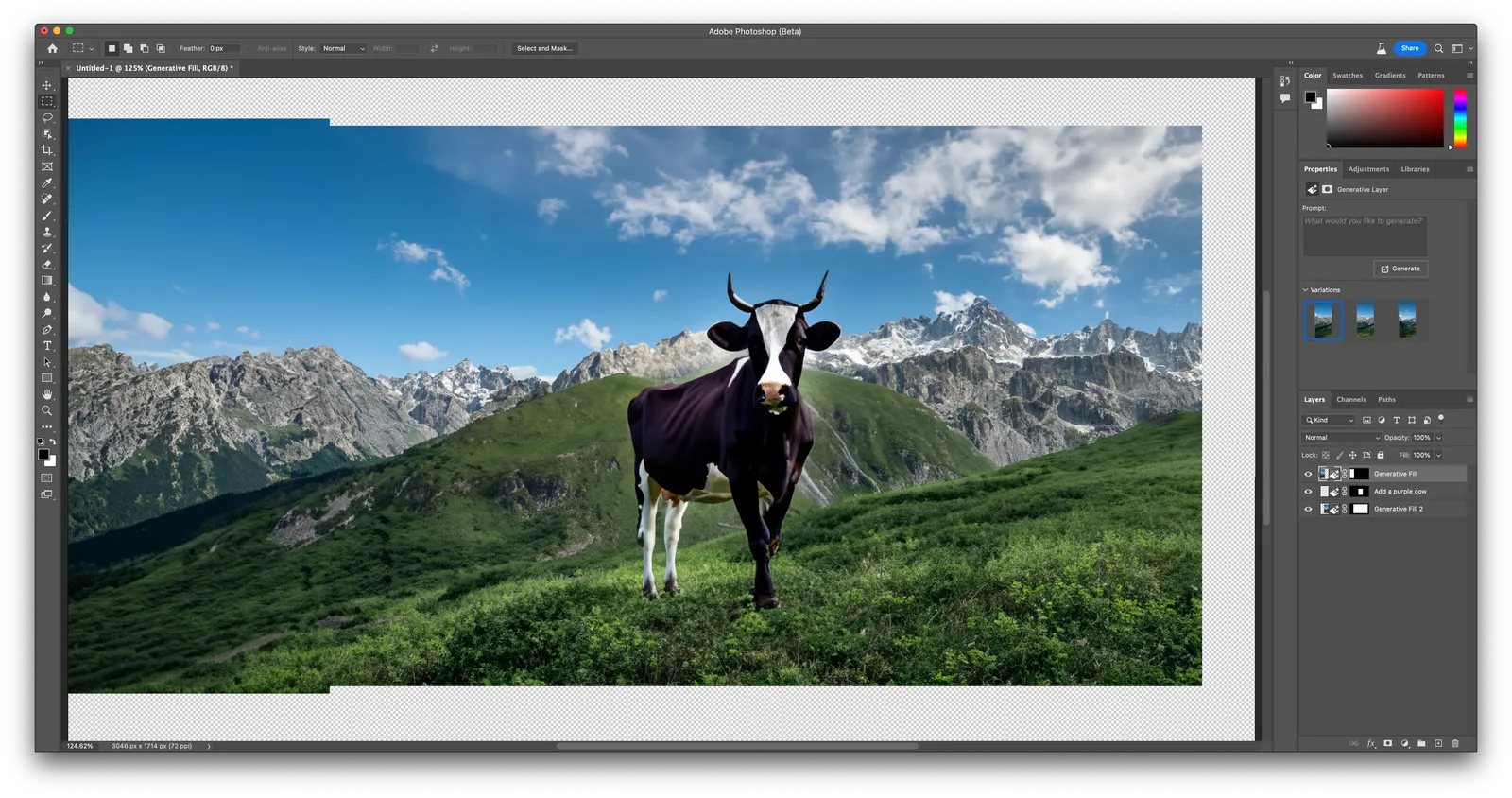
The best feature of the app might actually be the extension of backgrounds. See the example below, the area to the right was added automatically.

Firefly is part of a beta version of Photoshop (it will soon appear in other Adobe apps as well), and as a result requires a bit of Photoshop skill to use it (which will be a drawback from many). You can also access its features via the web interface. Results are pretty good (you can see that Adobe is very good at separating the foreground and background of the image), but the style is still slightly cartoonish.

Continue reading →
·Layout

About titles

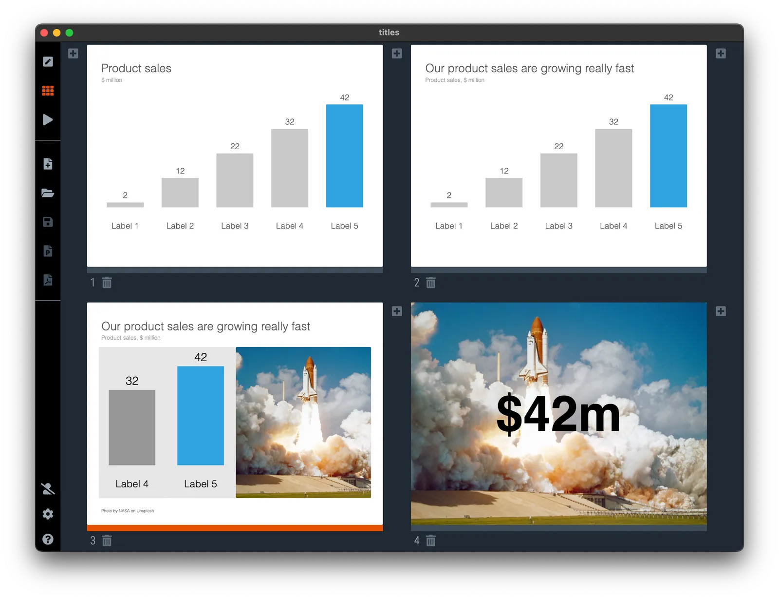
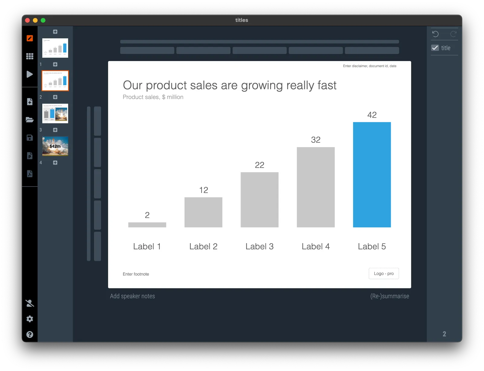
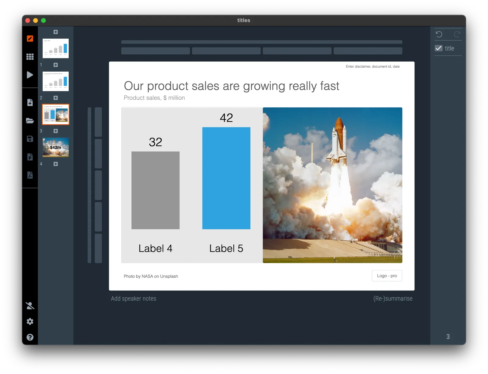
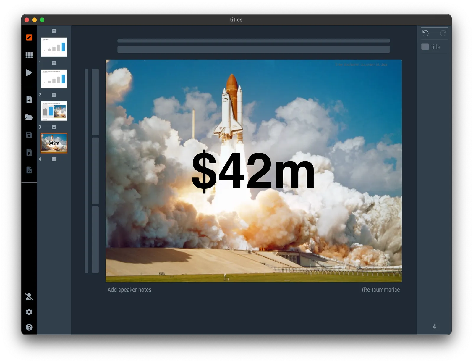
There are a number of ways you can, or cannot, use titles in your slide. See the examples below. (RSS subscribers might have to open the post on the web to see images).

The classic way is a basic description of what the chart is showing.

The management consulting approach is the message title: write out in a sentence what the chart is supposed to say, and put the description and unit of the data in a subtitle

You can spice things up with an image

And with full image slides, the traditional title does not actually really matter anymore. You can place text anywhere on the image to get your point across. If you are presenting live, you can even omit the exact description of what you are showing

·Delivery

DDD compact discs

Back in the 1990s, compact disks would show a so called SPARS code. A series of 3 letters that could either be “D” for digital, or “A” for analogue. “DDD” indicates digital recording, digital mixing, and digital mastering.

My late mother in law had a huge classical music CD collection and I would browse it to find a CD to play, when given a choice “DDD” would be my preference since it was clearly a recording of the highest quality.

My mother in law would answer that this was actually totally irrelevant. What matters is the conductor and/or solo artist that delivered the performance. A poor quality AAA recording from the 1950s might have been the best rendering of a particular piece of music ever.

There is an interesting parallel here with presentations: the actual performance and the supporting slides.

Image By Attosaur - Own work, CC BY-SA 4.0, source.

·Story

The case against recycling...

… of slides.

It takes time and effort to create a good presentation. So when a next meeting comes up, it is tempting to borrow from a previous presentation that was already created. And typical presentations that are readily available are:

  • Investor presentations of the last fund raising round
  • Board presentations
  • Product / sales presentations

We recently needed to pitch a tailored, one-off, joint service offering with a strategic partner. The first draft of our presentation:

  • About company A (lots of slides, with an investor presentation flavor)

    • The market need for what company A does
    • The generic solution of company A to solve this market need
    • The team of company A
  • About company B (lots of slides with a product presentation flavor)

    • The technology of company B
    • The results and achievements of company B
  • What company A and B can do for you (1 - 2 slides)

Basically 2 generic company introductions, with a few minutes left to talk about the joint solution we were pitching to the client. We changed things around to focus almost everything about the specific problem of the client, and the company introductions were reduced to appendix background reading.

The stars from Unsplash

Be careful when using free images of people from Unsplash. Some of these have be come really popular. Marlene R. on a web site that rents ski and mountain bike gear, has the exact same head shot as Vignette F., one of the demo users of 9xchange.

You can find the image here: photo by Edward Cisneros on Unsplash. It shows up on page 1 of a search for “woman portrait”

·Creativity

If AI gives poor results...

…when you prompt it to generate your presentation, maybe you are on to something new! AI generators predict what to write based on information it ingested before.

Now what if your AI generator comes up with a brilliantly written pitch?

·Software

Finally, a color picker...

A feature that was long overdue: today we added a color picker to the SlideMagic settings page. Better late than never. Click on the big bar to reveal the pop up. If you want, you can still enter RGB codes. With the eye dropper, you can now sample colors anywhere on your desktop. Make sure to have V3.1.7 installed to use this feature.

(Proud of my daughter Mia who insisted to put this in, and actually wrote the code to do so herself)

·Software

Two more AI generators

I added 2 additional AI generators to SlideMagic, the produce a slide with some text and an image based on your prompt. One generator pulls the image from Unsplash, the other creates it from scratch. There is no update to your SlideMagic app needed to see the extra image generators.

See an example below:

·Layout

When (not) to hyper link

Clickable links are the fundamental building blocks of the web page format that was developed in the 1990s. In the early days of the web, you could spend hours getting lost in clicking the blue links in text pages. In modern web design, these pure text links are less useful though.

Sometimes I see them as a reference to a core element of the story. Our product has a key competitive advantage that helps drive our amazing financials<.ink>. He user who clicks links is leaving your story line flow. Seeing messages in the wrong order, tripping up a sequence of big picture versus detail, and is probably not returning to the point she came from.

Web design guidelines in the 1990s also prescribed not to add the work “link” to a URL, but rather put descriptive text: “the 1996 financial results” so that Google and other web search engines would index the page correctly. The result is a page where the reader never is completely sure where it ends up when clicking a URL.

How do I use plain text links? Mainly for references, in the same way academic papers use numbers to refer to relevant resources. A home page of a company, a link to a photographer for credit, download links for documents, references to previous blog posts. And often, I violate the 1990s guide line and call the link what it is, a link, so that the reader knows what to expect.

Back from the summer break

I just returned from my summer break and will start picking up blog posts again. (Looking at the date, this month is the 15th anniversary of this blog…)