AI images fixed
There was a small glitch in the AI image generator in the SlideMagic desktop app. It has been fixed. Log in and out of your account to get everything working again. (AI images are a pro feature)


Frequent updates about all things presentations since 2008. Subscribe to never miss a post.
There was a small glitch in the AI image generator in the SlideMagic desktop app. It has been fixed. Log in and out of your account to get everything working again. (AI images are a pro feature)
Need to make over a slide but don’t have access to the data in a graph? AI to the rescue. Upload a screen shot to an LLM and you get back pretty good estimates of the data values in the chart. It might not be scientifically 100% accurate, but good enough to recreate the graph in your own presentation software.
One of my big slide puzzles is usually a messy table of pros/cons of a product, or a competitive comparison. How to highlight the right dimensions. Make sure that one is not a sub point of another. Make sure that cells have short text in them. Make sure that text is roughly equally long in each cell.
GPT-5 is very good at this. Copy-paste the messy table into the interface, and the output is pretty useful. Something to integrate in SlideMagic at some stage.
Many confidential presentations often use disguised case examples of clients, potential investments, drugs in development. AI has become incredibly good at uncovering even the most vague ones. Before sending your deck, double-check them in an LLM to see what comes up…
Apologies for the click bait…
I have not been writing here for a while now as I am focusing on 9xc/9vc. But recently, as I am pushing further into the world of AI, all my pas experiences seems to be coming together: computer science, company analysis, presentation design, and hardcore biopharma science…So I might occasionally come back here.
The majority of “presentations” are documents that are used make decisions inside companies. They happen to have graphs and other visuals inside them, hence the word “presentation”. Most humans are not very skilled in writing a concise memo to make a point: hence bullet points in large font and visuals to the rescue.
AI could change that: boiling down these big slide decks to a few paragraphs with a decision that needs to be taken, pros/cons of alternatives, and the recommended way forward. No slides needed.
Most project presentations consist of slides ripped from the project working documents. Pages you used to learn and discover things to analyze and make conclusions. They are not the best visuals to communicate the project outcomes to outsiders.
Here is an alternative approach to make your final presentation:
This image will go in the history books anytime the election of 2024 will be discussed. Image credit: Evan Vucci , image analysis: David Altizer
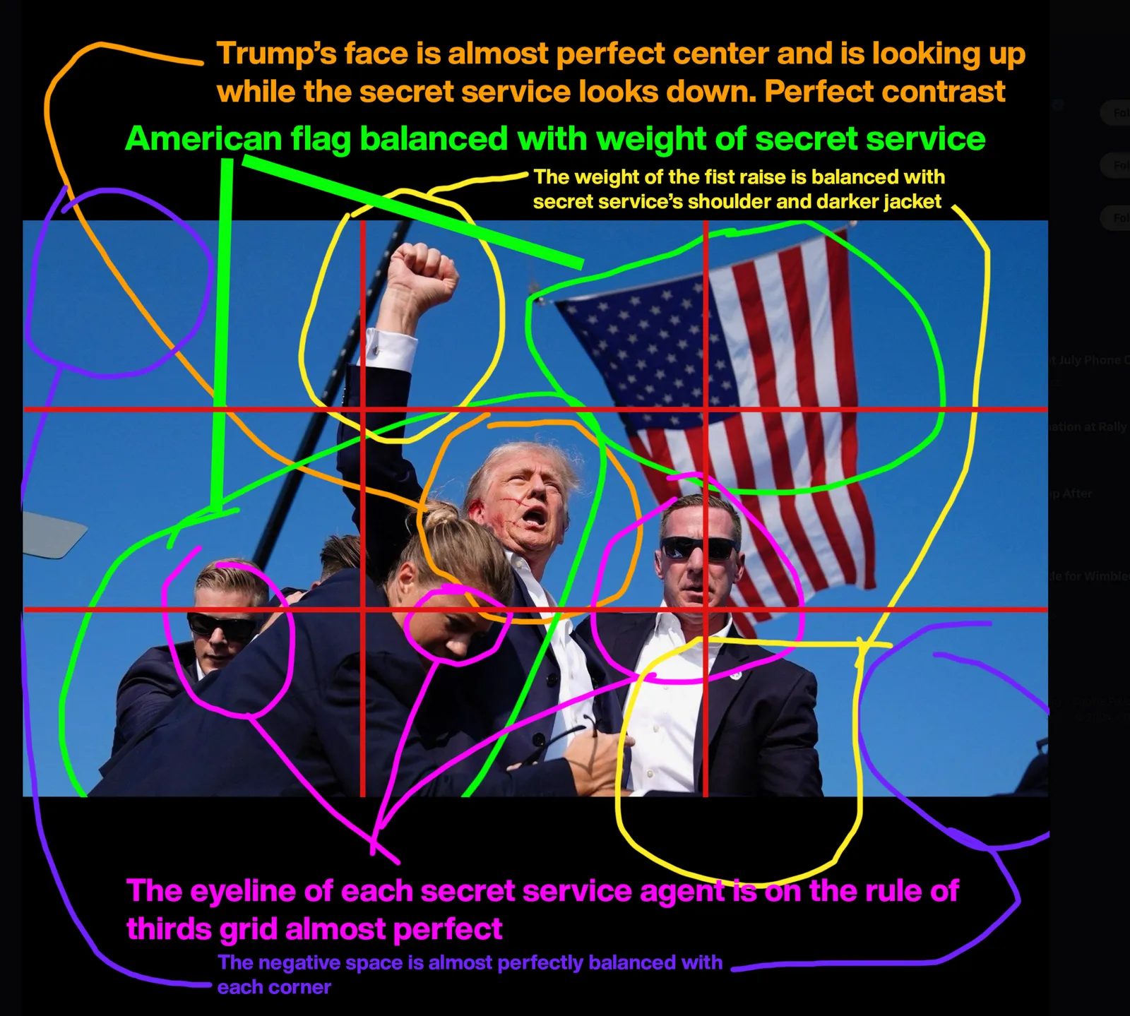
The trick here is cropping. A good photographer will have a good first start when snapping the image, but adjusting things slightly afterwards can add a lot.
Stock images can be cheesy and cliche, and the current AI image generators are trained on tons of stock images. So if you ask for an image using a stock-image-like prompt, you will get a stock image…
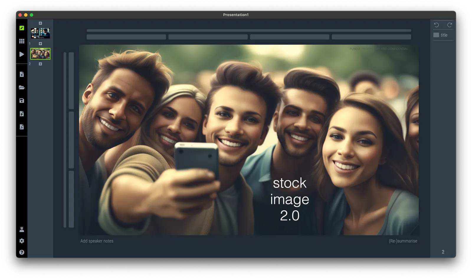
Stock images can happen to the best of us, above, SlideMagic had a go at “a happy group of young adults taking selfies”.
I saw the following slide coming by in my Twitter feed (original post):
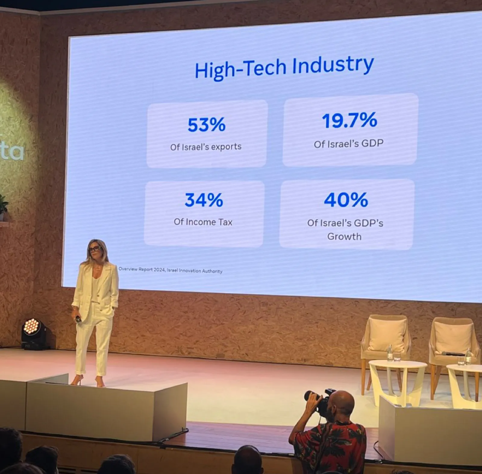
Here are some things I fixed:
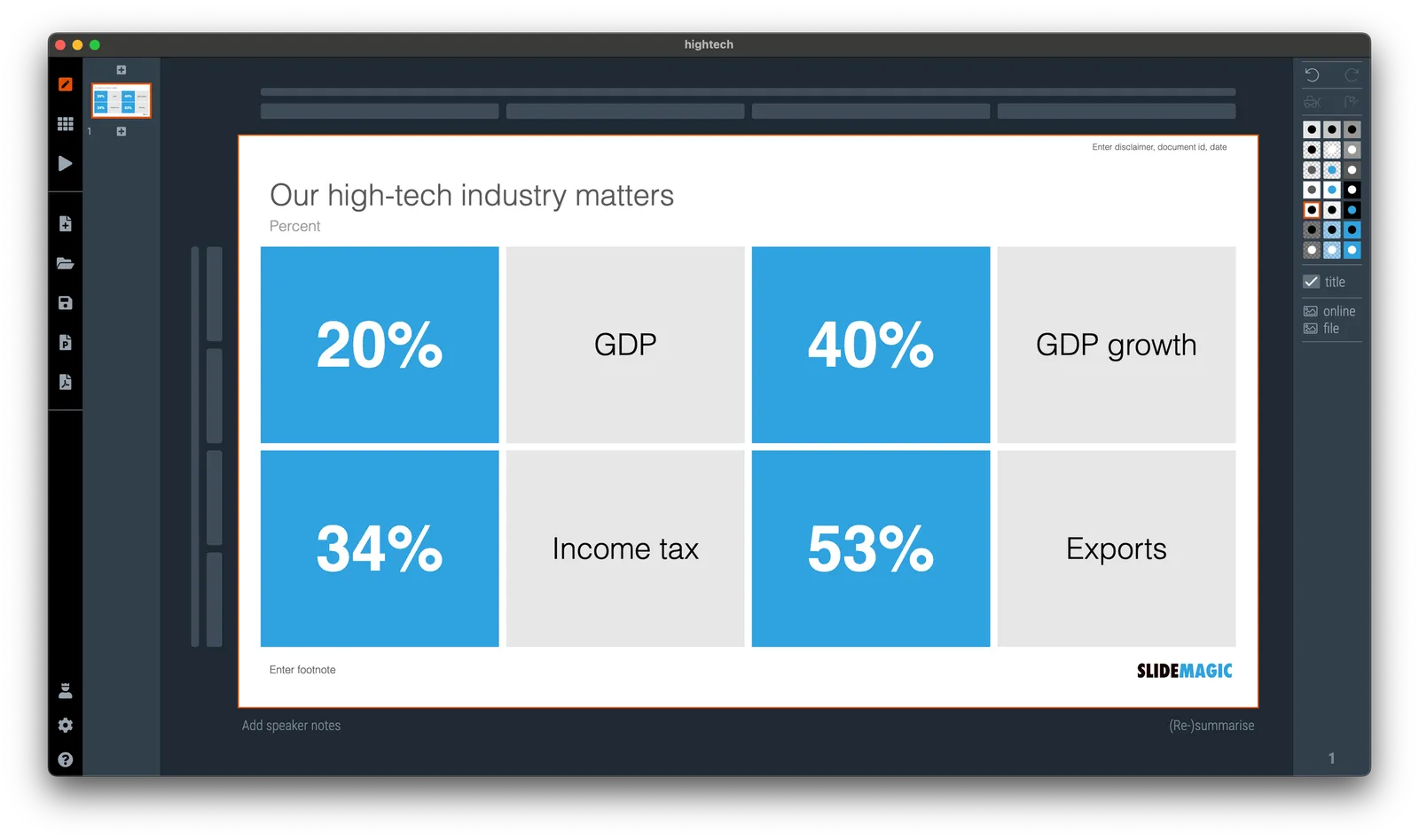
(For those of you interested in the political context: Israel is fragmented in many population groups, the Israeli high-tech sector which is mostly secular, pro-democracy, situated around Tel Aviv, and not really represented in the current government is making the case that it generates a big chunk of the Israeli economy and is bank rolling many other sectors.)
I am making updates to the server plumbing of SlideMagic, to ensure uninterrupted service, please log out and back in to the app. Apologies for the inconvenience, but this keeps everything safe and secure.