SlideMagic Blog

Frequent updates about all things presentations since 2008. Subscribe to never miss a post.

RSS
·Software

"I forgot how to do PowerPoint..."

Overheard in a conversation. “I used to create lots of PowerPoint decks 10 years ago, but would not know how to do this anymore today”.

Graphics designers need to learn how to use Sketch, InDesign, and yes, PowerPoint. Coders need to learn how to work with software development tools.

Twenty years ago, mastering presentation software was a skill. First, dedicated graphics designers and/or secretaries would translate hand-drawn designs into PowerPoint. Then, the junior analysts on teams started to figure it out.

Putting a presentation together is now as normal a task as sending an email: it is a required skill for everyone (from new recruit to CEO) without the need for extensive training. If training (or memory) is required, then it is a software problem. SlideMagic is trying to solve it.

·SlideMagic

Update: V2.5.19

I have been keeping a low profile here over the past week as I continue to improve the performance and stability of SlideMagic. I feel a bit like a construction contractor: putting up the house is easy with very visible progress, but getting those last tweaks done is time consuming and relatively below the radar work.

Under the hood things improve very well. The tool gets used more intensely now so every corner it will soon be tried and tested. I notice that I am fixing some of issues that are similar to the ones I encountered with PowerPoint’s public software releases (as an industrial user, I hit them first). My software development budget is a bit lower than Microsoft’s but we are getting there.

Photo by Cesar Carlevarino Aragon on Unsplash

·Data visualization

Stack charts with tighter grid integration

Stack charts are very useful. So useful in fact, that SlideMagic does not support pie charts (by design).

They are very easy to make in Excel, but using them straight in a presentation is tricky. First there is the overall formatting of the chart, then there is the legend which is never connected to the chart itself, and does not leave enough space for text other than ‘new’, ‘old’.

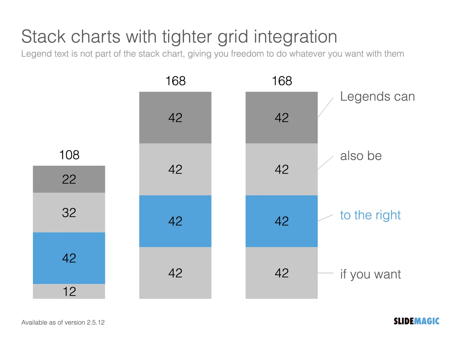
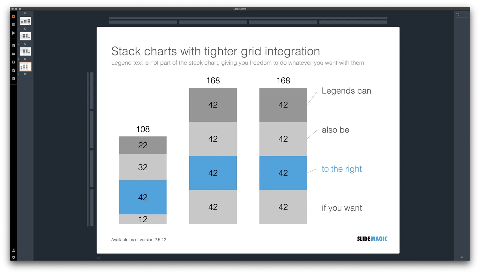
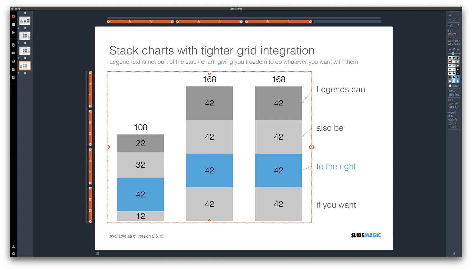
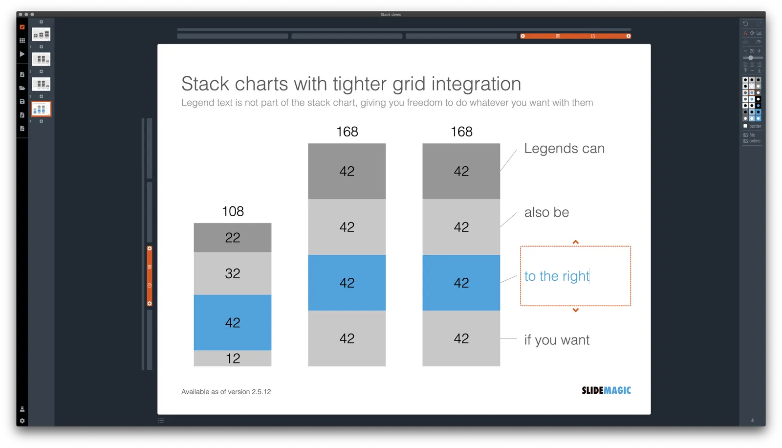
I just overhauled the stack chart in SlideMagic and forced to be tightly integrated with the slide grid. Adding/deleting rows to your slide will add/delete data series to your stack chart. Furthermore I have actually removed the legend from the stack chart shape itself, what is left is only the option to add lines that point to boxes outside the chart. This gives you total freedom to do whatever you want with the chart legend, small, big, or even huge text boxes. Everything lines up, you can even fit stack charts in tables if you want.

The charts below give you a sense of what the new engine does:

The old stack charts will continue to work in SlideMagic for the moment. If your charts have them, you can edit them. If you want to make new ones, click + and you can still make them. An old stack chart can instantly be converted into a new one by selecting it and clicking the icon.

Stack charts in the template database are still in the old format, I will convert them over the coming weeks to the new format.

Continue reading →
·Layout

A box for each point

It is really easy and quick to add bullet points to a text slide: hit return and start typing away, boom, you found a place for that other thing you want to say. Check.

SlideMagic does not support automatic text bullets, and you need to put each item in a separate box. Bummer.

This is by design. (Let me explain in a number of bullet points).

  • Boxes look a lot better on a slide than a list of sentences. The equal size and background colour compensate for different length of text content. Everything is always lined up and spaced out
  • More importantly: the box hurdle is a little ‘brake’ in your writing process. Do I need 3 or 4 boxes? Should the points be one, or multiple slides? Are the points equal in weight, or is one a sub point of the other?
  • The list is hardly ever the post visual layout for a slide, maybe boxes should be lined up next to each other, centred around some central box, go up, go down? When writing text lines, you are not even considering these layouts.

When designing slides, I spend most of my time thinking about the layout, the amount of rows and columns in the page and how everything fits. Once that is settled, the rest follows. I want you to do the same.

Photo by 🇨🇭 Claudio Schwarz | @purzlbaum on Unsplash

·SlideMagic

Regenerating the PowerPoint slides

For subscribers who are using SlideMagic to download PowerPoint templates only: I have re-run the conversions of the entire database to solve some issues with arrows not being rendered correctly. All should be working fine now, let me know if you still find a slide that does not download correctly.

Pro-tip: try the SlideMagic app, a much more convenient way to work with the template database, convert to PowerPoint (if needed) as the very last step in your workflow.

·Data visualization

Creative with bar labels

Below a screenshot from an Economist instagram post:

The labels of the first 2 bars have been placed over the bars themselves to save space: there is now more room for the bars themselves. Other labels to the right of the bars.

I am not a fan:

  • The white over red of the top labels is hard to read
  • There is no nice and simple list of the top players, aligned in a consistent way
  • The names inside the chart area makes it harder to relate the bar to the axis
  • (I also prefer to put data labels in the chart rather than having a very imprecise value axis)

Here is a quick illustration of a bar chart in SlideMagic (The Eonomist did not provide the exact values, hence the dummy data).

·SlideMagic

A dedicated browser

Many people are surprised that SlideMagic is a desktop app. “Hey, it is 2020, not 1995?” Well, the SlideMagic desktop app is a bit different than the things you would run on your machine in 1995. It updates frequently (sometimes daily), and constantly is in touch with the slide data base server. I would actually call it a “dedicated browser”: a front end for the SlideMagic server with features such as dropdown menus and drag/drop between multiple windows that you cannot find in a regular browser.

People agree that on phones and tables, a dedicated app gives a better experience than a web page. The same is (still) true on a desktop.

Photo by Ilse Orsel on Unsplash

·Layout

Use the whole page

White space is a good thing in design. It makes text breathe, the whole page looks calmer somehow.

This applies to business presentations as well. Cut text that is not required, make images as big as possible, and your slide starts to look like a well-designed ad on a billboard.

However, in some cases, a business presentation slide is not meant to be a fashion ad. Think of the sales target data for the next quarter, or the new IT system architecture that you need to get approved. What I often see in SlideMagic is a “left over battlefield” with the final product of a complex table or system diagram. After many iterations it finally looks like it should look and everyone agrees to it.

In the process, the designer forgot to clean up, and remove rows and columns that are no longer needed. In SlideMagic, you can get rid of them with a few clicks and your entire diagram or table will scale up instantly, in the right proportions.

Yes, you gave up some white space around the edges, but overall the chart is more practical. To make things calmer, consider cleaning up data and text in the cells of your diagram instead.

·Project management

Final final final final versions

Unlike in the case of a printed book, digital documents are never finished or final (despite being called “final version v3 - final”). Instead they have “committed versions” like programmers use when working with git to manage iterations of code. For most presentations these committed versions are documents you deemed good enough to share with someone at some stage in the project. That’s why the email sent box is becoming the new file archiving system. (Where is that document I sent out last week?). Sent it, or it did not happen.

Photo by Ben Wicks on Unsplash

·Concepts

Example: COVID chain of infection

A slide came flying by on Twitter:

I might a quick remake of this slide in SlideMagic, in line with the SlideMagic philosophy: quick, clear, nothing too fancy (= time consuming) and added it to the SlideMagic template database since it could be a useful basis for any slide that needs to show some sort of chain of events.

What did I change?

  • Removed the low-contrast red on black colours
  • Took out the simplistic icons and replaced it with no-nonsense clear numbers
  • Rounded up numbers so to avoid cut up people (audience is not hard core scientists)
  • Put in a proper bar chart to show the magnitude of 416 vs 3, instead of an icon count
  • Flipped the design left to right to make the flow in time more clear

This slide demonstrates how easy it is to line up bars of a data chart, arrows, and text cells of a table in the overall slide layout (an absolute pain on other presentation design software).