SlideMagic Blog

Frequent updates about all things presentations since 2008. Subscribe to never miss a post.

RSS
·Layout

How to crop headshots in your presentation

The ideal design for a slide that shows your team is a group picture, all taken together. Unfortunately, these are almost impossible to produce. Teams change, and people are hardly ever in the same room (especially now with the virus).

The next best thing is a collage of headshots. Professional graphics designers have a specific approach to line these up properly:

  • Make sure that the eye line of all the head shots is more or less the same (at 25-33% of the image height
  • Make sure that the sizes of the heads are more or less the same

In PowerPoint and Keynote, this is an absolute pain to do. Getting different images to have the exact same size is tricky. Cropping images to position eye ines is tricky to do, and might undo part of the work that you did to get them to be all the same size.

In SlideMagic, things are easier, because it works with fixed shapes and smart cropping.

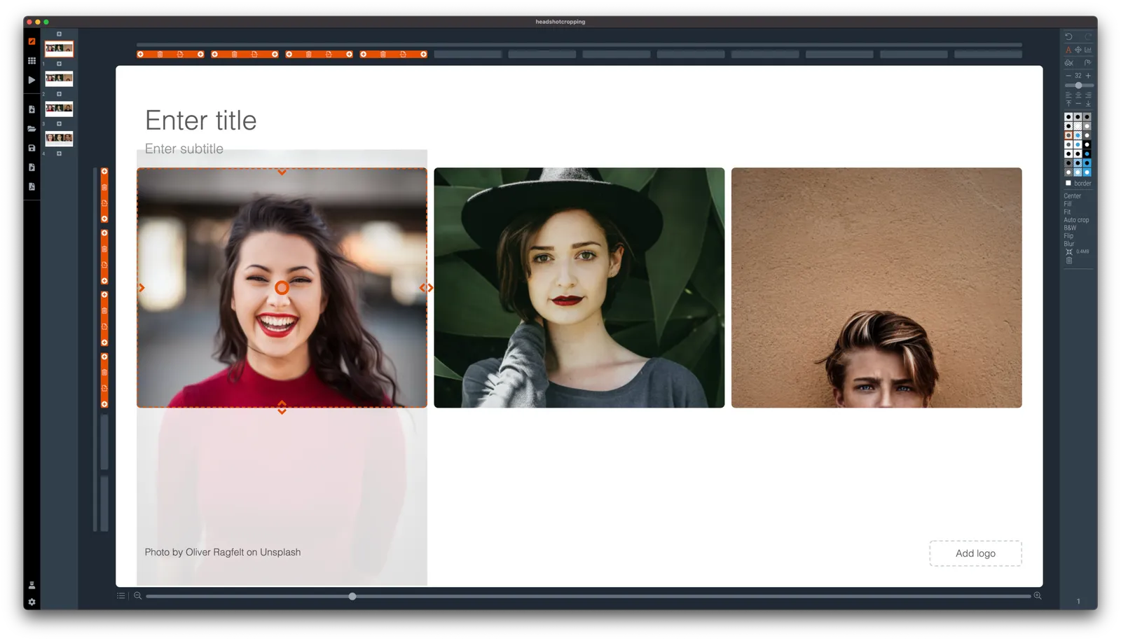
Below I plopped in 3 portrait images from the built-in image search engine of SlideMagic. In 2 of the 3 cases, the “AI” smart cropping algorithm did already a reasonable job, in the last case, totally not. But first things first, all images have the exact same size, and are spaced out absolutely perfect.

Next, we are going to drag the central dot at eye level for each of our team members and drag the images inside their boxes so the eye lines line up.

Continue reading →

SlideMagic, now with "Artificial Intelligence"

SlideMagic is getting smarter. As of version 2.6.4, the software will analyse images before pasting them in a slide and suggest a good crop, taking into account what’s in the image (which you can always change and override later). if your image is in “auto crop” mode, it will continue to adjust things when you change the aspect ratio of your slide, or make changes to the slide layout.

For example, if you start of with a 3 x 1 grid of images and move to a 5 x1 one (you added two new members to your team for example), the images will have a narrower aspect ratio. SlideMagic now tries to re-crop your images automatically to make sure everything lines up properly.

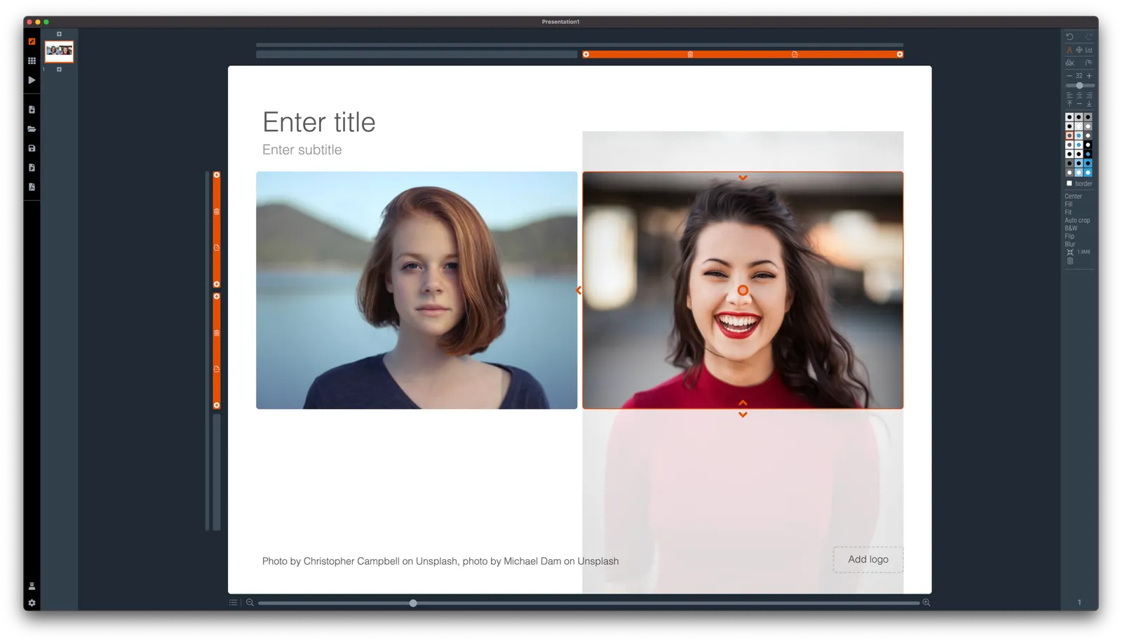
Below is a search result when you search for “portrait” using SlideMagic’s built-in image search engine. Various images show up in different aspect ratios. See what happens when you select one with a horizontal and vertical aspect ratio. SlideMagic puts them both more or less correct in the shapes of the slide. (The crop is pretty good, the sizing of the headshots could be slightly more uniform, you can fix this manually by fine tuning with the zoom slider).

Auto cropping is not always perfect, but at least I have put in the infrastructure in place now to upgrade its capabilities over time. Results are best with images with a very strong separation between the subject in the foreground, and the background in which it is placed.

·SlideMagic

New focal cropping now out of beta

I released version 2.6.1 as a regular SlideMagic app update, which includes the new focal cropping image rendering engine. I have been testing it extensively over the past few days and things are working smoothly.

If you are working on slide decks that you made a long time ago with SlideMagic, briefly check whether the image positioning is exactly as you intended it to be. (Including a possible logo image at the bottom right of the slide). An image that you thought was cropped “fill” or “fit” might just show a tiny gap around the borders. Hitting “fit” or “fill” again should solve the problem.

·Layout

Seth Godin chart make-over: Venn vs. 2x2

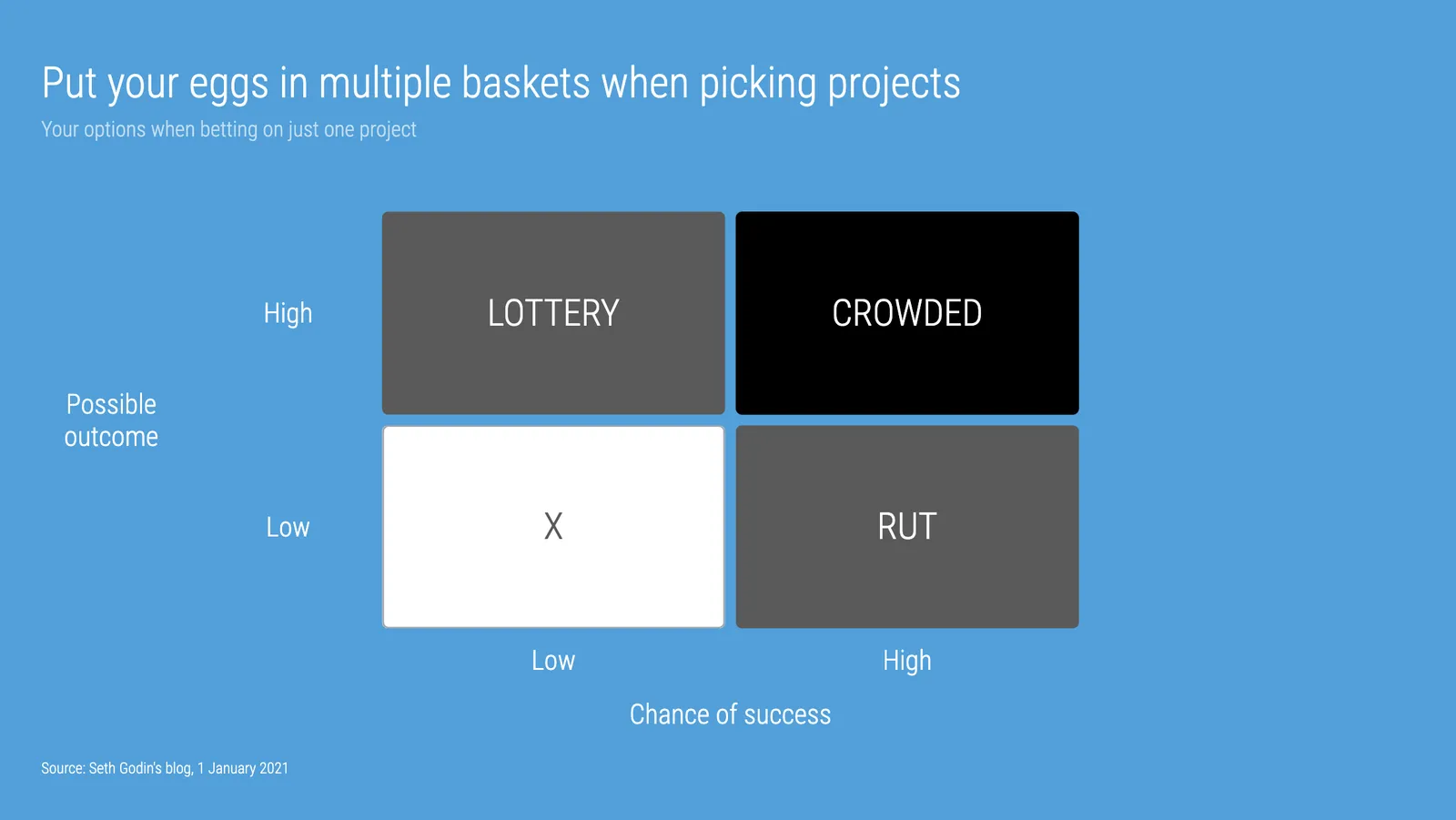
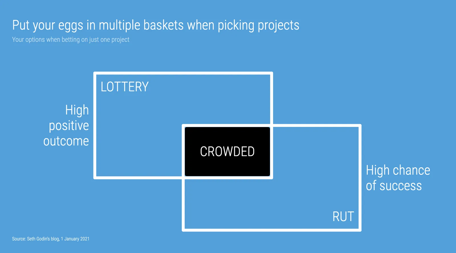
Seth Godin opened the 2021 blog with a post that argues not to put all your eggs in one basket when it comes to picking projects. (You could argue that my own bespoke presentation design projects fit in the “rut” category, and the SlideMagic software is a “lottery”, but on balance the risk of the overall portfolio is small with an option to win the lottery, even if it is modest).

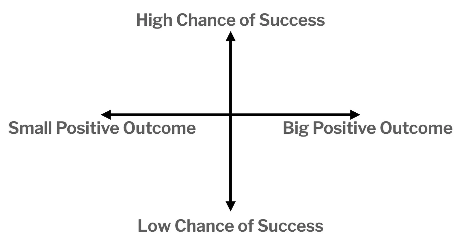
To illustrate his point, he used a 2x2 matrix.

The 2x2 works, but when looking for these type of charts consider a Venn diagram as well. In many cases, the low-low option is not really realistic (in this case picking projects with a low probability of succeeding, and with a low potential upside).

I added 2 charts to the SlideMagic database to show the 2 options, in a different colour scheme this time. Download them from the web or search for “seth” inside the desktop app to access them.

·Layout

Weave effect in slides

See the slide below. A weave effect shows how vertical and horizontal things are interconnected (in this case stuff I did back at McKinsey). It is impossible to weave shapes in programs such as PowerPoint or Keynote, they cannot be on top in one spot, and at the bottom in another,.

One way to get around this is the visual trick I applied here. Stick to a flat grid of boxes and colour/connect them to fake the visual effect. Super easy to make, super easy to change (adding, removing rows and columns). Below is the basic grid structure I used for this chart:

In PowerPoint and Keynote it can still be fiddly to line up all the boxes, especially when you want to make changes to a grid. You might have to resort to tables with very fat white margins between cells,. In SlideMagic it is super easy and even fun to create these charts. (Pro tip: SlideMagic converts to PowerPoint and can do the hard work for you).

I have added a variant of the slide to the SlideMagic template database (find it here, or simply search for “weave” in the desktop app)

Saving time when making slides

Yesterday’s slide about the UK’s vaccine priorities is a good example of the SlideMagic philosophy to creating presentations: making something that looks decent, very quickly, so you can get on with more important things than making slide decks. SlideMagic is for every-day-presentations.

What is done right:

  • You get the message instantly
  • The design is preserved in whatever screen or aspect ratio you choose
  • It is super easy to add/remove columns from the design without creating mayhem in your layout
  • Fonts and colors are sorted and fit instantly with the corporate branding

What the pro designer would have done differently for a big keynote address:

  • No duplication of shape labels
  • Line up the shape labels 1-2-4-6-X in a straight diagonal line
  • Nice L-shaped boxes by either creating a custom shape, using different padding margins across the slide, or using a clever stacked overlay of rectangles
  • Label the columns between the breakpoints, rather than “>70” labels

Adding each of these finishing touches would have added a lot of time, and make it a lot harder to apply changes to the slide (“oops, we have a 45+ category now as well, please fix it, I am on in 5 minutes”).

Maybe I find ways to solve some of the compromises above in the future in a different way, but in the mean don’t be embarrassed by this result and get on with the work that is really important. Spending slides is no longer an excuse for procrastination.

Continue reading →
·Concepts

Chart make-over: UK vaccine priorities

I took on the challenge from this tweet:

The embedded tweet is obscuring the image, here is the original taken from the BBC:

I think these icons are very cute, but are very hard to understand. I quickly put the following together in SlideMagic.

In the philosophy of SlideMagic, not the design of a pro, but very clear and very quick to put together. Notice how I kept things simple, by including the theoretical 0-16 years in nursing home residents, there won’t by any but the big horizontal bar shows the message “everyone” and maintains the visual harmony.

I have added this vaccin priority slide to the SlideMagic template database. You can access this slide for free by simply searching for “vaccine” from within the SlideMagic desktop app.

·Layout

Focal point cropping!

********* UPDATE: The new focal cropping is now out of beta and part of the regular SlideMagic release **********

Happy new year to you all, 2021 has already an important feature update.

I am testing an exciting new feature for SlideMagic: focal point cropping. (I first spoke about this back in August.) For each image in SlideMagic, you can set a focal point, a dot on the most important part of the photo. This can be a face, a feature of your product, a quote on a screen shot for example. If you subsequently change the size or shape or zoom level of the image, SlideMagic will re-crop the image so that your focal point appears in the right spot.

I have seen many examples of focal crops in other applications, but no one did get it completely right. That small house on the mountain you focused still disappears on certain screen sizes, or pictures get completely stretched and distorted when resizing screens or changing the composition of your slide. In SlideMagic, everything stays in place.

A particular design decision in web technology standards made it particularly hard to do (without having to divide by zero). Over the winter break, I rewrote the entire image rendering engine of SlideMagic, which was a bit like replacing the foundations of a house while people continue to live in it.

A lot is going on here, in terms of underlying math and how the user interface works. I won’t spell it out in detail here, the app should respond naturally without you having to think about it. The basics are in place now, but I still see a lot of improvement opportunities to the image cropping algorithm including automatic object detection.

Continue reading →
·SlideMagic

Winter break 2020

More or less every year since 2008 when I started this blog, I posted around the winter break that I would pause writing to enjoy a holiday with my family. This year is a bit different. I am currently completely rewriting the image rendering engine for SlideMagic with a number of objectives:

  1. To finally enable proper smart cropping of images: if you scale an image, change its aspect ratio, crop, resize, whatever, SlideMagic will do the right thing and keep the item you want to be in focus, where it should be: in focus. The math for this is actually tricky, let’s hope I get it to work.
  2. Improve the performance of the application dramatically, especially when zooming/resizing and repositioning images. I should be able to match “video game”-type response rates
  3. (To remove a dependency on a very weird 1990s specification standard how images are rendered on web pages).

Non-beta SlideMagic users will not be guinea pigs for my plumbing changes, don’t worry.

Happy holidays everyone!

Photo by Mike Kotsch on Unsplash

·Creativity

Off topic - teaching kids how to code

As I went through to the process of refreshing my 1990s computer science degree, I am now trying to help to teach my teenage kids the basics of coding as well. Not as obligatory homework, but something that is fun to do. Some observations.

  1. Unlike in 1986, it is actually very hard today to get a basic environment up and running to write a few lines of code. All the stuff you need to install. The HTML screen rendering complexity that is great to produce web sites on different devices, but an absolute pain to put something basic on the screen. So I actually need to deploy a fair share of my own coding horse power to build some basic functions that my kids can use to do something like plotting an ‘x’ in a coordinate system, reading keyboard inputs, getting code to wait for a few seconds. And there is of course the challenge of getting a small web site you build on your own machine to show up on a real URL.
  2. I don’t believe in special kid programming languages or programming tools. I see the big problem with language for grown-ups as described in point 1, understanding the actual concept such as variables and loops is pretty much the same. And once kids get into it, they can continue to build out their skills that are useful in the real world, and are everywhere around them (inspecting code in web sites they visit for example). So HTML, Javascript, and CSS it is.
  3. Coding is all about doing. Watching videos or in-person lessons is boring. Doing algorithm homework-style problems is boring. You want to get that frog move across the screen, and you try everything to get it to work because you want to, not because you have to.
  4. Learning how to learn from others online is an important skill. Answers posted online can be wrong, outdated, not relevant. Sifting through information overload and tolerating ambiguity is important.
  5. I found that the key to getting kids started is the presence of interesting problems for them to solve. Here are a few:
Continue reading →