SlideMagic Blog

Frequent updates about all things presentations since 2008. Subscribe to never miss a post.

RSS

Work flow example

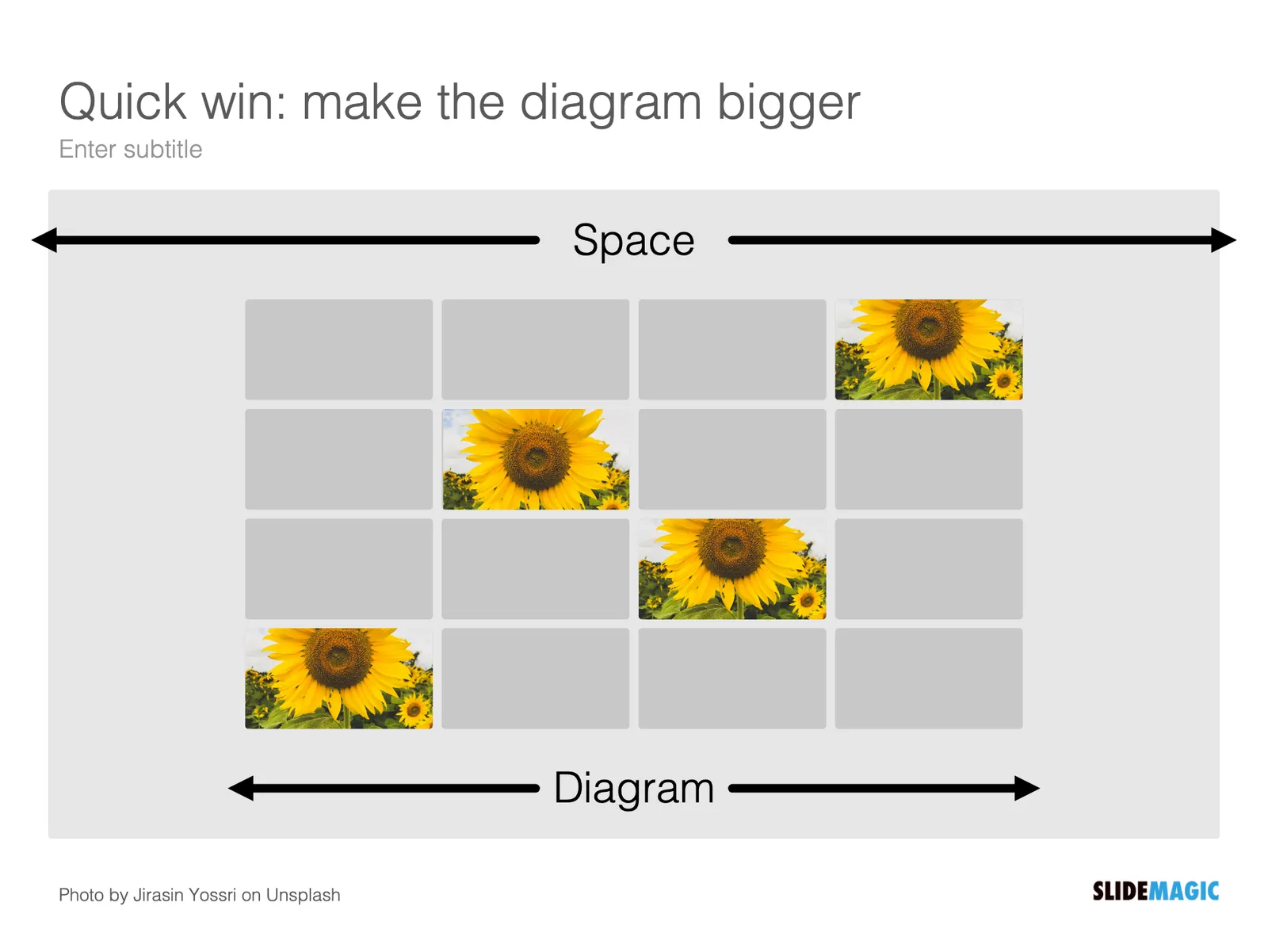
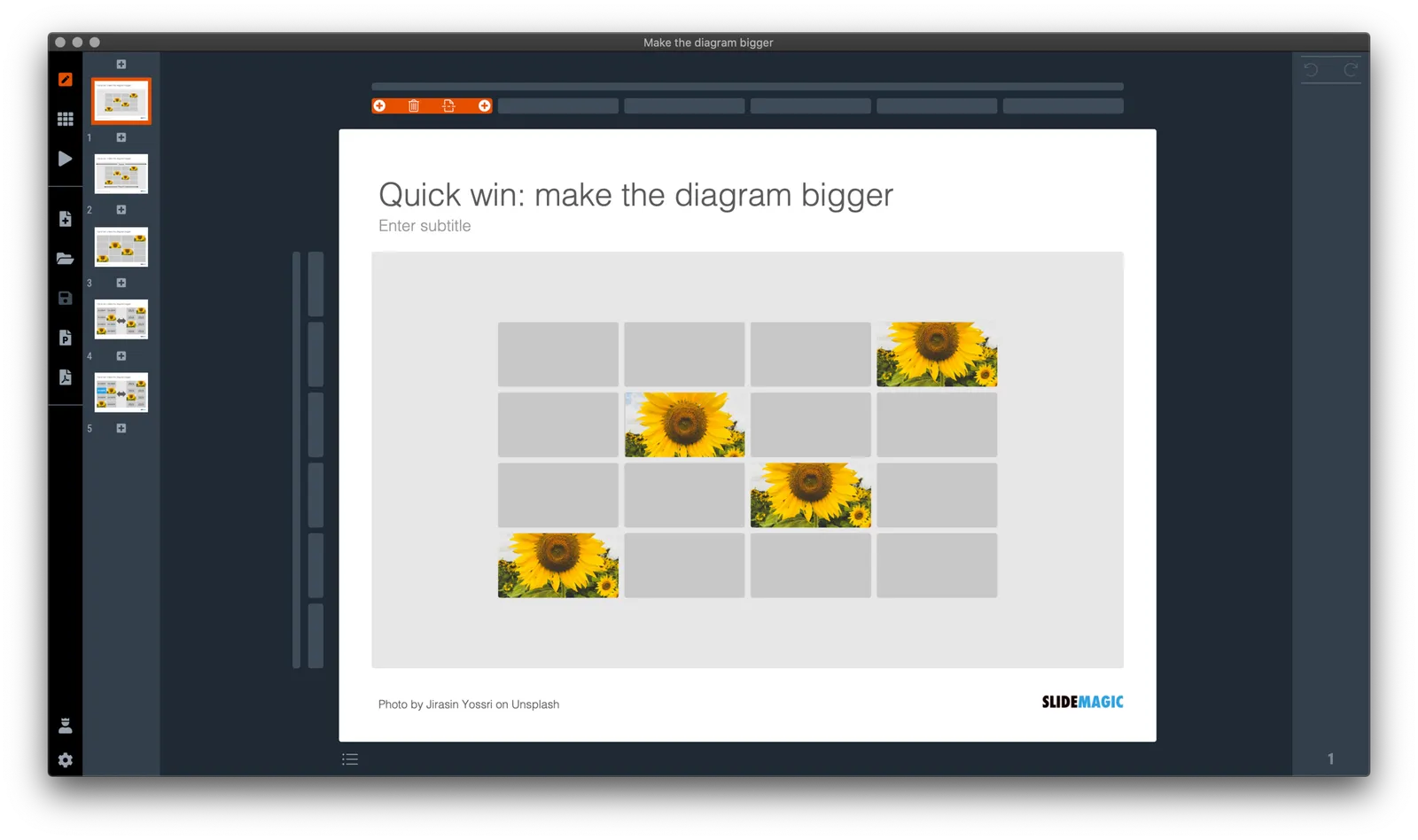
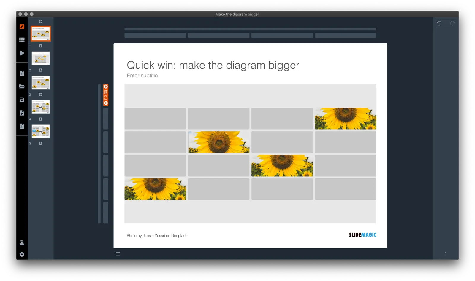
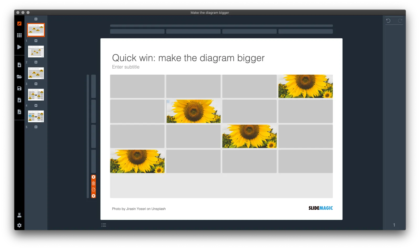
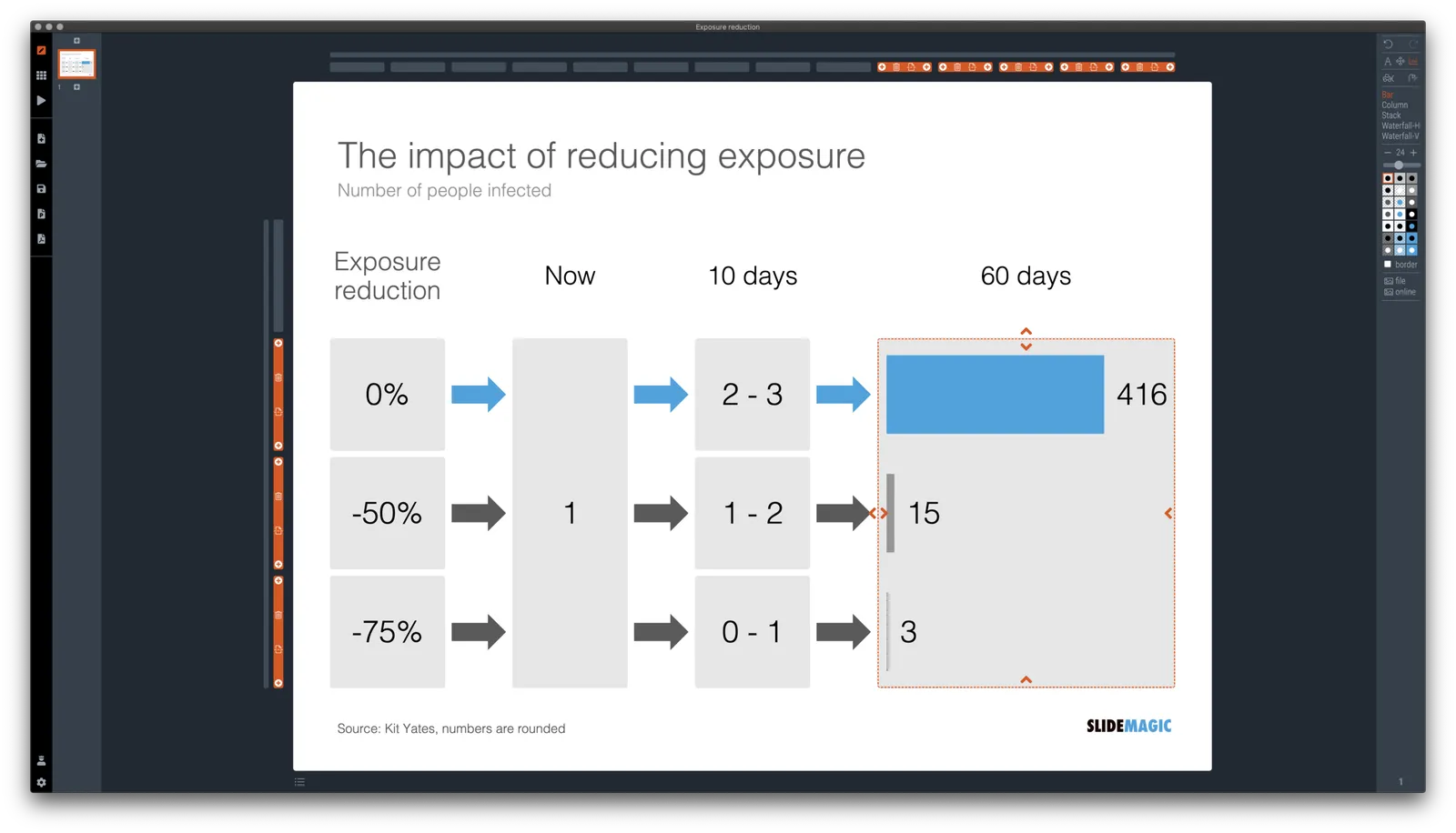
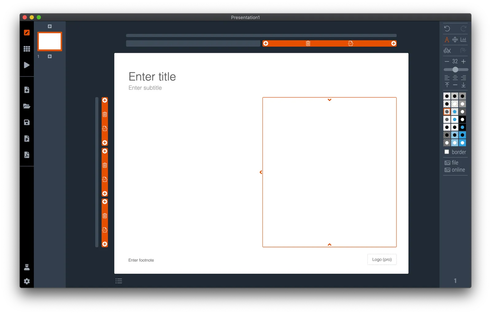
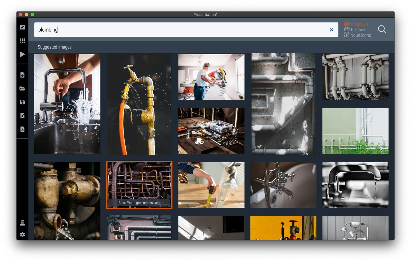
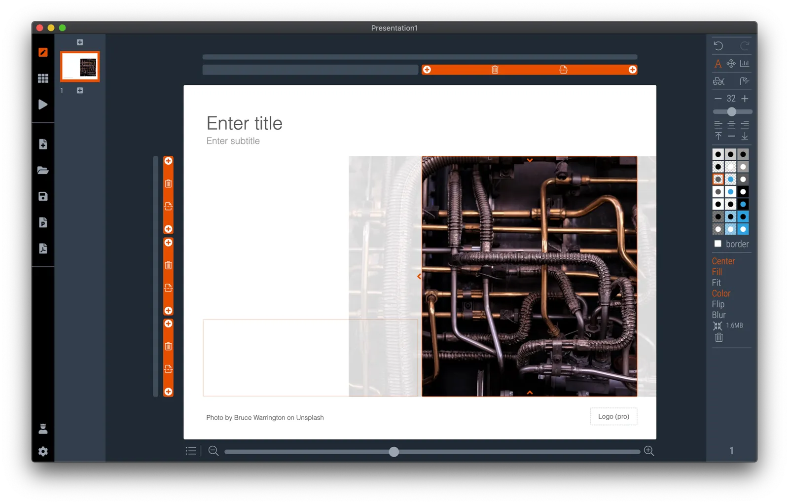
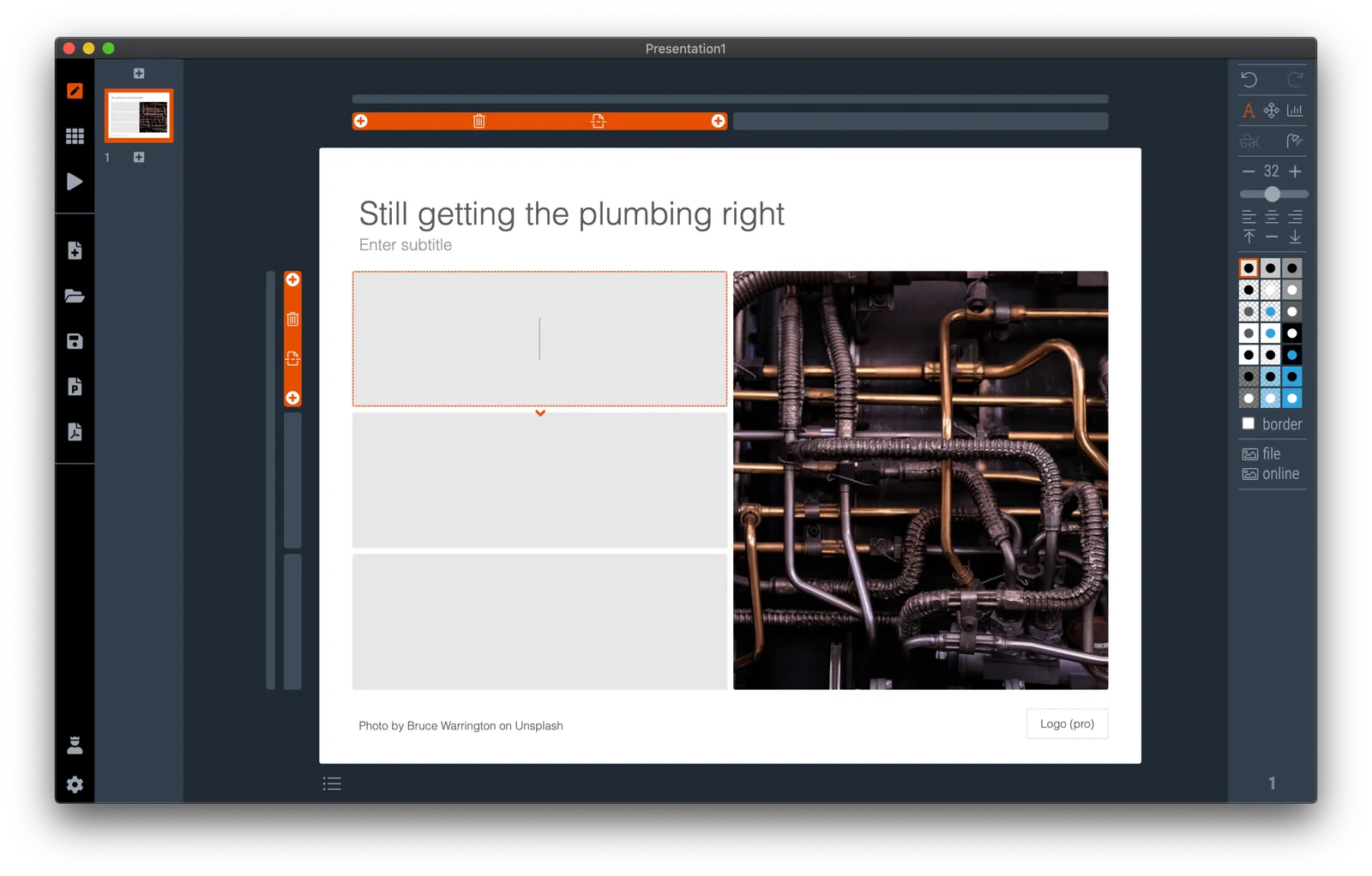
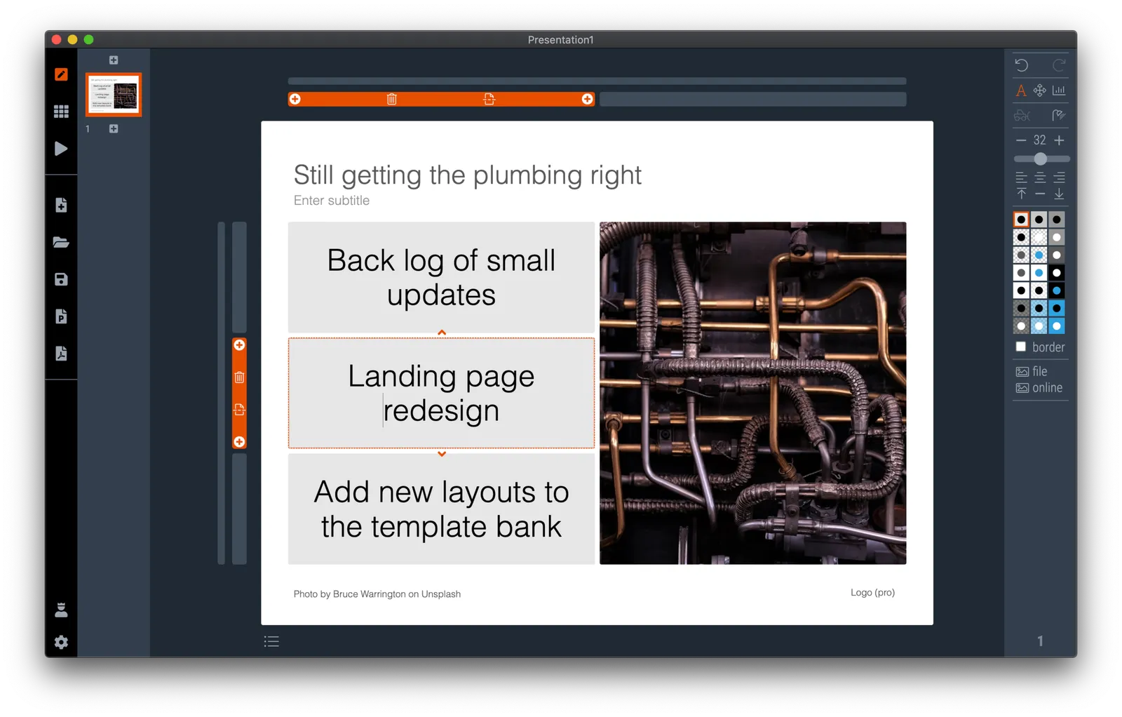
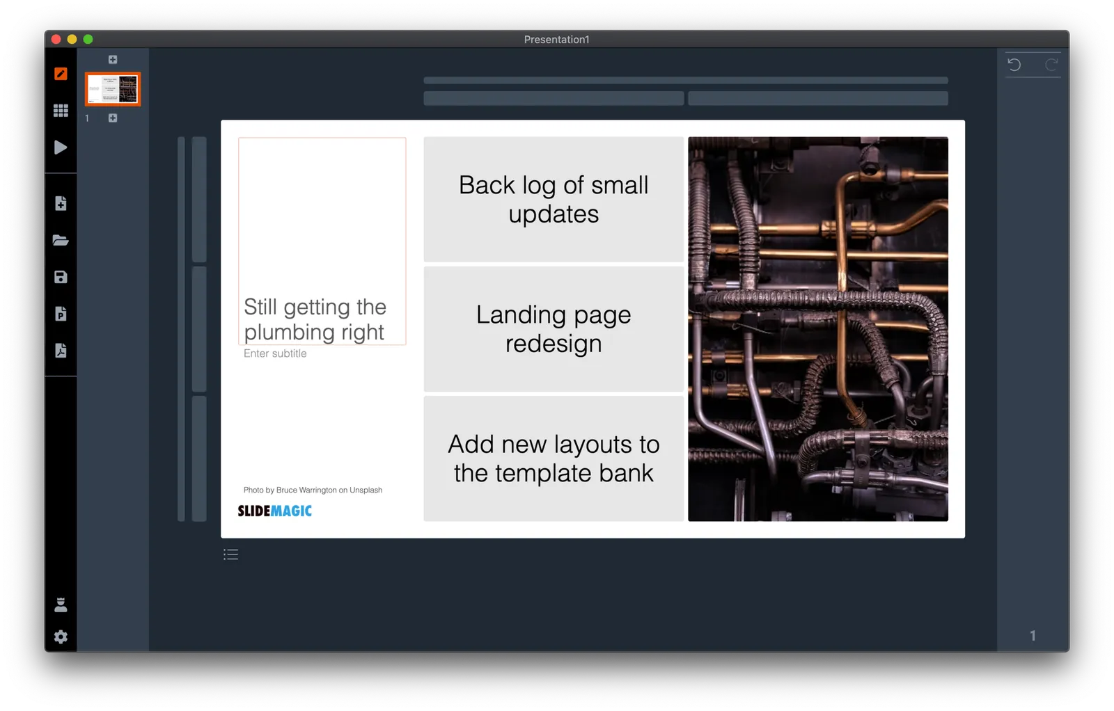
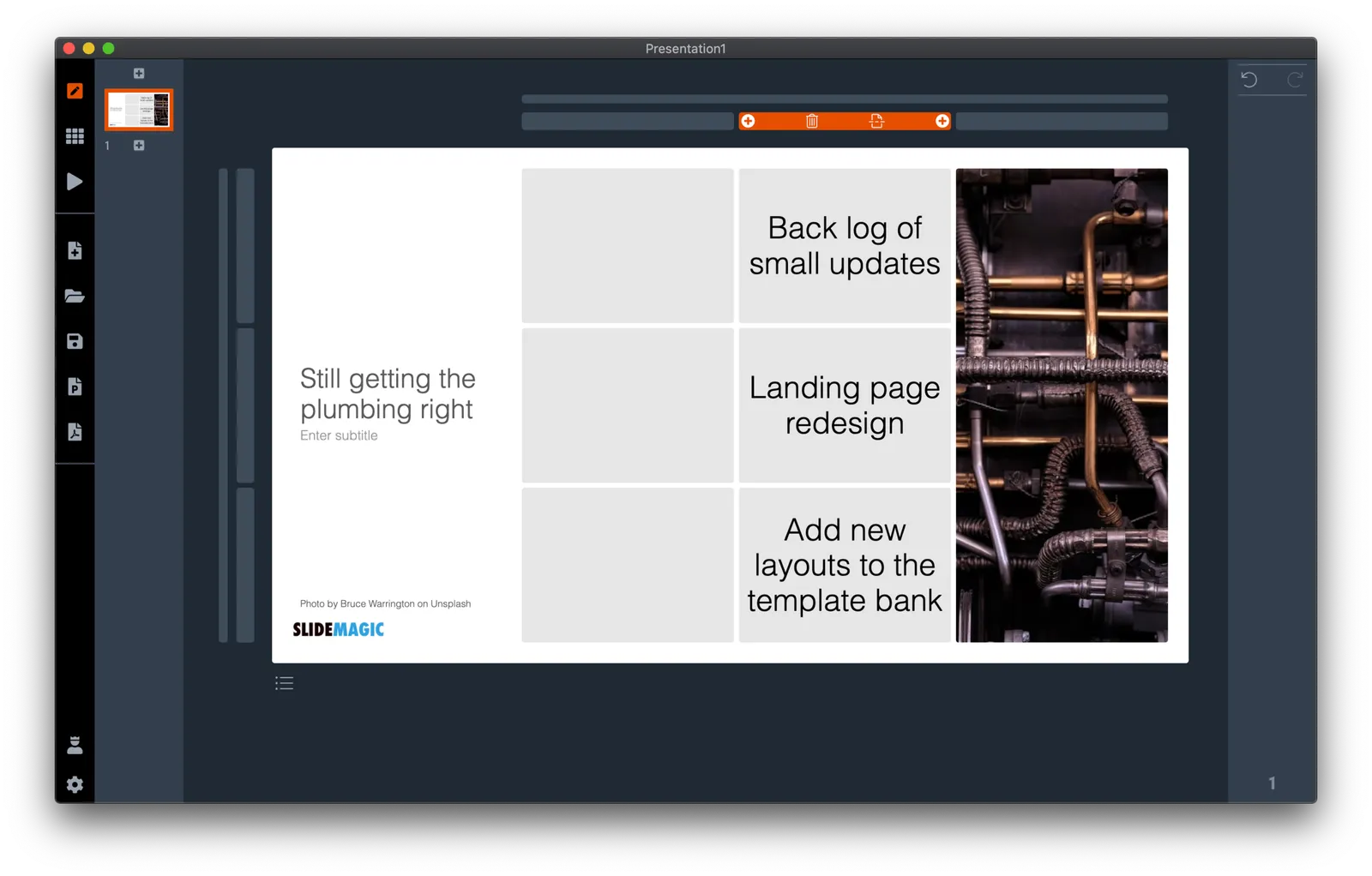
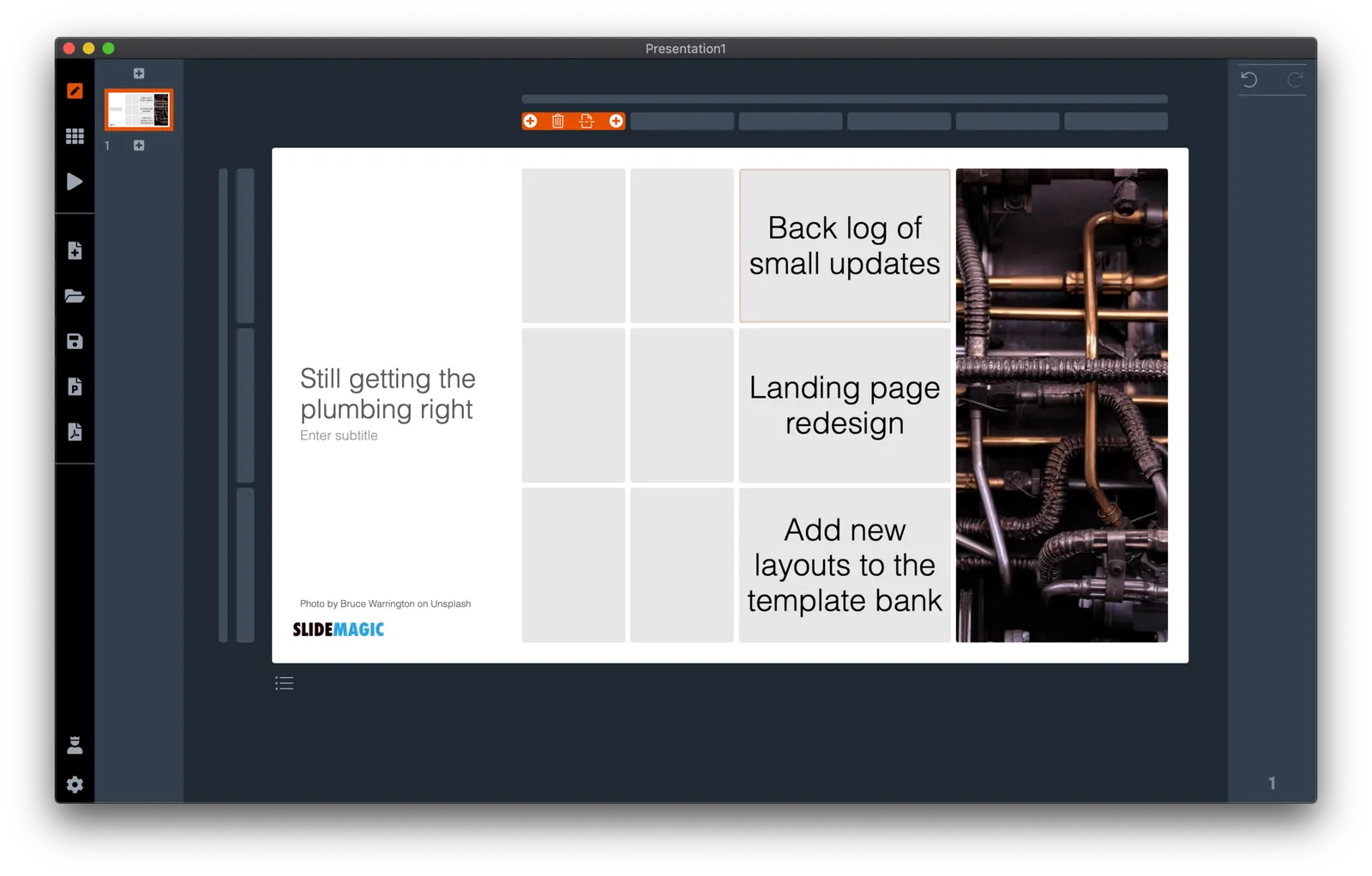
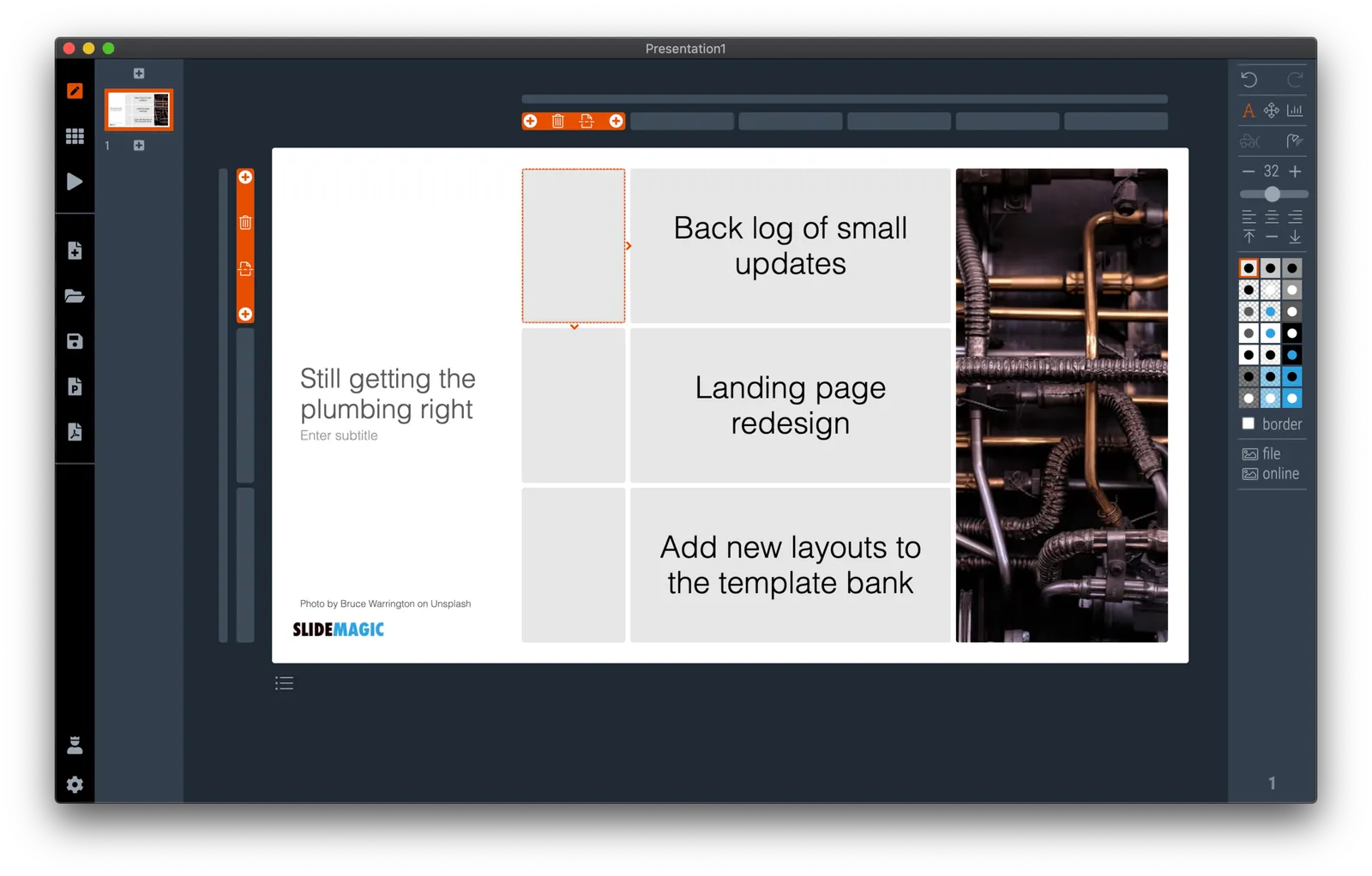
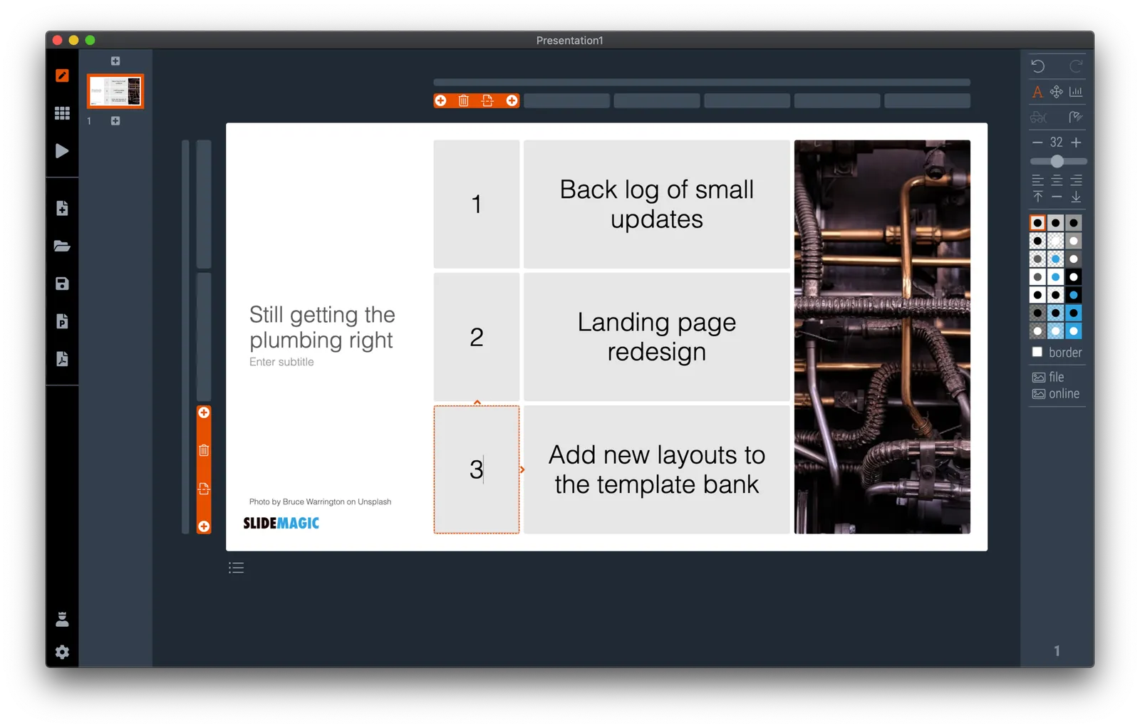
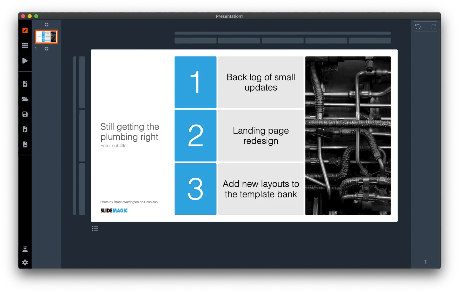
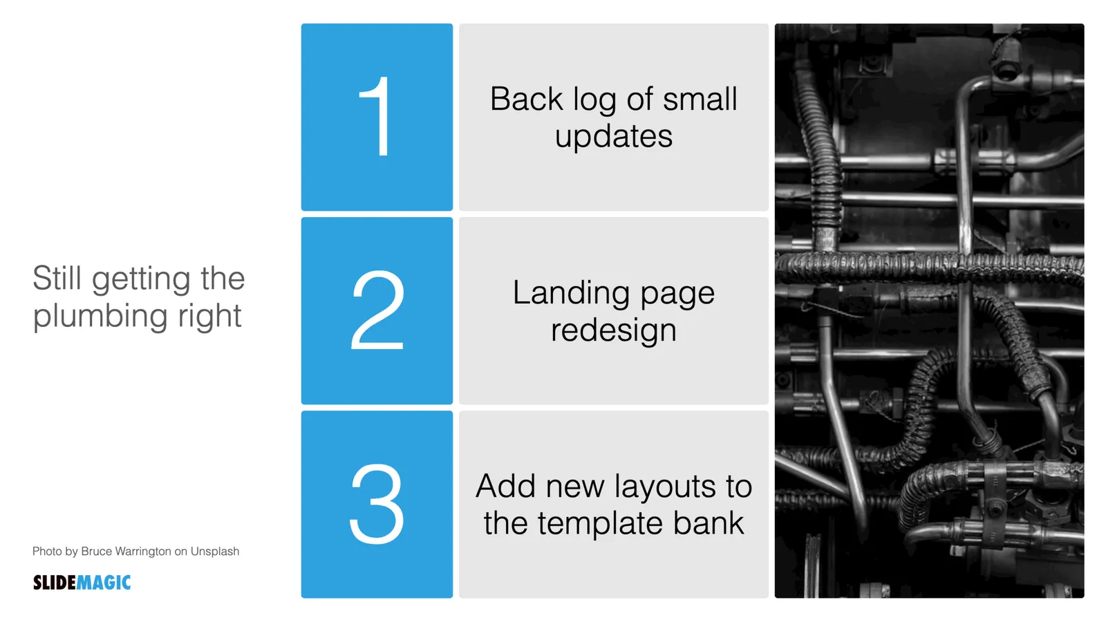
Yesterday’s “plumbing” post triggered me to show you an example of how you would quickly put a slide together to update the management team of your company when you are doing some plumbing. The work flow sequence below took less than a minute:

·SlideMagic

More plumbing...

An update.

A couple of days ago I released version 2.5 of SlideMagic with lots and lots of small updates that were sitting on the todo list. When designing, I cannot stand it when a small detail is off, and the same applies to software development. And like in design, most users/viewers won’t notice these individual details, but when taken together they add up to something. This slide does looks right for some reason, this app just works for some reason. Opening up SlideMagic should trigger an update to version 2.5.3 (writing this on November 11) after a few minutes, if not, you can visit the SlideMagic download site to install the latest version.

I am making changes to the positioning as well. That download or app landing page is now the home page of SlideMagic and no longer the web site that says that SlideMagic is a template bank, but also an app, and also a place where you can download entire presentations. All confusing, and still a left over of the SlideMagic template store on Shopify. The Shopify store is closed, and (that was quite a moment), the entire V1 version of the SlideMagic web app has been wiped from the server.

So the web site (still WIP) now reflects what SlideMagic is: presentation software with a uniquely clever user interface and a huge built-in template data base.

Photo by Bruce Warrington on Unsplash

·Data visualization

How to make a source of change waterfall chart (Apple quarterly results)

In between the election news: waterfall charts….

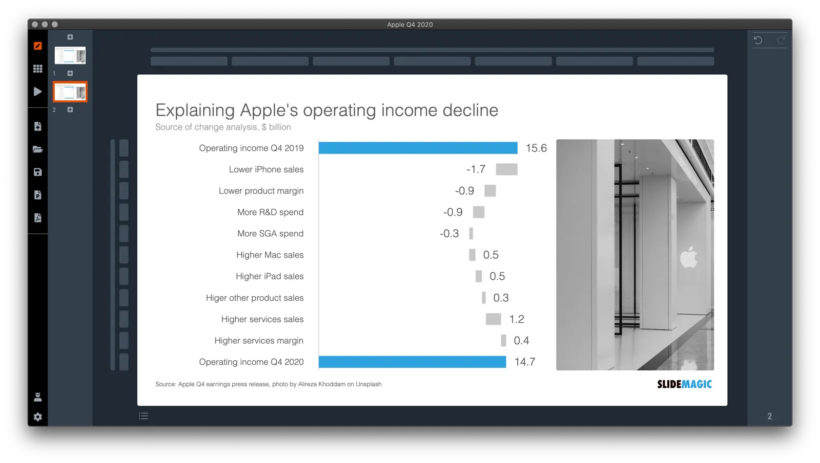
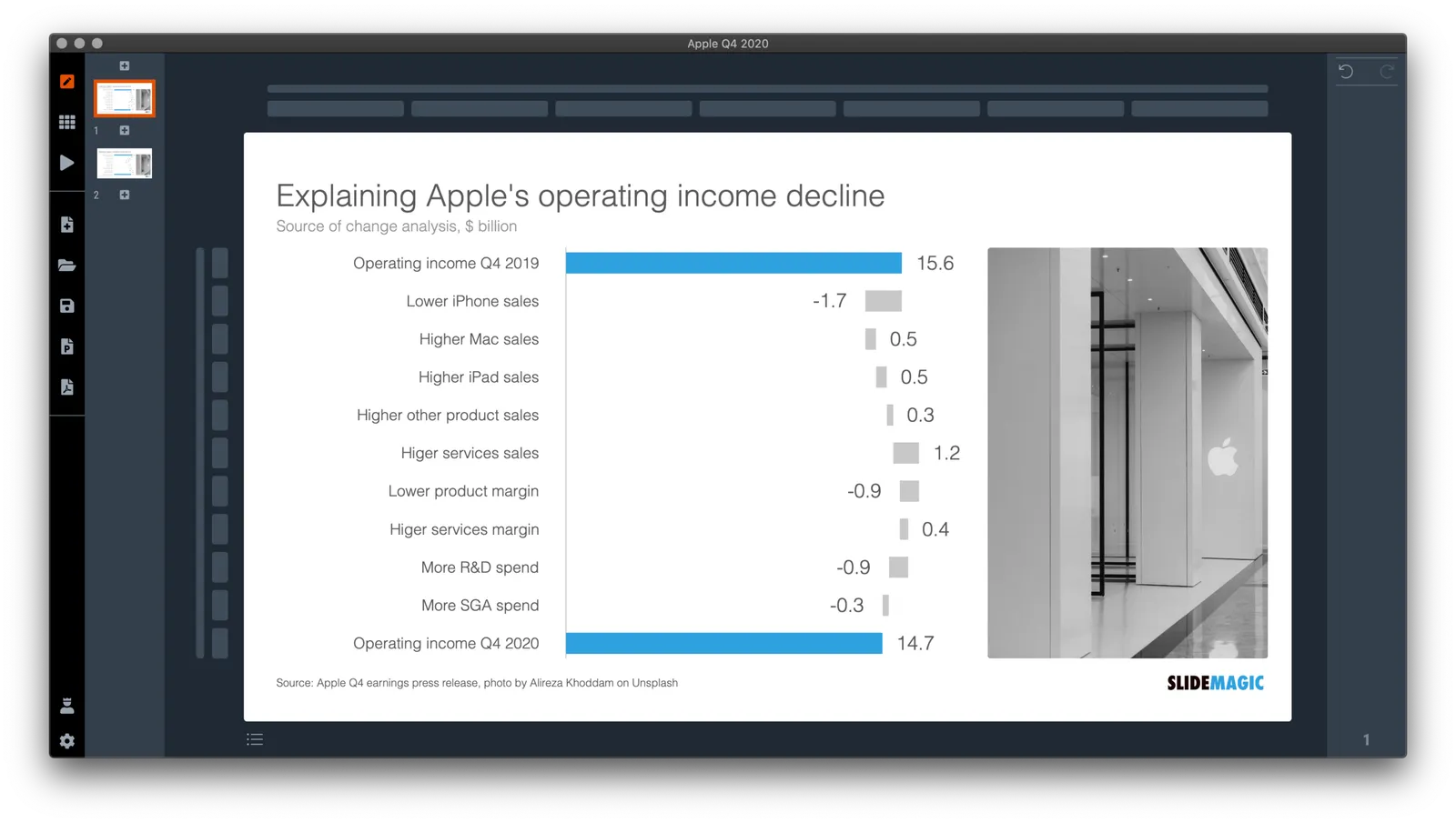
Waterfall charts are a great tool to explain the difference between 2 scenarios. In SlideMagic, they are really easy to create. Below is one I put together quickly with data from Apple’s 2020 Q4 earnings result, and a photo I found using SlideMagic’s built-in Unsplash image search. Notice how I opted for an unusual vertical waterfall, to create more space for the axis labels.

Some people would argue that you could make the chart even clearer by breaking the axes: showing them as ‘5.6’ and ‘4.7’ for example. Yes, it would highlight the deltas better, but in general, I think manipulating axes, well, manipulates the message. The fact that the changes are relatively small to the total is part of the message.

I reshuffled the rows a bit to group the decreases and increases. That makes it more clear in one sense, but less clear in another. Your choice.

\How do you go about making such an analysis? I put my numbers in a Google Sheet that you can view yourself.

  1. Enter the data for the 2 comparable quarters in 2 columns. Add the totals as calculations rather than hard-coded numbers to check that you did not make any typos. (The blue cells are the one that I type in, the white ones are calculations).
  2. Create space between the 2 columns
  3. Pull numbers from the input that you consider drivers. You see that I deviated a bit from the way the input was presented:
Continue reading →
·Story

"Please send us the slides 1 month in advance"

This tweet about a habit of conference organisers:

It does not make sense. Nobody prepares slides that long before a presentation, nobody reviews presentations 1 month in advance, and the request is probably not credible.

Why do conference organisers try?

  • To spot potential content disasters early
  • To spot potential time over-runs early
  • To spot potential layout disasters early (bullet points…)
  • To spot potential technical issues early (‘What, no Apple Keynote?”)

These are valid concerns and the solutions is possible somewhere in between.

  • Rather than sending a broadcast request, do some research about your speakers, leaving the pros, and focus on possible weak links with coaching (and hassle)
  • Ask for a draft of a “typical presentation” way in advance to get some sense of what is coming
  • Set a very credible deadline 2-3 days for the event (“we are building the conference hard drive”)

And, if you are a speaker and do not have a story on the shelf (it is the story that matters, not the slides), it is probably a good idea to start getting your head around what you want to say a few weeks in advance. Slides can be made in a couple of hours (try using SlideMagic, it is really easy), crafting a compelling story takes a lot longer. Starting to think about it early means that your brain worries about it, even when you are not actively aware of it and things will fall in place later.

Photo by Tim Gouw on Unsplash

·SlideMagic

Opt in/out for beta versions

I am pushing new updates to the SlideMagic desktop app almost every day. Most of the things I do at the moment are not spectacular new features, but improving the plumbing of the app. I have now created the option to opt in or out of these beta versions (that could have the occasional bug). Users on deadlines for important presentations do not have time to beta test software.

All users are by default opted out of beta versions. You can opt-in by accessing your user account on the SlideMagic web site and tick the appropriate box. Make sure you are logged in to your account in the SlideMagic desktop app as well for the automatic updates to work.

To switch back to stable updates only, untick the box in your user account, and go to the desktop app download page to install the latest regular version of the app.

It is pretty amazing that today’s software development tools enable this juggling of regular and beta versions in just a few lines of code. Soon, beta versions will move again from plumbing to a number of new features I have in mind. Stay tuned.

Photo by Scott Webb on Unsplash

A strategy overview slide

Here is a slide from a recent Daimler strategy presentation:

The slide does not look bad, and is definitely an improvement of earlier versions of the same chart:

Still there is room for improvement:

  • The big blue action verbs are highlighted, but these are not the key messages of each box. (Side note: yes it is the most correct way to write things starting with an action verb, but when space is limited, I tend to break this rule).
  • The 16x9 wide screen format invites a horizontal layout, which in turn makes the resulting narrow boxes hard to read, and the layout looks a bit strange because of the line breaks resulting from longer words
  • Wording can be reduced and improved further.

I quickly put something together in SlideMagic. It might look a bit less sophisticated than the heavily designed slide above (exactly in the spirit of SlideMagic), but I think it conveys the message better.

(Disclaimer: the above text is obviously mine and not the Daimler strategy)

I added this slide to the SlideMagic template database, search for ‘strategy’ in the desktop app or download it. (The thumbnail of the slide looks a bit different, as all slides show up in 4x3 format on a light background, you can change those settings instantly in the app).

Where did it save my file?

Producers of productivity software are changing the user interfaces of their software:

  • To make things work with (their own preferred) cloud storage service instead of the computer file system
  • To copy user friendly concepts from the world of consumer software to enterprise users. (What if Instagram would have used drop down menus?)
  • To make it even better because they can (“duplicate” is so much clearer than “save as”)

On an app-by-app basis this might be a good decision. The new user interface is definitely better than the one that originated in the 1990s on one of the first releases of Windows.

But there is a problem for the enterprise user: all applications start to look different. Wonder what would happen if car manufacturers start switching around the pedals and other basic inputs of vehicles…

Also, the use settings of a consumer and enterprise application are different. Fixing the numbers or details in an annual report or contract is different from posting your latest story.

SlideMagic has a radically different user interface when it comes to designing slides, but the basic file management controls are pretty traditional.

Photo by Marten Newhall on Unsplash

Vague truths

It is a bad idea to bend the truth in investor communications. Alternative reality might get you the attention in the first deck screening (or that initial bump in the share price), but things will come crashing down if you cannot deliver on your “mortgage” towards the future. The value of your business gets reset to where it should be, but also, your own personal credibility just got a big blow, creating a negative impact for your current idea and everything you are planning to do in the rest of your career.

Sometimes the truth bending might not be intentional. A marketing person in a pharma company might say/believe that we have “phase 2 data”, when in fact the company has “phase 2 preliminary data”. It sounds the same, but makes a huge difference in how investors evaluate a pharma business. Pay attention to detail where it matters.

Try keeping your presentation honest without:

  • Actually amplifying your weakness… There is a middle ground between hiding the truth and putting it on the cover page. In the latter scenario you will score a lot of points for honesty, but investors will doubt your ability to communicate with investors and clients
  • Let lawyers take over your slide and fill it with disclaimers, it just becomes background noise (think of the Fortune 500 CFO reading the legal disclaimers while journalists walk into the auditorium for the analyst presentation).

Photo by Toa Heftiba on Unsplash

Reminder: V1.0 shutdown October 31...

A reminder that we will be pulling the plug on SlideMagic 1.0 (long live 2.0!) on October 31. Over the next week you will still be able to download your presentations yourself from the old site, after that, you will need to contact support to ask someone to go down into the basement and find it for you in the archives.

Instructions for V1.0 download are here.

If you stopped using SlideMagic years ago because you did not (yet) like it that much, be sure to check out SlideMagic 2.0 which is in a totally different league. The desktop app can read your V1.0 presentations.

Photo by Tincho Franco on Unsplash

·Story

Four ways to write a story

My daughter is progressing through high school and is now asked more and more to write essays with her opinion. This got me to think about four levels of writing a story:

  1. Without having a clear idea of the answer/plot, you start jotting down your thoughts with the main objective of reaching the total word count, and buzzword count targets. This gets you a fail on an exam, and you can also compare this to an unprepared presenter “winging it”.
  2. You write a skeleton of the points you want to make, in the right order, with main headings and sub bullets, all in super short grammatically incorrect and incomplete language (because you are the only person who needs to understand it). This is probably what the high school teacher is trying to reverse engineer from the full essay when grading it: did she make the right points.
  3. The skeleton, but now expanded into proper language. It makes the point, it is logical and organised, it is grammatically correct, but also, it is pretty boring. This would be a typical exam submission of a student, or a management consulting report
  4. A convincing story, that abandons some of the logical rigour of the previous level and replaces it with an interesting flow, with some tension that resolves to the conclusion. As opposed to “winging it”, this is a story that a skilled salesperson can pull off on the fly without any slides or skeletons. Very few business documents or high school essays make it to this level.
Continue reading →