

A slide came flying by on Twitter:

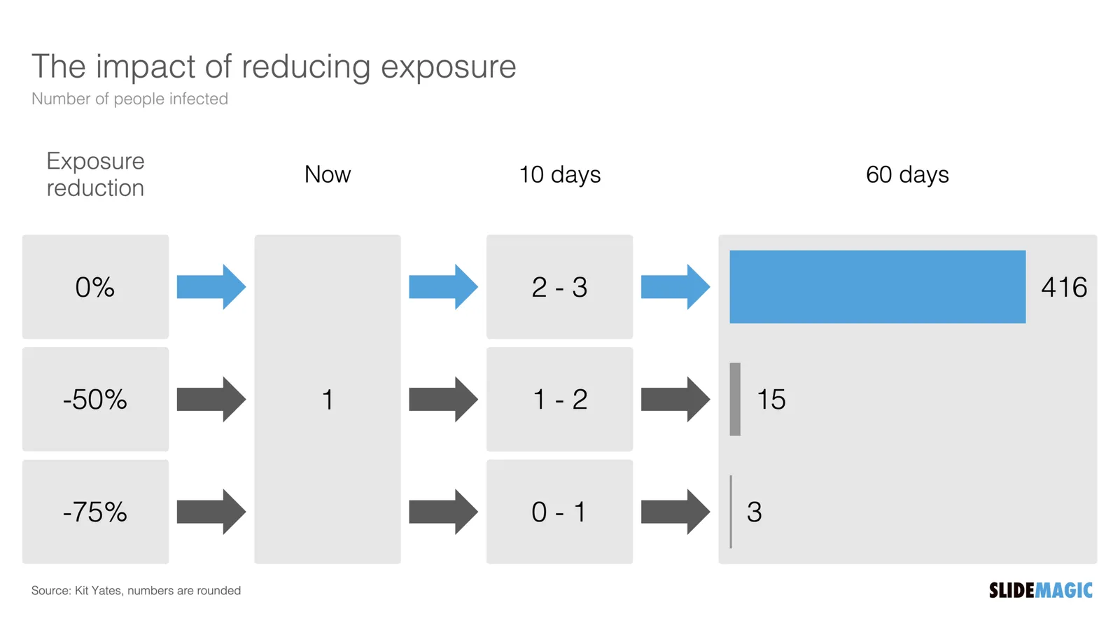
I might a quick remake of this slide in SlideMagic, in line with the SlideMagic philosophy: quick, clear, nothing too fancy (= time consuming) and added it to the SlideMagic template database since it could be a useful basis for any slide that needs to show some sort of chain of events.

What did I change?
- Removed the low-contrast red on black colours
- Took out the simplistic icons and replaced it with no-nonsense clear numbers
- Rounded up numbers so to avoid cut up people (audience is not hard core scientists)
- Put in a proper bar chart to show the magnitude of 416 vs 3, instead of an icon count
- Flipped the design left to right to make the flow in time more clear
This slide demonstrates how easy it is to line up bars of a data chart, arrows, and text cells of a table in the overall slide layout (an absolute pain on other presentation design software).