

SlideMagic Blog

Frequent updates about all things presentations since 2008. Subscribe to never miss a post.

RSS
all posts

Category Project management

·PowerPoint

This presentation tool is not a presentation tool

PowerPoint, Google Slides are presentation tools that most of the time are actually not used as presentation tools. Rather people use them as a visual collaboration tool. The organization chart that needs to go into the deck forces the issue: it is time to agree on where the boxes sit and which lines (dotted or straight) go between them. The tiny footnote is essential to agree the strategy for the North America entry strategy etc.

The visual character of these programs makes them more useful to do this than word processors. Online collaboration adds another option to manage multiple pens in one document. Comments give a system to manage todo lists.

SlideMagic on the other hand is a presentation tool.

Image credit: Jay Cross on Flickr
·Project management

Final final final final versions

Unlike in the case of a printed book, digital documents are never finished or final (despite being called “final version v3 - final”). Instead they have “committed versions” like programmers use when working with git to manage iterations of code. For most presentations these committed versions are documents you deemed good enough to share with someone at some stage in the project. That’s why the email sent box is becoming the new file archiving system. (Where is that document I sent out last week?). Sent it, or it did not happen.

Photo by Ben Wicks on Unsplash

·PowerPoint

Turning a bar chart into a Gantt diagram

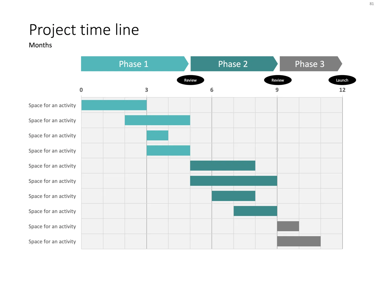
Project Gantt charts are a pain to create in PowerPoint. Screen dumps from professional project management software are too detailed and don’t have the right look & feel. Manually resizing blocks is tedious, and oh boy, what if you have to add or change an activity…

I often use a disguised stacked bar chart to create project flow charts in PowerPoint.

First, you need to look at the content. Like my approach with all data charts, project plans should not be copy pasted directly into PowerPoint. Project planning, data analysis, is not the same as presenting the result to an audience, you need to disconnect the two activities. This means in most cases starting with a blank sheet of paper.

Purely from the stand point of communication (not planning): which activities should be grouped together, which separated? What is a logical phasing? Sometimes, nitty gritty activity details are crucial for planning purposes (exact roll outs for each city), but can get pretty boring in a presentation. Sometimes the opposite is true, a small pilot might be worth highlighting in the presentation.

Once you have this sketch, you can transfer it to PowerPoint. PowerPoint does not have pre-configured Gantt chart templates, but the stacked bar chart can provide a solution. See the chart below as an example:

It takes a bit of thinking to set up, but once in place, it is easy to make small changes to the length of the bars and/or add and subtract activities without having to go through the hassle of lining up everything again.

Continue reading →
·Project management

Red flags

This blog is read by many fellow presentation designers. Here are some of my clues that warn me when a potential project could be difficult to get right.

  • The CEO (or anyone else who actually has to give the presentation) is not involved enough in the process, so you do not hear first hand what the person actually wants to say
  • The potential client says “we just need a polish” of existing slides, because 1) she wants to negotiate the project budget and/or 2) [worse] she thinks that after all the work the company invested in the slides it is not possible for an outsider to turn things upside down and start fresh, better.
  • The project deadline moves forward to a few days from now leaving no time for creativity
  • The project deadline moves backward
  • Every change, edit, discussion requires a full in-person meeting with many people in the room, including small punctuation edits in slide headlines
  • There are conflicting story lines: 1) multiple messages for multiple audiences, or 2) “this is what we want to say, but we cannot really say it”
  • “We want a presentation like this” (with an attachment of a poorly designed presentation)
  • We give you total creative freedom except for a), b), c), d), and e)
  • Any question re the content of the presentation gets avoided, with “just let us know the cost and the time it will take you”

Designers should look out for these warning signs and people tendering project should look in the mirror.

Continue reading →