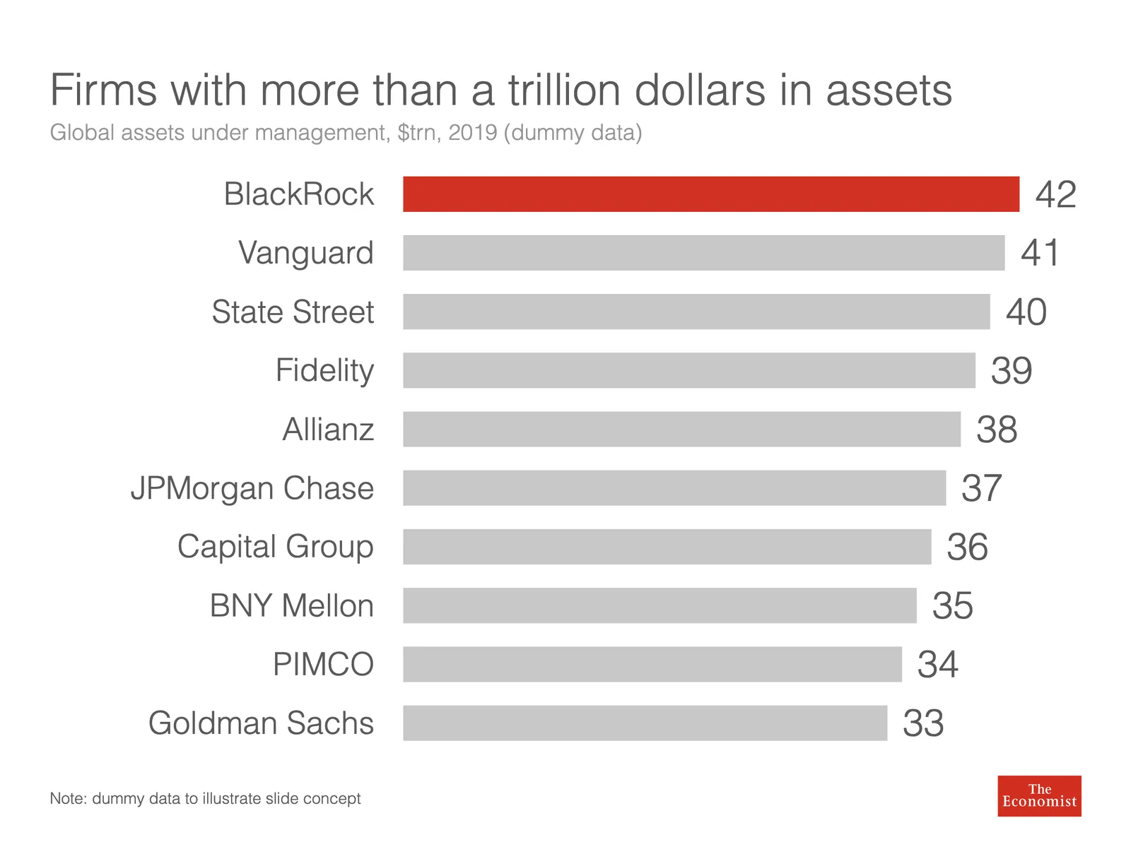
Below a screenshot from an Economist instagram post:

The labels of the first 2 bars have been placed over the bars themselves to save space: there is now more room for the bars themselves. Other labels to the right of the bars.
I am not a fan:
- The white over red of the top labels is hard to read
- There is no nice and simple list of the top players, aligned in a consistent way
- The names inside the chart area makes it harder to relate the bar to the axis
- (I also prefer to put data labels in the chart rather than having a very imprecise value axis)
Here is a quick illustration of a bar chart in SlideMagic (The Eonomist did not provide the exact values, hence the dummy data).