SlideMagic Blog

Frequent updates about all things presentations since 2008. Subscribe to never miss a post.

RSS
·Concepts

"Why are 2x2 so popular in consulting firms?"

I answered a question on Quora:

I can think of a number of reasons:

  1. A 2x2 is a nicer way to present options than a slide with 4 bullet points, a 5 dimensional space can get very complicated
  2. It forces you to think things through thoroughly for holes and overlaps, maybe you start with 2 options, add a third, take a step back and think what actually defines these 3 options, come up with the 2 axis, and then realise you overlooked option number 4 to be complete
  3. A 2 dimensional framework allows you to think about what happens if you move things around, and makes it easy to visualise.
  4. In most cases there are more than 2 dimensions to a problem, but it is hard to visualise (see point 1), and think about. The 2x2 forces you to choose the 2 most important dimensions.
  5. Cultural habit, if you are in a place that uses a lot of 2x2s, you will use it more often, it is a language that people understand easily.

SlideMagic has lots and lots of 2x2, 3x3 and other matrices as slide templates for your to get started. Download the app and get started.

·Images

Making Bernie memes, and image positioning in more serious presentations

Everyone is super imposing the image of Bernie on other photos at the moment. Why do certain images look realistic, others not? Some pointers that might help with your Bernie creations, but can also be useful when you need to make more serious presentations.

  • Think of the size of Bernie versus reference objects close to thim. Putting him next to other people makes it easy to get it right. In the absence of reference people, focus on other objects to compare the size to. The size of Bernie versus objects that we know the size of, tricks the brain in getting the perspective of the image right.
  • See at what angle the image of Bernie is taken. The legs of his chair show the angle at which the floor should run. Bernie’s image is taken from a long distance with a zoom lens, therefore you will see that most compositions that you took with a phone (lens 1.7m above the ground, subject probably 5-10 meters away) will not work.

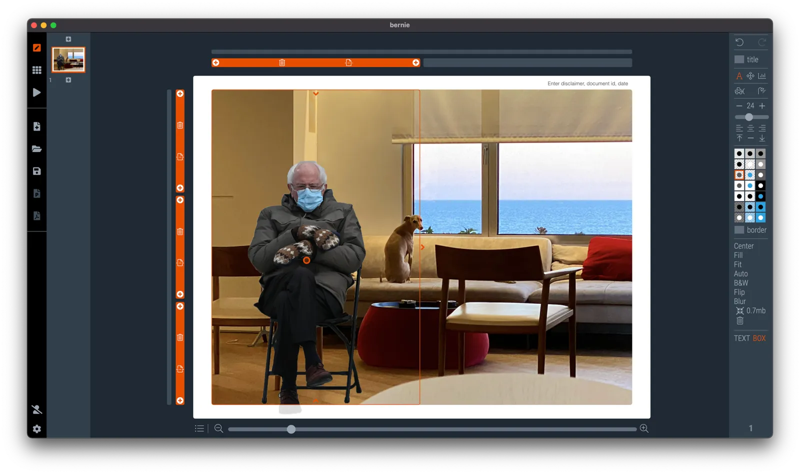
It is hard to get these right. Simply move and zoom the image around a lot until you see that it fits right. Here is Bernie in my living room keeping Grifin company, In SlideMagic I put the living room as a ‘frame’ image, and made one big grid box as the foreground for Bernie. Then, I switched off the titles.

(@taber has already done the hard work for you, download a Bernie image with transparent background here).

·Story

"This is the part I always skip..."

If you always skip that part, maybe it is time to reshuffle your slides to a flow that comes more natural to you.

There was probably nothing wrong with the original slide flow you used, but things can get stale:

  • You switched from a project flow, where the series of charts reflected the sequence of the project work, to the story that sells the outcome
  • You have a much more powerful presentation opening with a real life customer story than the usual market data slides that are sitting there
  • You are still using the same slides that you put in 3 years ago
  • The audience of your presentation has changed, they either have caught up and know more things now, or you are presenting to different people.

Time for spring cleaning of your pitch?

Photo by Jeremy Sallee on Unsplash

·Layout

A faster way to edit slides

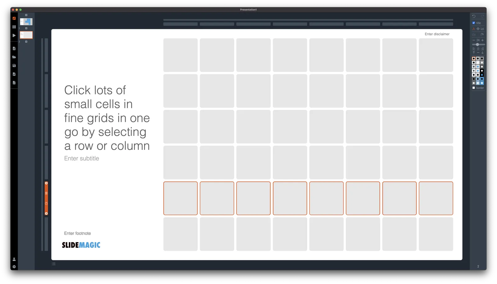
I have made more improvements to the SlideMagic user interface. Is is now easier to select multiple cells, especially in fine grids.

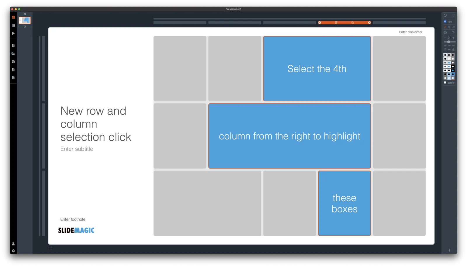
If you select a column marker at the top of the slide, all boxes in your slide that “touch|” the column will be become selected, and you can apply formatting to them in one go (for example, make them all blue).

The same applies for rows, click a row marker, and all relevant boxes in the row line up.

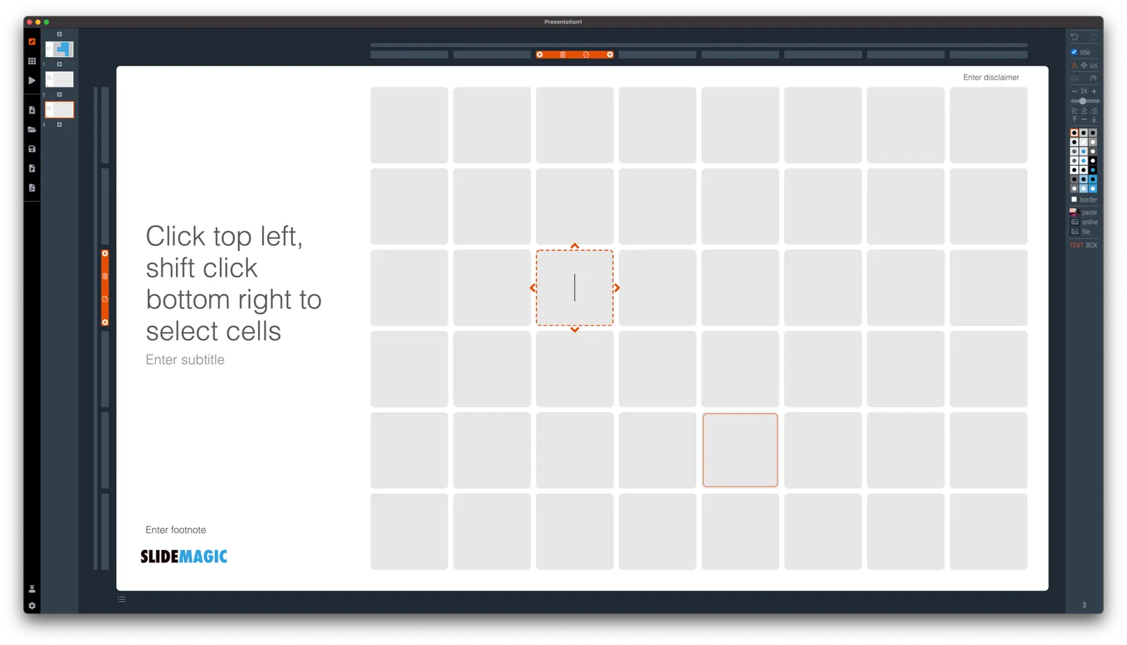
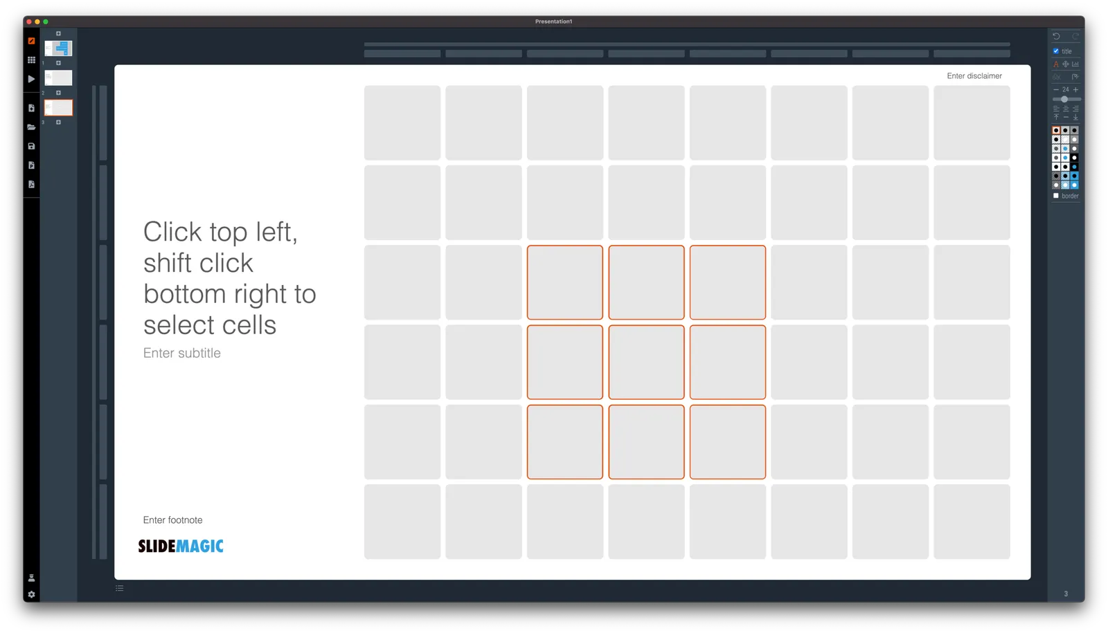
Finally, you can select whole areas of boxes by first clicking a top-left element, then clicking a bottom-right element, and SlideMagic will light up all the boxes that are in between. See the example below.

·SlideMagic

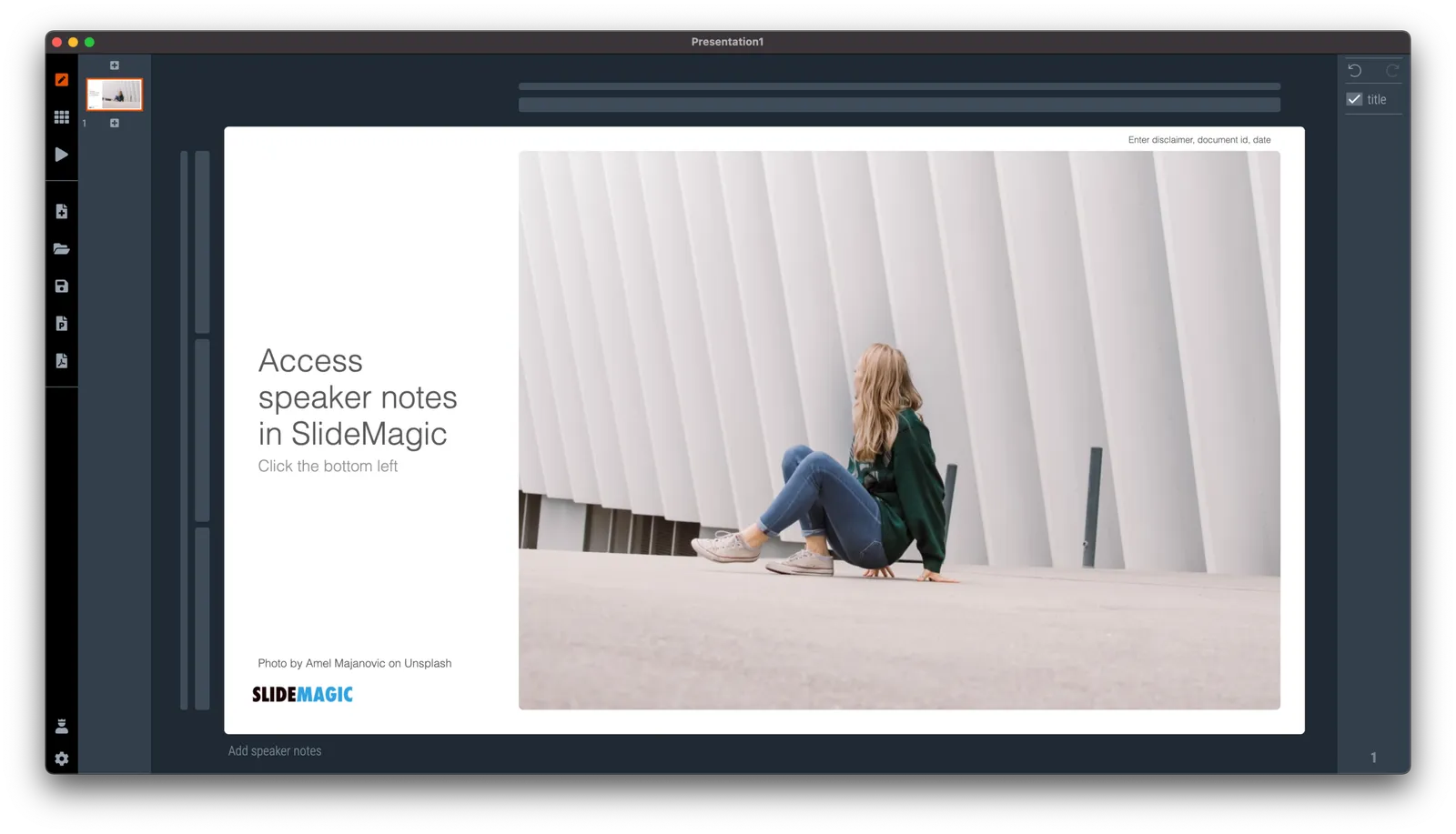
New 'no-title' layout

SlideMagic works with fixed positions for slide titles, subtitles, footnotes, and logos. Each slide looks organised, consistent, and the same.

Some slides call out for a slightly differently layout. Tracker pages for example. A simple text box that sites right in the middle of the screen. Up until now, SlideMagic would push these text boxes a bit down or to the right because of the required space for the slide title.

With a very simple check mark, I now created the option to remove titles from the slide on a slide-by-slide basis. It is a tiny adjustment to the user interface that can improve the look of layouts significantly. I am still putting a high hurdle when it comes to complicating SlideMagic. This is definitely not a complication!

While the user interface adjustment is easy, behind the scenes, there is a lot going on. Removing the the titles from a slide requires recropping of all the images on a slide. With SlideMagic’s new automatic cropping algorithm, this has now become possible. Imagine doing this for a slide with 40 client logos in a regular presentation design software, after which you come to the conclusion that the slide looked better with a title: re-cutting, re-cropping, re-distributing 40 images again. In SlideMagic, this is a button click.

You can check out the new features as of version 2.6.9

Photo by Boris Smokrovic on Unsplash

·Investor presentation

Should you put 'confidential' on every slide of your presentation?

For years I tried to resist the pressure from lawyers to fill every slide with legal disclaimers. They do not look very pretty. But SlideMagic aims to be practical and as of version 2.6.8, you can do so, if you have to.

To make them still look OK:

  • I made the font really small, in all caps, so the disclaimer looks more like some sort of a document id
  • All disclaimers are exactly the same and at exactly the same place
  • The placement of the disclaimer changes based on what sort of aspect ratio / slide layout you are using

Should you put disclaimers? (Warning, I am not a lawyer). There are certain situations where you probably should. Certain confidentiality agreements state that information needs to be marked as being confidential to be covered by the agreement.

But, if there is no such agreement in place, I am not sure how much leverage you have if people are sharing pages despite all the scary warnings on the page. Also, if you are using slides with a big TED talk or product launch, the whole world can see them, making the disclaimers pretty useless.

Most investors do not sign NDAs, and you actually you want the junior VC to forward your pages to a partner in the firm. Assume that when you send your slides to investors, there can be leaks, so be careful what you put in there. In most cases the actual content of your super secret technology will not make the difference when it comes to evaluating your pitch deck in the early stages of the investment process.

Continue reading →
·Layout

It is all about box counting

One of the biggest issues in business presentation design is adjusting frameworks to the amount of boxes you need. You had this great slide that fats 8 things, but thing number 5 and number 6 is no longer relevant, so now you need to rehash the whole slide layout…

I think this “bug” in the design process might be one of the biggest reasons for the popularity of bullet point lists: it is super easy to add and subtract things on your slide. And this is also the reason why pre-fab PowerPoint templates are so hard to use. The designer made that super pretty 8-box slide with sophisticated shapes, and 5 minutes before your meeting, you need to get rid of one without destroying the design of the slide…

In SlideMagic things are super easy. Option one: it is easy to adjust the grid layout to match your new box count. Or even better: a new box count might merit an entirely new slide layout. In the latter case, you will have to copy-paste your boxes, but at least SlideMagic takes care of the fiddly task fo lining things up.

Here is a pro tip: box counting is the first thing I do when staring a new slide. How many items, how do they spread across horizontal and vertical dimensions? Can we consolidate points? Should we break them up across multiple slides? Once you have your count, it is easy to find a matching design.

·Investor presentation

Some advice for a seed investment pitch deck

A nice collection of startup pitch deck wisdom by Hiten Shah and Marie Prokopets:

Chart make-over: the US restaurant industry

A slide came flying by on Twitter:

The original chart:

Below a the same chart, but now in SlideMagic style. A few modifications:

  • Toning down the colors
  • Switching to regular bars instead of the stacked bars for the detailed sector breakdown. The boxes are more or less equal in size, so the stacked bar does not really add that much information, while making the whole thing much harder to read.
  • I cleaned up the categories and totals, they did not add up properly. This is probably the result of the analyst who had to work with multiple conflicting data sources. I am a strong believer of pushing through one, consistent, view of reality when it comes to a final presentation. Either you add your own interpretation to multiple sources and come up with a new one, or you stick 1-on-1 to a consistent source. The in-between ambiguity is useful when you do the analysis, it is confusing when you make the final presentation.
  • The segment concentration numbers are actually very interesting in this chart. In the original, they are very hard to read and compare in the boxes. The SlideMagic chart gives them much more space

I added this slide to the SlideMagic template database (download it here), or simply search for “restaurant” in the desktop app and it will pop up.

·SlideMagic

Making SlideMagic more Zoom-friendly

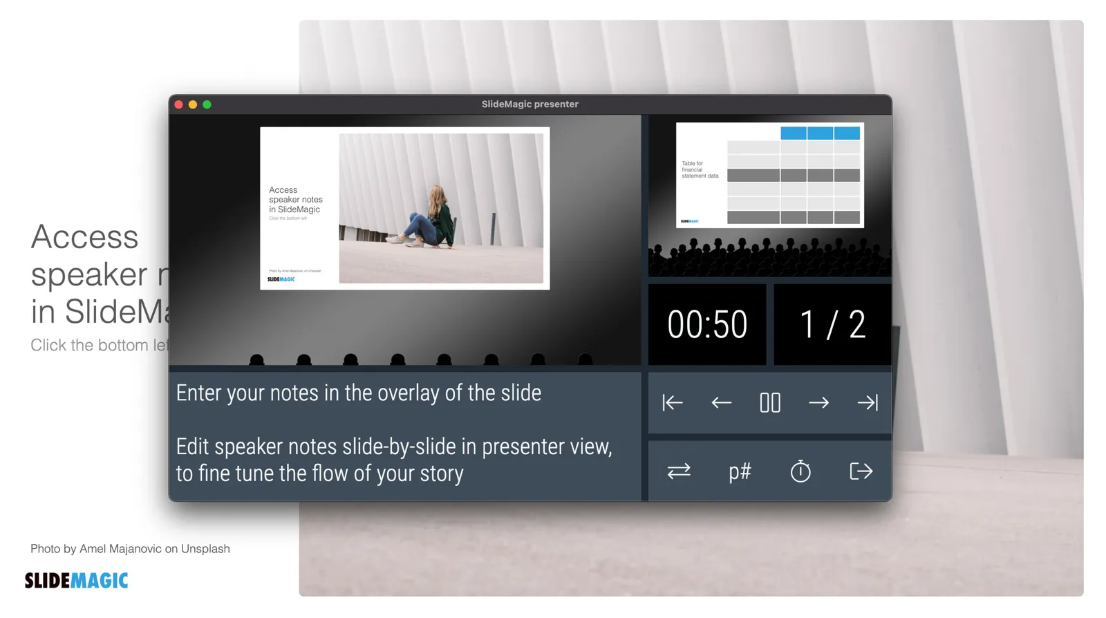
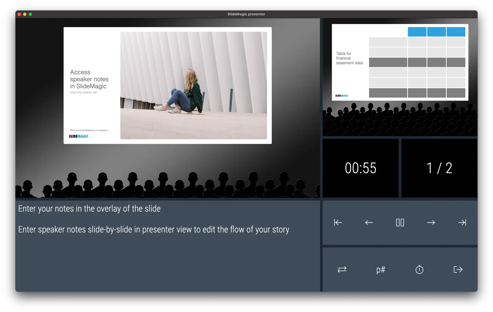
Up until now, playing a SlideMagic presentation would trigger a full screen view of your slide, plus second full screen window on the presenter machine (if available). Switching back and forth to full screen, swapping monitors can be a bit disorienting, and in the area of Zoom, it does not work well when you want to share your audience window, but not your presenter view.

As of version 2.6.3, entering a presentation will now always trigger 2 windows (not in full screen): the slide and a smaller presenter view with timer, counter, and a thumb of the next slide coming up. You can re-rearrange them to monitors as you see fit, and go to full screen manually if needed.

This also ‘solves’ the issue of deciding which screen is the audience screen, and which one the presenter’s when many on screen projectors (not replaced very frequently) have lower screen resolutions than most computers.