SlideMagic Blog

Frequent updates about all things presentations since 2008. Subscribe to never miss a post.

RSS
·Design

Pick your battles

Professional designers can do it all:

  1. Give slides a professional look
  2. Come up with innovative visualisation concepts that make messages stand out
  3. Use advanced software features to craft technically complex slides

The amateur designer is in a different position and needs to pick her battles. That amazing visual concept of the elephant riding a convertible car does not really work if it does not look picture perfect. That very clever consulting diagram does not really contribute when it actually does not support your message.

You do not need to be a graphics designer to ensure number 1, a decent professional look of your slides. Simple designs can look great (look at Swiss graphic design for example).

When in doubt, drop ambitions on point 2, and 3, and but never compromise on 1. (And this is exactly what SlideMagic is trying to do).
·Concepts

Psychology of young people pondering the COVID vaccine

I am intrigued by the dynamics surrounding how people make the decision whether to take the COVID vaccine or not. Unlike most other countries, people have the luxury to ponder this decision here in Israel. The government has a real communication challenge here.

We spoke about segments before. If you are a fundamental anti-vaxxer, or have severe doubts about the vaccine safety, you are unlikely to be convinced.

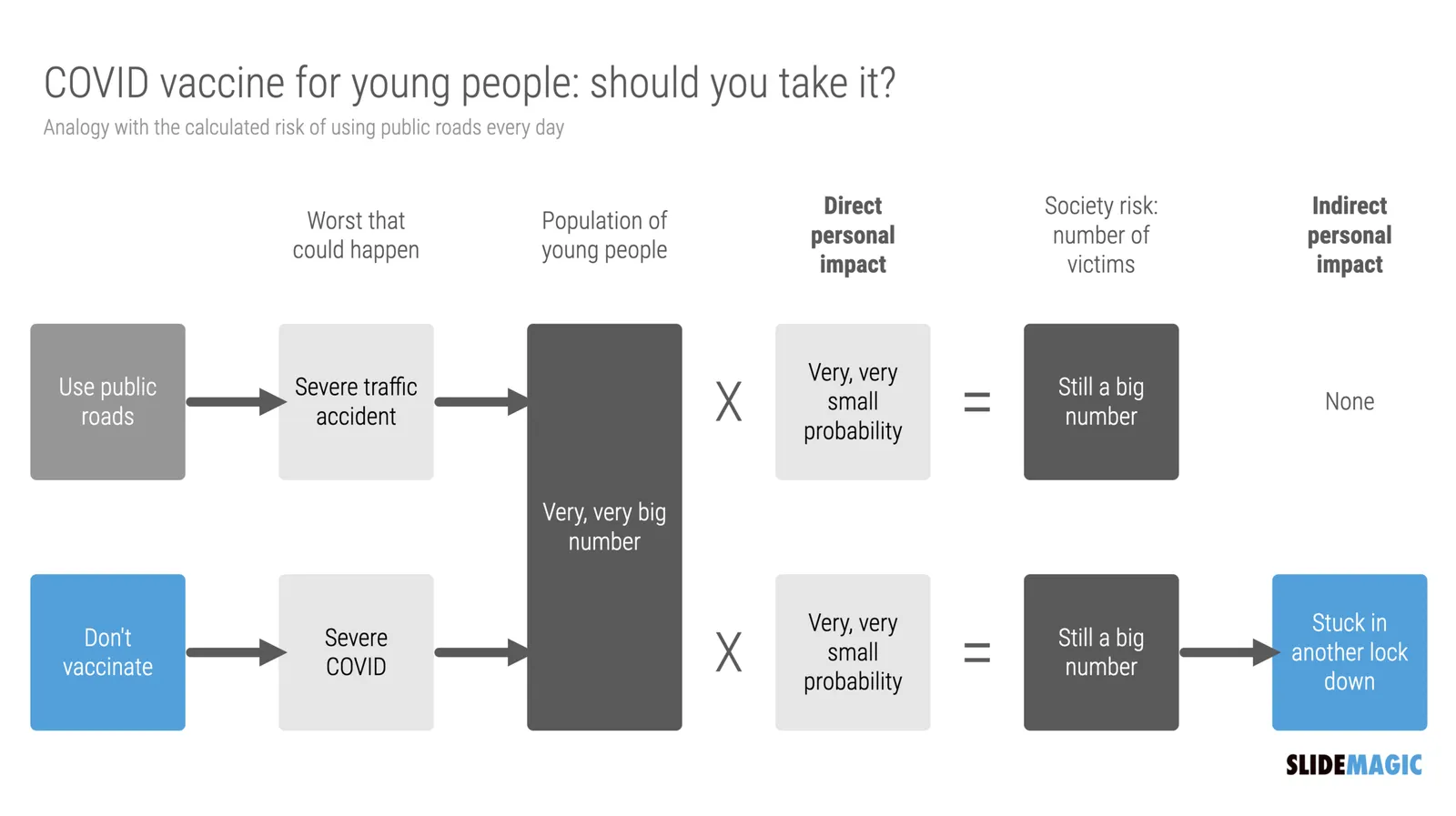
There is a segment of young people though that “can not be bothered”. The personal risk of getting severe COVID is very low. They consider it the same as joining public roads every day. You consciously take this calculated risk, knowing that the probability of getting stuck in a severe accident is very small, especially when you drive safely.

What people forget, is the indirect impact. Big number of people x tiny percentage is still a big number of people at country level. And filled up intensive care units, trigger more lockdowns, more closed restaurants, bars, parties, zoom schools, etc.

I compared the two scenarios in the chart below (search “COVID” in the SlideMagic app to use something like this logic flow in your own presentations for other topics, also put it in the web template bank, download it here).

·SlideMagic

Observations from a slide magician...

“Slide magician”, that is what you become right after using SlideMagic for a while?

Recently, I had to go back to PowerPoint for wireframing some new app screens (it is this “free hand” doodling that is made impossible by design in SlideMagic). Here are some of my impressions.

  • PowerPoint has gotten much more polished. I do not use PowerPoint that often anymore, and you see improvement in the details of the UI elements (I have developed an eye for app design now).
  • Some elements are a bit intrusive. I had to work hard to save my work on a local drive rather than the Azure cloud folder, and the “AI-powered” design ideas with bold pictures and graphics took some time to switch off.

The biggest change was in my head though and has nothing to do with PowerPoint. I have become so accustomed to making slides in the SlideMagic-style (boxes and grids), that I started trying to make these slides in PowerPoint as well. And here I noticed how hard that was.

Something interesting is happening. I start to ‘forget’ certain workflows in PowerPoint, things are getting a bit rusty, compared to 3 years ago when I would fly across the user interface with the help of my custom toolbars. Maybe that is the same starting position as most PowerPoint users who are not professional designers.

Photo by Almos Bechtold on Unsplash

·Layout

Knowing your audience

A follow-up on yesterday’s post about convincing the center when it comes to COVID vaccines.

Most people who create presentations are not marketeers or PR professionals. They hear people (including presentation designers like me), talk about how important it is to think about your audience when crafting slides. And when thinking about the audience, they don’t have much sophisticated data. Insights are likely to be basic: “They do not believe that we can get traction with our search engine that needs to beat Google”.

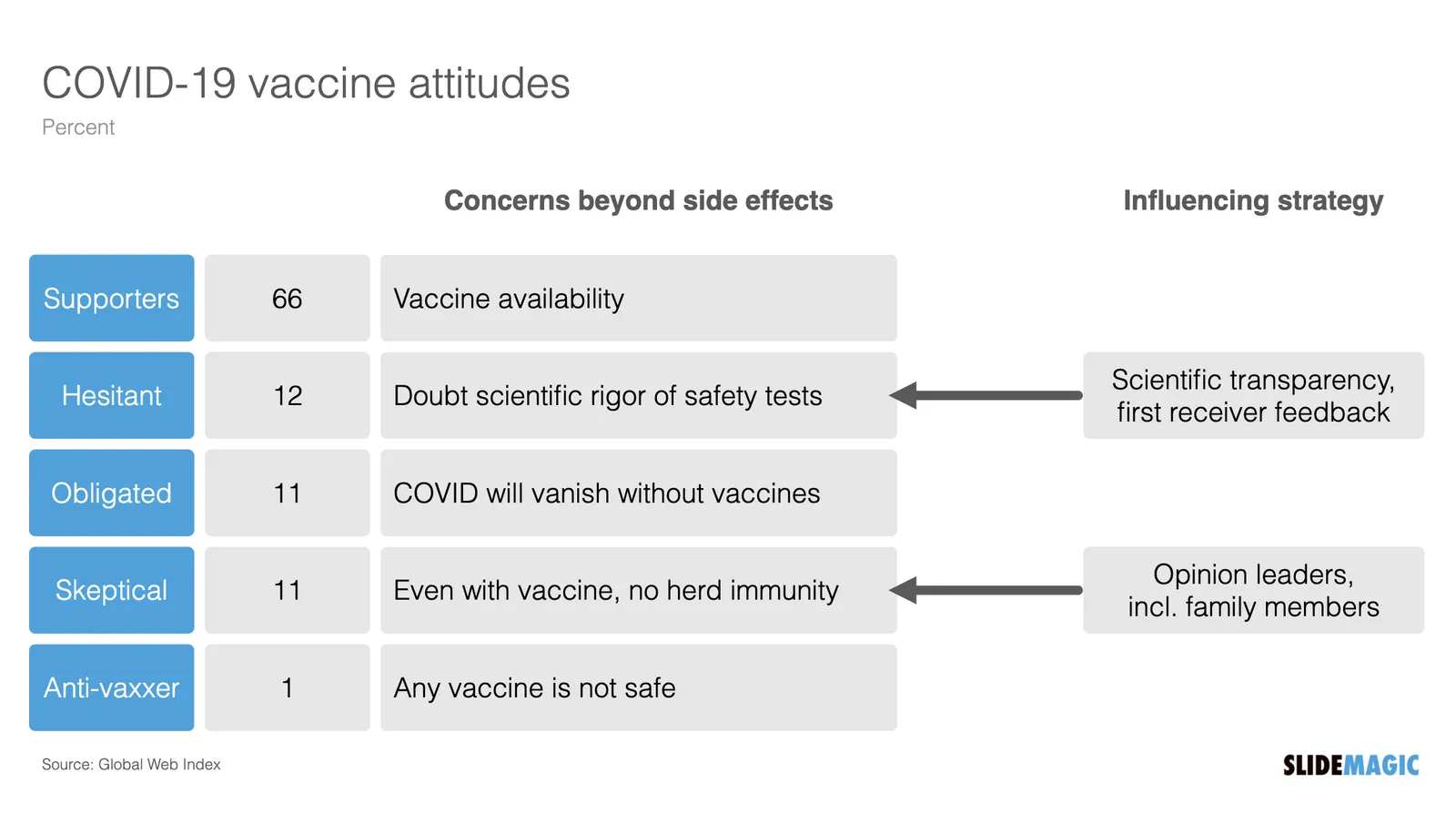
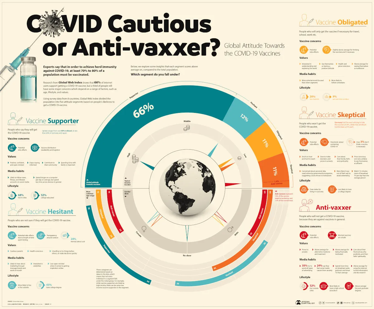
Global Web Index did research in people’s attitudes towards a COVID vaccine, the results of the findings are put in this visualisation by Visual Capitalist. The main message to me about this pretty but busy graphic is that it is complex, things are not clear cut.

Here is my summary of the segments, and a possible communication strategy. (You can find this slide in the online template bank, or search for ‘covid’ in the SlideMagic desktop app)

Most business presentations will not have the luxury of a detailed audience analysis, but it is an interesting thought process of running through an imaginary one.

·Sales presentation

Convincing the center (redux)

This posts keeps on coming back, usually around elections. This time around the trigger is the debate among “younger” Israelis (below 60) whether they should take the COVID vaccine or not (widely available here in Tel Aviv).

Normally speaking, the risk of serious COVID complications should be relatively low for individuals in this group. With the immediate threat out of the way, people can start arguing. Messaging groups are now a favorite channel for heated debates about the pros and cons of vaccination.

Some points to remember when persuading people:

  • Focus on the center, the people who are in doubt. It is 100% certain that you can convince a die-hard anti-vaxxer, or genetics professor to change her mind in a few message exchanges
  • “Screaming”, aggression, calling people on the other side of your argument stupid and incompetent is not going to score you sympathy points (and help you become more convincing).
  • People in the center are likely to be reasonable people, so wild conspiracy theories or unusual scientific “evidence” might not stick very well

All the above applies to investor and sales presentation as well. Pick your battles and focus on the people who could change their minds

Photo by Marcos Paulo Prado on Unsplash

·Data visualization

Making sense of Israeli vaccination data

Here in Tel Aviv, I was lucky enough to receive my second vaccination with the Pfizer COVID-19 vaccine. The whole world is watching us:

  • High vaccine availability
  • Advanced healthcare infrastructure, with a centralized IT system (any medical professional can punch in my ID number in her computer and get all my medical records on the spot, this would raise some privacy issues in other countries)
  • (Unfortunately) we are set up to deal with national crises and get organised quickly

There is lots of data available, cases, hospitalizations, difficult cases, casualties, by age, religious background, location, total cases, new cases, etc., etc. And everyone is looking at the top line number, will the big case graph go down and can we declare victory over the virus. Unfortunately so far, it stays more or less stable (at high levels).

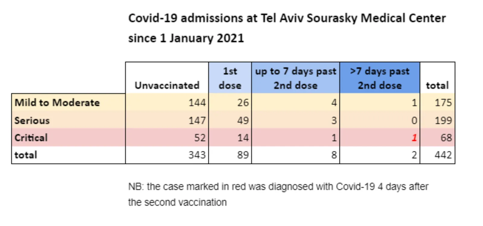
This is a typical case of data overload. If you want to see whether the vaccine works you need to compare 2 things like for like: people who got vaccinated, and people who did not. And when you do that (pretty much like a clean medical trial), it shows that the vaccine is overwhelmingly effective, the same size is just not the entire Israeli population.

One such example is hospital admission data from a Tel Aviv hospital. Not millions of people, but a small, isolated group that you can compare. The original chart is here:

I did a quick makeover of this slide in SlideMagic.

  • Colours are consistent
  • Everything is properly spaced
  • A better way to communicate the ‘1’ exception case
Continue reading →
·Typography

PowerPoint conversions back to Arial

I changed the font that SlideMagic uses for PowerPoint conversions from Calibri to Arial as of version 2.6.22.

The thought behind Calibri was that when converting slides to PowerPoint, I wanted to stick as close as possible to the box-standard Microsoft format as possible, and Calibri is the standard font for Microsoft Office applications. SlideMagic users “complained” that the PowerPoint conversions did not look very similar to the beautiful originals. So I made the change.

Helvetica (especially thin variants) looks more elegant but gives compatibility issues on Windows machines. Hence Arial it is….

Obviously when you convert your SlideMagic .magic files to PDF, you get the exact same look & feel as in the SlideMagic app. This is the workflow we should aim for. SlideMagic .magic files are the source code of your documents, PDF is how you share the result with external audiences.

Photo by Natalia Y on Unsplash

·SlideMagic

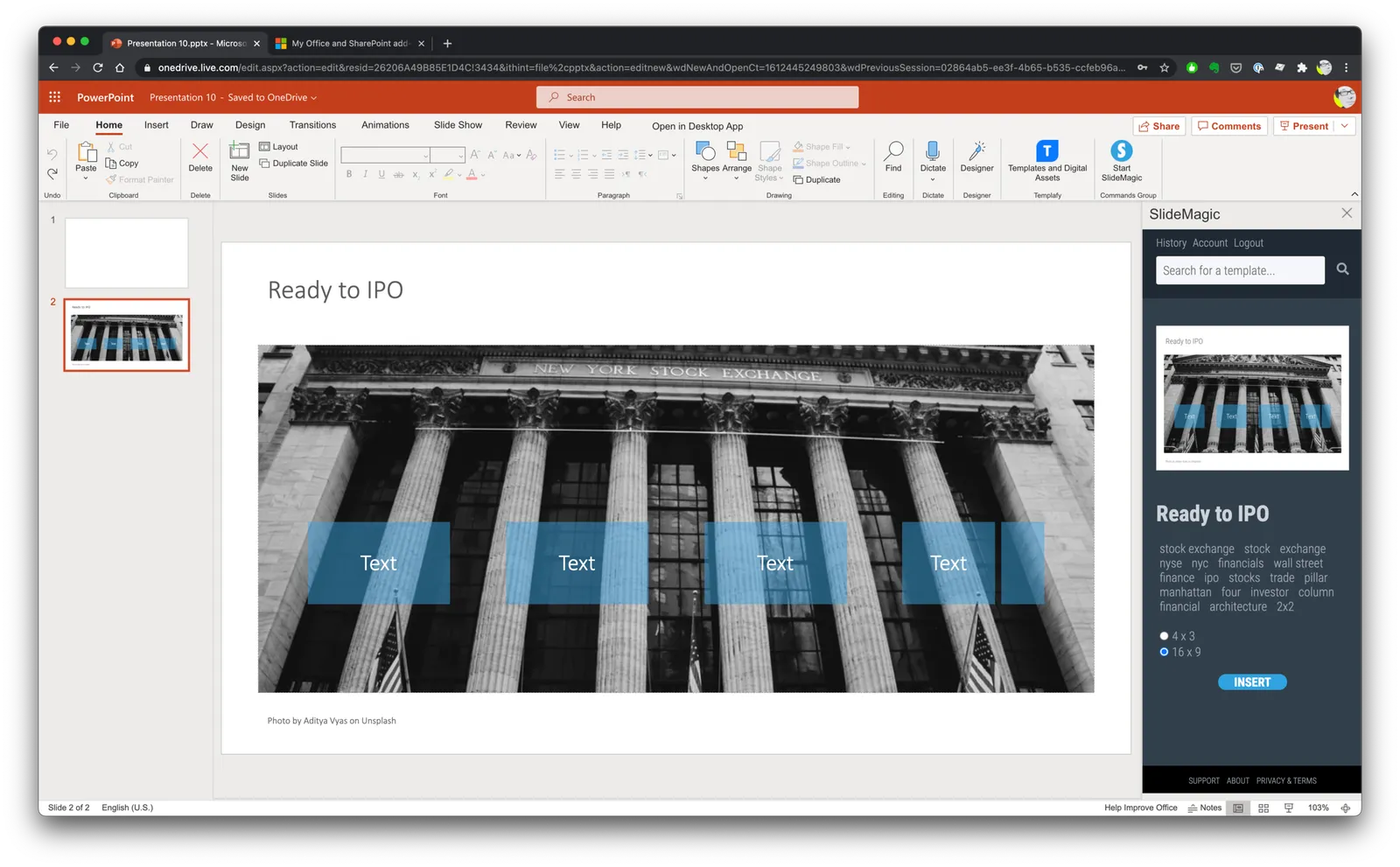
Updates to the SlideMagic PowerPoint Add-in (alpha)

UPDATE: THE MICROSOFT OFFICE PLUGIN HAS BEEN DISCONTINUED (30 JUNE 2026)

Microsoft made some updates to its Office API (and SlideMagic made some changes to its server), and as a result, the SlideMagic PowerPoint add-in starts working a lot better.

The SlideMagic PowerPoint add-in is especially useful for users who download PowerPoint templates from the SlideMagic web site. Most of you are people who were subscribers to the legacy template store (RIP). Since PowerPoint conversions are a pro feature of SlideMagic, the add-in is only useful for pro subscribers.

What has changed?

  • The add-in now remembers your login details across PowerPoint files No need to constantly log in (again).
  • More importantly (thank you Microsoft), the SlideMagic add-in now adds slides straight into your existing PowerPoint presentation

The add-in is still an alpha phase, and things are tested for the moment in the online PowerPoint environment. I will submit it for another go for Microsoft approval to get it working with PowerPoint desktop versions as well.

Here is how to install the add-in:

  1. Download the file slidemagic.xml from this link
  2. Log in to your online Microsoft 365 account, click PowerPoint, and open a new presentation
  3. Select “insert”, then “add-ins”
  4. Select “my add-ins”, then “upload my add -in” in the top of the window (it is not available in the Microsoft store yet)
  5. Select the slidemagic.xml file you just download and upload it
  6. Go back to the '“home” ribbon

The add-in is installed. To use it:

Continue reading →
·SlideMagic

"10 happy users"

This tweet sums up SlideMagic’s strategy at the moment:

Ten happy users who use the product for hours every day and pay for it. Presentations is a very tricky segment, and existing solutions (including those with lots and lots of installs) suffer from one of these problems:

  • Users don’t think making presentations with it is fun
  • Users don’t use it as their go-to presentation platform
  • Users don’t see the value to pay for it

The strategy of buying millions of users and then waiting for 0.5% who might end up as a user is expensive, risky, and probably leads to the wrong product.

Photo by engin akyurt on Unsplash

·SlideMagic

In-app tutorials

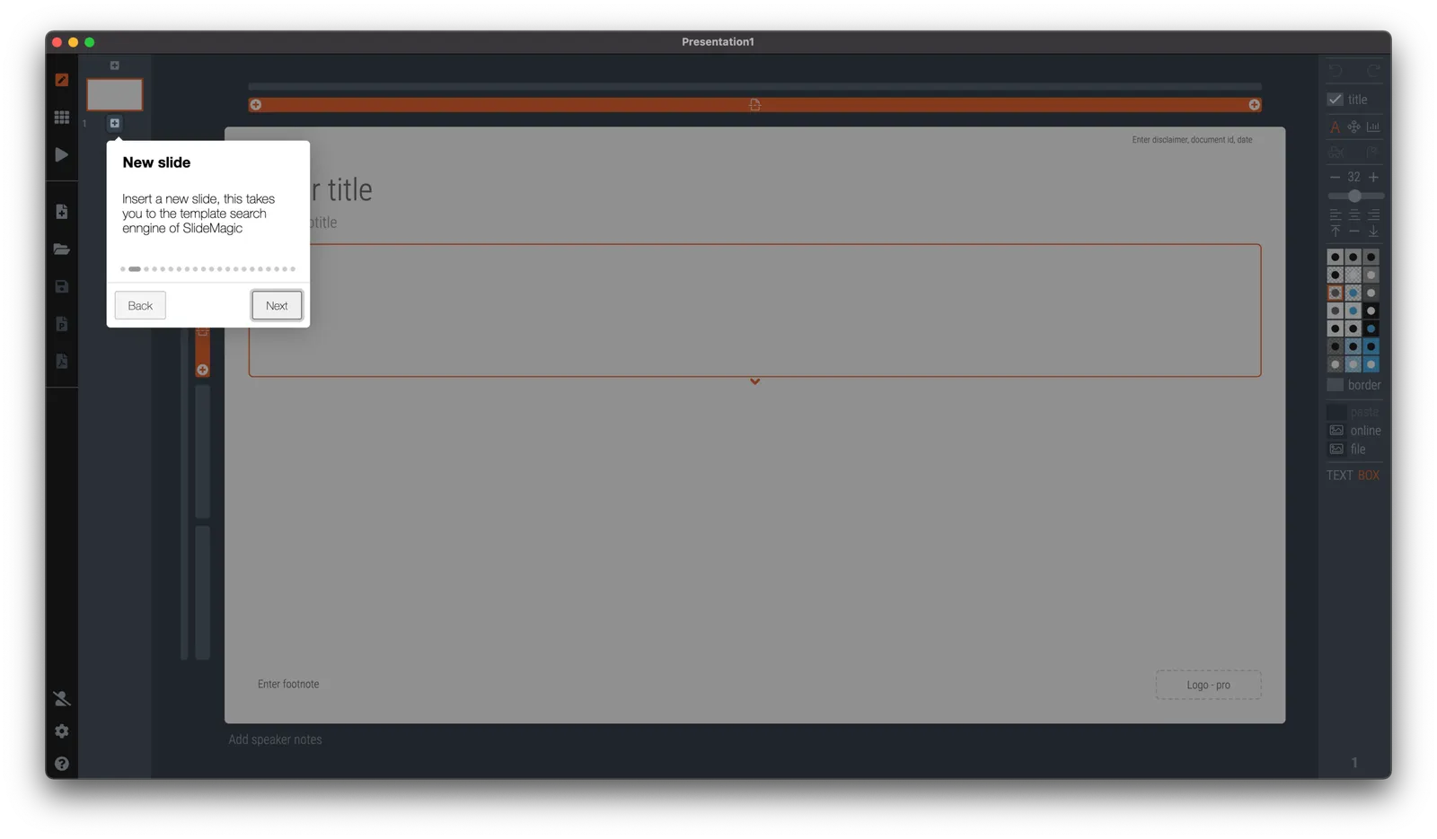
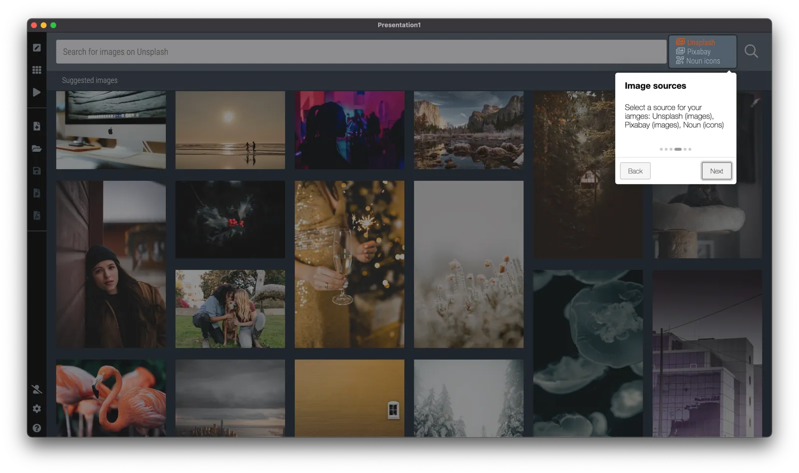
Since v2.6.18, SlideMagic has in-app onboarding tutorials. Click the ‘?’ icon in the bottom left of the app, and you will be taken around the features of the screen that is currently active. The slide edit screen also covers the general navigation inside the app. Next to the edit screen, there are page walkthroughs for the story, settings, presenter, image/icon search, and template search screens.

There is still some formatting to do, and the tutorial needs a more prominent position when you start SlideMagic for the very first time, but all in all, very useful I think. The real-time examples work much better than static tutorial pages, and now, the tutorial will always be up to date with the user interface (which is still changing now and then).

Photo by Zoltan Fekeshazi on Unsplash