SlideMagic Blog

Frequent updates about all things presentations since 2008. Subscribe to never miss a post.

RSS
·PowerPoint

Help, I just moved my PPT drawing guide by accident!

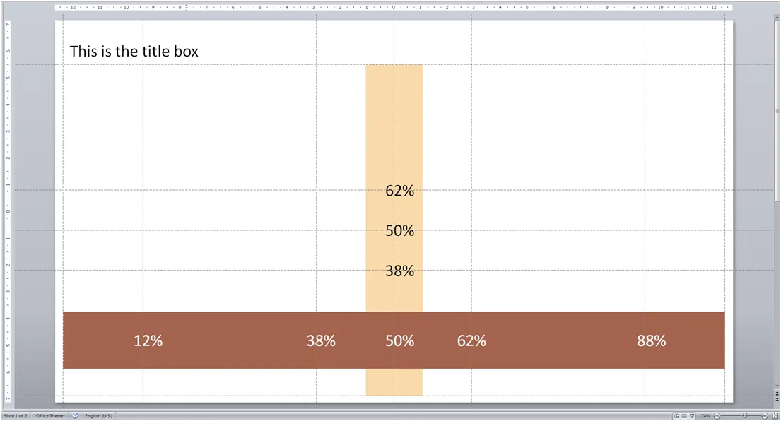
Drawing guides are very useful to keep your pages consistent. I always put ones in such a way that I get a grid similar to the rule of 3:

  • Left and right, bottom
  • Top, under the title line
  • Middle (not at 0, but in the middle between top and bottom guide)
  • Two vertical, at 61.8% of the page width (golden proportion)
  • Two horizontal, also at the magic 61.8%

Below an illustration of a typical gird I would use for a 16:9 wide-screen presentation.
The big issue with drawing guides is when you accidentally move them: how to put them back in the right place?

  • To display drawing guides go to home/drawing/arrange/allign/grid settings and tick the box
  • Now use the same menu to set the grid spacing to a round number, for example 0.1 cm, instead of “8 grids per cm” which will give you a spacing of 0.125 cm, making it very difficult to bring a guide line back in its original position.
  • You can drag/move grid lines around
  • To create a new one: press CTRL, click an existing guide, and drag it to the new location
  • To delete a line move it off the page
  • Write down the grid positions on a piece of paper, with a nice, round, grid spacing number it is easy to move guides back to their original position if moved by accident
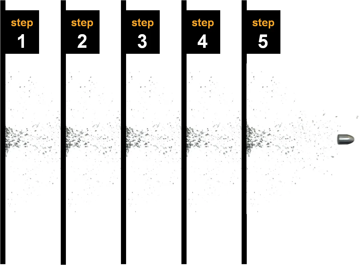
Chart concept: bullet shattering glass layers

The power of repeating images. I used a stock image of a bullet going through one layer of glass as the basis for a setup page explaining how a hacker can gain access to secure data through a series of steps. As people go through the presentation, on additional layer is added to the tracker page One image, cropped and repeated a few times. All other elements of the chart are minimalist and simple. People get the message, no need for more sophisticated graphics.

·Colors

There are more font colors than black

When working on a white background:

Using very dark shadings of one of your color scheme colors as the standard font color, can give your slides a much nicer feel than using high contrast but boring black. 

Especially true for title lines.

·Gadgets

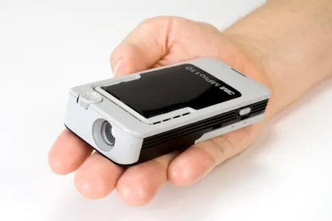
3M will launch a pocket-sized projector soon

I wonder whether this gadget will change the way we conduct presentations. The overhead beamer has just been resided to something that actually could fit in your pocket. Rather than looking in a coffee shop for a socket to plug in your laptop, now you also need to find a decent surface of white space on the wall…

Photo by 3M. Source: Popular Science

·Books

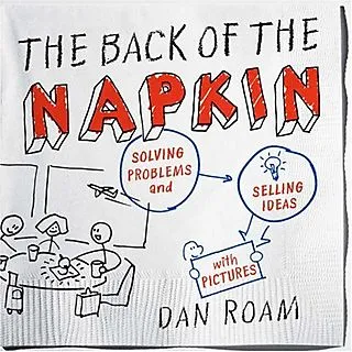
The strategy consultant's review of The back of the Napkin by Dan Roam

We talked about sketching chart ideas on paper before, but Dan Roam takes visual problem solving to the next level in his book The back of the Napkin. This book was an interesting read for me not only because of the presentation concepts discussed, but also because The back of the napkin aims to provide a complete framework to solve business problems. (The key frameworks can be downloaded here for free). I think the book did really well on the presentation front, the goal of a generic strategic problem solving kit is not really reached. Dan does a great job convincing us that we should use our drawing/visual thinking skills that most of us have been neglecting since we started formal education. On top of that he provides practical guidelines to get going

  • Have the courage to use a more informal drawing style (away from the computer) to get to the essence of problems, focus not on form but on content
  • Help us think about what type of drawings are best to be used in which situations (who, what, when, why, etc.) and to what audiences (the visionary CEO, the detailed operations manager)

As a problem solving tool kit, he provides useful tools but falls short of providing a generic solution framework for all business problems (which impossible anyway I think).

  • Dan takes the “S-type”/“sensing” approach to problem solving, spread out all data, put in on the walls, digest it all to see the bigger picture. A way of data processing very similar to the human brain sizing up a new environment. This is actually a useful and fresh approach compared to for example strategy firms such as McKinsey, that apply a very targeted data gathering approach focussed on key questions/issues that have been identified earlier.
  • Another take away for me were diagrams that try to summarize all relationships in a problem. Plot a variable on the x axis, one on the y axis, start adding bubbles in different sizes and different colors to analyze 5-6 dimensions in one diagram. Useful for solving problems, less for communicating results to a “cold” audience that is confronted with the material for the first time.
  • I do think however that the book does not provide a simple step-by-step guide to solve problems, you need guidance for this. Running problem solving brainstormings around a white board requires a strong moderator, and picking the right diagrams requires experience. Hiring Dan’s firm would probably do the trick, but the novice will find it difficult to apply the techniques after having read the just the book.
Continue reading →

Sometimes cramming lots of detail in a PowerPoint slide looks great

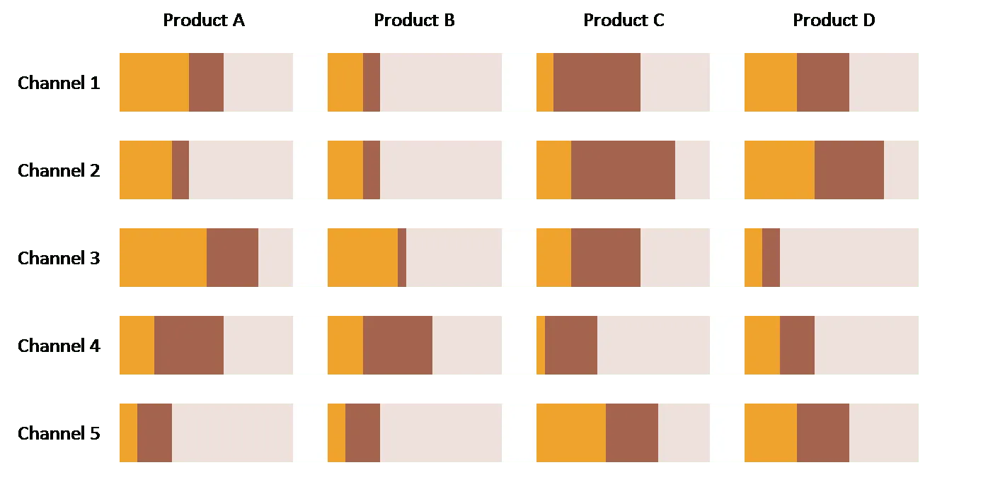
It is clear that good charts address one idea only, and use minimal text and data. Still, I sometimes make charts that have an enormous amount of information in them. The smart use of graphics and colors makes sure that the message comes out.

The trade-off heat map we talked about earlier is an example. Here is another one of my favorites: all market shares for all products for all channels in one chart (random data without a clear message I must admit here).

  • Create the chart as 1 PowerPoint bar chart with “white” data series to separate the graphs so they are exactly lined up
  • Use contrasting colors for the data you want to focus on, plus a pale one to fill up the chart to 100, reinforcing the grid structure of the slide
  • Group rows and columns with similar numbers together so the become stronger visually when looked at from a distance
  • If necessary add a message with a bright red circle

Strangely enough: the more products, the more channels, the better the chart looks.

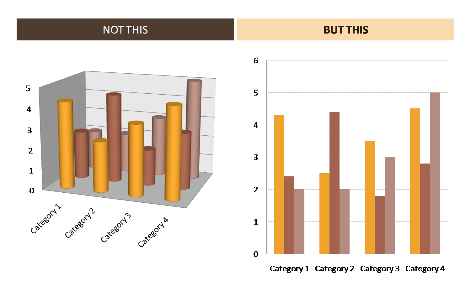
Present data in clean 2D

The fact that PowerPoint can apply a lot of 3D graphical effects on charts does not mean you have to use them. Simple 2D looks better and is easier to read

·McKinsey

Classic McKinsey business frameworks

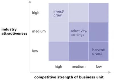
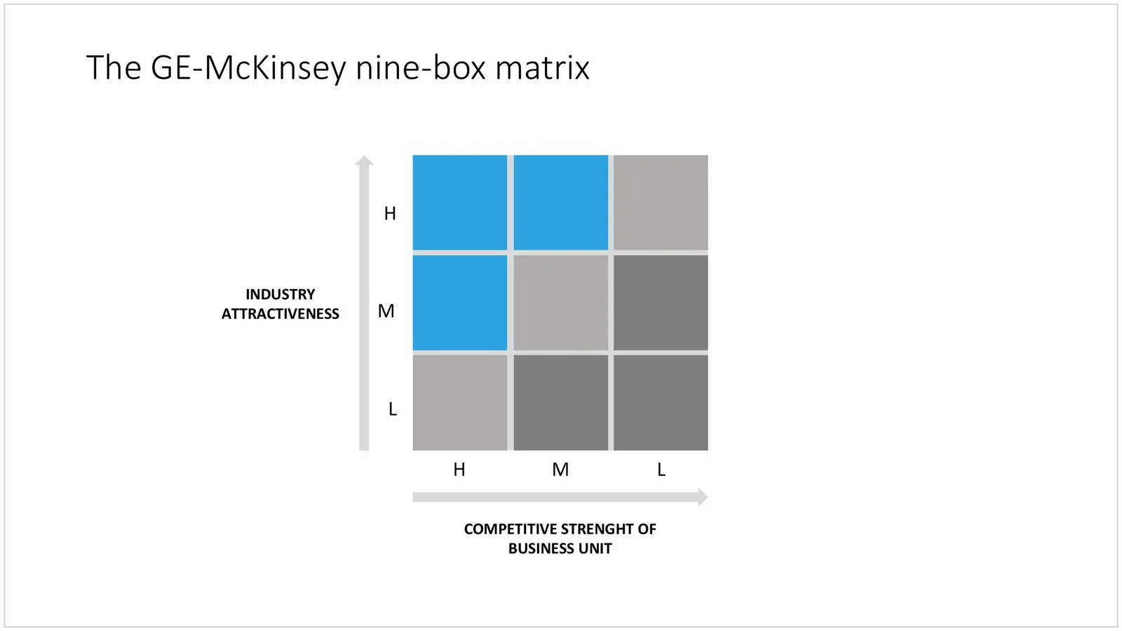
The McKinsey Quarterly added another framework to a series that discusses historic business analysis frameworks: the GE-McKinsey 9 box matrix, developed in the early 70s.

Glancing over the article and hearing the audio explanation made me realize: things have moved on. Managers have become much more skilled in absorbing diagrams, and business portfolio analysis is more than plotting industry attractiveness and competitive strength. The elaborate explanation of the 3x3 would almost be an “insult” to a sophisticated management audience in 2008. Still, today I constantly invent “frameworks” for presentation on the spot: how to present 4 steps, 3 distinctive factors versus the competition, 6 phases to launch, the best of both 2 worlds, but none of them are standard. Also, I am increasingly moving away from the urge to summarize all factors and aspects of a solution on one (the first) page. Rather, I take an audience through a step-by-step story to the final answer. The difference between a concise document and an engaging live presentation. For more nostalgic reading:

  • Classic frameworks by McKinsey & Company (7-S, Structure-Conduct-Performance [SCP], others)
  • Classic frameworks by the Boston Consulting Group (Growth-share matrix [Stars, cash cows, dogs, question marks], others)

UPDATE February 2018: I have now added the GE McKinsey matrix and lots of other consulting frameworks to the SlideMagic template store.

 The GE-McKinsey matrix in PowerPoint

The GE-McKinsey matrix in PowerPoint

·Shapes

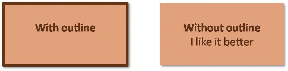
Avoid shape outlines if you can

I think PowerPoint shapes just look better without a dark line around them. A fill color that stands out from the background is enough. If you have to use a contrasting line, use either white or a dark shade of the fill of the shape rather than black.

Heatmap - visualizing complex trade-offs

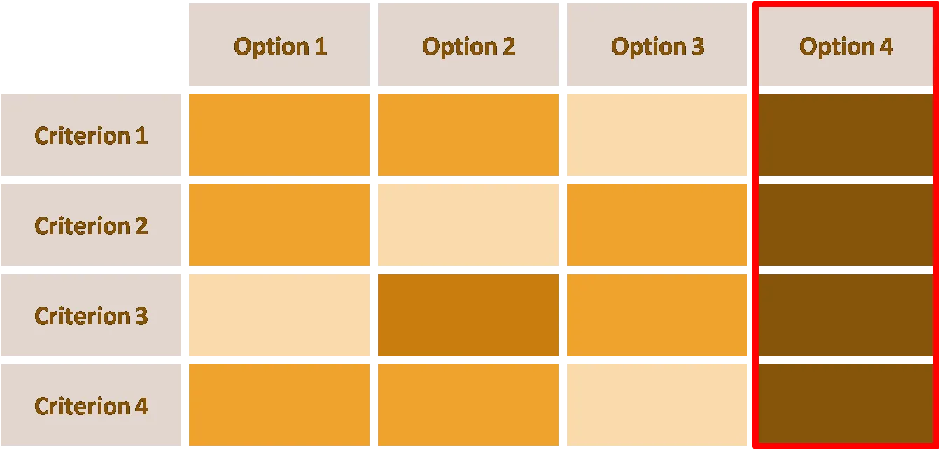
Often the key page in a presentation is the one that makes the trade-off between a number of alternatives. Examples are selecting a new strategic direction for a company, or explaining why your product is better than all alternatives in the market. It is “easy” to write down this information in document: a big table with all the pros and cons explained. However this approach is too dense for a presentation slide.

I often use a “heat map” in these situations. Options on one axis, criteria on the other, and use shades and tints of the same color to show relevance (“dark = good”).

  • Select criteria in a smart way: group similar items that give similar scores (volume, revenue, profit) across criteria into one
  • Use minimal text to describe options, criteria.
  • Group rows, columns in such a way that you create big “fields” of similar color

When presenting the slide, the point is not to discuss all the cells (that should be done in subsequent slides, 1 topic per slide), but rather to highlight the point that “option 4 is the best”.

UPDATE: A similar looking chart is now available on the template store: have a look at this heat map template