SlideMagic Blog

Frequent updates about all things presentations since 2008. Subscribe to never miss a post.

RSS
·PowerPoint

Presenter view - your screen's different from the audience's

PowerPoint has a smart little-known feature built in: presenter view. The screen on your laptop is different from the full-screen view the audience sees.
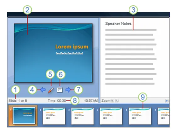
  1. Slide count
  2. Current slide
  3. Notes
  4. One slide back
  5. Marker
  6. Opens a menu (black screen, white screen, other functions)
  7. Next slide
  8. Presentation timer
  9. Slide sequence

In order for it to work, you need to setup your computer for 2 monitors (The primary monitor is your laptop, the second one the big projector) in windows control panel/display properties. After that, in the PowerPoint slideshow menu, set up slide show and go to the multiple monitors section.

UPDATE: From the comments below, John Goalby is pointing to his very detailed, free ebook on the subject of Presenter View.


·Investor presentation

David S. Rose: 10 things to know before you pitch a VC for money

Presentation Zen posted a good review about the presentation aspects of David Rose’s TED video about pitching your company to VCs. I watched the video, and would like to add a summary of some of the content that David is talking about.

  • It’s all about you. The content of the presentation is about the substance of your business. But VCs look for things you are not directly presenting, but convey in between the lines about yourself.
  • Integrity, realism, coachable were 3 characterization that stood out from the 10 or so “you” criteria David was listing (including more obvious ones such as passion, knowledge, etc.). Be a person that stands with both feet on the ground and is open to learn.

After discussing “you”, David moves on to discuss a structure of a pitch presentation. Many elements are not new (market, team, financials, etc. see video for details), but he adds useful thoughts to all of them (I use the words “don’t” alot):

  • Start immediately with a very, very brief description of what you actually do, so the audience is not guessing through your talk but rather can focus on the content
  • Don’t “pop” the buildup of excitement by going back, making a mistake, stalling.
  • Don’t say anything that is not true (linked to the integrity point) above. (My addition, say “I don’t know” if you’re not sure)
  • Don’t make the audience think/wonder about number inconsistences between slides, even if they are not errors (net sales, versus gross sales for example). It distracts, “pops” the flow
  • Use real concepts instead of abstract ones, also in financial forecasts. Instead of cleaming 0.5% of a $1bn market, why would someone buy 1 product, how many customers do you think you can get, hence, what would your sales be.
  • Give the audience a something to compare your idea against, to validate it (a comparable company, etc.(
  • Finally, do a verbal wrapup (maybe with only a company logo on the slide), rather than a crammed slide that invites a repeat of the entire presentation
Continue reading →
·Images

How to crop portrait pictures

Portrait pictures always come in different sizes, different background colors, different poses. Ideally, you would make one consistent photo shot. The next best alternative is fixing things using the crop function.

If it not possible to resize/crop the pictures in such a way that faces have the exact same proportion, hold on to these guide lines:

  • Eye lines at the same hight
  • Eye lines close to the “golden proportion” of 62%
·Sharing

Flowgram - stitching web content together into a presentation

Ars Technica is featuring this review of Flowgram, a tool to create a sequence of web content (sites, Flickr photos, audio voice over) into one presentation-like format. Flowgram’s founder has written a flowgram about - you guessed it - what is a flowgram here. This new tool seems particularly useful to develop presentation content that is loaded on a web page and designed for individual viewing. In a strange way, some of these web 2.0 presentation tools take some of the interactivity out of the internet and bring the online experience back to something that is called TV… Sit back and enjoy. UPDATE: Tony from Flowgram has a good point in the comments, Flowgram preserves the ability to click links during the presentation, so not that passive after all.

·Layout

Who said that PowerPoint shapes always have to fit inside the canvas?

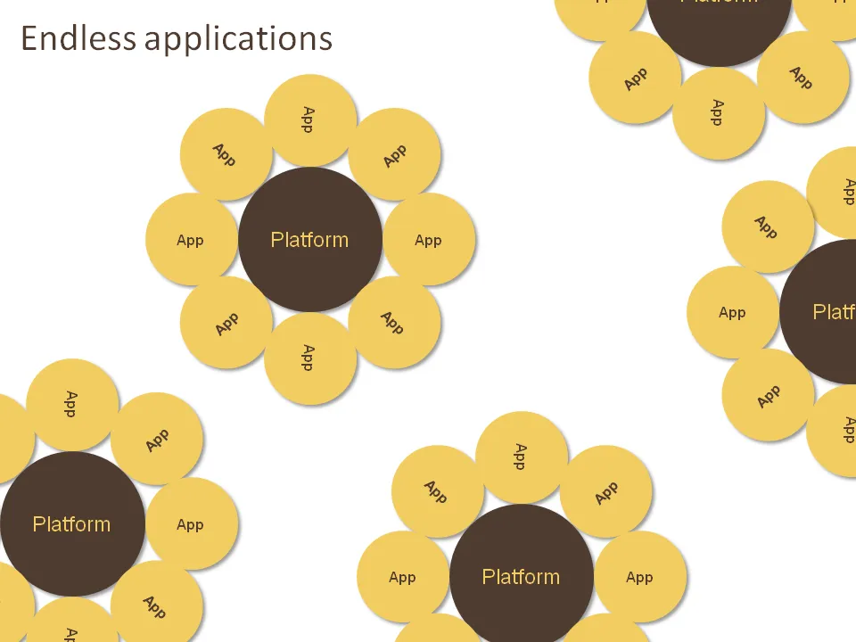
Like images, it can also look very nice to let PowerPoint shapes float off the page. Just position your object half off the canvas, PowerPoint will eliminate the content that’s not on it when in presentation mode.

The concept below was made for a company that has a technology platform that can be applied in an almost unlimited amount of applications. Yes, the chart was inspired by a field of sun flowers in southern France. Here is how to get all these circles lined up nicely.

·Sharing

Web tools to complement PowerPoint - I did not know about many of these

Paul Gibler just posted this article with a large set of web tools that can enhance PowerPoint.

Some of them I knew already, some of them are less interesting to me (I am not into video), but that leaves a whole lot of new tools to explore, such as PPT-editable maps and PPT file compressors.

·PowerPoint

Focus on you - (b)lack or (w)hite PPT screen mid-presentation

Two useful PowerPoint keys depending on whether you use a dark or light background:

  • Pressing “B” during a slideshow turns the screen black
  • Pressing “W” makes it white

With one button, you bring back all the attention of the audience to you, and you can deliver an important message without slide support.

UPDATE: Bert Decker pointed me to one of his blog posts in which he suggests deliberartely injecting black (or white maybe) slides into a presentation. After you press “B” to black out a slide in a live presentation, you have to make it appear again to continue with your story. Inserting black slides in the presentation does not require to bring the audience back to a point you already made.

Juice analytics chart chooser tool

Another link to a tool today. This one has probably been around for a while, but I just stumbled on it. It is important to pick the right type of chart (line, bar, column, pie, etc.)  that fits with the message you want to get across. The Juice Analytics chart chooser automates (part of) the choice for you. As with all automated tools, results should not be blindly applied. Still, one piece of input in the design process.

Wordle - nice tag cloud generator

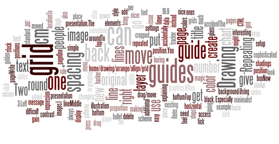
I stumbled on Wordle today, and let it have a go at my blog RSS feed. I could not get it to work in Chrome yet. To extract a screenshot you need to use the good old SHIFT CTRL PRTSCR since the Java applet cannot save image files to your computer.

Thank you Michael Kogeler.

UPDATE: Wordle is actually part of Many Eyes as well, I talked about that before.

·Layout

Word repetition - looking at text as shapes

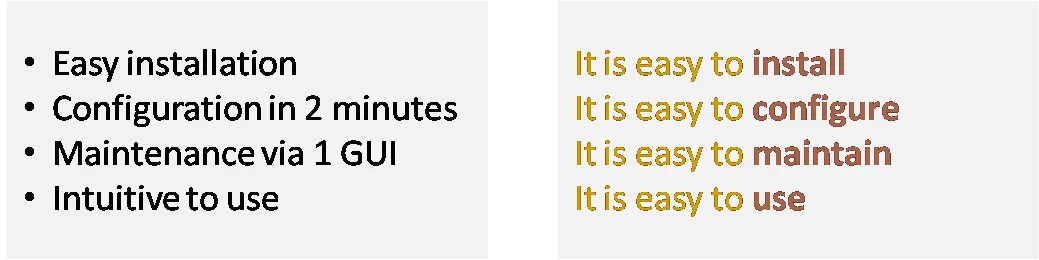
Repeating text might not be the best writing style, but it can add expression to a chart. I often look for interesting patterns in text (or create them by changing words or re-grouping items).