SlideMagic Blog

Frequent updates about all things presentations since 2008. Subscribe to never miss a post.

RSS
·Templates

Chart concept - empty billboard

There are many “empty billboard” images available on stock image sites such as iStockPhoto. Many of them are cheesy, but the more realistic ones could be useful. I use them often in presentations as a place holder for information about a major product (re-)launch, or maybe a final slide to shout the key message home. They look best when you use an actual add containing images instead of just text. Make it look more realistic by using grey scales instead of black, make the image semi-transparent and (for the pros) use a blur filter in PhotoShop. Also, changing to a night setting adds more focus to the image. All the effects below were done in PowerPoint (gradient overlays).

See an earlier post about pasting text on images here.
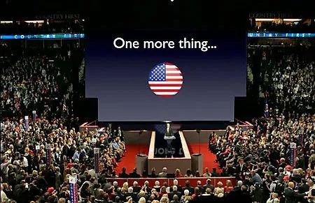
The huge screen - McCain's background visuals

Lots of linking to Garr Reynolds this week. After a lively discussion in the press, Garr added his review of John McCain’s background visuals. An amusing read, the above image is a PhotoShop of what would have happened if Apple had prepared the visuals.

But it highlights a bigger issue: how to use these huge, huge projection screens? We have moved from the overhead project slide, to the PC projector, which in turn have gotten bigger. Now in a big conference, a video of the presentor and a PowerPoint visual are usually projected on a moderately big screen. We started to learn how to best use these screens.

But these size screens? I tend to think that they are actually too large for any image, graphic. Maybe just a few simple words? Anything else will distract the attention from the presentor.

·Books

Book review - Presentation Zen by Garr Reynolds

I had a big shipment of books coming in recently, hence the stream in book reviews.

I finally had a chance to read Presentation Zenby Garr Reynolds. Garr is a leading authority on presentation design and delivery, advocating his minimalist (or “Zen”) approach to presentations. His blog is one of the most visited web sites on the subject.

That’s what 50% of this book is about, convincing the army of business managers writing thousands of PowerPoint presentations every day to drop their bullet point slides, take off big corporate logos from their slides and use more images supported by minimal text. It is an important message and I forgive Garr for repeating it many, amny times throughout his book.

The other 50% is focussed around taking the designer approach to presentations. I enjoyed reading backgrounds on Japanese and Zen culture and how they can be applied to good design. I did learn a few things about photo composition.

The book is nicely illustrated with example presentations, and many “before and after” slide transformations. There are a lot of references to iStockPhoto in the book. A great site (I use it a lot), but the suggestions could have been put in slightly more subtle

Having read slide:ology by Nancy Duarte just a few days a go, it is interesting to draw a parallel. Slide:ology contains more practical presentation advice: how to define color schemes, specific examples about slide build up. Presentation Zen adds more on the create design process, esthetics, and photo composition.

Continue reading →

Aligning PowerPoint object around a circle

PowerPoint has useful tools to align and distribute objects. Spreading things around a circle is more tricky though. Here is one solution that works with an even number of objects circling the center.

  1. Draw the rough configuration of the diagram you want (something in the middle, an even amount of objects around it, not yet aligned)
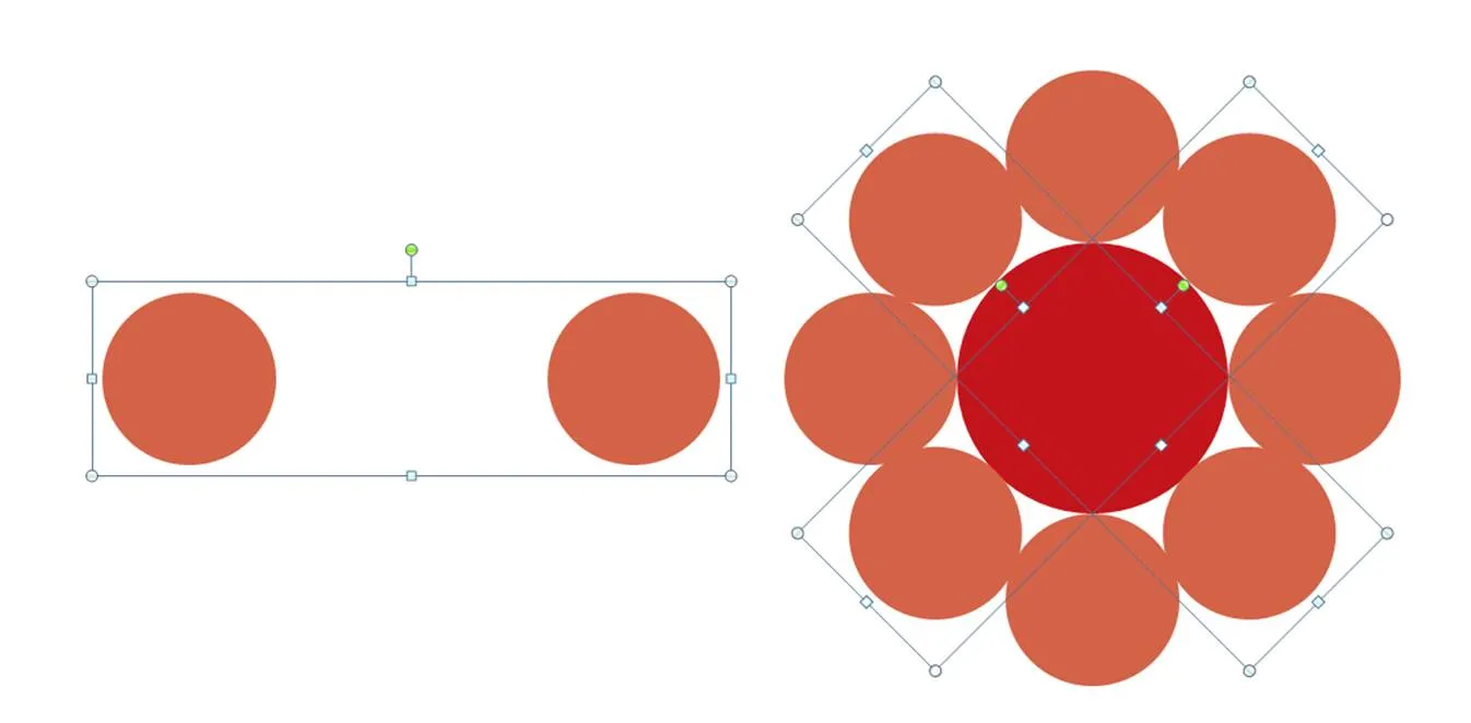
  2. Align 2 objects horizontally, and fix the distance in between them (left part of the attached illustration)
  3. Using the “size” function copy (in my case I needed 4) them, and rotate them in increments you need (in my case 360/8=45 degrees).
  4. Center and middle-align all objects until the diagram is finished (right section of the attached illustration)
·Software

Many Eyes - "Flickr for data visualization"

Weekend reading. The NYT pointed me to Many Eyes, a site for sharing of data visualization. You can upload a data set (or use an existing one), pick a visualization and publish it to the world. Many Eyes is part of one of IBM’s fundamental research programs. Some visualizations are the standard charts also available in PowerPoint, others are more unusual, for example tag cloud generators, and maps (countries, world) which are always tricky to create in PowerPoint. A shame though that it is not possible (at least I have not discovered it) to take visualizations off the site and use them offline in your own presentation.

·Animations

Multi-layered slides: the selection pane

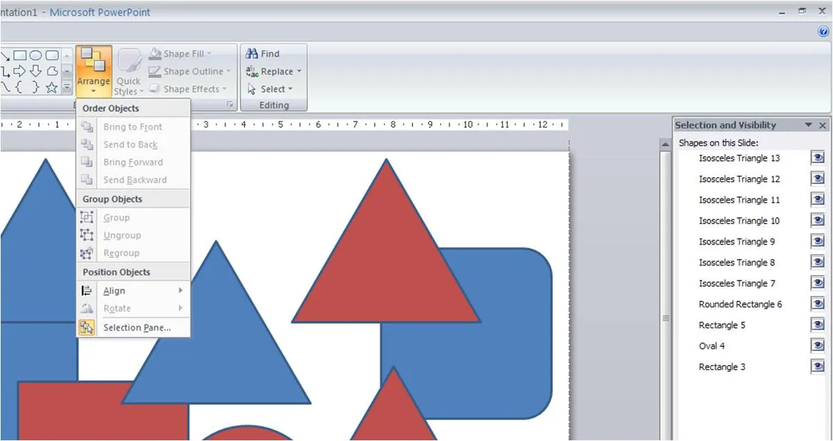
It can become almost impossible to edit complex animated slides that have layers and layers of objects on them. My solution used to be to spread the chart out over multiple pages.

Recently, the selection pane tool in PowerPoint 2007 was pointed out to me. You can find it hidden away under the arrange menu. Click on the image for more detail. Life has just become easier. Thank you Glen Turpin.

Google Chrome - technology explained via cartoons

Google is using a cartoon book to explain the benefits of its new Chrome browser.

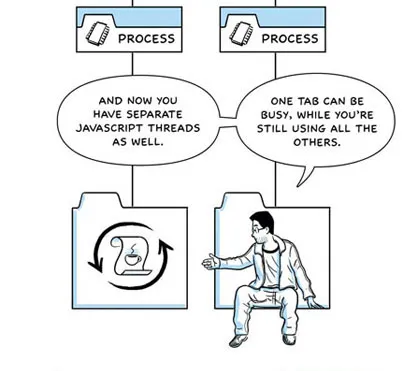
This just opened my eyes. A lot of work I do for Israeli high-tech clients is helping them explain complex technology to potential investors. Until now, I never considered using a cartoon. Maybe it’s time to change that. As an example, the attached illustration is a fragment of the explanation of the concept of a multi-threated browser. Still, the cartoon format is more suited to a presentation handout than an on-screen presentation, where you almost cannot avoid investing in an animated cartoon to get a similar effect. Gary Reynolds posted broader thoughts today about using cartoons in professional presentations.

·Books

Book review - slide:ology by Nancy Duarte

A copy of slide:ology: The Art and Science of Creating Great Presentationsfinally made its way across the Atlantic. (Disclosure link via Amazon Associates program) Nancy Duarte is managing Duarte Design, a company that has created some high-profile presentations (Al Gore is one of the clients). They (her husband is the company’s CFO) started out in the 80s when the Apple Macintosh brought desk top publishing and graphics design to the masses, and have now become one of the big brands in professional presentation design. This is the perfect book for those who have mastered the PowerPoint (or Apple Keynote) technical skills and need to make the final jump to master concepts usually taught in art schools (rather than software manuals):

  • Picking pleasing color schemes
  • Slide composition
  • Typography
  • Etc.

The trained eye can extract almost everything there is to know about presentation design. However, this is not the book that will teach you magic that will turn your beginner-level PowerPoint edits into a professional presentation. Many subjects discussed in this books are covered in other material as well (minimal bullet points, cut words, use professional images, etc. etc.) However, there are some very specific things that I picked up in this book that were new to me:

  • Thinking about cinematic movement for animations or slide composition
  • Creating one big map and using the PowerPoint push transition to navigate it: one presentation - one big slide
  • A large library of chart concept sketches, there were many new ones I did not use before
  • Stressing to adopt a “designer” mentality to presentations
Continue reading →

Slideshare presentation contest winners

The results of the contest are out. Here are the winners. The winning presentation is this one:

THIRST

These are beautiful presentations, but all of them are written in a similar style (high pace, big image, big words) that is only suited for a specific set of topics/presentation settings. UPDATE. I tend to agree with many of the comments on Guy Kawasaki’s blog (he was one of the jury members). These slides are beautiful, they adhere to the maximum graphics / minimal text rule. But, the result is a presentation that is great for high-paced clicking online, but probably not the ideal format for a big live presentation. I particularly liked one observation that these slides are in fact disguised bullet point slides: 0.5 bullet points per page instead of 5 bullets per page.

·Creativity

You can't hurry presentation design

I discovered that the subconscious mind really works, and it changed the way I design presentations. Partly driven by my experience as a strategy consultant at McKinsey where presentations are mostly associated with presenting recommendations at the project deadline, presentation design used to be a focused and exhausting sprint to the finish line. I changed my approach: dropping work on a presentation for a day, doing a few detailed charts, taking a break, sketching high-level stories, sleeping on it, working on the color scheme, working on a different project, finding a great closing image, etc. Maybe you should try it as well.