SlideMagic Blog

Frequent updates about all things presentations since 2008. Subscribe to never miss a post.

RSS
all posts

Category Shapes

·Keynote

Consulting frameworks

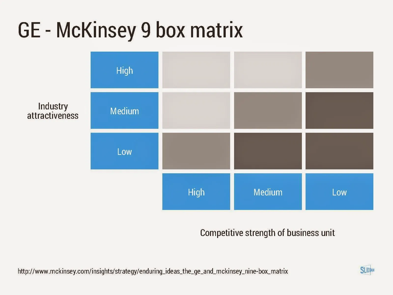
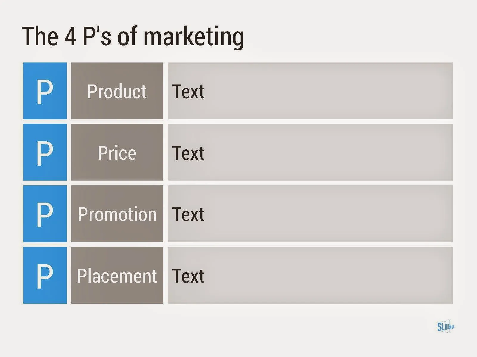
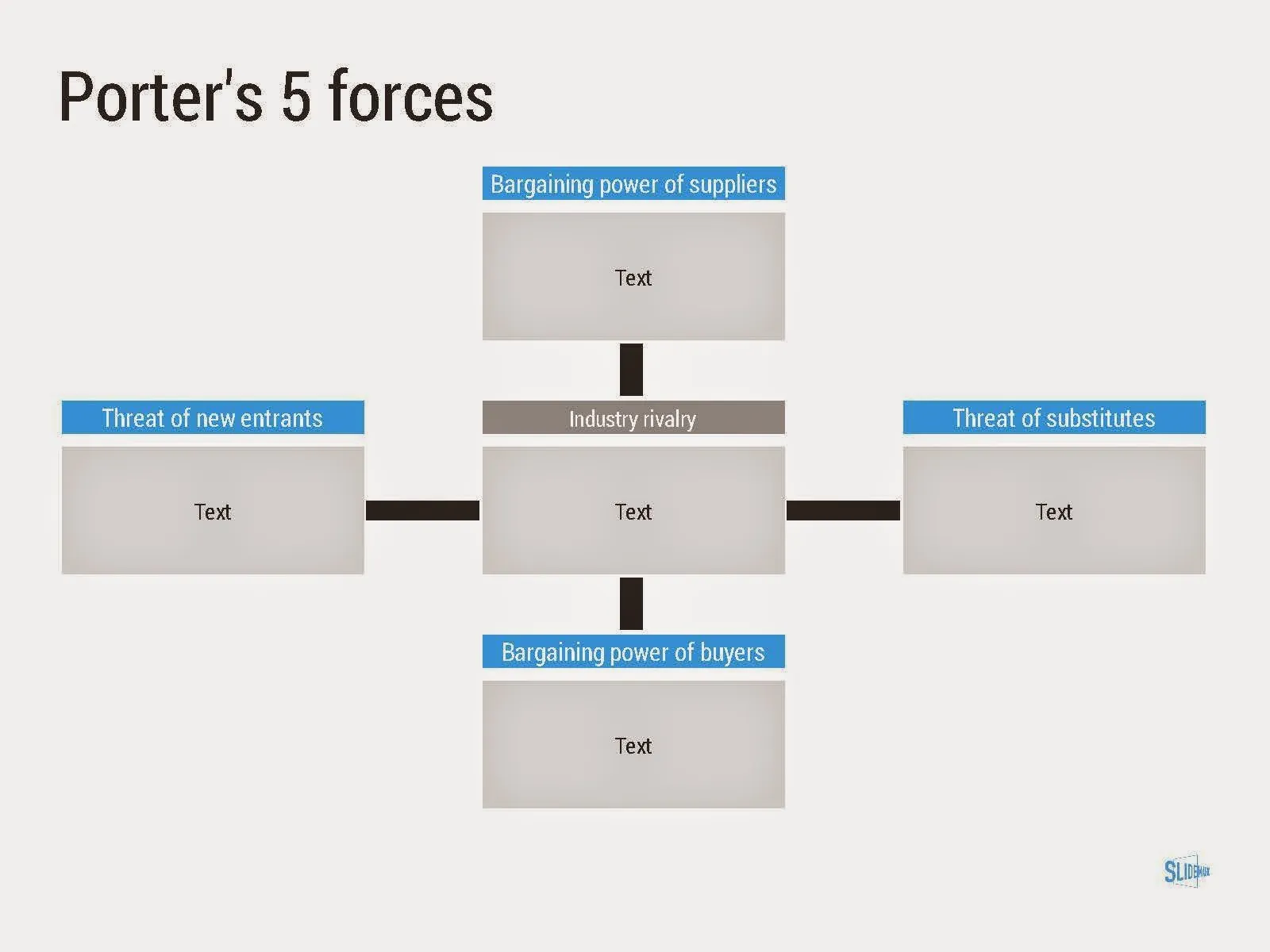
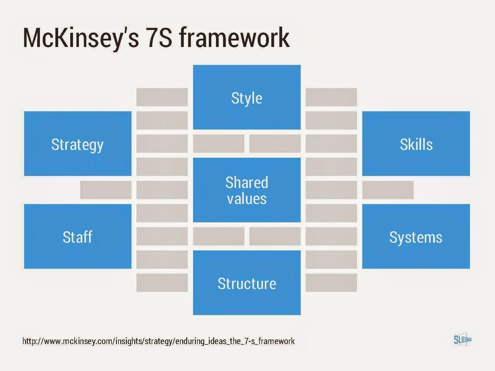
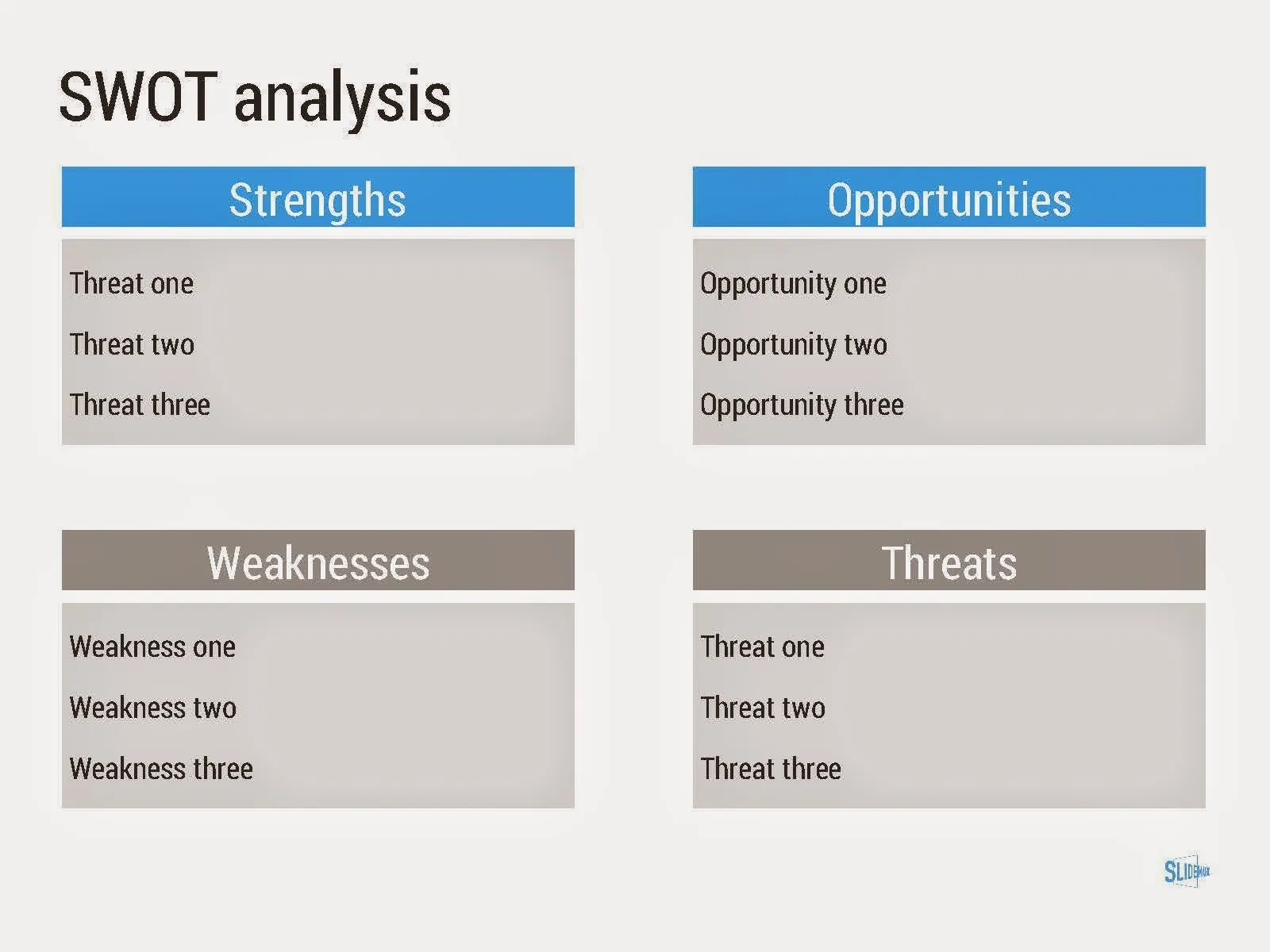
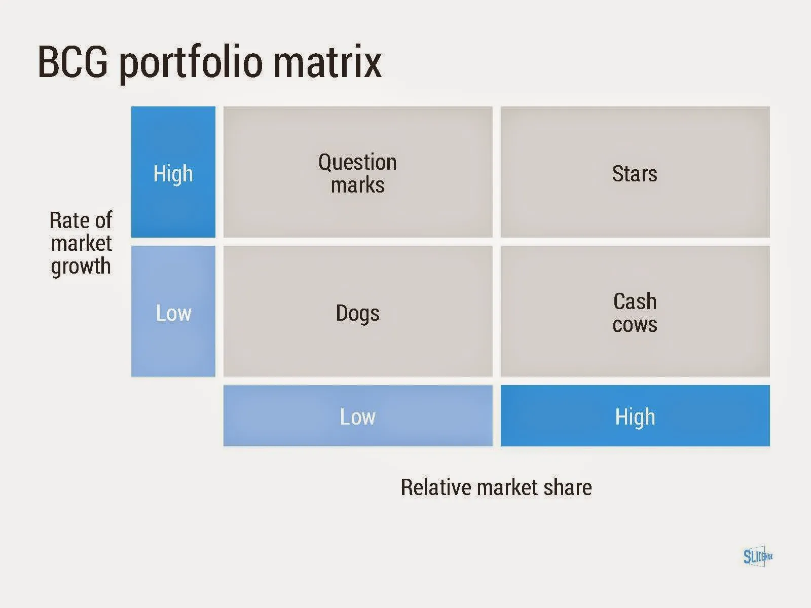
I added a new set of templates to my presentation design app SlideMagic: consulting frameworks. It was an interesting journey back in time (I used to work for 10 years at McKinsey back in the 1990s).

Putting them in SlideMagic was interesting, it shows exactly what SlideMagic is supposed to do for business presentations. Take unnecessary complexity out of visual designs down to a level that the chart still says what it needs to say, but that you do not need to have a degree in graphics design to make them. I had to make slight deviations from the original here and there (Both SlideMagic and layman designers do not like curved shapes for example), but the end result is pretty good.

As to the content of these frameworks. They are more tools to help you think about a problem than slides that will get your audience jumping out of their chairs. Many of them are linked to classic micro-economics theory (demand/supply/competition). I think the strategic issues of many companies today have moved beyond these problems. Still some frameworks can work to kick start a discussion, they good old SWOT works great in group white board discussions.
·Keynote

90 degrees

Nature prefers curves and round shapes. Steve Jobs likes rounded edges. White board sketches are curved and fluid. People prefer rounded shapes in architecture.

But: curved shapes are a pain to design. It is hard to fit text. It is hard to align them properly. They waste space (the Japanese invented the square water melon that makes better use of fridge space).

This is the reason that I “squarify” almost all diagrams and white board scribbles when designing presentation slides. Circles/ovals become squares/rectangles. Curved connecters become elbow connectors. Business presentations need to be efficient, and as a result they might not always be artistic master pieces.

·Keynote

Home screen clutter

The longer I use my iPhone, the fewer the apps change that I frequently use. So while these apps have been sitting for a long time on my phone home screen, I still make frequent mistakes in tapping the right one. Some lessons here that are also applicable to presentation design.

  • Colour is the first differentiating factor I look for (and the reason I make most mistakes: Apple Music and Strava, Twitter and Skype)
  • Cacophonies of colours do not work, newsstand, photos, are all recognised as colourful clutter
  • Complicated graphics, or trying to fit in typography does not work. Very simple shapes stand out. And surprisingly, shadows of human postures (Amazon Kindle, the local taxi hail app), the brains is somehow trained to recognise these.
·Keynote

Icons in PowerPoint

With smaller screen sizes, icons are becoming an increasingly important element of user interface design. Not everyone of you is likely to be using PowerPoint to design a web app (hey I do), but icons can also be useful in regular presentation design.

I am not talking about floppy disks and other ancient icons we still use, but stylised symbols that can be an effective visual short cut to a category of (pick the appropriate) products, benefits, user problems, etc.

One option is to create your own icons in PowerPoint, set the zoom to 400% and create miniature shapes using shape booleans. Often you can use a quick Google Image search to find inspiration for your icon.

Stock photo sites sell endless amounts of icons, but there are compatibility issues when using them in PowerPoint or Keynote. Most icons are design as a vector graphic in Adobe Illustrator. It makes them infinitely scalable (like a PowerPoint shape), but PowerPoint does not read this file format. Copy-pasting Illustrator objects (if you have the software installed) is unpredictable and results in a shape that is hard to manipulate (changing colour for example).

Cropping icons out of a JPG or PNG file is not a solution either, if you forget to compress the small image file, you end up storing a huge image file with all your icons multiple times on a PowerPoint slide. Cropping also kills the vector-like scaling of icons, and background transparency.

A recent trend in web design might provide a solution: custom icon fonts. Modern successors of Zapf Dingbats (what?) provide clean icons that are scalable and can be manipulated (colours, shadows, and - do not use this - reflections).

Continue reading →
·Keynote

The joy of tables

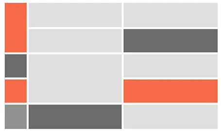
Tables in PowerPoint are a great basis to set up a slide in PowerPoint. Everything is instantly lined up in a grid, it is easy to add and remove boxes (lines). I often use tables with a very light grey fill and fat white lines.

·Keynote

Dummy grid

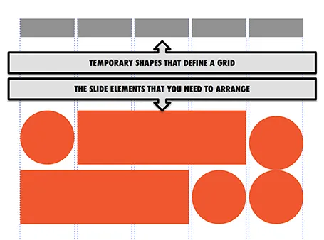
Drawing guides are a pain in PowerPoint (when you need to move an object close to the grid, you always end up moving the drawing guide line by accident). Also, grids can change from slide to slide.

My solution, quickly plop in some dummy shapes that define the grid for the slide you are working on. With snap to shape, you can create the slide layout you need, and get rid of the temporary shapes when you are done.

·PowerPoint

DIY shapes

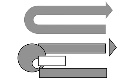
It is hard to get an arrow to point exactly right in PowerPoint. If the standard shapes fail, why not construct your own out of small individual bits. You can group the shape together, or create a new custom shape with one of the shape boolean functions (Windows instructions here, on a Mac: select 2 shapes, right click, go in the grouping menu).

·Art

Table with fat lines

For boxy charts, I find it very convenient to use tables as the basic organising structure. Use big fat lines to separate the cells. In this way, it is easy to add, delete cells, combine, and split them. The Mondriaan look.

·Data visualization

Shape fill with a data chart

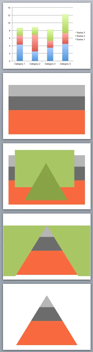
You can use shape cut outs as masks to create unconventional data charts. Here is how I created the pyramid-shaped stacked column chart:

  1. Insert a standard stacked column chart
  2. Cut away clutter until you are left with one huge column
  3. Insert a rectangle and a triangle
  4. Align the two shapes, select the rectangle first, the triangle second, right click, grouping, and hit subtract (PowerPoint 2011 for Mac)
  5. Color the remaining mask in the background color and position it over the graph

·Images

Crop to fill

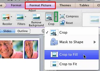
It is never too late to learn something. After my post about fixing aspect ratios of image fills in PowerPoint, Geetesh Bajaj pointed out that there is a much smarter way to do this. Here are his posts for Mac and for Windows.