

Often the key page in a presentation is the one that makes the trade-off between a number of alternatives. Examples are selecting a new strategic direction for a company, or explaining why your product is better than all alternatives in the market. It is “easy” to write down this information in document: a big table with all the pros and cons explained. However this approach is too dense for a presentation slide.
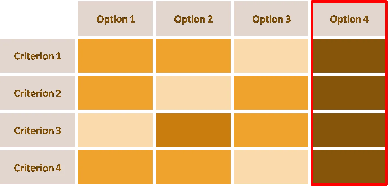
I often use a “heat map” in these situations. Options on one axis, criteria on the other, and use shades and tints of the same color to show relevance (“dark = good”).
- Select criteria in a smart way: group similar items that give similar scores (volume, revenue, profit) across criteria into one
- Use minimal text to describe options, criteria.
- Group rows, columns in such a way that you create big “fields” of similar color
When presenting the slide, the point is not to discuss all the cells (that should be done in subsequent slides, 1 topic per slide), but rather to highlight the point that “option 4 is the best”.
UPDATE: A similar looking chart is now available on the template store: have a look at this heat map template
2 comments
Please include real world examples as much as possible in your map/table/pictures. For example: Substitue "Option 1" as : "Expand Mid-West"; "Option 4" could be: "Expand Nationwide". Similarly for Criteria 1 and so on.
Thanks, and look forward to more tips from you.