SlideMagic Blog

Frequent updates about all things presentations since 2008. Subscribe to never miss a post.

RSS
·Culture

PowerPoint cap in a coalition agreement

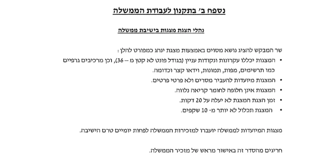
On page 41 of the coalition agreement of the new Israeli government, some restrictions are put on PowerPoint presentations:

  • 10 pages maximum
  • 36 point font minimum
  • 20 minutes maximum
  • Presentations are not a substitute for reading material

I think the last point is crucial: the presentation of your proposal and your working document with all the facts and backgrounds are two documents. Most people now write their working papers in PowerPoint and then are lazy by putting those slides on the screen. If you made something in presentation software PowerPoint, it does not automatically mean that the end product is a presentation.

I offered the government a special version of SlideMagic with minimum font size 36 and 10-slide page limit.

Source on Twitter.

·Story

Keeping the suspense

The award ceremony of a piano competition builds up to the climax of announcing the #1. But keeping the suspense is not always right. In investor pitches, keeping your audience guessing what it is you actually do, is not a smart thing to do (previous post).

The other day I came across another situation where it did not really work. Email invitation: important org update during the weekly update call. So everyone expects the announcement of a promotion or departure of someone senior. Leave the anecdote, intro, buildup aside. Say what is happening in the first sentence, then provide compliments, congratulations, thank you’s.

Photo by Malcolm Lightbody on Unsplash

·Story

The spontaneous speech

Here in Israel we had an eventful swearing in of a new government yesterday. The “swearing in” was preceded by a lot of swearing, heckling, and screaming. One of the members of parliament tossed his prepared speech and instead delivered a spontaneous one on the spot, denouncing the behavior of some of his colleagues.

In the world of presentations, many probably have observed this. You work for months on a document/presentation, think carefully about every slide, and then, when put on the spot without your slides, speaker notes and/or projector, you delivery the whole story eloquently and seemingly without any preparation.

Well, not really without preparation. You have been building this story for months in your head. Without the work, the spontaneous presentation would never have worked. It always a good health check for your presentation, “ditch the deck”, and scribble your story if you had to tell it right now without any support. Then compare notes honestly.

Spontaneous speeches are not for everyone. You need to have the plot very clearly in your mind and avoid being side tracked on tangents, losing your energy and ending the story without the punch.

Photo by Steve Johnson on Unsplash

·Delivery

The "business side"

There is a strong divide between “tech people” and “business people” in startups. Usually people start in “tech” and then move on to “business”. Tech people usually do not want to get into anything “business” and/or pretend not to understand “business”.

Maybe all of this goes back to high school / university where the introvert technology student never was accepted in the extrovert world of fraternities. Later on their careers they were just amazed by all these people that knew all these important sounding concepts and knew exactly what to say in meetings.

Having made the unusual reverse path from “business” to “tech” some advice:

  • Yes, every technical founder actually needs to understand a few basics of business. It is like having some proficiency in English, know how to ride a bike, drive a car. It is essential in “business” but also in your personal life.

    • Being able to understand a financial statement: P&L, assets, liabilities, equity, debt, cash flows. It is not hard at all. What matters is not so much the technical terms, but the general approach and philosophy behind it.
    • Understanding the basics of law: agreements, liability, ownership. A tiny 2 month course in engineering school I did was probably one of the most important subjects I took on.
  • Ignore and don’t be intimidated by any sophisticated sounding buzzword or concept, if you don’t understand it, ask what it means, or Google the term and you will be surprised how quickly the bubble pops. This is the equivalent of “tech” people claiming their server supports AI-driven cache invalidation (Business people: this does not make sense).

  • Every one can make a pitch or tell a story. Your “tech” background does not automatically imply that you should give the pen to someone else. The flip side of this though is that you should invest time and effort in it, rather than using your background as an excuse not to bother.

  • A career path that start in “tech” does not necessarily have to end in “business”. “Business” is not more important than “tech”. People often confuse “management” with “business”. Some people like running things (management) and that career is measured by how many people report to you, and/or what amount of revenue your are responsible for. There are other careers in “business” where managing people is less important.

Continue reading →
·Templates

An actual presentation as a template

Most companies have some sort of corporate PowerPoint presentation template sitting on the file system. It consists of a title page, some trackers, some bullet point layouts, some picture slides. The template probably looks ago, but as soon as employees start to use it, this is no longer the case.

Why?

  • Most templates are designed as an afterthought, after the logo, web site, letterhead and business card have been approved
  • PowerPoint templates are created by designers who understand graphics design, web/print design software, but NOT PowerPoint and as a result a lot of technicalities go wrong
  • But most importantly: templates are designed on a blank canvas, encouraging the designer to “do something” with all that white space.

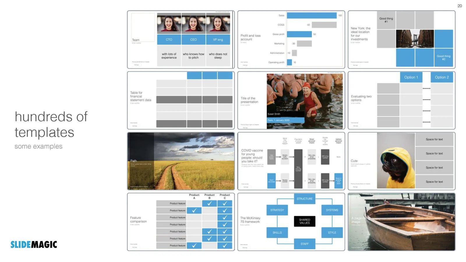
A better approach: start with an actual presentation. The general company introduction, a product sales pitch, last quarter’s analyst presentation. Make that deck look perfect and put on the on the file system as a starting point.

  1. The template is designed around actual content, rather than content being forced to fit around a template
  2. Most companies need very specific templates. Consumer goods companies: products/packaging demos, market shares and sales across many channels, consumer research data. Pharma: scientific clinical trial data. Chemicals: process layouts, project maps. Consulting firms: fancy frameworks.

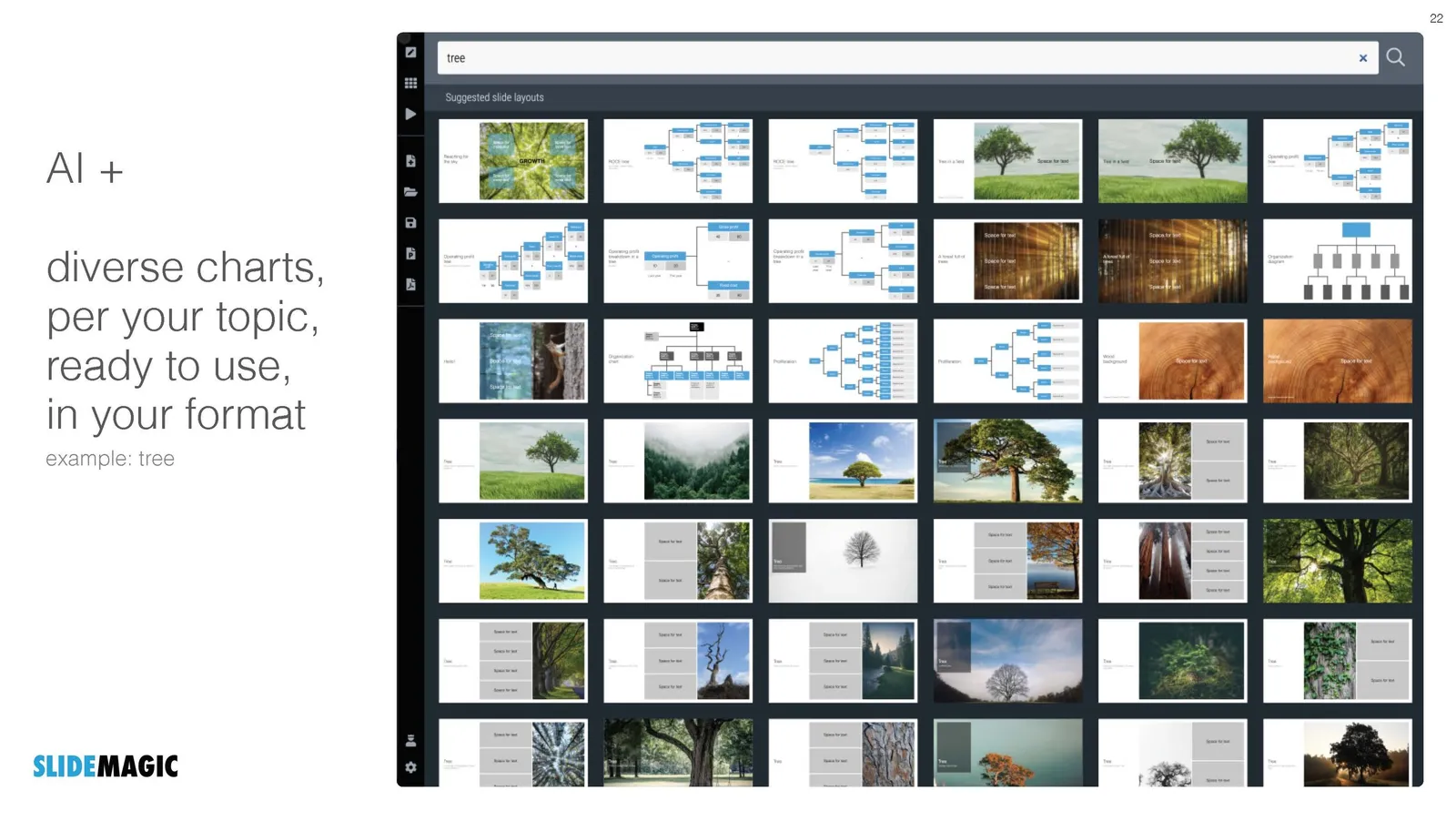
I am contemplating some new ideas for SlideMagic to make the above all a bit easier.

Photo by MagicPattern on Unsplash

·Layout

Better design for legal documents?

Contracts and other legal documents look horrible and are impossible to read.

Even documents produced by the world’s most prestigious law firms are basically Microsoft Word files in Times Roman font with hard coded formating (i.e., no style sheets or templates, but text is formatted directly to be centered, bold, italic.)

But the content is even worse than the design. Complicated sentences and unclear paragraph structures requires you to look for hidden clauses that could be hugely important for the meaning of the contract. (The legal profession probably has an interest in keeping it this way).

Two improvements:

  • Bring the design, the look and feel, back to 2021. Fonts, white space, paragraph hierarchies.
  • Add a non-binding layman “so what” summary before each paragraph, backed up by the legal code.

As a result contracts will be shorter to negotiate, and people might actually read the terms of use. I might have a look at the SlideMagic terms of use and see if I can give an example…

Photo by Patrick Tomasso on Unsplash

Imaginary eye contact

Eye contact is essential for any presentation. Just think of the speakers you have watched who were staring at the ceiling, the floor, or their slides on the projector.

And eye contact means eye contact. Lock in with a member of audience for a few sentences. Quickly moving from one audience member to the other will make it look like you are looking for someone in the room.

This eye contact with strangers will feel awkward for the presenter, but it does not for the audience. There is a way to make it slightly less uncomfortable though. Call it “imaginary” eye contact. Look at random spots in the (dark) audience, for away to the back. Look in between 2 members of the audience. The audience thinks you are connecting with someone, but you don’t really.

In video calls you need to be aware of the camera as your point of eye contact. If you are looking at the screen, the audience will see that you are “looking down”. The closer you are to the camera, the stronger this effect is. If you are relatively far away from your camera and/or laptop, it becomes hard to tell what you are actually looking at.

One other solution is using an external camera and a teleprompter (Seth Godin created the shopping list for you). You look straight into an angled semi transparent mirror, behind which you position your camera. Direct eye contact news anchor style. This setup is great for one on one discussions. But the picture in the teleprompter is relatively small, so it works less well for group calls and presentations where you have to follow along with slides on the screen.

Continue reading →
·Culture

Pitching to VCs outside of your home country

Mostly thanks to COVID-19, the venture capital industry is going global. Which means that VCs are increasingly willing to invest across borders. Some implications for investor pitches.

VCs get the confidence to invest further away partly because of increased specialisation. They know exactly what sort of deals to look for, have a very deep understanding of technology in that particular field, and as a result can size up opportunities easily, even at long distance.

[P.S. Something similar happened in my bespoke presentation design business, where I specialised in a very specific type of presentation which is highly similar across borders, and usually have very similar type of clients. This was both important in terms of deciding whether you can do the project, winning a pitch for a project, and making the call whether this unknown client in a different country would eventually pay my fees].

Even more than before, as a startup, you need to do your homework and select potential investors carefully. The upside of this extra work is that if your company fits a specific investor profile, you are very likely to make it through the first investor screen, people will actually look at your deck. “Hmmm, these guys are not from Palo Alto” is no longer relevant. The cost of a brief Zoom call to check you out in person is much lower than a “coffee chat”, so you might score that one as well if the field is relevant.

For a highly knowledgeable investor with an office 5 time zones away, that first deck might have to be more specific than a nice mysterious teaser inviting her to schedule a phone call. You can cut slides with general industry background, but probably need to add data that investors in a specific technology segment are expecting to see (experience from looking at hundreds of other companies in your specific sector).

Continue reading →
·Data visualization

Dashboard design

In my current (stealth) side project I need to build many dashboards to show information in different cuts and slices. For me, it is a very interesting experience as I can apply the full arsenal of my slide design experience, but now with dynamic data. I control the full stack of technology: what information to store, how to slice it, what information to show, and how to show it.

Each of the above usually reside in a different person. Management consultants spend time recutting and re-combining data manually in spreadsheets because systems can’t do it. So called “BI” applications take data from systems and spit out an endless amount of bar and pie charts in the hope that it will give some insight in where things are going. Traditional front-end web designers can make data look pretty, but don’t really understand what data is required.

The principles of a good dashboard and a good slide are completely the same. Every detail is important. What information to show, what rounding, what order, what sort of graph, what headings, bold, not bold, margins, right aligned, left aligned., how to group things, where to put subdivisions, etc. etc.

But once you get it right, it will work for a long time.

Photo by Cody Fitzgerald on Unsplash
·Investor presentation

The audience is always right

Sometimes, you can be so absorbed in your own story that your forget to put in the obvious in your pitch deck.

Yesterday I overheard a healthcare VC reviewing a pitch deck for a new diagnostic tool. Pages and pages about the impressive team, the excellent trial results and robust data, until what the tool actually was diagnosing was revealed on page 15.

An investor who is scrolling through a deck to find an answer to an obvious question is not paying much attention to other information that is put on the slides.

Maybe in this case, this answer was actually written somewhere in page 1 of the deck, but remember that when it comes to presentations, the audience is always right.

Photo by Girl with red hat on Unsplash