SlideMagic Blog

Frequent updates about all things presentations since 2008. Subscribe to never miss a post.

RSS
·Data visualization

Tiny data labels

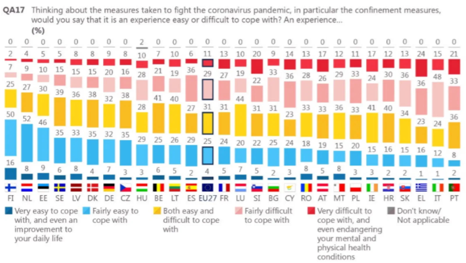
This chart shows 2 interesting things. One, Finland was pretty happy under lock down. Two, an interesting way to put data labels on a stacked column chart. The small boxes are always a problem in a regular format. Here you get the combination of the visual effect of the size of the boxes, versus the table of the actual information. This could be inspiration for a future SlideMagic expansion.

I would do some things different though. That row of zeros at the top does not add much. The flags make the whole chart even more busy. And given that this is a comparison, I would have shown the data as a stacked bar chart.

If you were to use me as a bespoke designer, I would actually show this data on a map of Europe, color-coding different countries with maybe only the some of the 2 blue data series. The geographical clustering of the countries is interesting. In addition, I would combine it with one stat about the health impact of COVID in these countries.

If you do not have the software and/or the time to make a chart like this, the solution is easy, take off the data labels completely and make a straightforward stacked column chart.

I found this chart on Twitter, without quoting a source, the format looks like a page in some document by the European Union though.

·Story

Purging slides

Following on yesterday’s post, here are some examples of slides you could get rid of when you want to make your deck shorter, without diluting the message.

They key idea is to see the difference between an analysis deck and a story deck. The first is your working document and contains all the information, data, that you needed to get to your conclusion. Everything is organized, logical, referenced, backed up. The story deck’s sole purpose is to get your audience to do something, most of the times this will be moving on a sales or investment process to the next stage (i.e., land the invitation for a zoom call).

Some stuff that usually sits in your analysis deck, and is not essential in your story deck (in random order):

  • Detailed competitor analysis, especially when they follow a repetitive framework page after page, competitor after competitor
  • Historical analysis, all the milestones your company went through in the past 5 years
  • Market backgrounds that do not add insight to what is generally known (facebook user base developments, mobile phone penetration, etc.).
  • Any sort of business school framework that was once useful on a whiteboard, but now feels a bit forced because it does not exactly fit your situation (what the audience as you put up the SWOT slide)
  • Scenario and variance analysis and/or backup of financial assumptions
  • Screenshots of stages in your app that do not really differ from anyone else’s (the log in page for example)
  • Etc.
Continue reading →
·Story

Three approaches to making your deck shorter

Overhead: “No, don’t summarize the presentation, putting more info on fewer slides will just make it harder to read, just send the whole thing”. I see a number of ways you can make a deck shorter.

Compressing. The common approach to shortening a presentation is to take the shortening literally: reduce the physical number of pages. Smaller fonts, combining the text chart and the bar chart on one page, etc. The resulting deck contains the same amount of information, and would in theory take the same amount of time to present.

Dumbing down. The second approach is to make the story simpler. Replace complex chart with simpler headlines, eliminating complex plot tangents. Your presentation shorter, but it lost some information.

Plot writing. Here you try to extract the story from the pile of data and slides. You view your presentation deck as a completely different document than your project presentation. It does not have to be exhaustive, the logic flow does not have to be business school strategy-like, not every strategic option deserves equal wait.

Most people start with compressing. Then, after reading presentation blogs like these, realize that pretty pictures and big words look so much better, but end up dumbing down their deck. Becoming a plot writer is the challenge.

Photo by Nery Montenegro on Unsplash

·SlideMagic

New email updates should work now

Yesterday I moved over all email addresses that opted in to a new email update platform. You should have received your regular email updates, just with a slightly different look (the design still needs work). If not, you can re-subscribe here, or reach out to me directly.

Photo by Carol Jeng on Unsplash

·Story

Your placeholder, not the audience's

Some slides can stick around forever in a presentation. Over months, maybe even years, they turn into mental placeholders for you, the presenter. You see the slide from the corner of your eye, and you move effortlessly into a section of your pitch.

But the content of the slide might actually no longer resemble what you are speaking about for someone who sees it for the very first time. Time for some spring cleaning in your pitch deck.

Photo by Arno Smit on Unsplash

Feedburner RIP - changes to email updates

A heads up.

Google is shutting down the email subscription service of Feedburner. It probably does not like blogs very much (The Google RSS reader was suspended as well a few years ago). As a result, I need to move the email subscriptions of this blog to a new platform.

The only thing you will notice is probably the format of the email, the rest should work as usual.

·Software

Google Docs moving to canvas

A bit of a technical post. Google Docs is changing the way it renders documents. Instead of HTML, it will move to something called “canvas” (no, not Canva, the design platform), partly because of the same limitations of web page layouts that I have been battling with SlideMagic.

HTML was created in the 1980s to render text and links in web browsers. Over the years many features were added that improved its graphics capabilities. The result are the modern web pages, mobile apps, and desktop apps such as SlideMagic that we know today.

HTML is great for displaying content on a huge range of devices, different sizes, different process speeds, different resolutions, different generations of technology. The NYT front page will look great on all these screens.

But graphics applications require more than that. Specifying the exact crop of an image, exactly setting the font size to prevent an orphan word of a title dropping to the next line. What-you-see-is-what-you get editing. Copy-pasting of text or images. Exactly scaling up or down a layout rather than changing the point sizes of fonts with steps.

In SlideMagic, I had to apply a lot of tricks to get things to work, and basically created my own (x, y) coordinate space to do what I want. It looks like Google is going a similar way. My approach is to use vector graphics, that can scale to any size you want while being able to detect mouse clicks on elements.

Google is taking it further and moving to a complete blank “canvas”. Everything is “painted” bit by bit, letters are drawn, images are merged in, selection boxes are merged in with the document. To drag a box of text, Google will have to write software that fills the pixels of the box with the underlying pixels, then redraw all the pixels a bit to the right.

Continue reading →

Selling hours as a presentation designer, should you?

Building on a great blog post by Seth Godin.

In my (previous) career as a presentation designer, I walked the path from selling hours to selling presentations, but I did not start with this “pricing for value” right away. Finding your pricing strategy as a freelancer is tricky, especially if your field of work is not yet well established (which was the case with freelance presentation design back in the mid 2000s).

What did I do?

  • At McKinsey, we were billing hours, and I made an estimate what someone at my level (just before partner) could charge per day without the direct McKinsey brand. That daily rate was the input for project proposals priced per day, with a directional, but not binding budget. If the client gave an unclear project briefing, insisted on tons of meetings and revisions, or had lots of iterations, that was her problem. (I always was confident enough to offer a full refund for unsatisfactory work though, and there were probably only 2 projects in 15 years that took me up on that offer).
  • This daily rate soon translated into the dreaded hourly rate, and I was truly selling time. Not scaleable and instantly comparable to all other by-the-hour consultants that work at a client. It was important though for me to find out how much time it actually took me to create presentations. Which type of projects I could do amazing work in very little, and where I delivered less “bang for the buck”. Most designers could calculate their time by pages that needed make overs, each page so many minutes. In my case, I had to come up with the whole story (concept) and then execute it in PowerPoint and get the client to buy into it. Far less predictable. Bit by bit, I moved to projects I liked most, clients I connected with most, and noticed that I got much, much faster at my work.
  • As I got busier, I could raise my hourly rates (pure demand/supply, “sorry, no problem, let’s work together some other day”, but arguments about hourly rates, I hated those. So I switched to project pricing now that I had the confidence to size up project properly. I always did keep an hour book keeping in the background to keep myself in check, but never used it to renegotiate projects budgets with clients. It was much easier to raise prices for entire projects than hourly rates (which usually needed to be approved by purchasing departments)
Continue reading →
·Delivery

Which meetings work remote, which don't

An interesting perspective from AVC:

  1. Three-hour internal strategy session with VC partners worked great in person
  2. Shorter follow-on investment decision meeting with Singapore-based startup worked great remote

I think we will get smarter which meetings work remote and which ones don’t.

Why does meeting type 1 work in person?

  • People are in the same location anyway, and can all be in the same room (no “zooming in”)
  • A great setting to bounce off ideas between people who know each other well, have worked with each other for a long time,
  • That meeting required a significant amount of time to go through things (3 hours on Zoom… no). Also the relative cost of a commute for a 3 hour meeting is lower, than spending the same time in traffic for a 30 minute chat.
  • The type of interactions in this meeting are probably “messy”: lots of n-to-n question, answers and discussions. (Unlike a 1 to n presentation with a few specific questions)
  • It depends on personality: extroverts love to go back to long in-person problem solving sessions, introverts might not

Meeting 2 is the opposite:

  • 1 to n presentation with Q&A
  • Predictable content and questions to cover
  • The meeting was shorter, and maybe stacked with other similar type meetings.
  • And the obvious one: people were a continent apart, and the meeting (or even a call) might not have happened if it weren’t for Zoom.

The short pitch via Zoom (even if you are close physically) has opened up a real new way to connect. In a call investors can’t really size up the team. With this uncertainty, a full meeting with filled with small talk and other logistics is too expensive and will not happen. The Zoom call fits right in between.

Continue reading →
·Delivery

Everyone or no one

If everyone is on a Zoom connection, the meeting works, we have gotten used how to deal with the new setup. If a few people are present in person, and a some others are “Zooming in”, the meetings dynamics are broken.

When planning meetings for next year, think about the time, money, and the environment wasted in travel, and prioritize which meetings really have to be in person, and which ones can be done remote. If you go for in-person, everyone has to show up though. Another reason to think twice about that option

Photo by Marvin Meyer on Unsplash