SlideMagic Blog

Frequent updates about all things presentations since 2008. Subscribe to never miss a post.

RSS
·Images

"Made to stick" authors on avoiding presentation mistakes

Chip and Dean Heath, authors of the best selling book “Made to Stick” devoted this month’s column in Fast Company magazine to How to avoid making a bad presentation.

It is an interesting read. Two key messages for me:

  • Firstly: “before your audience will value the information you’re giving, they’ve got to want it. Most presenters take that desire for granted. Great presentations are mysteries, not encyclopedia entries.”

  • Secondly: puting the use of stock images into perspective. They are definitely better than clip art, but spending hours to find that perfect image to support let’s say “innovation” (“which one, the bunny coming out of the magician’s hat or the smiley-face guy with a light bulb over his head”) will not help you communicate the concept better.

Apologies for the many apostrophe an quotation mark errors in this post, too many HTML codes to put in.

Via Andy Nulman
Steve Jobs pitching his company (NeXT)

Two interesting videos in which Steve Jobs (then still busy with NeXT) uses a white board and a marker to explain the strategy of his company:

  • who is the target customer?
  • why do they pick us and not the competition?
  • how are we going to reach them?

The informal presentation style is very similar to the one advocated in “The back of the napkin” by Dan Roam.

Video 2:

Via Venture Hacks A summary of useful links with advice on how to pitch a startup to a VC here.

·Layout

Critiquing a McKinsey exhibit - analysis charts are not presentation slides

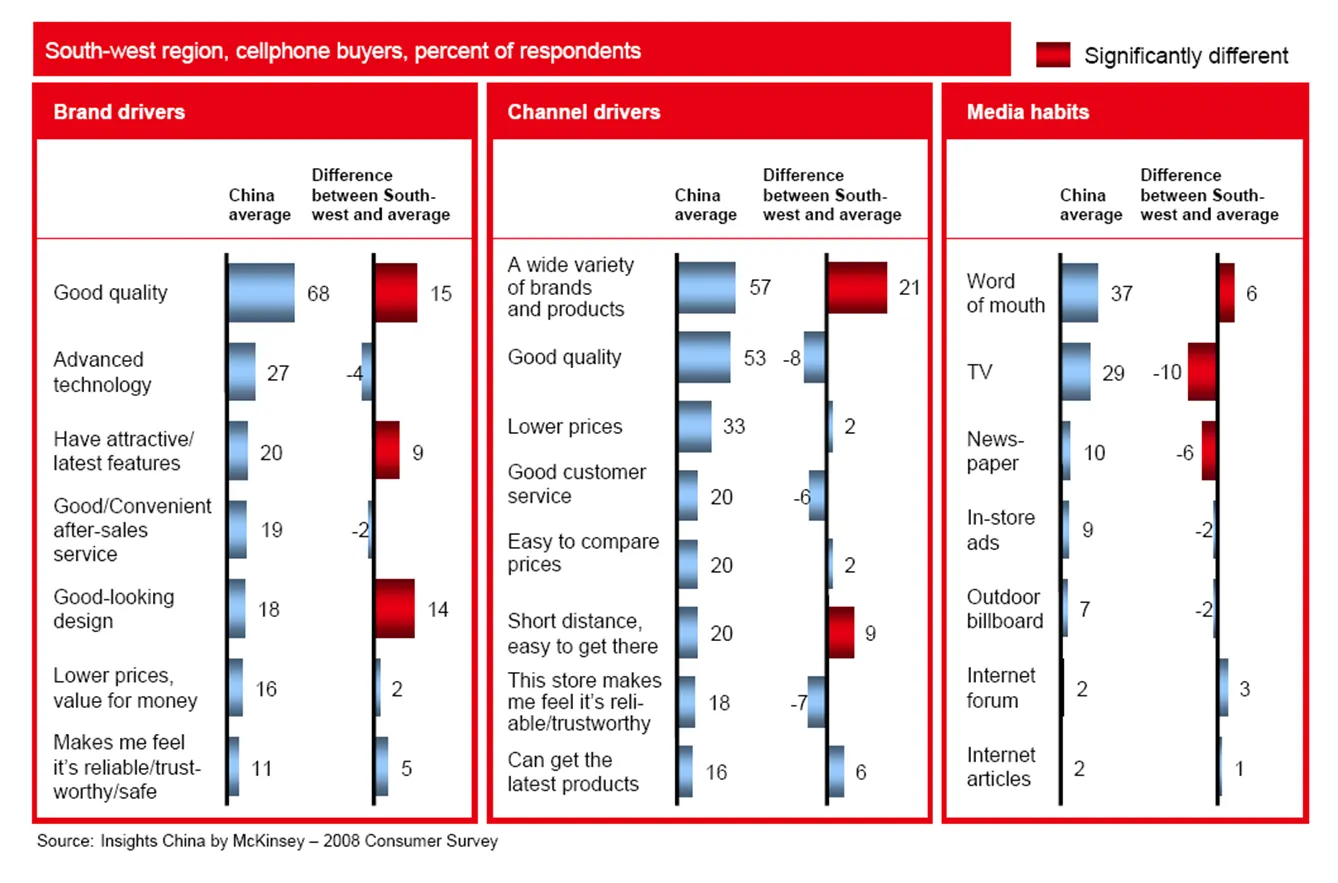
PowerPoint slides that are used to analyze data and solve problems inside a team are not always the best exhibits to be used in presentations. To illustrate the point, I am using a chart out of a publicly available McKinsey document: the 2008 Chinese Consumer Report published by McKinsey’s Insights China initiative.

The report itself is formated very nicely with beautiful pictures, the content of the report looks very interesting. I am just focusing on the cosmetics of one chart as an example. (Click image for a larger picture)

  • Overall, there is too much information on the slide, but given that this chart is used inside a long-hand document, that might not be too bad
  • Because of the red background, the title does not stand out clearly
  • The boxes around the chart are too heavy, to separate the 3 charts, it would be better to use a very light background shading
  • The box on the right is narrower than the other two.
  • Because there are so many bars in this slide, they become very narrow, and hence they almost stop helping the reader see the differences in size, maybe boxes with simple numbers work better
  • The gradient fill of the bar does not add to the understanding the chart
  • The legend in the top right looks slightly lost
  • The text labels are too long: “the store makes me feel reliable/trustworthy” is appropriate for a consumer questionnaire, but can be shortened in the chart
  • The text labels “dance”, they are not right aligned, some labels take 1 line, some 2 lines, some 3
  • The middle graph has 8 bars, the other two 7, disturbing the visual calm of the slide
Continue reading →
·Typography

I don't understand the U.S.-English habit of title case...

It is common in English-language publications to capitalize words in the title (the full detail on rules behind “title case” in this Wikipedia entry). Once (in the early days of printing), it might have been a good way to emphasize words. In today’s PowerPoint presentations I find that title case actually makes it harder to read the title of a slide.

I do not use it.

·Templates

Chart concept - counting hands

I love these images of hands counting. They are a powerful way for quickly getting across 4 or 5 things: “here are our 4 distinctive features, let’s go into a bit more detail in each one of them”.

Sites like iStockphoto list many, many of these (the image above was ripped from this site).

·Investor presentation

Google Q3 results - a shame that companies invest so little in these important presentations

Google released its Q3 2008 results yesterday. Besides the usual reports, a PDF was released to support the earnings conference call with investors (someone uploaded it to slideshare, see below).

Google Q3 2008 Earnings Slides

Investor presentations are very important and can greatly influence the share price of a company. The remote conference call format makes it even more challenging to control the presentation delivery. It is a shame to see that even the world’s most resourceful companies like Google invest so little in these documents.

  • Busy bullet point slides
  • Busy data tables
  • Busy data charts with redundant information

The presentation gives the impression that after the hard work to meet the publication deadline someone thought last minute to knock up some slides to accompany the conference call. There is clearly an opportunity to rais the bar here.

·Humor

PowerPoint supporting a standup comedian

I stumbled on this recent (June 2008) video of Tim Lee, a comedian who uses PowerPoint extensively.

This was the first time that I saw a “PowerPoint-based comedian”. It looks like he is actually only starting to use all possible creative opportunities. At the moment, there are just (poorly formated) bars with made up statistics. There must be more possibilities here for someone with the combined PowerPoint  (animations, images, colors, etc. etc.) and comedy talents. Unfortunately, I lack the latter… An archive of other PowerPoint comedy videos at Presentation Zen.

·Typography

Correct use of apostrophes and quotation marks

Inspired by a Tweet by Garr Reynolds, I dug up the typography rules for apostrophes and quotation marks. The ’ and " that everybody is using because they are conveniently located on a computer keyboard are in fact the characters for feet and inches.

  • ‘ and ’ - the single quotation marks (the right one is the apostrophe), ASCII codes 145 and 146

  • “ and ” - the double quoation marks, ASCII codes 147 and 148

Their use is different in some countries. In the UK, people use single quotation marks, in The Netherlands for example, people use low opening quotation marks. How do you enter them? There are a number of options:

  • ALT+code (Windows only). Swith on your numeric keypad with NUMLOCK (laptop owners read your manual). Hold down the ALT key, now press “0” plus the ASCII code you need on the numeric keypad, the number keys on top of the regular keyboard will not work. For example, an apostrophe would be [ALT] [0146] [release ALT]

  • HTML option 1, for example to display the apostrophe enter ’ (for more ASCII codes see above)

  • HTML option 2, enter & followed by a specific character code, a full list can be found here. Single open: ‘ Single close: ’ (apostrophe) Double open: “ Double close: ”

  • Microsoft Office (including PowerPoint), I use the insert symbol menu option, switch to ASCII decimal code and find the right symbols at position 145-148

Because of the complicated entry, I double check use of quotation marks only in final versions of presentation documents. In email, Twitter, (and even in this blog…),  I will continue to violate the rules and use my feet and inches characters… Sorry.

Continue reading →
·PowerPoint

Merging PowerPoint presentations without mixing up formats

Merging different PowerPoint presentations usually creates format chaos. The slides that are inserted are automatically re-formated in the style of the mother presentation. Especially if you want to make a collage of different presentations with a completely different look and feel, this is a disaster. Simply “ctrl-c / ctrl-v” slides across does not work. One solution is to PDF both presentations, then merge them in Adobe Acrobat. But there is a solution inside PowerPoint as well.

Apple:

  1. In the insert menu, select “slides from”
  2. Select “other presentation”
  3. Here is the trick: click “select slides to insert” rather than “select all slides”
  4. Click insert, wait a few seconds
  5. A window will open from which you can select slides, at the bottom you should click the box “keep design of original slides”

PC (PowerPoint 2007)

  1. In the home ribbon, click “new slide”
  2. Click “reuse slides”
  3. Browse for the file to be inserted
  4. Click the “keep source formating” box

UPDATE: hey, a solution for PowerPoint 2003 as well (thank you BusinessToolsBlog)!

UPDATE: PowerPoint Join seems to be an automated tool developed by Sobolsoft that links PowerPoint presentations together. I have not tried it though.

·Layout

PowerPoint slides - the only way is up!

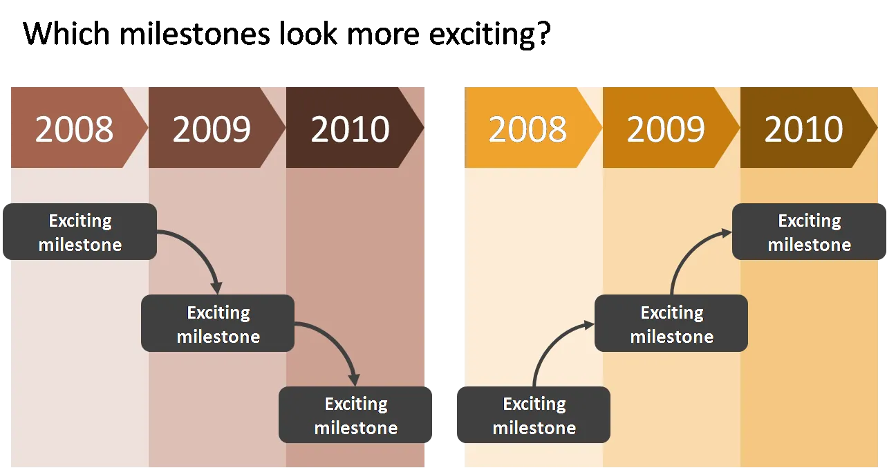
When designing a flow, always make sure that the direction of the eye is moving upwards to create a more positive feel of the slide. The horizontal orientation (left-right or right-left) is less important and depends in which part of the world you are living.

I use flow charts often when I help startups pitch to a venture capital firm for funding. One of the final slides in the deck talks about milestones and future plans. Without revealing too much detail (in a 25 minute presentation the actual/precise/detailed content of the milestones is strangely enough less relevant, they can be discussed later), the chart should show upward momentum.