SlideMagic Blog

Frequent updates about all things presentations since 2008. Subscribe to never miss a post.

RSS
·Images

Chart concept - stage curtains waiting to be opened

Although a bit cliche, I like using an image of a red stage curtain about to be opened. They give a sense of anticipation, look beautiful (nice warm colors, lots of detail), but at the same time focus all the attention on you, the speaker, since there is not that much to look at at the projector.

I got the image below from iStockPhoto (referral program link), many other stock photography sites have many, many of them.

Makes sense, different startup phase - different VC pitch

An interesting post on Eric Ries’ blog today: A hierarchy of pitches. Adjust the messages of your startup pitch depending on the stage your company is in. Makes sense.

My collection of startup VC pitch advice here.

·Animations

Moving graphic equalizer in PowerPoint - fun but maybe not that useful

I needed a chart to visualize 3 quality levels I think a presentation can go through:

  1. Your audience bothers to listen
  2. Your audience understands what you are trying to say
  3. Your audience follows up after leaving the room

Brainstorming some concepts, I ended up with that of a graphic equalizer beating away at higher intensity levels. Stock images failed, so here is the DIY approach in PowerPoint:

  • Create distributed rows of narrow rectangles
  • Add green, orange and red colors
  • Add a “flicker” animation on the last 2 bars of each row (going back and forth between grey and the accent color),
  • Set animation repeat to “until slide ends”
  • Set animation speed to “very fast”

The still image does bring out the happily dancing bars very well though…

Rules (animations do not add anything) are there to be broken sometime. Still, this type of chart fits in a more frivolous presentation setting, and not in one where you let’s say have to pitch your company to venture capitalists.

·Software

SlideRocket public launch - good enough to take PowerPoint into the cloud?

SlideRocket comes out of public beta today with some new features (TechCrunch post). Given increasingly heavy PowerPoint files (images, video), I think the only future solution for collaborative presentation design is an in-the-cloud model. Getting people to learn an new interface as an alternative to PowerPoint though is difficult. And, Google Docs, Microsoft’s Azure, are some pretty heavy competitors to beat…

·Delivery

Bad idea - live web pages in your PowerPoint presentation (LiveWeb)

A number of blogs posted about LiveWeb yesterday, a PowerPoint plugin that lets you open a fully functioning web browser inside your PowerPoint slide show. All links work and are active.

Any live demo in a presentation is very, very high risk. Live web browsing is no exception

  • You need to get an Internet connection to work in a strange environment. If finding power lead extension can be difficult, and setting up projectors is not obvious while the audience is settling down, going online is a challenge of a whole different magnitude

  • The momentum is gone. If you have 20 minutes to make your pitch, you cannot afford to break the carefully build up momentum in your presentation. Turning away from the audience, “Wait a minute, where is that link, it was there yesterday” will make your audience opens up their PDAs to check email.

  • Unpredictable content. A large banner ad for a gambling site. A breaking news story about stock markets tumbling. A sighting of Britney Spears. Distractions that will not help your story.

There are obviously situations where you need live web pages on a projector to work together as a group. In an informal setting, why not open up a regular browser? The only exception for a browser inside your PowerPoint might people that run training courses, either on Internet use, or on using internal corporate intranets.

P.S. Not sure what stirred the blogging activity yesterday, LiveWeb seems to have been around for some time.

·Images

How to get the most out of stock images for your presentation

Stock image sites with affordable pricing schemes (iStockPhoto is one of them) have transformed PowerPoint presentations. While using a stock image instead of clip art will always lead to a better chart, there are many poor (and cheesy) images out there. How to pick a good one? A slightly random, rambling list of suggestions (resembling the creative design process):

  • Start with the slide design. Brainstorm concepts. Write down chains of keywords. Think through what images could work. Only when you are happy with the short list of design ideas, start taking the limitations of PowerPoint or your design skills (i.e., making complicated 3D compositions) into account.
  • Iterate, go back and forth between image sources. While a stock photograpy site might be the final source of an image, use Google Images as well to get ideas by seeing what sort of images are returned based on key words. Use Flickr for “real images”, especially locations (check the license). Stock image sites usually go for “touristic” photo compositions of landmarks and/or artificially smiling models.
  • Models are not real people. I hardly ever use images with faces from stock photography sites, they hardly ever look natural (with the exception of children). Search “team” on iStockphoto and you will see what I mean (here). Sometimes these images are even funny (the opposite of what you want them to be. Photographer takes model that usually does fashion shoots, puts on suit, puts on spectacles without lenses, and hey: we have a “business person pondering his vision as he looks towards the horizon”
  • Leverage advanced search. Add the word “isolated” in an iStockPhoto search to get images on a white background. Sort iStockPhoto images by “most downloaded” instead of “best match”
  • Crop. Consider that you can zoom into images and take just a small detail if you purchase a high enough resolution. The photographer’s composition does not have to be yours.
  • Avoid “cheesyness”. Be careful with using renderings or illustrations, often cheesy. Make the conceptual graph yourself, use stock images only for the components. Ready-made stock photography conceptual images (i.e., a few dollar bills with an arrow going up in the background) do not look good. There is a good list of cliches (where is that accent) on the Slide:ology blog.
  • Think of color. In iStockPhoto you can narrow down images by color range, especially important for large, page filling images. If no option, use a PowerPoint color overlay to take the color out the color all together and replace it with an overlay of one of the colors in your color scheme.
  • Look at many, many, many images until you find something that catches your attention. A small thumb nail is enough (and actually better than the full size image) to check whether an image evokes some emotion in you.
  • Less is more. Look for white space, or in fact, any empty space to add text if required.
·PowerPoint

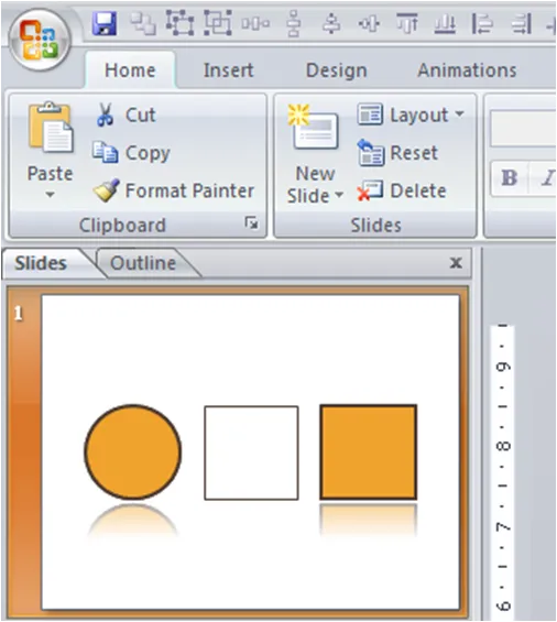
Little known PowerPoint feature - format painter

The format painter in PowerPoint can be really useful. It transfers the exact formating of one object to another.

  • Click an object with the desired format
  • Click “format painter” (left in the home ribbon)
  • Click the 2nd object
  • Done!
·Software

Animoto - transform your PowerPoint presentation into a slow zooming video

Animoto is a sight that allows you to create a slow zooming animated video of any series of images. I tried it on my company’s introduction presentation using the overture of Mozart’s Figaro: I do not like the wild slide transitions, the pace of transition is too high, but the slow-zoom is highly appealing. I assume that in the professional edition you can control all these features. If not, then this tool is actually only useful for use with still images without text.

·Story

PowerPoint now required for MBA applications - a survival guide

The University of Chigaco is now requiring applicants for its MBA programme to produce a PowerPoint presentation of a maximum of 4 pages with complete creative freedom. Any subject, any style, what you want. More details here in a post on Manhattan Review.

First of all, a very good initiative I think.

  • 4 blank pages of PowerPoint leave a lot more room for creative self-expression than the classic short essay
  • Visual communication skills are very important to become a succesful executive, there is not better way to test them than to ask for a real-life example

Now, how would I address this challenge (having completed a regular MBA application more than a decade ago…)?

THE CONSTRAINTS

First, let’s think about the constraints, and what it means for the sort of presentation you need to design:

4 pages maximum, it has to be short and to the point

The presentation will be printed and included in your file. This is a huge constraint.

  • No video
  • No animation (this a bad idea anyway)
  • The color printer could be poor: avoid textured background (a bad idea anyway), avoid dark backgrounds (what if the black toner runs out), use pin sharp images, use contrasting colors
  • Printed documents can carry more detail than projected slides (if they are printed out in full page), so you can insert more dense text on one of the slides if you want to
  • You are not in the room. The slide needs to stand on its own

Continue reading →
·Images

Godin on Tribes - a PowerPoint documentary

Seth Godin will be presenting about his latest book Tribes this morning in New York. The slides of the presentation are available on slideshare:

Seth Godin on Tribes

Why a PowerPoint documentary? This presentation uses a huge amount of slides (more than 200), mostly full-page images that are clicked through at a very high speed: the presenter only speaks a few sentences to each of them. The effect you get is similar to documentaries on for example the History Channel: the camera zooming slowly over still images with a voice over in the background. (Ken Burns is the master of the slow zoom, see a post on Presentation Zen) Not suited for slideshare. The notes are an integral part of this presentation. Because they are not very visible, this presentation is actually not that suited for publication on the Internet. The images are nice, but you do not get the message by clicking rapidly to the slideshare document. I would have included a black “subtitle” bar to provide background to the documentary. About Tribes. Seth is making the case that marketing is all about enabling a group of followers to interact with each other. More here.

UPDATE: a video of Seth’s presentation can be watched on Mixergy.com.