I found this presentation today. Playing around with simple text and fonts on an almost empty screen can sometimes be incredibly powerful, to the extent that you can do without that “stunning” stock image.
Watch those fancy fonts though that are not installed on everyone’s computer. (I disagree with Seth Godin on this one).
New “in the cloud” presentation development tools seem to be popping up all the time now. Today, I came across Zuiprezi which allows you create a “non-linear” presentation on a large virtual canvas in which you can navigate and zoom your way around. Read a review on CNET, and/or watch the video below.
While I see the advantages of a dynamic presentation flow, I still think that in most presentation situations a tightly controlled story line works best, especially when time is scarce, for example in VC startup pitch presentations (25 minutes, that’s it). When there is more time, non-linear presentations could work. Especially when a group of people needs to discuss, brainstorm and analyze a complex subject (for example a spaghetti-style workplan for a big engineering project).
UPDATE: Another interesting application for this technology might be to visualize complex system dynamics analysis in business. At McKinsey I used to use it (it was called “Business Dynamics” there) to map complex interactions between multiple drivers. This analysis can be very insightful to spot recurring loops (and hence how to accelerate or stop them), but delivers very messy diagrams. See one here.
Related postings on my blog:
PPTplex, a Microsoft tool for zooming inside PowerPoint
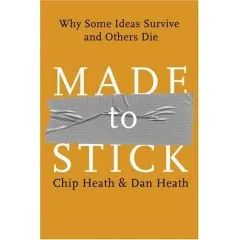
Made to stick by Chip Heath and Dan Heath (find it here, affiliate link) is recommended reading for everyone who delivers presentations: it analyzes why certain stories “stick” in people’s mind, and why others disappear, almost independent of the content: it’s they way that they are told that matters.
Keep them simple without creating silly sound bites
The book is written as a set of stories that are analyzed following the above framework. Sometimes this categorization can feel a bit forced (since most stories combine multiple elements), but generally it works well.
Framework or not, the stories inside the book are the real treasure. They are interesting and fun to read (many of them still stick in my head).
Besides the big idea of the book there are countless interesting bits of knowledge hidden in the stories. Some examples:
The brain stores stories in a “virtual 3D” space. Slightly absurd experiment: people read a sentence about a guy and a shirt slower when the shirt has just been taken off a few seconds ago. Your presentation structure and the structure used to absorb information is not the same
Being analytical, logical, thinking of numbers switches off your emotional mood: the mood in which you are most receptive to store information. Think about that when ordering slides
The curse of knowledge (actually this is a big idea in the book) prevents people from putting themselves in the shoes of an audience for which a concept that took you 3 years to understand might not sound as obvious as it seems to you
Another example of the curse of knowledge: when someone taps a song with his fingers on a table, he/she hears the entire performance including vocals, instruments, etc. A bystander just hears an irregular beat of taps…
70% of learning can happen by just imagining, anticipating, thinking about the task ahead of you (scientifically proven): rehearse, rehearse, rehearse your presentation.
Negative “don’t”, “avoid this”, “don’t fall in this trap”-type recommendations stick better than positive ones: people learn from mistakes. This goes a bit against my marketing theory in business school though.
Posted on TechCrunch today. A presentation of VC firm Sequoia to portfolio companies. You can click through it in a few minutes. From a presentation design perspective, not great (i.e., not all slides are perfectly designed with many bullet points, but what do you do if you have to put something together quickly), but not completely bad either. The content is slightly depressing though for startups trying to raise money (many of my clients).
CEO_ALL_HANDS_10-7-08_FINAL - Free Legal Forms
UPDATE: someone making fun of this presentation here.
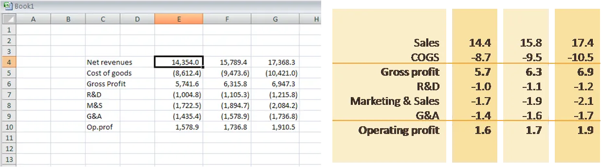
With a few tricks you incorporate even the most dense financial accounting data in your PowerPoint presentation.
Obviously, these are not the slides for your big idea. Still, you sometimes cannot omit them. For example, VC s would like to see some financials even in a 25 minute pitch deck.
Round numbers
Sligthly different tints/shades of your color scheme to highlight columns
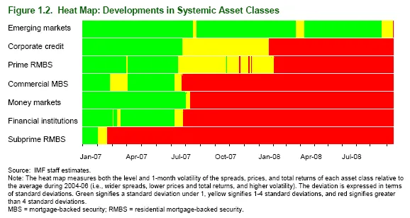
The current financial crisis is a “gold mine” for data visualization. Below is a heatmap taken from a recent IMF report on the world’s financial (in)stability. The chart shows how the troubles have spread from subprime mortgages to other asset classes over the course of 2007 and 2008.
Many more data visualization examples related to the financial crisis can be found on Paul Kedrosky’s “Infectious Greed” blog.
I discussed a financial crisis primer in PowerPoint earlier here.
More on heatmaps here and here.
A post on The Big Picture in February 2008 points to a “cartoonesk” PowerPoint presentation explaining the current crisis in the financial markets. We all should have listened to it…
There is no credit though for who created this file, also some explicit 4-letter words inside. (UPDATE, in slideshare an author is mentioned, not sure whether the person who uploaded it also created it)
For those who want to know it all in detail in a classic presentation packed with dense facts, I embed another presentation. It is not written in Presentation Zen-style, but most of the data charts are designed correctly. Viewing in full-screen mode is essential.
See his post here.
I agree with all his suggestions, except for the one where he recommends to buy your own font. It might look great, but creates an incredible headache when sharing documents with others, or putting things on the web.