SlideMagic Blog

Frequent updates about all things presentations since 2008. Subscribe to never miss a post.

RSS
·Gadgets

Double productivity - upgrade to a 24" (or more) monitor

The best hardware purchase decision I have made over the past year. Large computer monitors are not a toy or an executive perk anymore but a real boost of productivity.

  • Easier to design PowerPoint slides with big images
  • Space to open multiple applications and copy things across (Excel data into a PowerPoint bar chart)
  • No need to print - easy to read facing pages of A4 (Word, PDF)
  • No need to print - dozens of Excel columns open at the same time
  • Building and debugging Excel models in 50% of the time
  • Less strain on the eyes
  • Faster Internet searches
  • Faster search through hundreds of stock images
  • Easier to design slides for the 16:9 screen

I got an Eizo 24", but Amazon stocks many more (referral program links).

I cannot believe that I actually built most of my Excel models at McKinsey on a 13" laptop screen.

·Shapes

Turning PowerPoint shapes into freeform objects

More PowerPoint “how to’s” this weekend. (“how to’s” - apostrophe abuse alert) A reminder on the PowerPoint Ninja blog today on how to transform built-in PowerPoint shapes into free form objects. Read detailed instructions here.

Drawing free-hand is a challenge. In order to keep some control on where to move corners of the shape I recommend using a drawing grid with a wide spacing (PowerPoint 2007):

  1. Click the “Arrange” button in the home ribbon
  2. Click “Align”
  3. Click “Grid settings”
  4. Click “Snap objects to grid”
  5. Click “Display grid on screen”
  6. In “Spacing” choose a large value
·Layout

Copying PowerPoint objects and keeping alignment

Copying PowerPoint objects using CTRL-C / CTRL-V or “copy”/“paste” from the menu creates a new object to the bottom right of the original one. Often you want to copy objects horizontally, or vertically aligned.

Here is how to do it:

  1. Hold CTRL and SHIFT
  2. Use the mouse to drag a copy of the object (movement is locked horizontally or vertically)
  3. Release the mouse button

Thank you Titus Tielens (see his books on PowerPoint - in Dutch)

·Cartoons

Animated ad - cartoons should be used more in PowerPoint

This is an ad for the Detroit Institute of Arts. It has an example of how animated cartoons can support presentations.

I should look more into their use, especially for situations that are actually hard to explain in traditional slides: for example the benefits of the product of a new technology startup that is so early-stage that it does not yet have a product demo. More on cartoons in presentations in a post about Google Chrome. Via AdFreak.

·Creativity

TED - Tim Brown on creativity and play

Videos of presentations of the TED conference are released throughout the year. This one just got posted. Tim Brown is the CEO of the “innovation and design” firm Ideo (Prada store in New York). He talks about the (powerful) relationship between creativity and play. In the rush to the deadline, we very often forget that designing presentations is a creative process.

UPDATE: The McKinsey Quarterly has interviewed Tim Brown, read it here.

·Advertising

PowerPoint lessons from consumer advertising

I stumbled across this ad for a Mini. It contains useful lessons for designing a PowerPoint template.

·Design

Not all presentations are "Zen" - different formats for different settings

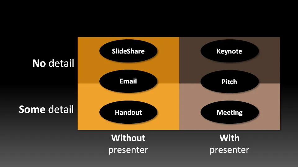
Not all presentation settings are the same. A “Presentation Zen” slide show with stunning images and the incidental word on a slide is great for a keynote, but might be a bit too much to discuss last quarter’s financial results. The 50 page deck with bullet point slides might be serve better as a printed business plan than the key communication tool for a 20 minute VC funding pitch. I have tried to describe 6 presentation scenarios and categorized them according to:

  • Whether the  presenter is present or not
  • The amount of detail/data inside the document

Here we go (click image for bigger picture):

  1. The key note is the classical “Zen” presentation. Huge fonts, dark background, few words, large images.
  2. The pitch is similar to the key note, with the difference that it might be shorter, and does contain some more data to answer questions from the much smaller audience.
  3. The meeting presentation is probably done on a light background, and contains much more facts and details. Over-simplified slides with beautiful pictures do not work in the small conference room with people ready to go through raw material. McKinsey and other consulting firm’s presentation often fit in this box.
  4. The slideshare (or online) presentation is something relatively new. People see it typically in small windows, i.e., fonts should be big, pictures should be nice. The audience of this presentation is highly impatient, clicking rapidly to reach the end, and aboning your presentation if it is not interesting enough. No animations here.
  5. The email attachment is similar to the key note presentatation with an important difference that it needs to stand on its own, titles need to explain the messages in the charts. Some animation could be used here (sparingly though). Detail is less than the handout.
  6. The handout contains the full detail, the full text. It should be prepared on a white background (people will often print it) and use no animation (again, does not come out in print). For VC pitch situations, the good handout makes the business plan “brick” obsolete (hardly anyone reads these anyway).
Continue reading →
·Advertising

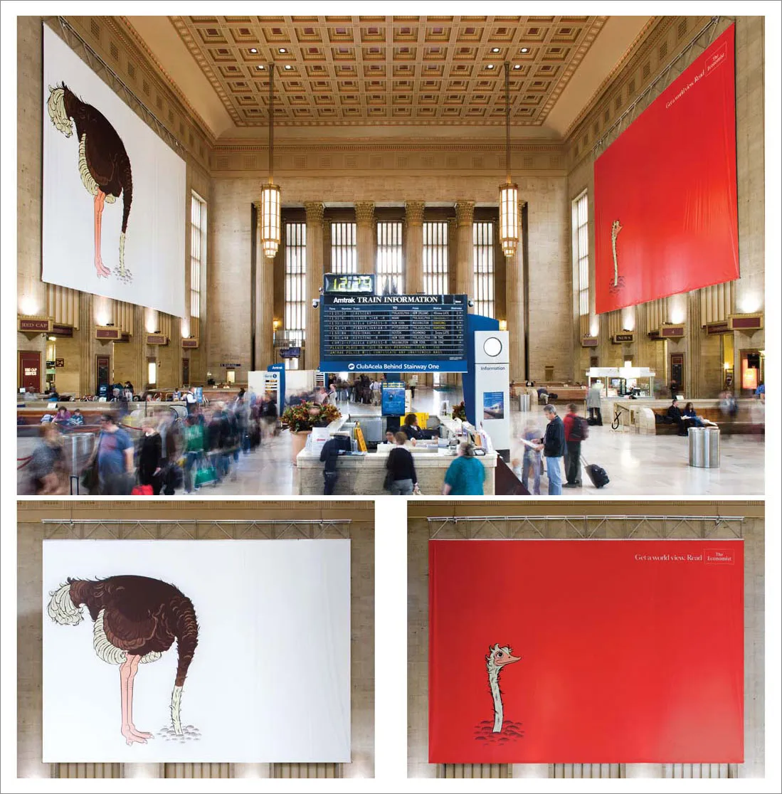
Powerful billboards - The Economist filling a train station hall with an ostrich

We can always learn from outdoor billboards. This one’s great. Huge but still elegant.

Via adgoodness

·Delivery

The pocket projector is coming to an empty white wall near you

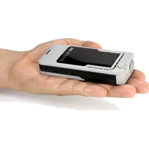
Pocket projectors are starting to ship. Two reviews posted within the last 24 hours: the 3M MPro 110 (around $475) and the Epoq EPP-HH01 ($229).

The reviewers’ comments suggest that although the devices can be used, it is still early days. Light strength is still relatively weak and resolution is not optimal (especially for text). As a result you need a darkened room, put the device 1-2 meters from the wall to get an image of around 40-50cm.

It sounds like we need some patience for 2 things to happen:

  1. These devices become powerful enough that they can project a bright, big image. Until then, the laptop screen might be better. Maybe a compromise could work. A projector that is as flat/small as a laptop, but not quite pocket size that does meet minimum projection quality requirements.
  2. More interestingly, this technology is incorporated in a mobile phone, providing these devices with a big screen instantly. The first application will actually be a replacement of the mobile phone screen for let’s say web browsing without the need for scroll bars, or viewing Microsoft Office documents for private use, or projecting the latest family pictures. Showing presentations to an external audience is still less obvious.
·Images

Stripping out the background color of an image in PowerPoint

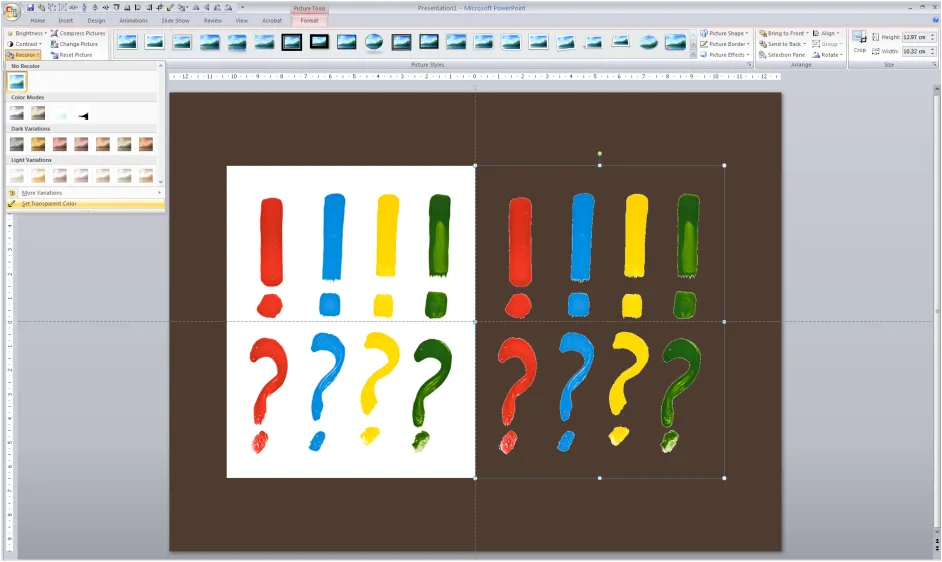
Adobe Photoshop has professional tools to cut out objects from images. In many cases, setting a transparent color in PowerPoint will do.

In PowerPoint 2007:

  1. Select the image
  2. Go in the “Format” ribbon
  3. Click “Recolor” all the way to the left
  4. Choose “Set Transparent Color” at the bottom of the menu
  5. Click the color that you want to be transparent

The cut out is not perfect and it works best with images with a sharp color contrast. I mostly use it when working with a stock image from iStockPhoto that is an isolated object on a white background. Making the white background transparent gives me more design freedom in PowerPoint.