SlideMagic Blog

Frequent updates about all things presentations since 2008. Subscribe to never miss a post.

RSS
·Delivery

Gary Vaynerchuk - passion / no PowerPoint

Somehow I only recently started to follow Gary Vaynerchuk who built a great personal Internet brand through “live” wine tasting sessions recorded to video (most wine critics taste offline and publish later online or in newspapers). This despite being reasonably hooked up to social media, and - more importantly - being a wine enthusiast. Anyhow, better late than never.

I stumbled on one of his presentations (September 2008):

A very passionate presentation. Not a single PowerPoint slide here. Very memorable and entertaining. Still, (a very small “still”), you can see that Gary is used to presenting to a video camera, rather than to a live audience. But he is forgiven, I will seek out more of what he has to say.

His messages in this video:

  • Stop doing anything you do not want to do, but do something you are passionate about right now and go all the way, give it your full shot
  • Build your brand and presence on every tool you possibly can find
  • Realize that you are building your legacy now: this is the first generation that will experience that anyone can see everything you ever did, forever (including your children whom you want to be proud of you)
  • Connect, interact with people to succeed
·Advertising

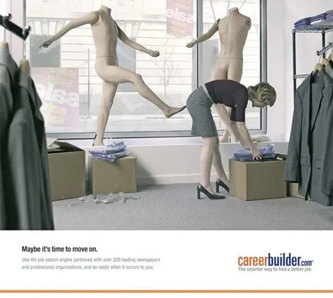
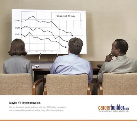
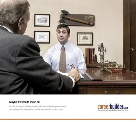
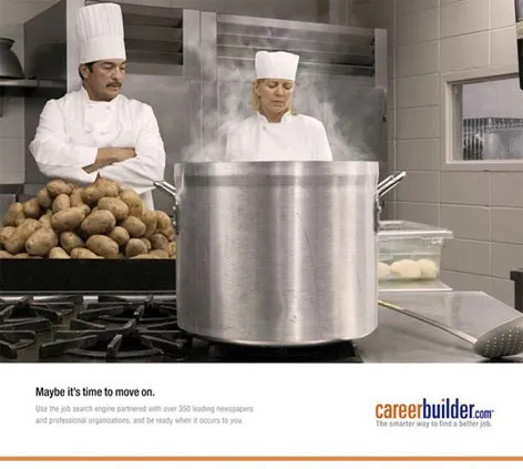
Great visuals - "maybe it's time to move on"

These ads do a great job in visualizing a state of mind (maybe in the current situation, people have less of these thoughts though). These type of images are good ice breakers in a presentation, but because they attract so much attention, I would follow with a black/white empty screen afterwards to get the attention back on you, the presentator.

The site careerbuilder.com seems to be down though… Via Fubiz.

·Creativity

Showers - why they spark creative ideas

Designing presentations is a creative process. Churning out slides and racing towards the deadline will not give the best results. I like to think about a presentation, let it rest, think about it again, drop it again to nurture the best creative ideas.

While reading this post on Cameron Moll’s blog I discovered that there is a scientific name for this, the creative pause: the time between the moment you stop actively thinking about a problem and the time the solution pops in your head unexpectedly.

Cameron goes further to analyze why taking a shower can help closing this creative pause:

  • Minimal distraction
  • Minimal mental strain
  • White noise
  • Change of scenery

All valid points (going on a bike ride or excercise in general creates a similar environment). One addition: people tend to take showers in the morning, I think that that long night of sleep with your subconscious mind griding away might have made the biggest contribution to cracking that difficult issue.

Via Hacker News

·Software

Balsamiq: visualizing software using a mockup - quickly

What a nice story on Read Write Web today. Someone quits his job, starts writing software, and has already made $100,000 in revenues in 5 months.

The idea behind Balsamiq is interesting: provide a tool that can quickly create a mock up of software or a web site. Not only useful to nail down a software specification among a group of engineers, but probably also handy when you want to communicate/visualize a very early startup idea to potential investors when you do not have a prototype or demo ready yet.

More background reading on demos: David Rose advises never, ever, to use a live demo in a pitch presentation, and an earlier post on presenting software interfaces in PowerPoint.

·Design

Injecting a designer's personal touch into a presentation

All presentations I design are used by others - not me

All presentations I design have a serious, professional subject

Still, I like to add a personal signature to my work. How can you do that within the constraints of the presentation other than the little reference in 8pt font on the last page?

As a designer you can steer the choice of visuals you use with things you are passionate about:

  • When you need an urban street image: take one from Paris, even better Boulevard St. Germain, even better people sitting outside Cafe de Flore…
  • When you need to express harmony use a black and white image of Miles Davis playing a away…
  • When you need to visualize something agile and fast, take a bright yellow Mini car…
  • When you need a newspaper cover, take one from a memorable date…
  • The list can go on and on…
·Layout

Picking a background color for a PowerPoint presentation

Some observations on setting the background color for your presentation:

  • Whatever you choose, it should be a plain background without watermarks, logos or shapes. The audience is interested in the content of your slides, not the artwork in the background
  • You have a choice of something dark, or something light. Different presentation settings, benefit from different background colors, see a previous post. (The 2 extremes: a big-audience-keynote is usually dark, a small meeting usually light)
  • In principle, any dark or light color could work. But, watch out for light “pastel” colors that come out ugly on (poor) color printers or overhead projectors. Also think about working with stock images, there are plenty of images with white or black backgrounds that blend easily into the background, finding one with the perfect marine blue might be more challenging.
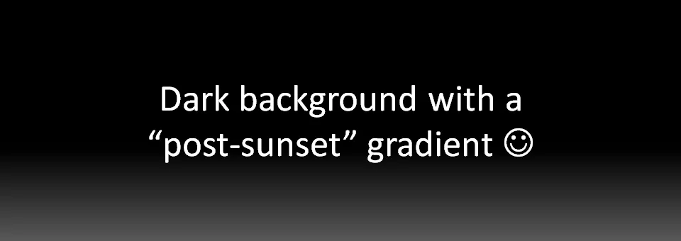
  • Especially with dark backgrounds, it can be elegant to add a tiny gradient to the color, making the bottomo of the screen 1 shide lighter. You create an effect similar to the color of the sky after the sun just went down.

·Images

Visualizing your consumer and/or audience makes it real

Using a good image is the best way to describe something as complex as a consumer segment. Putting a page loaded with bullets: young, Asian, affluent, female, confident, well-educated on a piece of paper does not get the message across. A picture does the trick: hey, here she is!

Finding good, non-cheesy, non-artifical-model images is a challenge though.

Visualization of a person is helpful in another way: preparing your presentation. Putting up that picture of a “typical” CIO of a medium-sized company might put you in the right “mood” to fine tune that important sales presentation for 200 blade servers. The picture itself of course will never make it into the final presentation (it might if the audience has a sense of humer, but it is extremely high risk).

Our Asian consumer image was purchased on iStockPhoto.

·Humor

Sometimes breaking PowerPoint rules can be a good thing

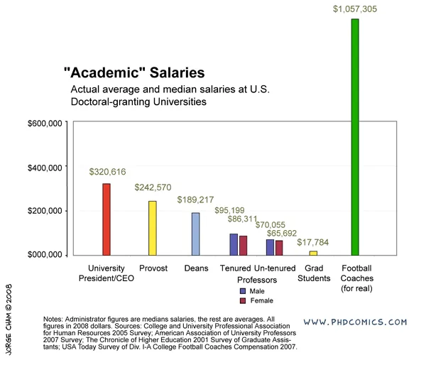
See this chart:

It breaks a number of rules. The most obvious one is the bar towering out of the chart frame. But hey, it helps make the point!

Original chart can be found on PHD Comics. I found it on Junk Charts

UPDATE: this chart does violate some other basic design rules that are better corrected, see an earlier post about cleaning up Excel/PowerPoint data charts.

·PowerPoint

Why SlideShare will turn into a major platform for spreading ideas

More and more I come to the realization how online presentation sharing tools such as SlideShare will become one of the main platforms to spread ideas.

  • An image says more than a 1,000 words. Long pieces of text do not work for an impatient Internet audience suffering from information overload. Short blog or Twitter posts cannot capture complex concepts. LOOK AT THIS SHORT POST AND MANY PEOPLE WILL ALREADY DECIDE IT’S TOO LONG TO READ

  • Images are a pain to manage in HTML, especially when you want to add text, shapes, etc. SlideShare makes it easy to put up a sequence of images. Slideshare makes it easy to embed, share this.

  • Presentation Zen ideas about good presentation graphics are spreading into the mainstream: more and more people know how to leverage presentation software correctly

  • SlideShare enables some remote “flow control”. People click frantically, but follow the script better than when scrolling down a column of text only eye balling bold words, or abandoning a YouTube (or TED) video mid-way

Remember, a good SlideShare presentation is not the same as a presentation for a live audience. See my earlier post on Not all presentations are “Zen”.

  • A SlideShare audience is as impatient as any, but it does not sit in a room where it is impolite to walk away mid-presentation. Every slide should invite watching the next one.
  • People watch SlideShare presentations on a very small screen, like sitting in the back of a huge conference room: large images, big fonts are even more important
Continue reading →

How people really use the iPhone - case example of presenting consumer research in PowerPoint

An interesting presentation on SlideShare, a consumer researh firm createwithcontext presents the research results about how people do use the Apple iPhone and its user interface:

How people really use the iPhone

Interesting on multiple levels:

  • The content itself, how people use/get used to a new user interface (beyond the scope of this blog)
  • The presentation of the results of the research: a series of screen shots with big arrows highlighting key messages. A format I often use to present screen shots of applications in PowerPoint.

This confirms how I think consumer research results in general should be presented: real images of products, of store interiors, preferrably with direct quotes from the research. “There is a book here, does that mean you can read?”, rather than “Focus group members did not understand the meaning of this book icon”. Conclusions do not have to be spoon fed, but rather readers benefit from digesting the raw results as if they were sitting behind the mirror of the focus group themselves.