Great visualization of people connecting on Facebook
See the video here. Full details in the original post on TechCrunch.
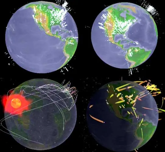
Update: if you like these type of visualizations, Mashable has a whole stack of them, including videos, in this post.


Frequent updates about all things presentations since 2008. Subscribe to never miss a post.
See the video here. Full details in the original post on TechCrunch.
Update: if you like these type of visualizations, Mashable has a whole stack of them, including videos, in this post.

Presentations to analysts and investors are very important for publicly traded companies: they have a direct impact on the share price.
In this interview for the McKinsey Quarterly, Gartner CFO Christopher Lafond lays out his investor relations strategy:
Note: (free) registration to the McKinsey Quarterly might be required to read this article.
Steve Hamm is a writer for Business Week who is about to publish a new book: The Race for Perfect: Inside the Quest to Design the Ultimate Portable Computer
Joe Lambert produced a graphic/comic version of chapter 4 of the book, about the development of the laptop and the contributions of Alan Kay, one of the main visionaries of mobile computing. Alan worked on a number of very important innovations: the graphical user interface and the mouse, the portable PCs, and the PDA just to name a few.
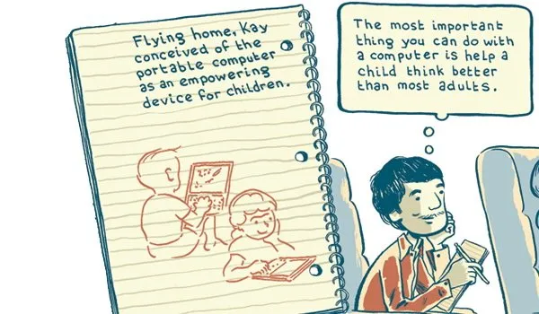
I think that the illustrations are beautiful, and the story is really interesting. However unlike the case of Google Chrome, I do not think that the comic format does a lot to add to delivering the message of this book. Neither Joseph Lambert nor Steve Hamm are to blame (on the contrary the art work and the story are great). The Google Chrome book confirms that comic graphics can do a great job of explaining complex technology. A historical time line simply leaves less room for creative expression. For more about Alan Kay and his ideas see this video at TED, the source of my inspiration for this blog post.

Big PowerPoint files are becoming an increasingly big problem. Yousendit is a convenient service that allows you to send very large files. You upload a file to the server, the recipient receives an email with a link to download it. FTP without the hassle.
Today, yousendit launched a plugin for Microsoft Office. It’s the same functionality that the web site offers, but now with a tighter integration into Excel, PowerPoint and Word.
Be aware of security issues though. If you use the standard transfer mode, anyone “guessing” the download URL can get to your file. Secure sending options are available but are not free of charge.
Reading through a web site with guidelines for designing web pages for dyslexic users, I realized how valuable these recommendations can be for any audience, not just people with this condition.
This is a PowerPoint presentation design guide 101:
Google has just put the massive archive of images from LIFE magazine online (Google blog post). The majority of which never made it to print. Google will ultimately scan in the entire collection of about 10 million images. Large-format print can be purchased.
Another example of how online media is unlocking the “long tail” of historical information.
This opens up a great new source of vintage images for use in PowerPoint presentations. They are very hard to find (stock image sites hardly list them).

Wide range of facial expressions on children at puppet show - The moment the dragon is slain, Guignol puppet show, Parc de Montsouris, Paris, 1963. Photographer: Alfred Eisenstaedt
I like using vintages images:
To search images from the LIFE archive, simply add “source:life” in your Google Images search bar (example: search results for Picasso)
No audience member […] has ever said, “it was exciting, useful and insightful but far too short.”
Read the full (short) post.
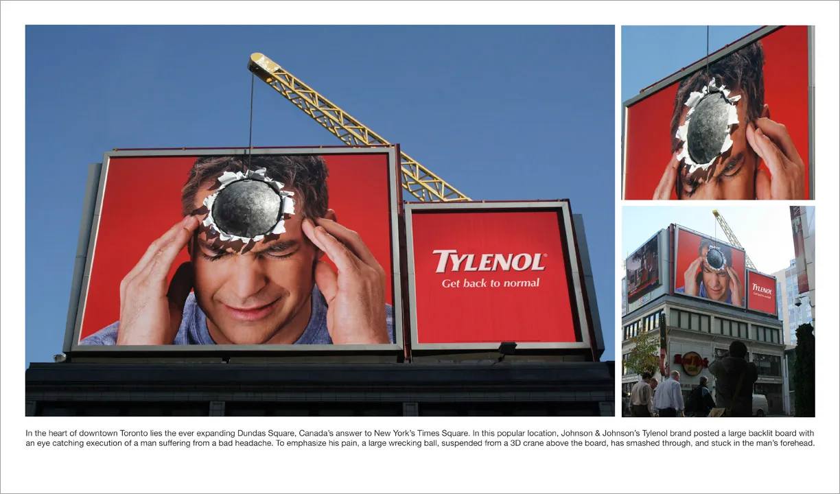
I am adding adgoodness to my blog roll. This is another great find.
The issue of race and the 2008 U.S. presidential election sparks big discussions everywhere, I am staying out of this here. This blog is not about politics. From a presentation point of view, the election offers some interesting data visualization opportunities. Maps can be powerful presentation tools.
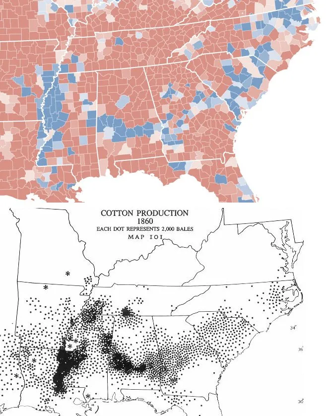
Via strange maps, which also has a chart overlaying the 2 maps. I actually think that visually, leaving the 2 charts separate looks better, keepin the ancient look and feel of the 1860 map intact.
My wife had to swap her mobile phone because my 2 year old son decided to empty a bottle of water on her previous one. These things happen. The new phone is a Nokia E71. Phone reviews are a bit out of the scope of this site (it is a great phone by the way), but I can comment on the graphics of the user interface.
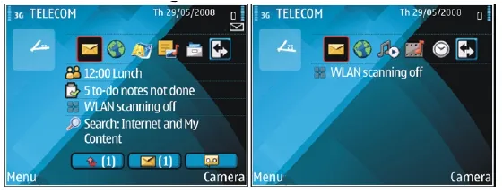
Nokia could have done so much better:
Mobile phone screens can also benefit from a “Zen” make-over to transform them into calmer and more minimalist user interfaces
PowerPoint and mobile phone interfaces are the same: the fact that you can make that sophisticated watermark background does not mean you have to use it!