

The issue of race and the 2008 U.S. presidential election sparks big discussions everywhere, I am staying out of this here. This blog is not about politics. From a presentation point of view, the election offers some interesting data visualization opportunities. Maps can be powerful presentation tools.
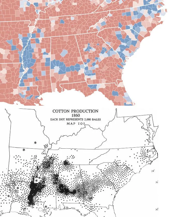
Via strange maps, which also has a chart overlaying the 2 maps. I actually think that visually, leaving the 2 charts separate looks better, keepin the ancient look and feel of the 1860 map intact.