SlideMagic Blog

Frequent updates about all things presentations since 2008. Subscribe to never miss a post.

RSS
·Images

Funny - video about cliche stock images

Great images can do amazing things to your PowerPoint presentation. But, cheesy stock images are as bad as poor clip art. The Empower Your Point blog dug up this amusing video on the subject:

There are no golden rules here. In practice I find that any image that is not “natural” usually does not pass the bar: renderings, staged compositions with models (exception: children), combination of 2 or more images (you can do that yourself). Related posts about this issue here, and here.

·Design

Be consistent - $s, Euros, millions, bns, GBPs, 000s

There are many ways to spell monetary amounts. Pick one and use it consistently throughout your PowerPoint presentation:

  • $, US$, USD, I actually like these 3-letter abbreviations, no searching on keyboards, no need to search and insert symbols, every currency has one that looks consistent
  • Billion, bn
  • Million, M, m
  • 000, thousand, k
  • Decimal point, decimal comma
  • Thousand separator point, comma, or none
  • Negative number with “-”, or in between brackets

Unfortunately, detail does matter in presentation design…

·Design

Using "paste as PNG" to wash out complex PowerPoint objects

Going a bit (only a bit) against the “Zen” presentation philosophy, I have argued before that overwhelmingly complex PowerPoint charts could be used in a large keynote presentation, if (big if) they are positioned well.

One way to use it is as follows:

  • Put up the overwhelmingly complex chart, message: “it’s complex, don’t even try to understand this now”
  • In a subsequent chart, wash out the original object
  • Start highlighting individual components for further explanation

You can use the “paste as PNG” function in PowerPoint to transfer any object (including complex groupings) into a picture and subject it to the regular picture manipulation tools available to you: resize (a pain for complex PowerPoint objects with text in them), crop, and of course re-color.

Recoloring the image with a very light overlay creates a wash out effect that you then can use as a background for subsequent highlights. I have tried to explain all this in the following SlideShare presentation (click on “screen” image at bottom right for full screen mode).

·Humor

Rediscovering PowerPoint classics: the Gettysburg presentation

More weekend reading.

Peter Norvig is Director of Research at Google. Back in 2000, being fed up with boring PowerPoint, he decided to use a famous speech by President Lincoln to demonstrate how a poorly designed PowerPoint translation could destroy its communication power completely. He put the creative “master piece” on his web site and more or less forgot about it.

Gettysburg address

·Advertising

Brilliant visualization of a "real word" design user interface

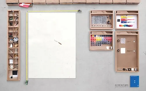
Weekend reading (1 day earlier than the rest of the world in Israel). I stumbled on this great ad for Adobe Photoshop CS4.

It shows what graphics and presentation design is all about, a creative process working with shapes and colors and a blank piece of paper. Computers make it easier to work, but in our mind we should go “back to basics” now and then. Go to this Flickr stream for more detailed/hi-res images. Agency Bates141. Via Zurb.

·Design

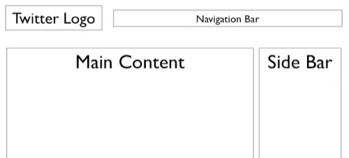
Create a Twitter background using PowerPoint

There is a lot of (white) space for self expression on Twitter in its background image. (Not implying that “cluttering it up” will make it look better though) The “The Closet Entrepreneur” posted a tutorial how to create a Twitter background in PowerPoint. It includes a template with the areas you should leave blank for Twitter’s own content.

P.S.: follow me on Twitter. Via Digital Inspiration

·Animations

Source file of the bouncing PowerPoint equalizer now online

I have put the source file of the happily dancing equalizer in PowerPoint now online. I uploaded it to Slideshare, you can see the animations if you download the presentation (a PPS file), the regular SlideShare embed does not support it.

·Images

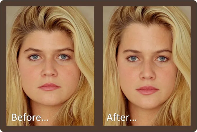
Improve your looks in a picture - automatically!

Israeli scientists have not only found a way to specify human beauty mathematically, they go a step further to develop a tool that automatically improves your looks in a picture. Not sure when this will be added to the PowerPoint format ribbon…

Project page here, found via Haaretz. An earlier post about face “recognition” here.

·Sharing

Reviewing the SlideShare financial crisis presentation contest winners

The winners of the SlideShare presentation contest about the financial crisis were announced a few days ago.

  • My general point about SlideShare-style presentations being great for online viewing but not always the best solution for live audiences still stands.

  • The content of the winning presentation is not surprising, most of us will have picked up the messages from the newspaper. It is a shame that none of the winners used visualization of data from original analysis to give us a really new insight in the subject matter.

  • It is great to see how contests like these can spark so much creativity in people submitting their work.

Having said that, let’s discuss the graphical execution of the winners:

The winner:

The Financial Crisis: an Historical Perspective

I like this presentation, especially the use of images (the historical paintings look great, the falling knife almost makes you feel the pain in your own hands.)

Number 2:

The crisis 101 (US economy 2008) - put simple serie

Not judging the content here, I like the execution of this presentation less. The link between the text and the images is not that strong.

Number 3:

Cooking up an International Global Finance

UPDATED. While I generally do not like simple graphics like clip art in presentations, this presentation uses this technique beautifully. All graphics are custom-made. They have a consistent style, and the “simplistic” graphics provide a good tongue-in-cheek contrast to the really complicated subject matter and the whole thing hangs together well.


Chart concept - using cinematic effects to provoke real audience emotions using PowerPoint

A combination of big (sometimes huge) projector screens and high-quality images creates an opportunity for (PowerPoint) presenters to enter the arena of the movie director to provoke real emotions in the audience.

  • A bright light or a beaming sun beaming right at us, although there is no risk of dammage to our eyes we intuitively squint
  • A sudden pop up and disapearing of a big spider (“booh”, never used this one though)
  • A gun pointing at the audience (or less dramatic: a remote control zapping you away)
  • Large close-up of eyes (beautiful, innocent, scary)
  • Nails and a blackboard (makes you feel the chart)
  • Looking down a roller coaster track, training coming at you, base baller about to hit a ball
  • The list can go on

Image purchased from iStockPhoto.