SlideMagic Blog

Frequent updates about all things presentations since 2008. Subscribe to never miss a post.

RSS

Free templates (just for one day)

I am experimenting with pricing on the SlideMagic template store, and trying to understand what sort of slide templates are most useful for you. So you can participate in another experiment: tomorrow you can download any template you want from the store by using discount code “Magic” (link). It is valid for 24 hours on November 17 Tel Aviv time (Black Friday came early).

UPDATE: this offer is now expired

·Concepts

Popping out of the box

Unlike many designers, I actually like framing my slides, leaving white space around the edges. Stretching your picture all the way to the slide boundary looks nice on one page, but creates inconsistencies with more traditional data slides, and reduces the readability of slide titles.

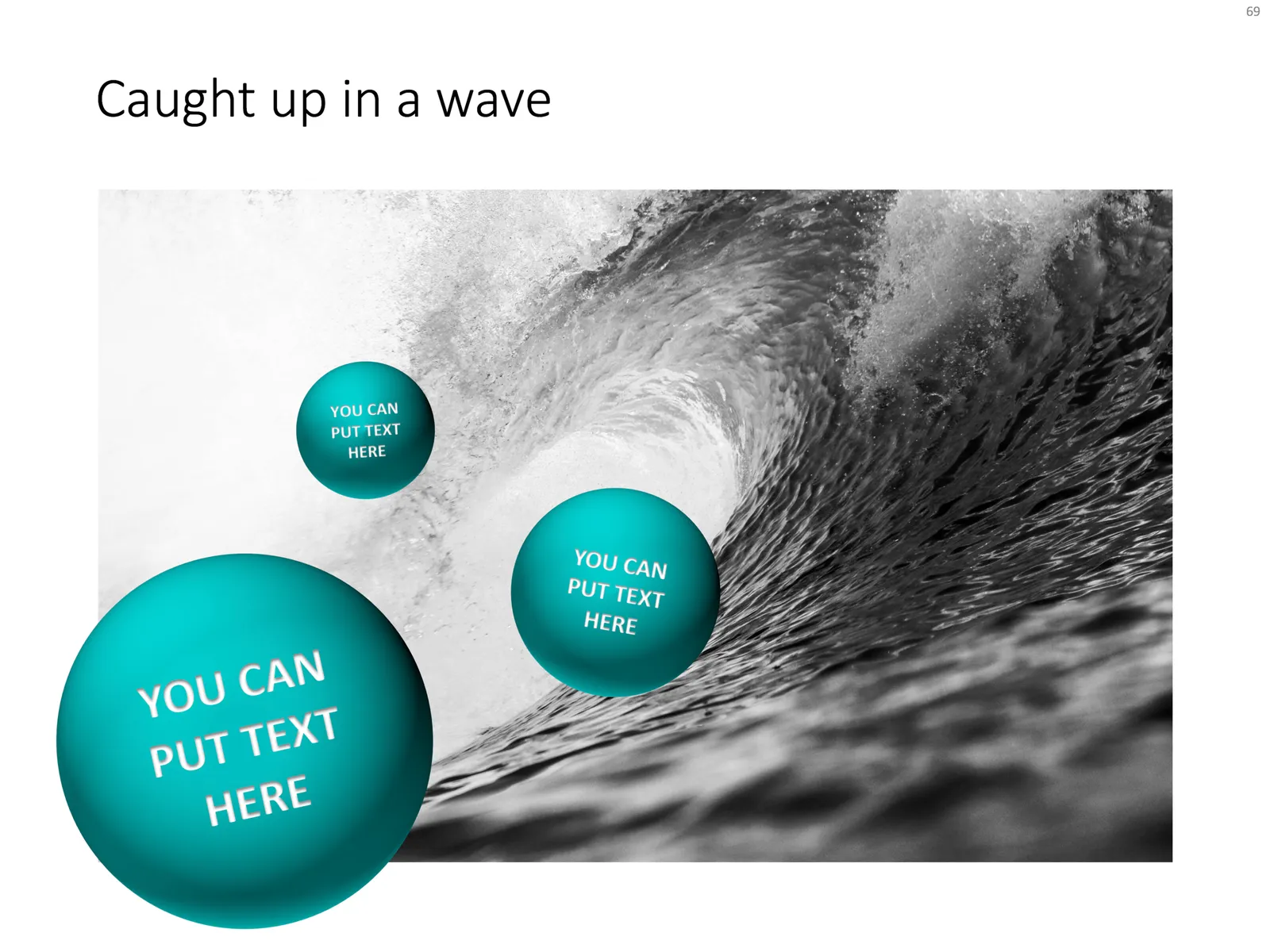
One advantage of the frame is that you can make things pop out, a trick that is often used in magazine design. See below an example I made using that approach.

Feel free to copy the design above, or buy it ready for you to use from the SlideMagic template store.

·Layout

How to present the competition

The best slide to talk about competition of your product or company depends on your specific market.

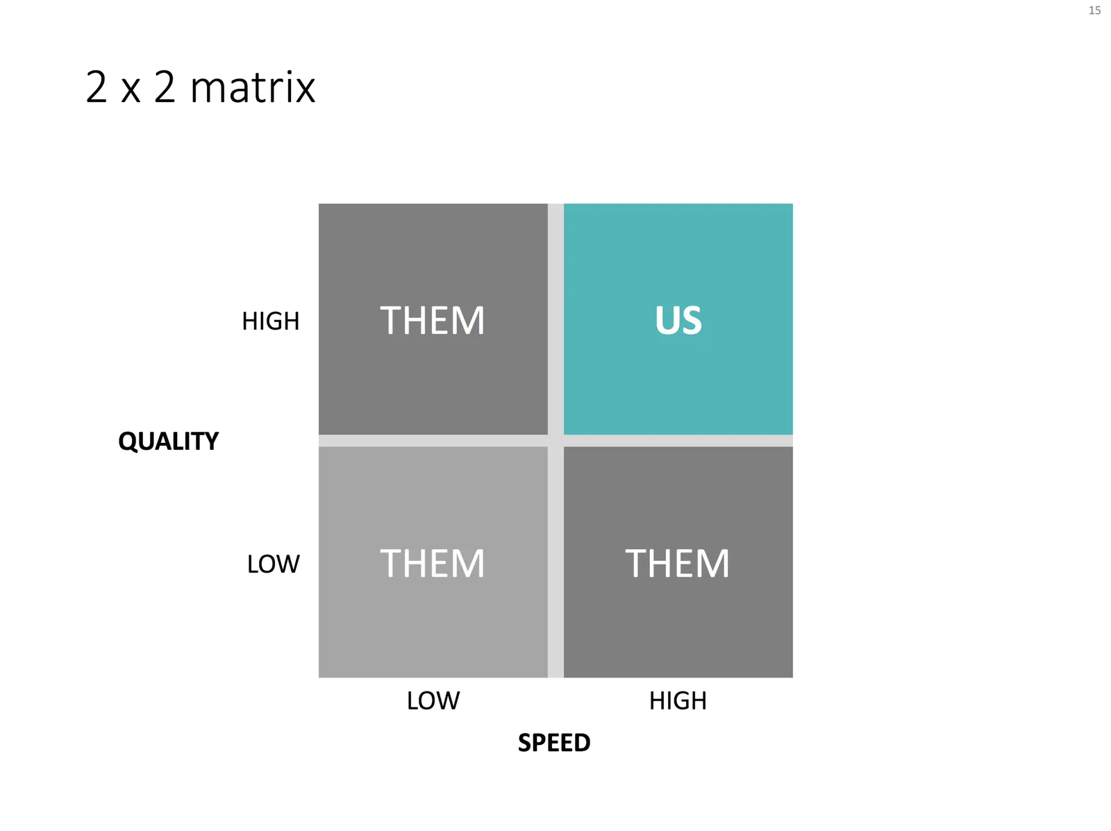
Most people first try to squeeze all competitors on to some sort of 2x2 matrix. This is a great option if there are 2 distinct axes, or 4 market segments.

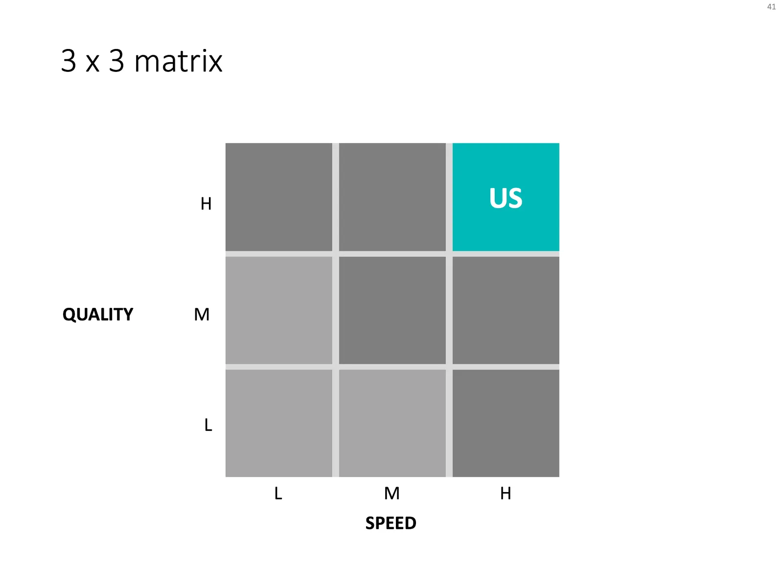
You can add nuance by using a 3x3, creating 9 market segments. I prefer to put the competitors locked to the grid, and don’t get into debates about where they exactly sit on the spectrum.

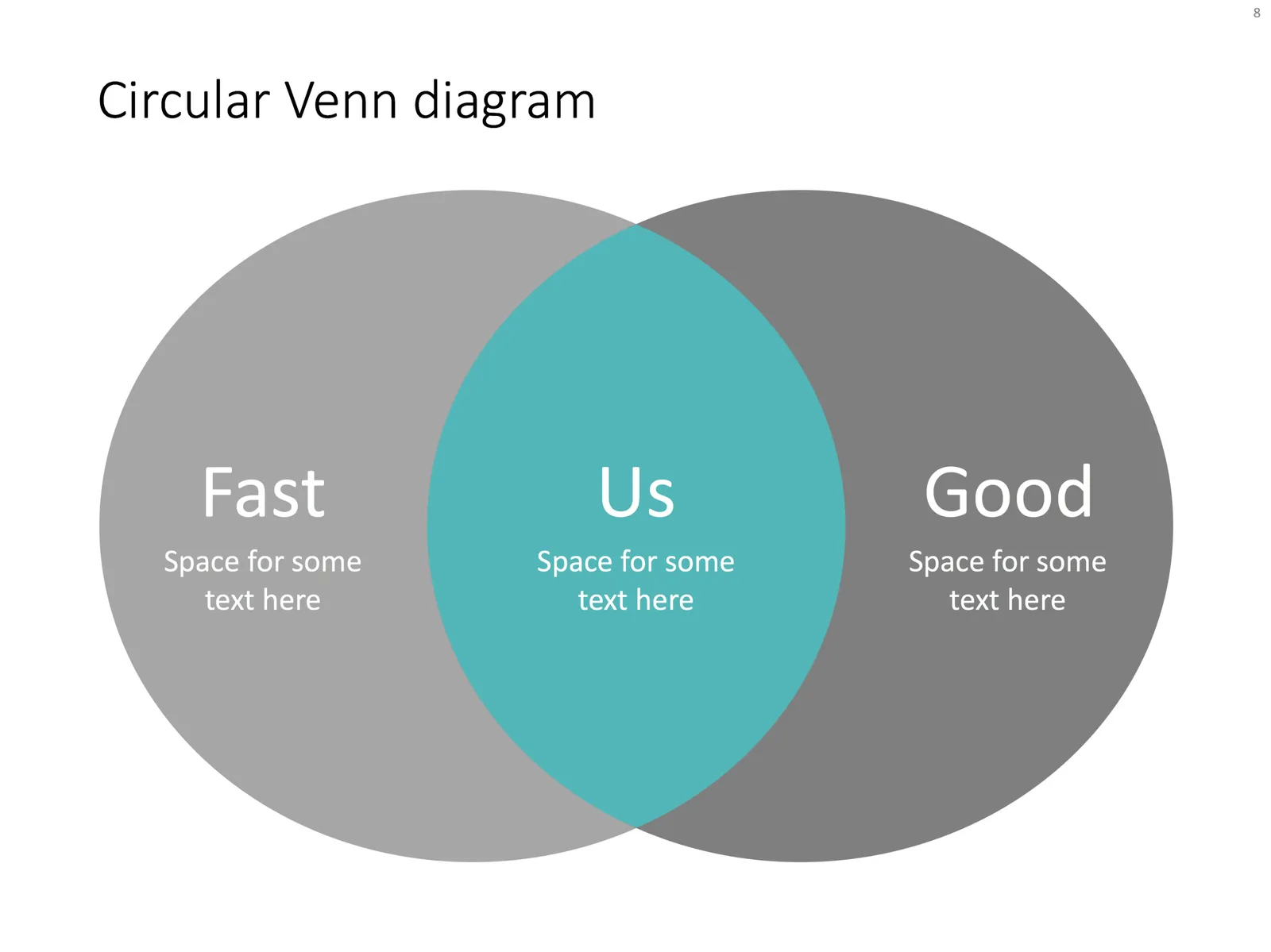
But, if you have a hard time finding the definition of these 2 axes, the matrix is probably the wrong format to use. In many cases, the bottom left quadrant stays empty, and/or is meaningless. In these cases, try using a Venn diagram, which is basically a 2x2 matrix with that bottom left box chopped of.

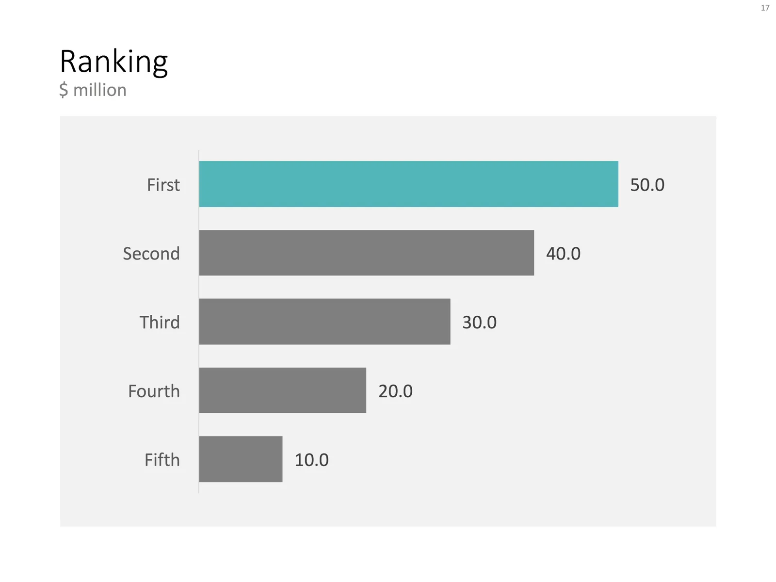
In other cases, a simple bar chart my be sufficient. Rank you versus the competitors with one simple variable.

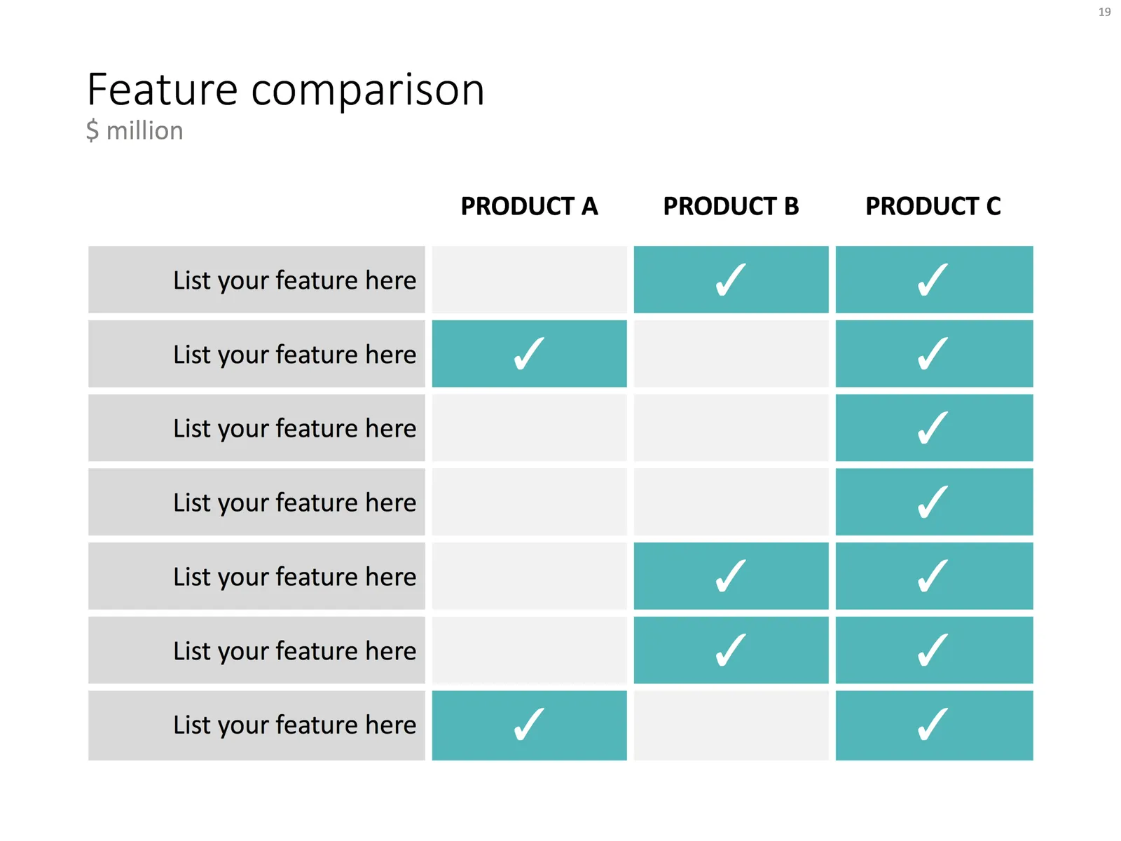
In most situations, I have to use some sort of feature table that can handle more than 2 dimensions on which to compare the competitors. Choose the comparison criteria wisely, avoid duplication, and give them the same level of abstraction/detail. Re-order columns and rows until you get homogenous blocks if “yes” and “no” cells.

Feel free to be inspired by the example layouts in this post. You can also click on the images, which brings you to the template store where I did the work for you. I frequently update the template store and try to tag slides with relevant keywords. A search for “competition” should bring up all the charts that I think are useful for visualising a competitive differentiation.

Continue reading →
·Software

Windows is at par

Every couple of years I am installing a Windows machine on my Mac, either to check how SlideMagic looks on corporate computers, and now, because I need access to Microsoft Office development features that are not available on a Mac. I went through Windows 8, then Windows 7, and now Windows 10. This time, I am not using the Parallels virtual machine, which allows you to run Mac and Windows applications side-by-side. I always found it slow, cumbersome, and oh boy, if you double clicked the wrong file your virtual machine would boot up, start the Microsoft update process, etc.

I must say, the whole Windows experience is fantastic (I mainly use Chrome, and Microsoft Office). If you need to work a lot with the file manager, you still see some left overs from past designs, but speaking of design, the overall look & feel might actually be better than Mac OS X.

Most hardware for Windows are still low cost / ugly corporate laptops or machines for home use. But, the combination of Apple hardware and Windows is a pretty nice one. I think there is a market opportunity for a super beautiful, super powerful, Windows machine aimed at creatives / designers, priced above Apple.

·Images

App demo slides

Doing a live app demo in a 20 minute pitch meeting is risky, the technology might go wrong, and probably more than half the time you spent in a 2 minute app demo could be things that are not really interesting: logging in etc.

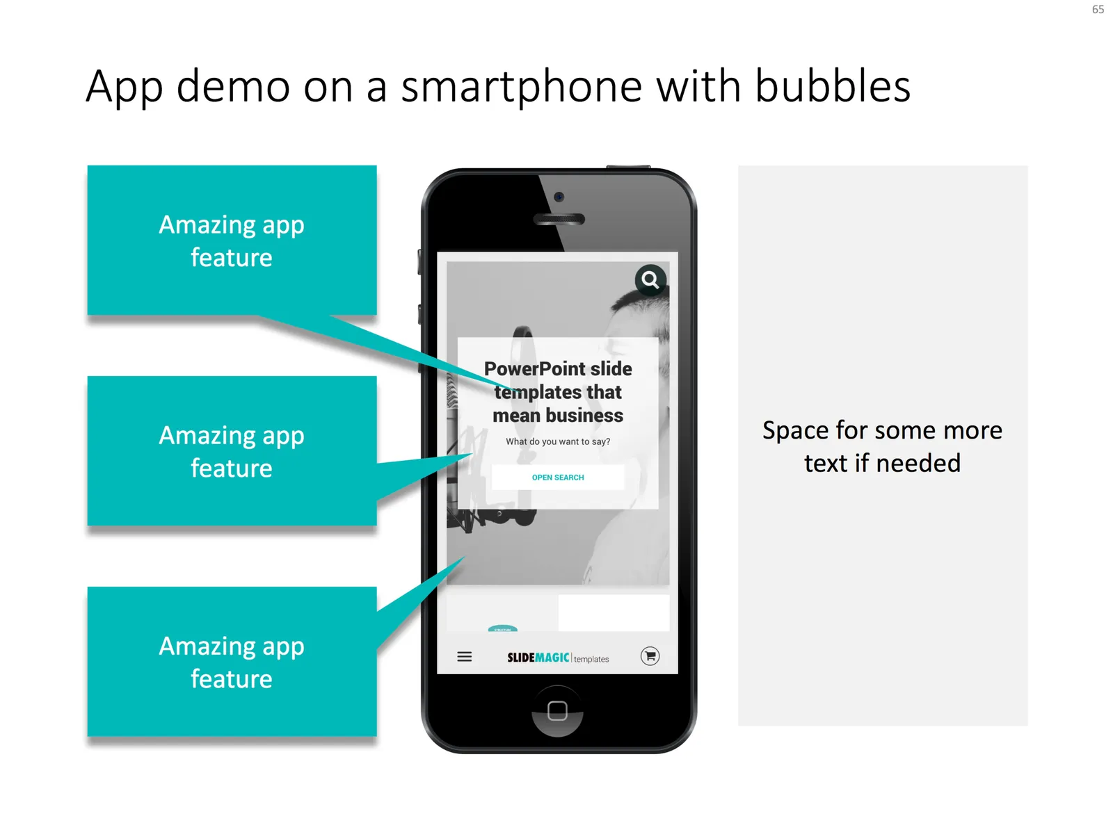
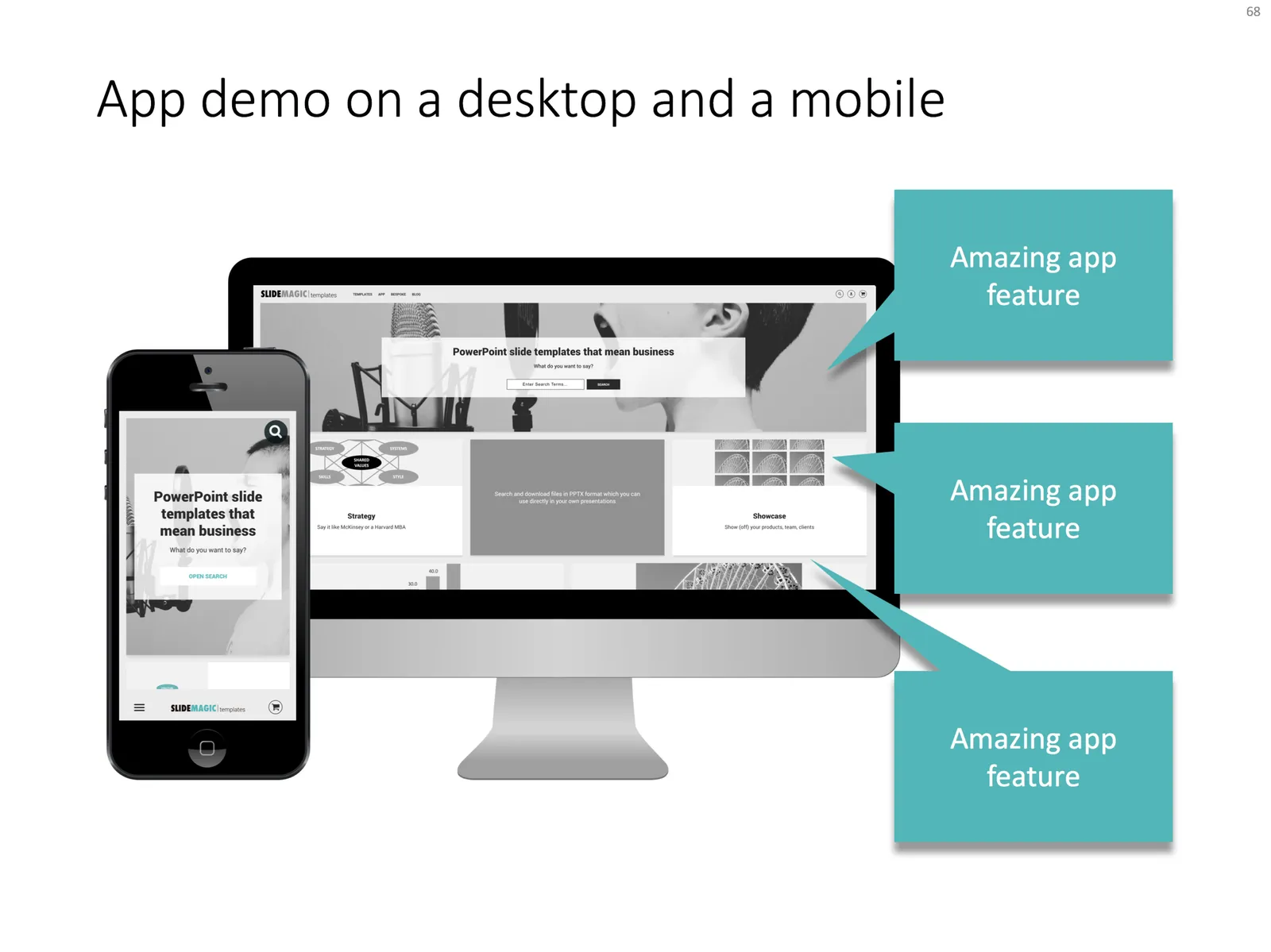
Instead, I usually prepare a series of screen shots with big explanation bubbles in my presentations. No technology risk, no loggin in, setups, and I can set the exact flow I want. The added benefit is that I can zoom into parts of the screen that are hard to do when showcasing the app live in an actual device.

Most of the time, I use page filling images to demo an app, to get as much screen real estate as possible. If I want to introduce the app in a general way, I use a background of a mobile phone or desktop to give the slide a more interesting context. As a result, the the screen itself will hardly be readable by the audience, and becomes a background image.

I added a few examples of app demo slide layouts to my template store.

·Layout

Spacing objects on a circle

It can be tricky to distribute text bubbles evenly on a circle. To make it easier, you can put a temporary shape inside the circle like in the example below. Delete it after your bubble chart is complete.

UPDATE, I have now added charts based on this concept to the SlideMagic template store, click the image to find out more.

·Data visualization

How to create a waterfall chart

I am learning a lot from the search bar in my template store, especially those searches that (still) deliver zero results. “Waterfall” is one of those.

Waterfall charts are the secret weapon of McKinsey and other strategy consultants. They are great to explain the source of change between two values (last year, this year for example). In Excel they are tricky to make, especially if values zoom up and down the zero axis.

In an earlier blog post (all the way back in 2008, nine years ago…), I explained the basics of creating waterfall charts in Excel. The secret is to make blank series in a stacked column chart that create the requires offset for the delta values.

For my store, I am working on an automated tool that creates waterfalls. It is still work in progress though, I want to to be very robust.

In the mean time, I have added a manual version of the waterfall to my template store. I created the general layout, fixed the colours. Still you will have to do some calculations and adjustments to make it fit your specific set of numbers. Also, you will need to add data labels manually. But with a bit of fiddling, you should get a good result.

Work in progress.

SlideMagic versus the competition

Today, I added a slide to the SlideMagic template store that shows how I usually visualise some sort of competitive comparison or product differentiation. I took SlideMagic itself as an example:

  • A simple yes/no table
  • Use the accent colour to emphasise features
  • Sort columns and rows in order to keep as many “yes” boxes together in a nice pattern

The slide pretty much sums up how I see SlideMagic. In the app, it is really easy to change slides, in PowerPoint it can be a bit of an exercise to add a column in a 4x5 grid and keep everything nice and organised. Most online template stores try to hard with design that look horrible when pasted into a corporate PowerPoint template, and most of all, template stores are run by designers and not by former strategy consultants, so they won’t always have the charts you actually need most in a business presentation.

Feel free to “steal” my design and copy it yourself, or download it instantly from the SlideMagic PowerPoint template store. Have a look at other slides in the template store about competition and competitive advantage.

Photo by Alex Holyoake on Unsplash

Juggling URLs

All the SlideMagic businesses and web sites run on different platforms. Through design, I have tried to keep a consistent look and feel as you click from one environment to the other. Yesterday, I made some drastic changes to URLs, and consolidated the facebook pages into one. Let’s see what all this does to my Google search results, but more importantly, hopefully all the redirects work and the user experience stays good.

Here is everything as it stands at the moment. There is still room for more consistency…

Let me know if you experience any broken links or other issues.

Cliche ads

Business speak is full of cliches, and when you take a cliche headline, and use a cliche image composition to visualise it, you get a cliche ad:

The small print in the ad:

Always one step ahead of the game: Predictions prove a bright future for you. Out autonomous vehicle will be safer, smarter and instinctively more brilliant than anything on the road

On the web site, it has a slightly different version of this (which is actually clearer and gets to the point what the ad means):

Always one step ahead of the game: Complex driving environment requires driver’s fast decision making and responsiveness. Autonomous Ioniq detects and protects its driver even before driver notices hazardous driving situations on the road. Hyundai Motor Company steps forward to bring safe driving environment for everyone.

The ad agency should have picked another visualisation to support their message. The current one is a cliche visual, but also the slow-paced chess does not connect to snap second decisions that can save lives.