

Unlike many designers, I actually like framing my slides, leaving white space around the edges. Stretching your picture all the way to the slide boundary looks nice on one page, but creates inconsistencies with more traditional data slides, and reduces the readability of slide titles.
One advantage of the frame is that you can make things pop out, a trick that is often used in magazine design. See below an example I made using that approach.
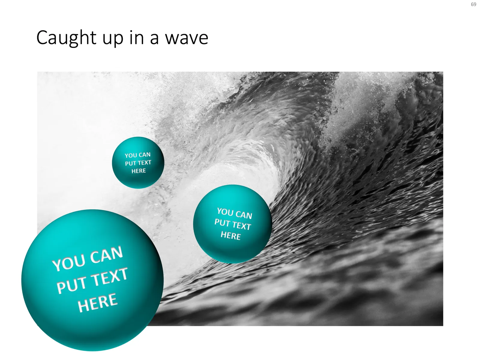
Feel free to copy the design above, or buy it ready for you to use from the SlideMagic template store.