SlideMagic Blog

Frequent updates about all things presentations since 2008. Subscribe to never miss a post.

RSS

Cliche ads

Business speak is full of cliches, and when you take a cliche headline, and use a cliche image composition to visualise it, you get a cliche ad:

The small print in the ad:

Always one step ahead of the game: Predictions prove a bright future for you. Out autonomous vehicle will be safer, smarter and instinctively more brilliant than anything on the road

On the web site, it has a slightly different version of this (which is actually clearer and gets to the point what the ad means):

Always one step ahead of the game: Complex driving environment requires driver’s fast decision making and responsiveness. Autonomous Ioniq detects and protects its driver even before driver notices hazardous driving situations on the road. Hyundai Motor Company steps forward to bring safe driving environment for everyone.

The ad agency should have picked another visualisation to support their message. The current one is a cliche visual, but also the slow-paced chess does not connect to snap second decisions that can save lives.

·PowerPoint

The origins of PowerPoint

This article The improbable origins of PowerPoint is probably the most detailed story of how PowerPoint became what it is today I have read.

·Data visualization

P&L as a column chart

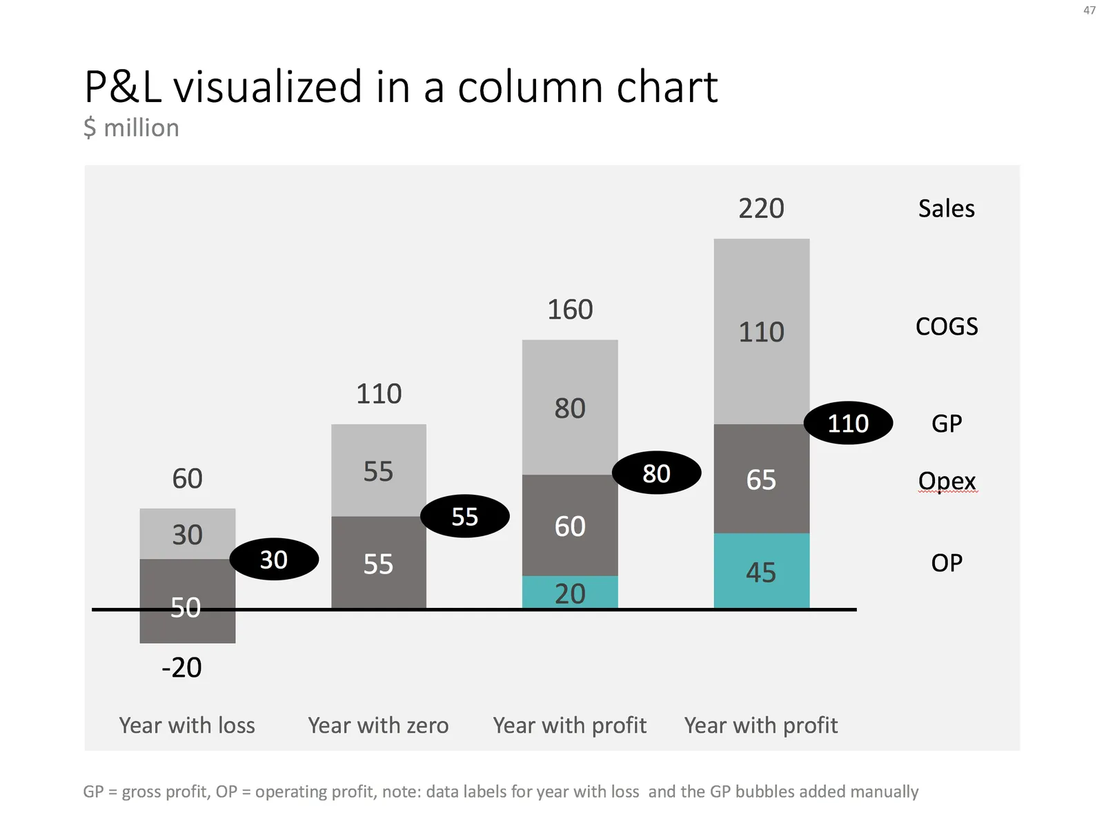
When you want to show a P&L with very few lines, consider using a column chart instead of the more traditional data table. In the chart below you can see how to go about it. Use a bold color for the profit series, a light color for the COGS, and manually add the gross profit as bubbles.

Things get a bit trickier for years where there is a loss. You create a separate data series in the same color as the last cost category (opex in this example), and calculate how much of the opex goes under the line and how much above. Tweak data labels manually. For these types of charts it is best to sketch them completely on a piece of paper, and then fiddle with PowerPoint/Excel to get it right.

The column chart works well, it shows a number of trends in 1 slide: sales growth, profit growth, and how fixed/variable certain cost types are.

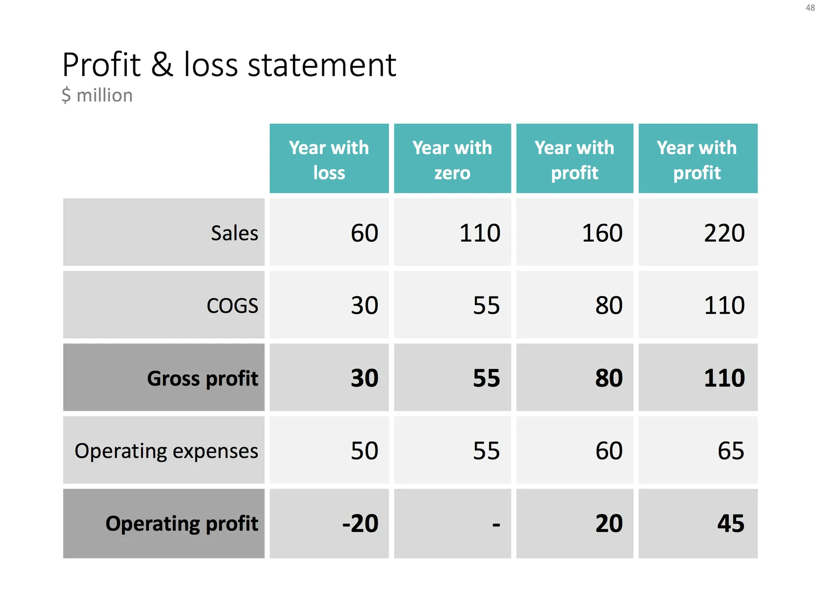
Below is the data I used to create this chart.

You can recreate your own chart with the description above, or download the example from the SlideMagic template bank.

·Data visualization

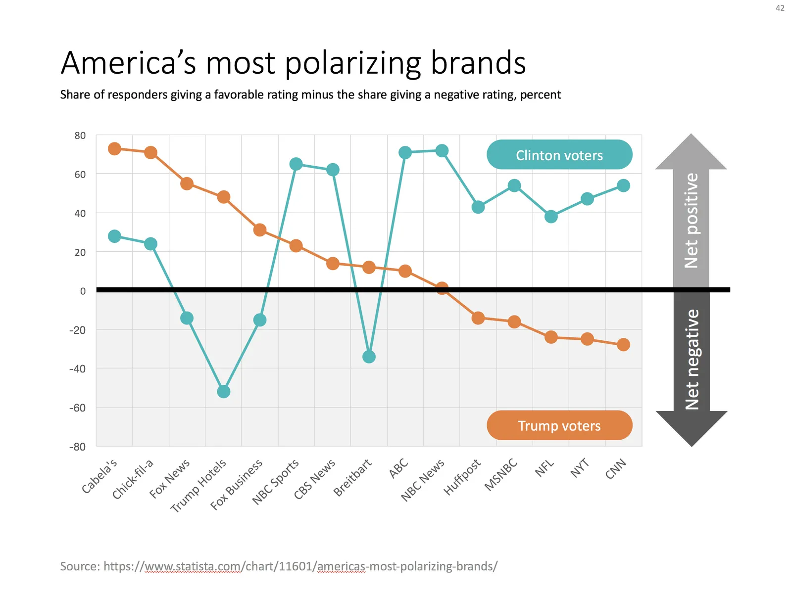
Slide make-over: polarising brands

I am across this chart recently:

This chart can be improved in a number of ways:

  • Actually, take down the brand images, or make the smaller. The different colours and sizes make the chart cluttered
  • It is hard to read what the percentages actually mean
  • The biggest problem is the confusing line up of the data bars
  • The data could be sorted, to create additional structure for the viewer

I replaced the chart with the one below in PowerPoint, using a line graph with big markers instead of the bars.

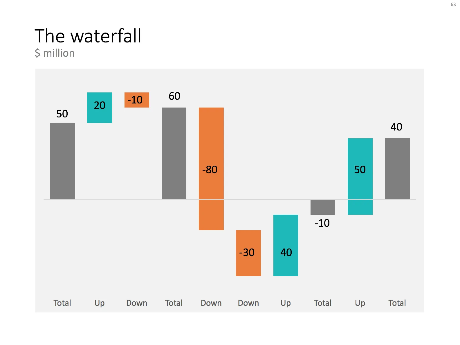
Ideally, I would have like to flip the chart 90 degrees, but this would require quite a lot of PowerPoint surgery (you can probably do it with a scatter chart somehow). The other option is to construct a highly complicated “waterfall” chart.

·PowerPoint

My own clean PowerPoint template

PowerPoint templates get corrupted over time. It usually starts with a template that was designed by a print graphics designer as an after thought after designing the logo and the business cards: creating slide layouts without paying much attention to the technical issues of programming a template that can be (ab)used by thousands of employees. Then over, slowly but gradually, “foreign” templates infect the original until nothing is left of the original.

I go back to zero every time I design a new presentation. The file that I put up in the SlideMagic template store is pretty much the one I start every new presentation design project with. It is really simple. You can customise it with your own colours and you are good to go.

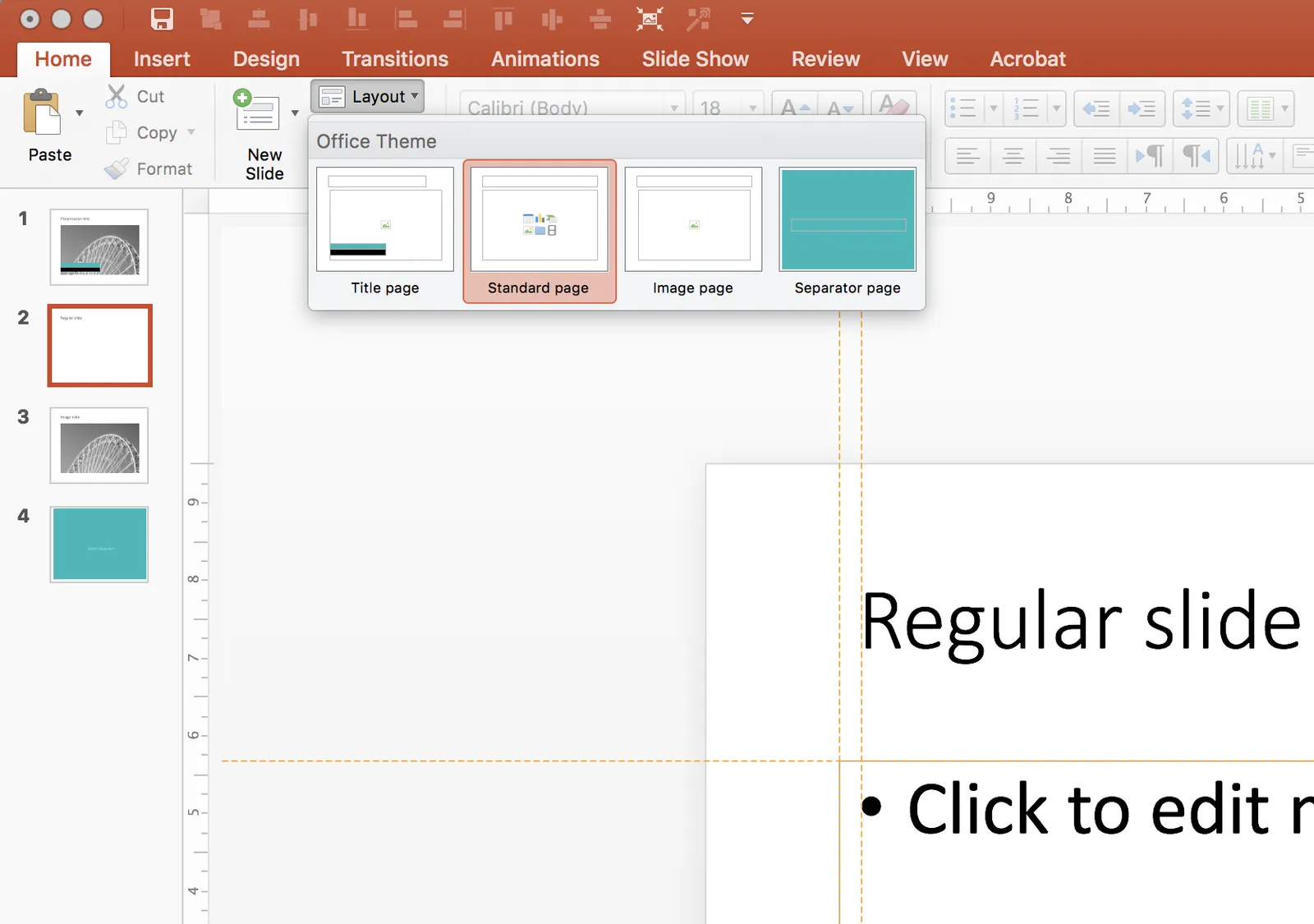
When creating a new slide, go to the “Layout” button in the top left of the menu to create a select a new slide layout.

·Templates

Focal point chart

A while ago, I discussed how to create a “focal point” slide, where a series of triangles can create the illusion of text boxes all disappearing in one big point. You can read the instructions how to create it in this blog post, but now you can also find them in the template store.

I am spending part of my daily time that I used to invest in blog posts, and increasing the library of my template store, I have an infinite amount of template ideas in my head, so there is still a lot of work for me cut out. Ultimately, the value of this store will be some sort of subscription, as a sign of support for me, in return for which you get unlimited access to all the designs. The combination of a powerful search engine and the largest library of useful charts on the net, I think the proposition of 1 second downloads will beat the alternative of manually copying my designs. Let’s see how it goes.

The drone perspective

Drones enable a new type of photograph by amateur photographers. A lower camera position than areal photos taken by planes, a higher camera position than what is typically possible from a rooftop, pictures that look down outside of big mountain ranges or dense high rise cityscapes. So you get that sense of perspective, but are still close enough to get very rich detail.

But most importantly: the lens can look 180 degrees down, which is very hard to do from a building or plane. The photos that are starting to emerge are beautiful and I assume we will see them a lot in presentations and other marketing materials.

·Data visualization

Mixed cluster and stack charts

On a few occasions, I had to use a combination of a cluster and a stack chart. This chart is not available as a standard option in PowerPoint. Here is how to make it:

  • Create a regular stacked column chart
  • Set the gap width to 0
  • Blank out the data where you want the gap between the years to be
  • Manually add labels for each of the years

You can create one yourself using the above ingredients, or you can download the one I made in the SlideMagic template store:

·Templates

Soft launch of the SlideMagic template store

Many users of the SlideMagic presentation app ask for the slides that the app generates in PowerPoint format. In response, I have built a SlideMagic presentation slide template store. The basic store infrastructure is finished, but the amount of slides available is still small.

It was quite interesting to see how in 2017 it is possible for a designer to pull of a full-fledged digital content eCommerce store with downloads and payment processing in a matter of days. (OK, my computer science engineering degree came in handy a few times when I had to go deep into HTML to customise the store template in a few places). A few years ago I was toying with the same idea, but the required investment in technology would have been a lot higher.

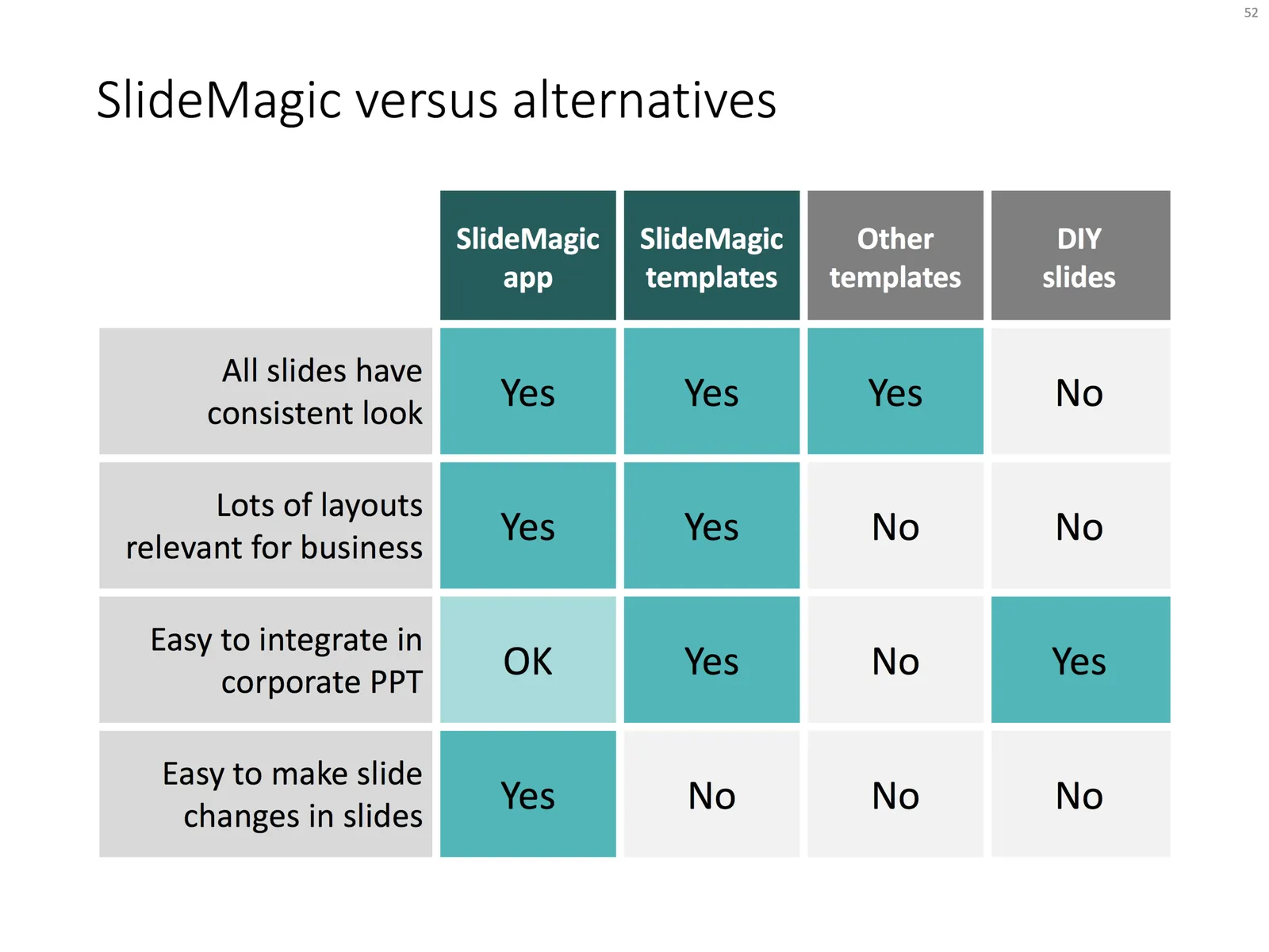
The main shortcoming of PowerPoint templates vs my presentation design app also applies to my own template store: templates are hard to customise. Adding a row of boxes to an existing design and getting everything to line up properly requires a bit of design skill. It is a trade off you have to make. The app is free to use, and makes these adjustments really easy. Where possible I will add slide variants to accommodate the layman designer where possible.

There are thousands of presentation template stores on the Internet and I tried to make mine different. All stores try to hard: designs are too sophisticated, full supporting graphical clutter that makes slides hard to customise and hard to fit in to corporate templates. My slides are incredibly simple and should blend in nicely when pasted into another corporate colour scheme.

Continue reading →

SlideMagic got a patent!

The US patent office has awarded me a patent on parts of the SlideMagic user interface, I am very excited!