SlideMagic Blog

Frequent updates about all things presentations since 2008. Subscribe to never miss a post.

RSS
all posts

Search results for “web design”

·Investor presentation

Cold emails

Now that I am a CEO of an Internet startup (www.slidemagic.com) my email address is slowly spreading in the databases of app developers, PR people, recruiters, marketing consultants, SEO firms etc. Although not in the same quantities, I start getting the type of pitch emails that venture capitalists, journalists, bloggers must be getting.

Most of these emails actually get through spam and other gmail filters. In some way or another, the recipient will look at them. Especially now that mobile devices enable you to kill dead time with gracing through your email field.

The majority of these emails get totally ignored. First of all because of basic hygiene that has been discussed in thousands of blog posts before: generic subject line, generic “hello there” greetings, spelling mistakes in names, etc.

But there is a bigger thing that turns me of: the way they are written.

  • Too generic. The sender has not bothered to check out what my app does, what stage my company is in, what sort of services I might need. Instead, it could have been highly personal and relevant (what features my app lacks, which LinkedIn contacts we have in common, etc.)
  • Too complete. The email tries to do a full pitch of the company and its services. As a results things sound bland. You will never land a contract with a cold email. Better is to write something very short, but intriguing. Something that does not cover everything you want to offer me, but makes me hit reply to find out more.
  • Specific links to specific information are missing. A portfolio to look at, apps that you designed, not just the root of your web site.
Continue reading →
·Typography

Letter spacing in PowerPoint

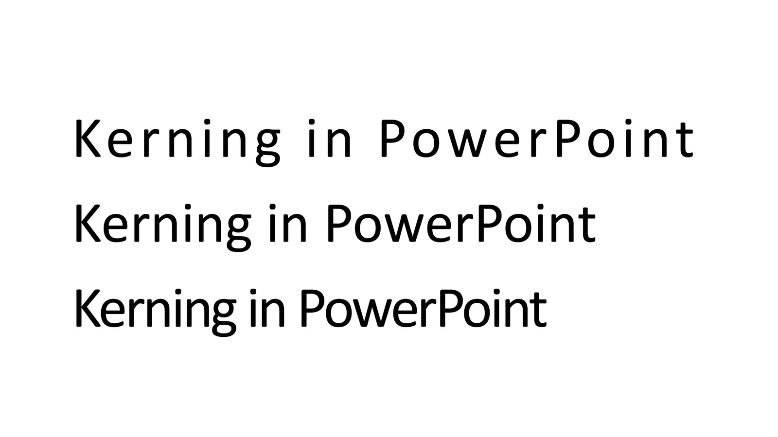
Kerning” is tweaking the spacing between characters in a word. Not to be confused with line spacing, tweaking the vertical space between lines.

Line spacing is important in presentation design. When you use very large font sizes, PowerPoint adds too much wide in between lines, you need to trim it.

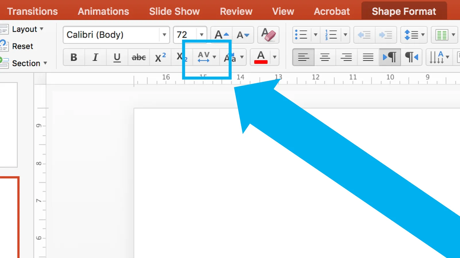
As an amateur designer of PowerPoint slides for a business presentation, you probably never need to worry about kerning. The one exception is cleaning up the mess that other users and/or templates have created. On the Mac, select all the text on a slide, click the little-used icon shown below, and set things back to “normal”

Cover image from WikiPedia

·Delivery

Presentations are not the only issue

Communication in the work place in general has its problems:

  • Email wording
  • Making a point in a meeting
  • Trying to get to a decision in a meeting
  • Annual feedback sessions
  • Handing over web/app designs to the implementation team
  • Product one pagers
  • Press releases
  • Keyword-loaden blog posts
  • Marketing slogans
  • User manuals
  • Travel policies

In presentations, the issue is most visible but it is sitting everywhere. People are used to transferring ideas in a dialogue where the recipient asks questions to help her understand what is being said. All this breaks down in one way communication.

Art: Tower of Babel by Pieter Breughel the Elder

·Software

Keynote for iCloud, a mini review

I had the opportunity to spend some time in Keynote for iCloud last week. We were editing a Keynote file with many people and needed to stay on top of versions. Keynote for iCloud was the logical solution.

It is amazing to see how web apps have evolved. After a relatively long wait time to upload/open the presentation in the browser, it is almost as snappy as if you are working on a desktop app. Browsing through slides, dragging and dropping of images, all great.

The issue is that there are a few features missing compared to the desktop version that are really important to me:

  • Distributing objects horizontally and vertically. The one biggest mistake people make in slide design is incorrect alignment of objects on the slide. Keynote for iCloud has the “soft guides” that pop up when you drag an object, but as soon as you have to deal with a lot of boxes, there is no way to line things up properly. A similar problem happens in resizing table columns and rows (but you could argue that this is a power user feature that not many users will miss).
  • Manipulating themes, especially colours. You can’t set them in Keynote for iCloud, your only choice is to pick a template when creating a new deck. When uploading an existing slide deck, the theme colours get copied, but only for shapes. In tables they do not appear. And in data charts you cannot set them either.

A smaller issue is that an animation that my client created in the desktop version did not play in iCloud presentation mode. I am not a big fan of animations in presentations so in theory this is not a big deal. But, differences in PLAY mode can create unexpected surprises when you deliver an important pitch and all of a sudden your content is displayed differently in the heat of the discussion.

Continue reading →
·Layout

But it looks so simple!

Often when I produce a slide with simple rectangular boxes and just once accent colour plus a black and white image (hey that looks like a SlideMagic slide), I get the comment that “things look really simple, unsophisticated”.

No icons, no shadings, Helvetica, no drop shadows, no rounded corners, no gradients, no nothing.

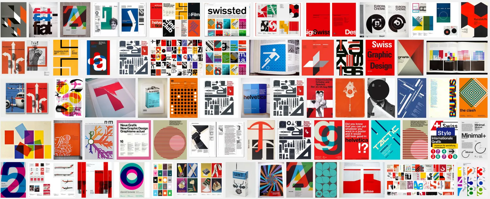
Here is the trick: it is the composition of the slide that makes things sophisticated. And that is the hard part to get right. Look at the work of the famous Swiss graphics designers of the 1960s. Most of them designed posters with the very same tools that you have in your hands when opening PowerPoint.

Look some of the simpler posters, look at your slide, look back at the poster, look at your slide. Spot the difference, and fix it!. It is layout, not fancy graphics.

And, my presentation app SlideMagic makes it a bit easier than PowerPoint or Keynote.

·Typography

Quotation marks in presentations

Quotation marks never come out right when you use large, bold, typography. Below is a nice idea by the designer of Gary Vaynerchuck. One huge, big, quotation market centred across the text. Note that the quotation mark is in a far bigger font size than the rest of the text.

·PowerPoint

Clouds in PowerPoint

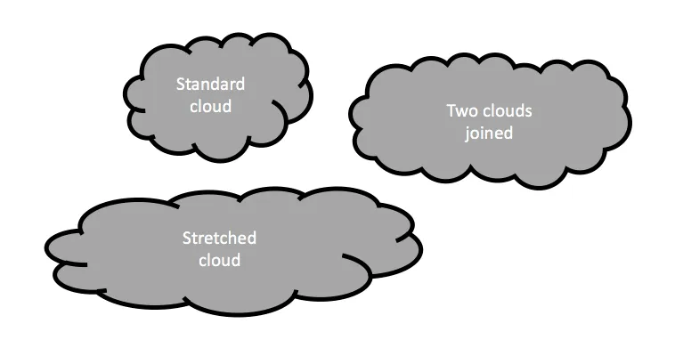
The standard cloud shape in PowerPoint is not very pretty. Especially if you need a different aspect ratio, there is no option but to stretch the shape, making it look even worse. My solution is to combine multiple cloud shapes into one to get a decent new shape (SHAPE FORMAT, MERGE SHAPES, UNION). See the example below.

It is interesting to see that merging shapes also kills the “inside” cloud contours.

You can get more sophisticated and design your own cloud shape based on circles. Here is my attempt in 2011 to recreate Apple’s iCloud logo in PowerPoint.

Art: View of Haarlem with bleaching fields, Jacob van Ruisdael, 1670

·Images

An alternative to a logo

When you need to list a handful of companies on a presentation slide, the main visualisation people use is a logo. It always looks great. Make sure you have the latest one (they tend to change rapidly), and pick one in a nice high resolution. If the colours clash too much, consider toning them down by making them black and white.

But the alternative to the logo, is actually getting an image of the company in action. An ad on the street, the neon on the corporate headquarters (no, not the HQ reception desk), a store front, etc. Make sure you don’t have any copy right issues. I usually search for photographs on Google Image search that are “labelled for reuse” Below an example for Vodafone:

 Image by Moyan Brenn on Flickr: https://www.flickr.com/photos/aigle_dore/15754634911

Image by Moyan Brenn on Flickr: https://www.flickr.com/photos/aigle_dore/15754634911

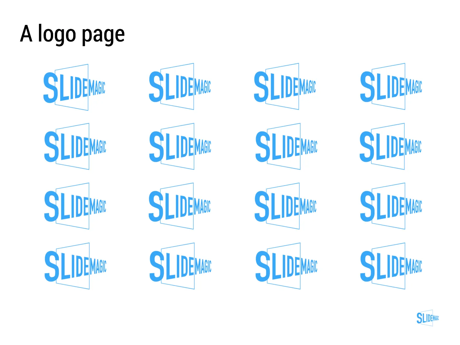
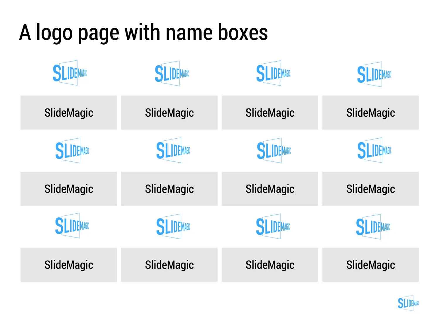
If you need to deal with a lot of company names, there is no escaping to the logo page. My presentation app SlideMagic makes lining up lots of logos very easy. Use the black and white toggle to mute logos if the colours get too busy.

Banner image from Wikipedia

·Typography

Lining up text, lining up text boxes

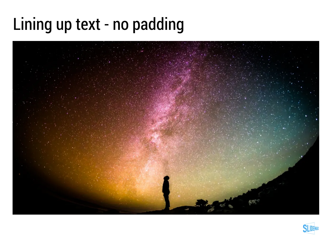
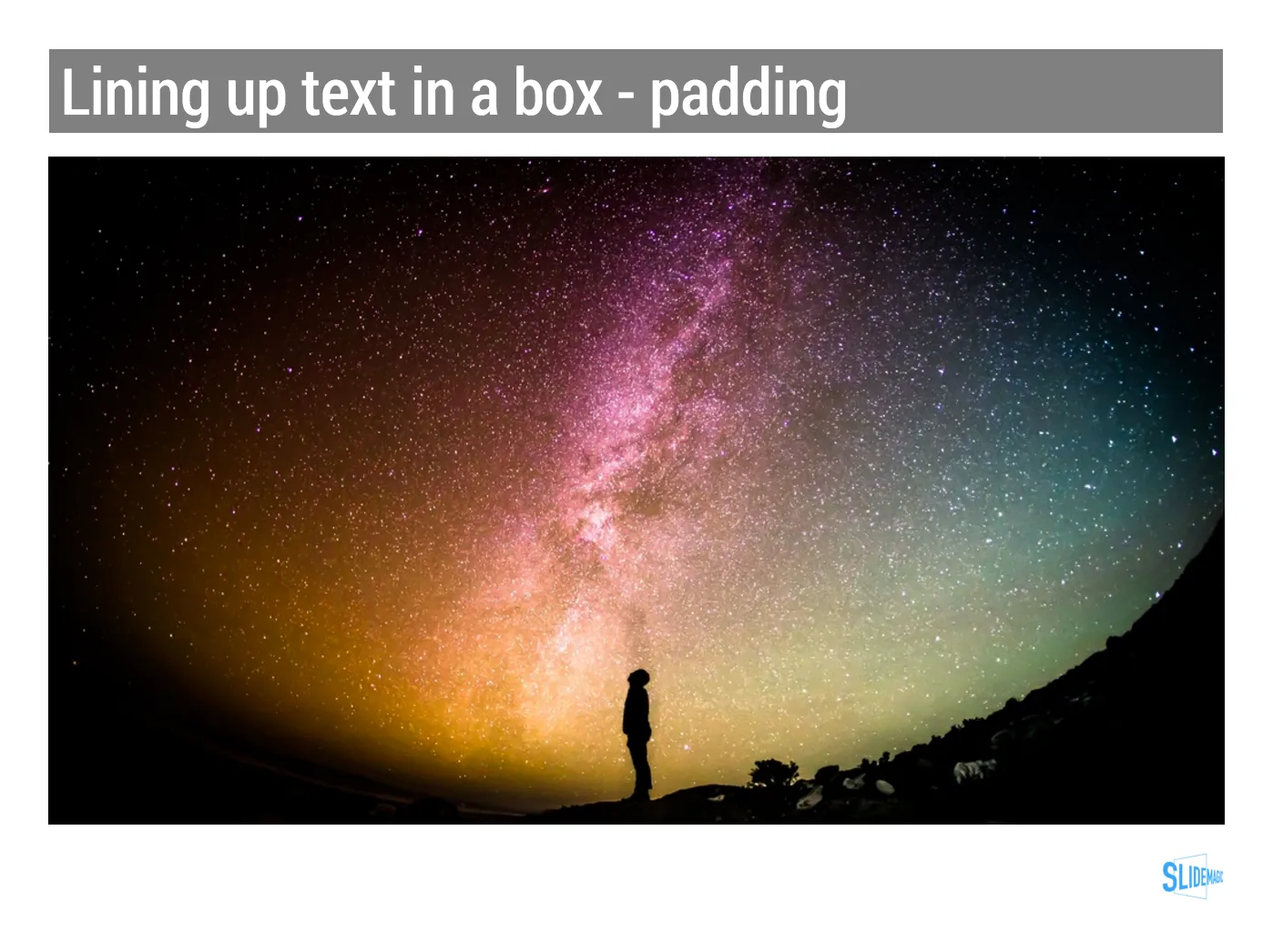
A post for the purists today. In PowerPoint, a text box and a rectangular coloured shape with text line up the same way: you hover them across the slides and “snap” lines appear that encourage you to line things up with items above or below. To do it correctly though, you need to make a small adjustment.

 A text box with a transparent background: line up the edges of the text (without padding) to the object below

A text box with a transparent background: line up the edges of the text (without padding) to the object below

 A text box with a coloured background: line up the edge of the box with the item below

A text box with a coloured background: line up the edge of the box with the item below

With my presentation app SlideMagic, you don’t have to worry about this. I remember “arguing” with my developer why this was an important feature :-)

Stale PowerPoint templates

User interface, web design, and presentation are moving quickly. Graphics that looked fresh and new a couple of years ago, now look really stale and old. Look at old version of Windows and Mac OSX operating systems, a mobile phone home screen in 2008, and the PowerPoint template you are still using today.

A large part of this is driven by screen technology. Ten years ago, monitors had lower resolutions and fonts had to be fatter, and rough gradients could still look smooth. Also documents that long reasonable on a 4:3 aspect ratio become harder to read on wider 16:9 monitors as sentences streeeeeetch over the entire screen. Harder to read, and it looks out of balance.

What can you do to your PowerPoint template to make it look less like the 1990s? Here are some steps:

  • Switch to a lighter font. Calibri light looks OK and won’t give you any compatibility problems on Macs and Windows.
  • Stop using drop shadows and gradients
  • Remove the old low resolution JPG graphics from your slide template. If you or your corporate communications department insists on having some branding on the slides, but a tiny high res logo at the bottom right
  • Don’t use bullet points
  • If you have to use bullet points don’t use a hierarchy of bullet points
  • If you have to use a hierarchy of bullet points, keep them all the same font size, and use a dot, dash, smaller dot for the levels (no squares, or other funny characters)
  • On 16:9 screens don’t run long sentences in small fonts across the full width of the screen. If you have a lot of text put boxes next to each other (a horizontal list, versus a vertical list)
  • Restrict the use of colour, use the accent colour in your company’s logo, well, to make an accent. Stop using bright red, pink, green, or yellow
  • Stop using underline and italic
  • Legal disclaimers, footnotes, and page numbers can be really, really small somewhere at the bottom, only readable for people who press their nose against the screen
  • Get someone in IT to program all these changes into a idiot-proof new PowerPoint template with all the right default shapes, fonts and colours
Continue reading →