SlideMagic Blog

Frequent updates about all things presentations since 2008. Subscribe to never miss a post.

RSS
all posts

Search results for “web design”

·Data visualization

Summary chart with 3 completely different data ranges

Sometimes you want to show 3 data sets in one chart with very different data ranges, for example:

  • 1,000s of customers
  • $ sticker price per unit
  • Number of products bought per customer

One solution:

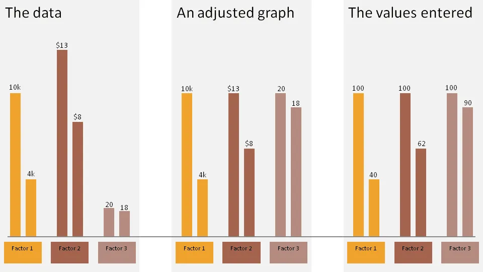
  • Set the column of the first data point of each series to 100
  • Calculate the 2nd value relative to the 100
  • Manually paste data labels with the correct factors

The chart below gives an example:

  1. The first chart contains the unadjusted data
  2. The second chart shows the adjusted version
  3. The third charts shows the values I have entered in the PPT columns

Click on the example image below for a larger image.
·Design

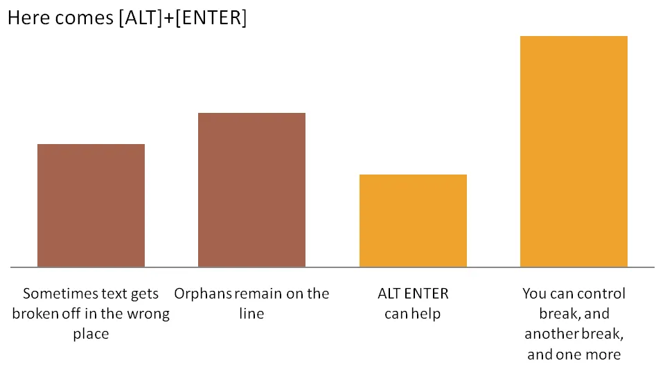
The joys of ALT ENTER

Pressing ALT ENTER in an Excel cell creates a soft page break, pushing the text down a line without “closing” the cell edit. You can use it to control line breaks in axis lables.

The other solution is to omit automated axis labels all together and put in your own standard PowerPoint text boxes under the bars in the chart.

·Data visualization

A different approach to data visualization

It is hard to get the magnitude of a huge number across on a slide. A $700bn bailout,how much is that? Photographer Chris Jordan takes a different approach. Repetitive patterns of miniaturized objects that form a bigger picture. Images have a political message, many of them try to put current “consumerism” into perspective.

The image below is inspired by Seurat’s “un dimanche après-midi à l’Île de la Grande Jatte”, and constructed from 106,000 softdrink cans.

Check out more of his images here. Via Village of Joy.

·Concepts

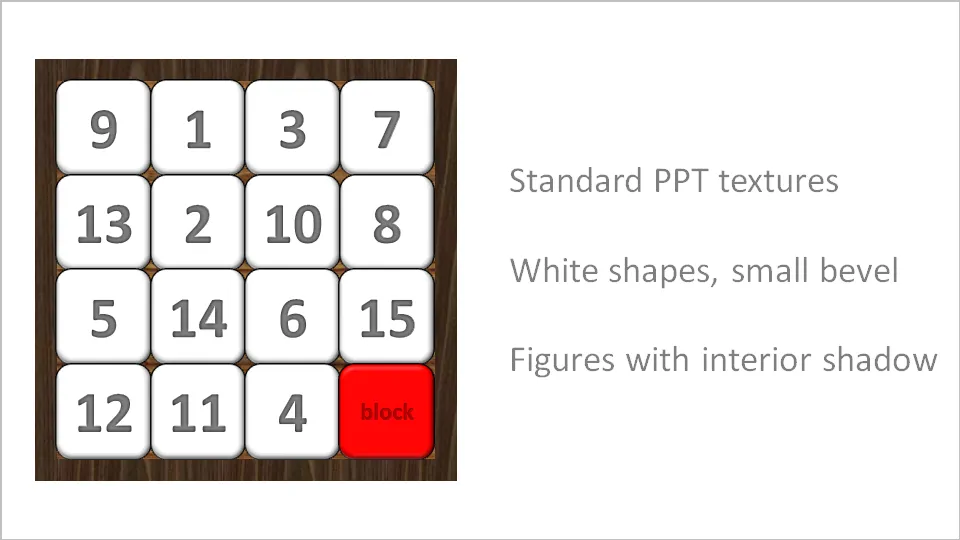
Stuck! - board games with simple PowerPoint shapes

The basic PowerPoint shapes and textures can be used to re-create realistic looking board games. Here is a concept I used for a client that needed to show how its potential customers are being hindered to move around their IT infrastructure freely.

·3D

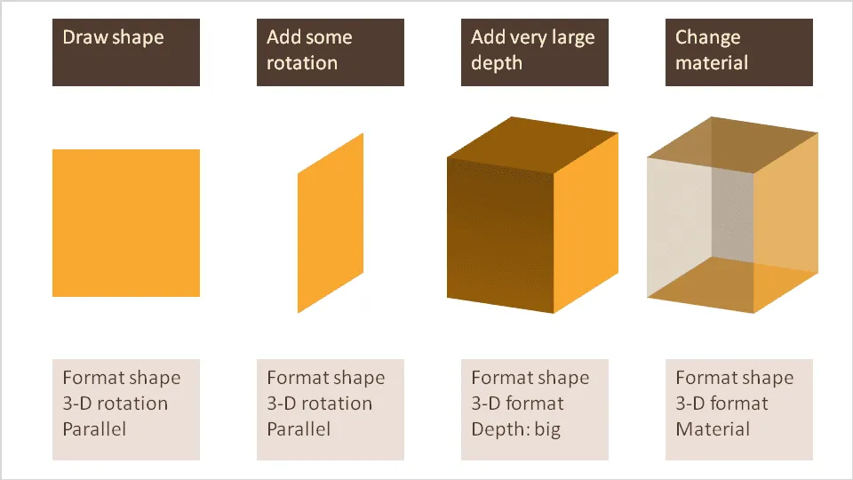
Drawing 3D boxes in PowerPoint

A while ago I discussed making translucent balls. Here is a similar trick for boxes that does not use the old PowerPoint shape with a simple cavalier perspective.

·Advertising

Esthetics in everything you do

Another ad found on Ads of the World: Samsung wide-angle CCTV.

Very good Photoshop work. Still, the resulting image is not esthetically pleasing. My personal rule: never let an ugly chart or image enter my PowerPoint presentation, ever.

·Design

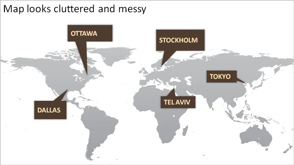
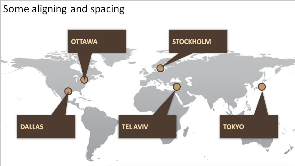
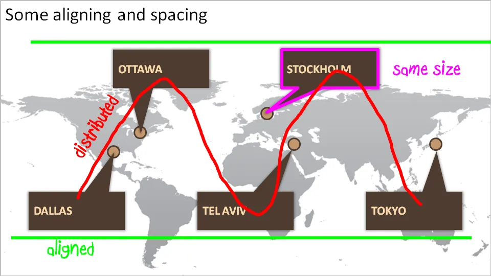
How to bring some order to a cluttered PowerPoint map

One of my clients is keen to show its new network of global support offices. Maps can look messy and random. Here are some simple things you can do to put things in order. We can not change the location of the planet’s cities, we have control over PowerPoint shapes…

·Data visualization

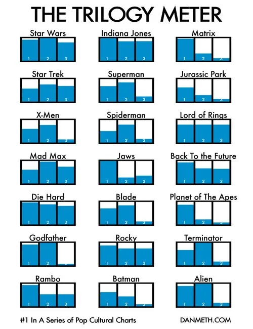
Visual power of many small repetitive data charts

A nice set of bar charts showing Dan Meth’s excitement about episodes of movie trilogies.

Many, many, similar small data charts on one slide can create a powerful visual effect. It is possible to create Zen charts that contain lots of detail.

Via Randy Krum

·Colors

Google image search narrowed down by image color

An interesting find by the Google Operating System blog: using Google image search to find pictures with a certain color. It is not an official search option (yet), you need to adjust the Google URL manually:

Finding red birds:

  • Enter “bird” in Google image search
  • Add “&imgcolor=red” to the Google URL so it looks like this: http://images.google.com/images?q=bird&imgcolor=red,
  • Replace “red” with “blue”, “green”, “teal”, “purple”, “yellow”, “orange”, “pink”, “white”, “gray”, “black” and “brown” to get other colors

Still, watch out for possible copy right violations or poor image quality when using pictures taken from Google in your PowerPoint presentations.

Thank you Ashish for pointing this out to me.

·Design

It's hard to find that perfect visual analogy

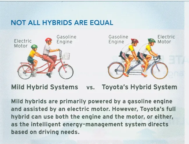
I came across this diagram in a print advertorial for Toyota hybrid cars (scanned it, could not find it online). Click on the image for a larger picture.

The diagram supports all the points in the text. Still:

  • The image looks a bit retro
  • You actually need to study it a bit to understand it
  • Race bikers can go fast, however they are by far not as powerful as a modern hybrid car…
  • The text below the image does not flow very well

In short, the image is probably good enough for an internal management presentation, but does not meet the bar for external advertising. It is hard to find that perfect image or illustration…