

It is clear that good charts address one idea only, and use minimal text and data. Still, I sometimes make charts that have an enormous amount of information in them. The smart use of graphics and colors makes sure that the message comes out.
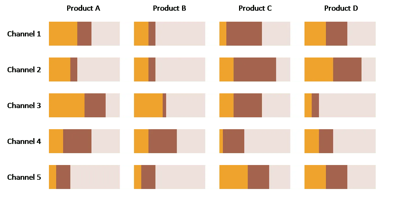
The trade-off heat map we talked about earlier is an example. Here is another one of my favorites: all market shares for all products for all channels in one chart (random data without a clear message I must admit here).
- Create the chart as 1 PowerPoint bar chart with “white” data series to separate the graphs so they are exactly lined up
- Use contrasting colors for the data you want to focus on, plus a pale one to fill up the chart to 100, reinforcing the grid structure of the slide
- Group rows and columns with similar numbers together so the become stronger visually when looked at from a distance
- If necessary add a message with a bright red circle
Strangely enough: the more products, the more channels, the better the chart looks.