

Blog post

Visual power of many small repetitive data charts

March 25, 2009 · by Jan Schultink
← all posts

A nice set of bar charts showing Dan Meth’s excitement about episodes of movie trilogies.
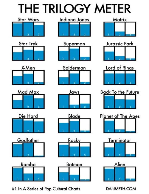
Many, many, similar small data charts on one slide can create a powerful visual effect. It is possible to create Zen charts that contain lots of detail.

Via Randy Krum

Data visualizationDesignImagesPowerPointPresentation designPresentation

About this blog

Notes on all things presentations — design, storytelling, and AI workflows.

Subscribe now to never miss a post.

RSS

About SlideMagic

A platform for business presentations.

A free student plan is available.

4 comments

Jan Schultink2009-03-26 09:11:00
@Travis. I would actually stick with the detailed chart and take some time to "mull it over" with the audience. In this case the exact data or precise height of the bars doesn't really matter. In cases where it does, additional charts might be required.
Travis2009-03-25 19:28:00
I've seen this Trilogy Meter before and I really like it (I do have some disagreements with some of their choices however), but I haven't seen them all together like you have it here. I like the effect. Would you do something like this and then go on to focusing on just one of the charts? I think that would really help because with all of this data, it is hard for everyone to see all of the information much less process it, but if you use it as a set up to another slide that focuses on one of them I think that would really be effective.
Jan Schultink2009-03-26 09:12:00
@Jon. Thx. Didn't know that.
Jon Peltier2009-03-26 01:01:00
In 'Envisioning Information', Edward Tufte calls these "small multiples".