Blog post

How to bring some order to a cluttered PowerPoint map

April 1, 2009 · by Jan Schultink
← all posts

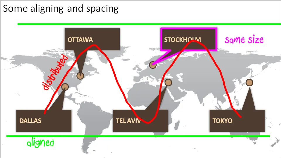
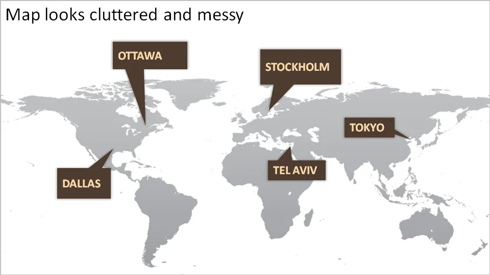
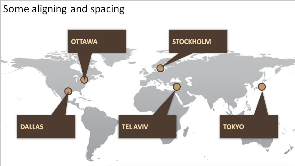
One of my clients is keen to show its new network of global support offices. Maps can look messy and random. Here are some simple things you can do to put things in order. We can not change the location of the planet’s cities, we have control over PowerPoint shapes…
DesignLayoutPowerPointPresentation designPresentationShapes

About this blog

Notes on all things presentations — design, storytelling, and AI workflows.

Subscribe now to never miss a post.

RSS

About SlideMagic

A platform for business presentations.

A free student plan is available.

2 comments

Jan Schultink2009-04-01 17:27:00
I agree that you can take out the heavy brown fill of the boxes. I still would go for a box though, maybe very light, or semi-transparent to get the eve spacing of the city names. Also it allows you to put in a bit more detail about each of the office locations without disturbing the harmony of the chart.
Anonymous2009-04-01 13:57:00
Hi Jan, why not consider to remove the brown boxes completely, and just write the cities' names beneath their location? With a nice font and good contrast of colour and size, this will look nice as well and provide a better visualization of where exactly the offices are located.