SlideMagic Blog

Frequent updates about all things presentations since 2008. Subscribe to never miss a post.

RSS
all posts

Search results for “web design”

·Delivery

Does the multi-story-rock-star-presenter exist?

I was wondering this the other day. Many of the best presenters nurture one story year after year after year, and are getting better and better and better at it.

  • Best-selling authors previewing their book
  • CEOs pitching their company’s products
  • Gurus urging us to leave our cubicle to do what we are really passionate about
  • TV evangelists trying to save our soul
  • Presidential candidates preaching hope
  • Social media experts telling us that luckily we are one of the few who really “get it”

Is there such a thing as the multi-story rock star presenter?

Osho greeted by sannyasins on one of his daily “drive-bys” in Rajneeshpuram, 1982. © 2003 Samvado Gunnar Kossatz

·Books

Book review - "Brain Rules" for presenters

I finally got around reading Brain Rules by John Medina and can confirm that it is indeed essential reading. Not only for people interested in visual communication (the likely reader of this blog). But it is also likely to change some of your fundamental perspectives on life if you are a knowledge worker, a manager, a student, a teacher, a parent, or any combination of these.

The book has been reviewed extensively elsewhere, and a good web site covers its basic ideas centered around 12 rules. I will not repeat this, but rather dive in to some of the details that I marked on the pages because I found them interesting. Most of them (but not all) are related to visual communication. Here we go.

  • Contrary to popular belief that (brain-related) things only go down after the age of 28 (millions of brain cells dying each day), the brain can renew. Just exercise and stay curious.
  • Everyone’s brain is wired differently, wiring gets decided early on in a person’s life. Surgeons about to operate on a patient need to keep the subject conscious with exposed brains, while touching part of it to figure out what’s inside. “Someone just touched my hand”. This allocation might impact performance. “Don’t let the superior temporal gyrus host your critical language area. Your verbal performance will statistically be quite poor”.
  • We don’t register boring things, after 10 minutes of a continuous flow of densely packed information, our attention is close to zero. A presentation should have a break, or something to wake us up every 10 minutes (or better still, presentations should last 10 minutes).
  • The first few moments of exposure to new information are the most important. Presenters should not waste it on boring generic overviews of their presentation, long-winded introductions of themselves. Leverage the fact that all brains in the audience are still switched on.
  • Recalling an emotion at the moment we are fed information the first time greatly improves our ability to remember it. Dare to use creative tools. “Apologies for the ugly drawing of this huge orange turtle, but it walks about as fast as the typical decision making processes in our company”. People will be talking orange turtles for the rest of the day.
  • Vision trumps all other senses is almost a cliche (the 1000 words etc.). We know that images in presentations are important. But here is interesting bit: reading text is difficult. Decode the funny shapes, construct the sentence, understand its meaning… Bullet points and text books create too many processing layers between information and memory. But this gives also food for thought to reconsider some of the “big font/powerful quote” slides. “20% of kids are obese” combined with a huge picture of a fat kid walking out of a fast food outlet. Sounds powerful, but I think visualizing the 20% will do an even better job of getting message across.
  • Vision is more than just registering an image. There are different parts of the brain that deal with color, motion, patterns. The brain is especially good at the latter. Use patterns, repetitions, in charts. Especially to visualize data.
  • The brain fills in missing gaps in a visual picture. When you imagine something should be there, you see it. Drawings don’t need to be perfect. Rely a bit on the audience’s imagination.
  • Meaning before details. We need to internalize what things mean before we can remember them. Out with the buzz words, out with the cliches. “Our new holistic security concept delivers scalable ROI that helps you stay competitive in an ever changing world”.
  • People need to sleep to function well. Poor sleep kills 20% of your brain power, that’s about 2 hours worth of work for an average working day. Brains are build to deal with short-term stress (“help a tiger!”) but cannot handle prolonged pressure. Manage your deadlines. A last minute, late night presentation iterations will for sure not deliver a brilliant end product. Our brain continues to chew on an idea in our sleep, give it time. These findings put into question the whole system on which corporate work environments are managed.
·Advertising

Chart concept - giving it all a fresh new layer of paint

Sometimes you need a fresh start, begin from a clean sheet of paper, do some serious house cleaning. Covering a busy messy image with a paint roller and some stripes of fresh paint is a great way to visualize this message.

Here is an example of images on iStockPhoto that could be that basis of such a chart (the yellow paint rollers, make sure to strip out the white background color in Photoshop or with this PowerPoint trick). This post was triggered by this ad on Ads of the World:

·Data visualization

How can we make that growth look more impressive?

“Can we make that look a bit more impressive?”

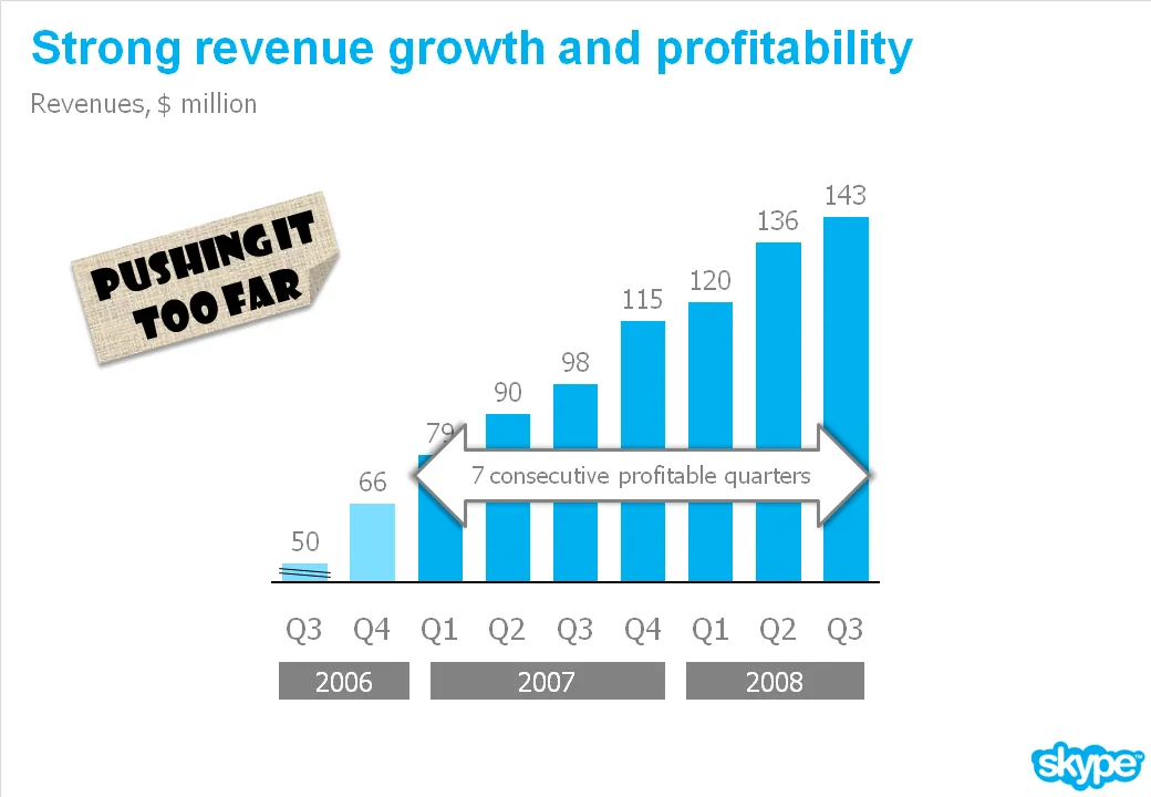
I get that question a lot. An obvious trick with column/line charts is to cut the axis. I think that is cheating the audience, putting at risk the trust in the content of all your other slides in the presentation.

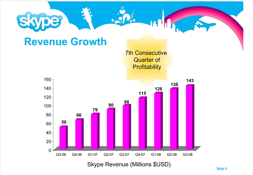
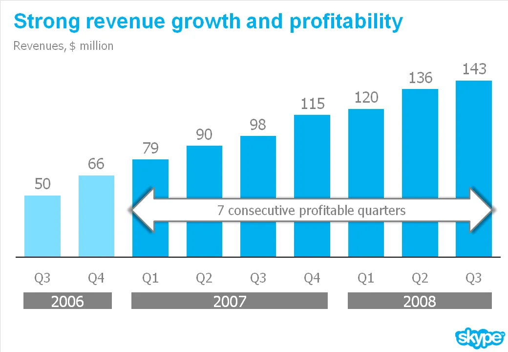
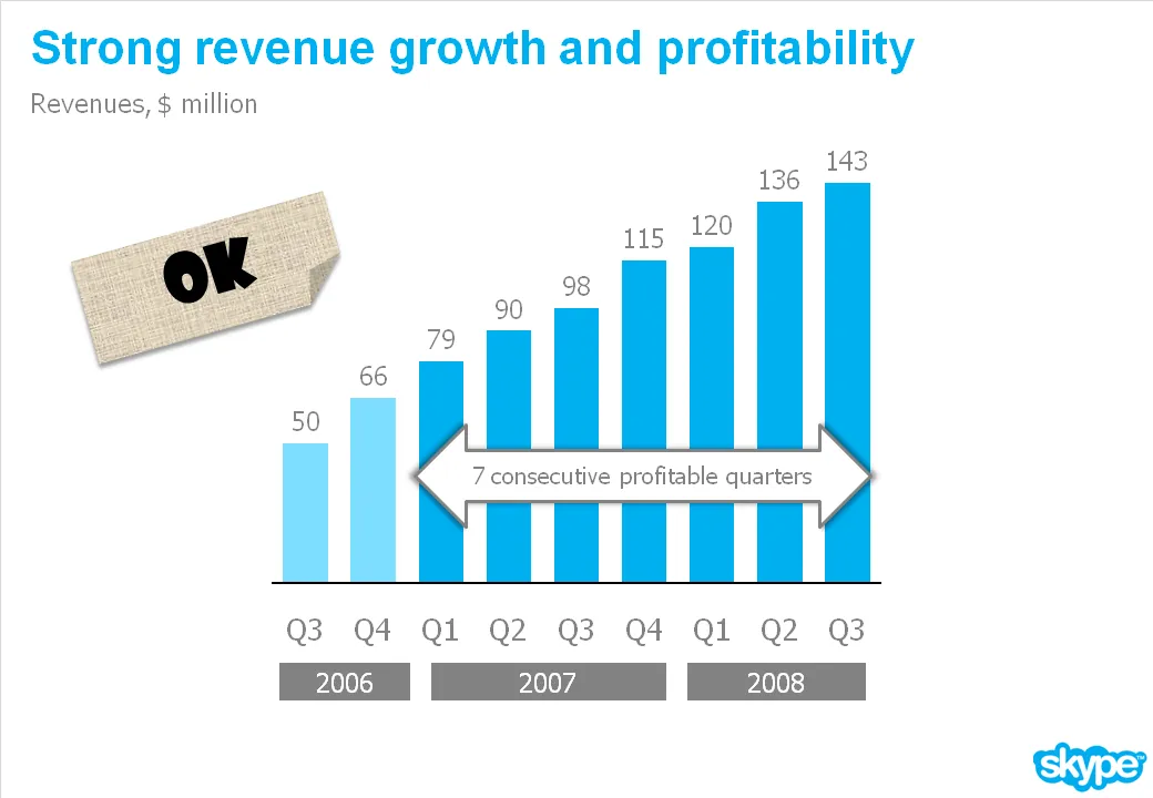
What you can do is play with the aspect ratio of your chart. As an example see the make-over of a Skype chart I used earlier. People in the comments were suggesting that the new version actually looks less impressive than the original. Maybe squeezing the chart horizontally while keeping the vertical size the same fixes that.

·Design

A daily dose of framework napkins

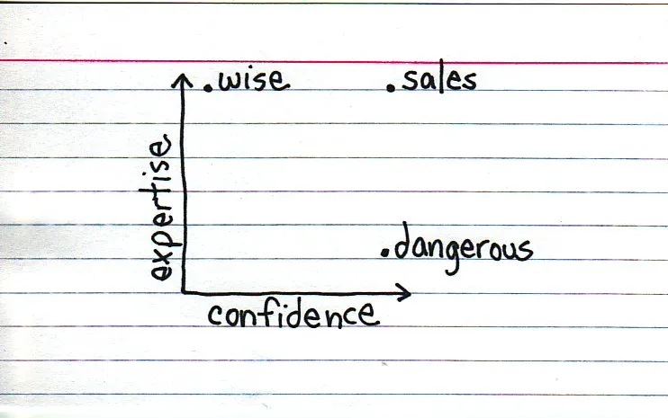
Yesterday’s post about Venn diagrams led me to a blog that I seem to be the last person on the planet to discover:Indexed. Jessica Hagy posts a napkin-style framework everyday. Sometimes funny, sometimes with a valuable insight about life or an unusual way of looking at things. Here is an example:

Venn diagrams, but especially 2x2’s, are very popular among McKinsey, BCG, Bain, and other management consultants. “We have put the world into 4 buckets, so now we understand it”.

For solving problems they are great, and I have used hundreds of them in my 17 year (oops) as a management consultant. All issues are on the map, how we can we move from one box to another?

But take a step back and think when you want to use these frameworks in a big keynote presentation. To illustrate my point: look at the drawings on the Indexed blog, and check which ones do you get in a second. Tricky isn’t it?

My advice: use these 2x2 frameworks only

  1. if you want to show movement of dots in the boxes. For example you can use the same framework in a few slides to show changes in strategy, or the positioning of a company
  2. if you want to highlight how your company/idea differentiates itself from the competition (by being in the top right box).

If you just need a structure to list 3 items, try to find a simpler way to visualize things.

Still, add Indexed to your RSS reader, it’s great fun.

·Design

Simple and complex at the same time

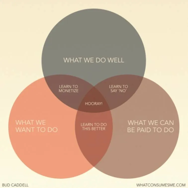
I came across this nice diagram with a useful lesson about what we should be doing in life (via Flowing Data).

A neat concept, and the Venn diagram is the right framework to visualize it.

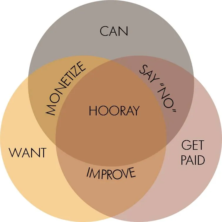
The chart is simple, but it actually takes the reader a few seconds to internalize it. If you want to use something like this in a stand-up presentation, some modifacations to the slides are required:

  • Simpler words to express the ideas
  • Create more visual space for the overlapping areas
  • Animations (unfortunately, I cannot avoid it here) to introduce the circles, introduce the overlaps between 2 of them, introduce the overlap between all 3 of them.

Unfortunately, my slide does not look prettier than the original one, and standing on its own, it does a worse job in explaining the concept. On stage though, it will work better.

·Concepts

Chart concept - kicking the competition out of the game

Anat created another great chart this week to visualize how a company is going to kick the competition out of the game. See the example below with the client-specific details and colors left out.

The image is purchased from iStockPhoto, the balls are standard PowerPoint circles with some “extreme bevel” added to it, gradient shading in the back, the font is Planet Benson 2.

·Data visualization

Confident graph lines

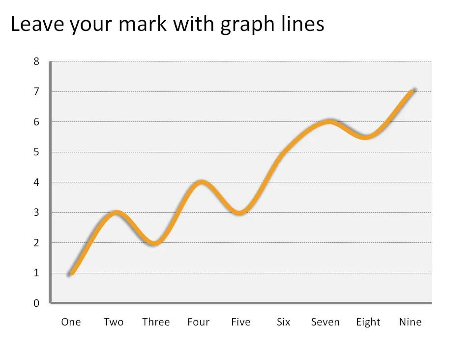
The standard chart templates in Excel and PowerPoint create fragile, thin graph lines. No one can see them. Right-click the line and make it bold and fat and it will stand out.

·Design

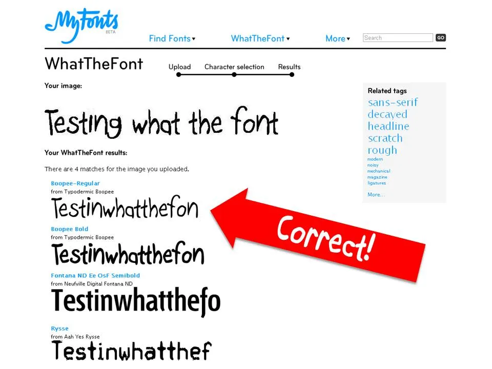
WTF - What The Font

I am not sure whether this is new, but I only came across this tool recenlty. You provide What The Font with an image of a text sample and it gives you suggestions what font might have been used.

·Design

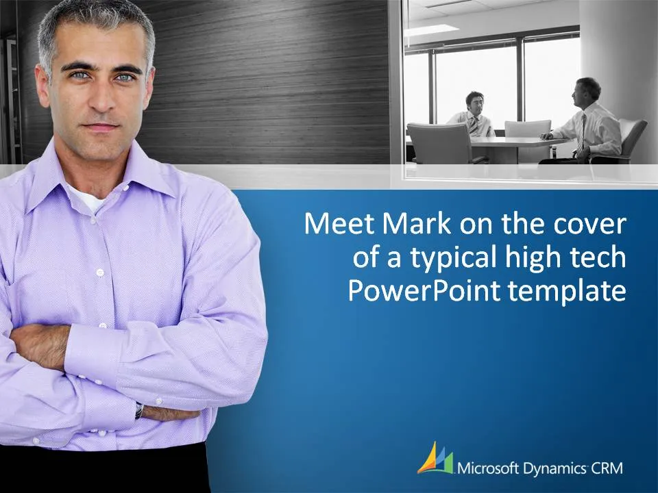
Meet Mark on the cover of a typical corporate PowerPoint template

I came across this template in a meeting yesterday. I am not picking on this specific company that is using this PowerPoint template, it is just a great example of templates that almost all companies in high-tech use. “Business-like” settings, professional models and big logos and graphical elements repeated on every page.

Technically, these templates are well executed (images, composition, colors). Your presentations look professional but they do not really stand out. They could look so much better and more original.

I do realize that creating a standard PowerPoint template for large corporations that have thousands of employees, most of them not skilled in PowerPoint, that have to produce documents that look vaguely consistent in format is a challenge.

Some suggestions:

  • Avoid professional models in slides, but especially in templates. They are not real people.
  • Get rid of “frames” around slides, the blue line at the bottom is not required
  • Avoid heavy graphical elements on the page, especially at the top. It makes the slide too heavy
  • I do like using images as separators for different sections in presentations. Instead of using images of models, hire a photographer and use real images: anonymous people in the street of cities your offices are located, images of a delivery truck unloading your product for different stores, cafes that feature your beer brand on their building facade. If you want to use people, take real ones (employees from all over the world that use your software) and include many, many, many images to avoid boredom of seeing the same face